Smart components are reusable website elements that can have editable areas. Go through this article to learn about everything you can do with them.
Smart Components let you define editable blocks of code that save you time putting together pages, give a unified look to your project, yet still have the flexibility to alter the block to fit the current page.
Important: Components only work with projects. To use them you have to either start a new page and save as a project, or open the folder where your website is located with File -> Open project.
Use the Components Tutorial sample project together with this document to explore examples mentioned here.
Smart components are website elements that can can be used on multiple pages in your project to give a unified look. They also allow for easy updating for any design changes that occur. Any HTML element can become a smart component.
Why would you want to use components?
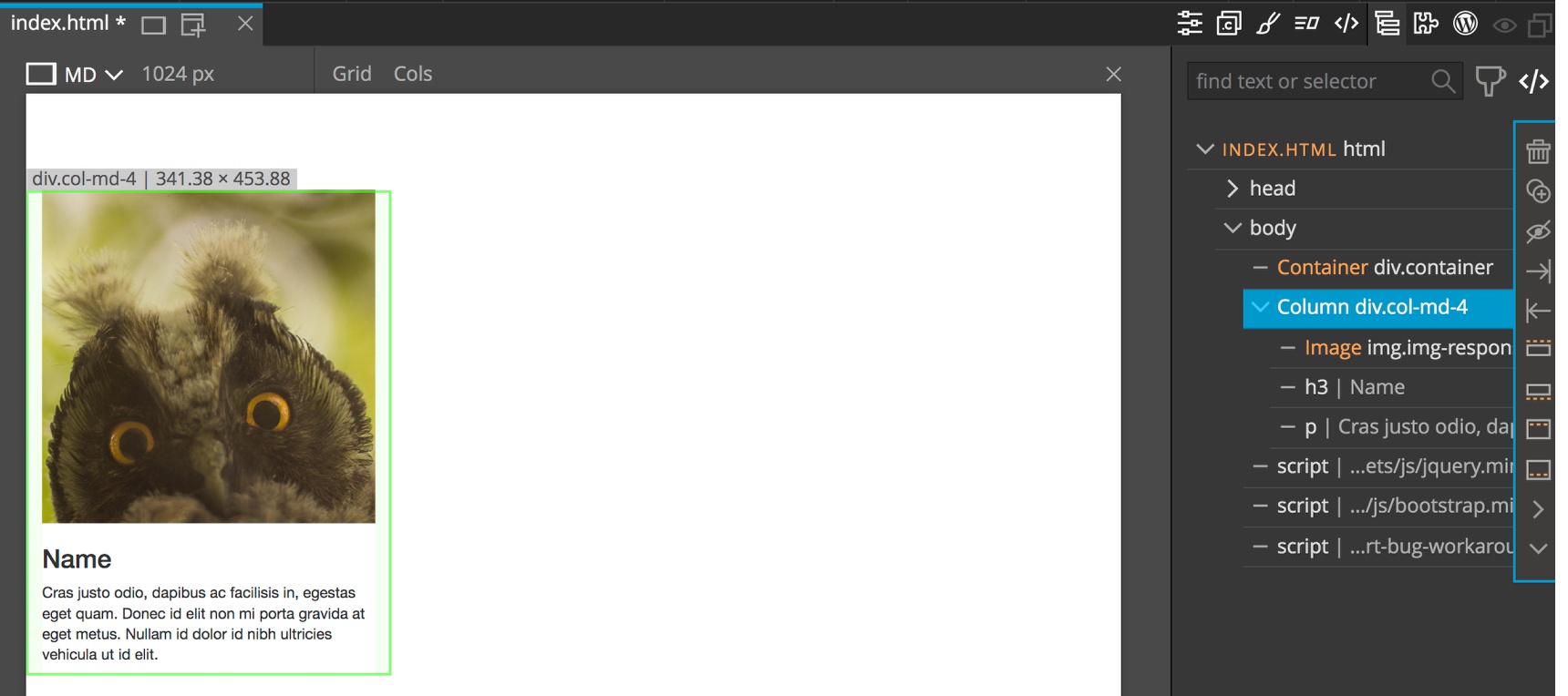
Let’s say that you have a Team section with four team members (see 1-team.html in examples). Each team member is a <div> that has an <img> with their picture, a <h3> with name, and <p> with description.
Instead of creating the same layout four times you could just create it once and then turn it into a smart component.
How to define a component?
It’s very simple. Just create the first card element in the Team section, like you would normally.
Next, within either the Page View or the Tree panel, select the Team member element.
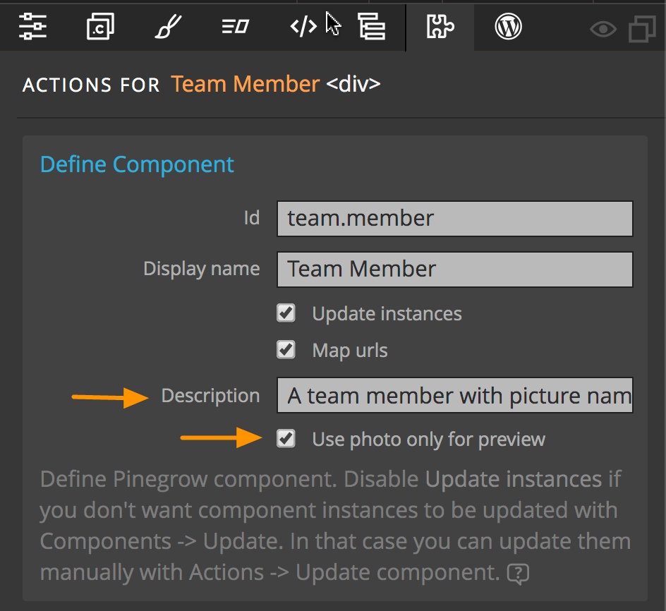
Open to the Actions panel by clicking on the puzzle piece icon and then click on “Define component”. This will add the “Define component” action to the element and display action properties.
Finally, set the component id to something like “team.member” and the display name to “Team member”.
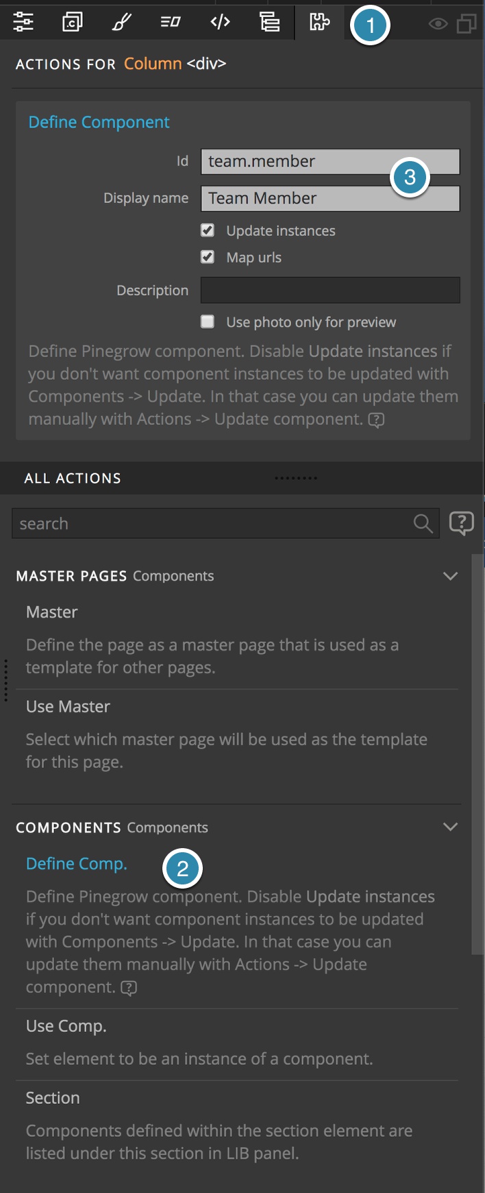
The component id must be unique across all libraries and plugins that are activated on a page. It’s a good idea to give them a library-specific prefix, for example “myblocks.”.
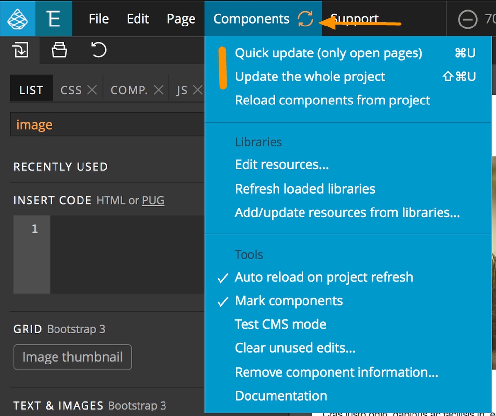
The orange Update components button will light-up on the top toolbar. Click on it (or press CMD + U) to quickly update components on all open pages. Press SHIFT + CMD + U to update the whole project. Both of these options can also be selected from the Components menu.
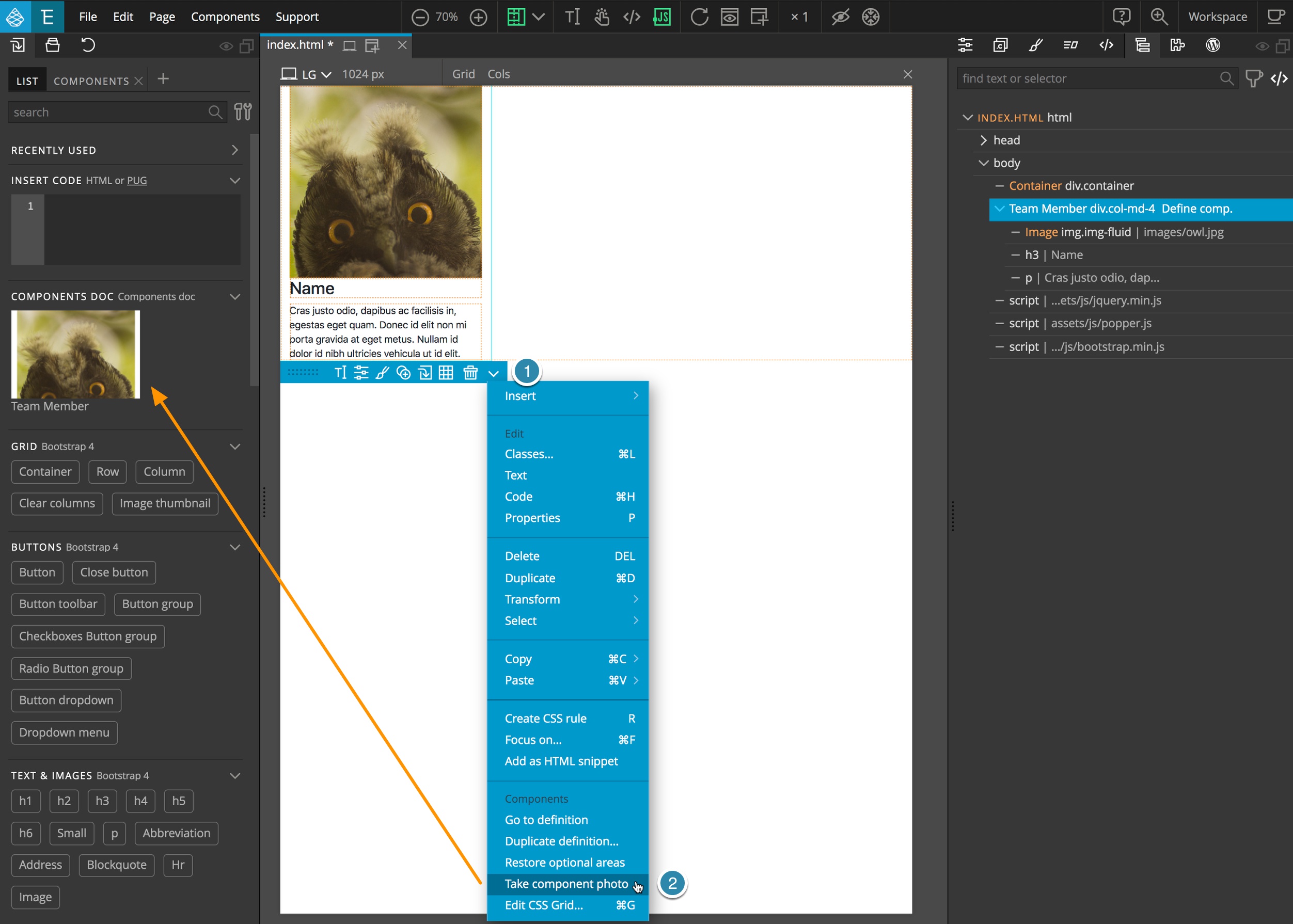
This will add your new component “Team member” into a Library panel. In order to have a component’s photo added to the Library panel click on the down caret in the helper menu and select “Take component photo”.
If you want to use the photo for a preview when hovering over the element, but not show it in the Library panel and only have a text label there, check the “Use photo only for preview” in the component definition. The Library panel will be updated when you update the whole project or select “Reload components from project” in the Components menu.
You can also enter a description into the Component definition as a reminder of what that component was originally used to display.
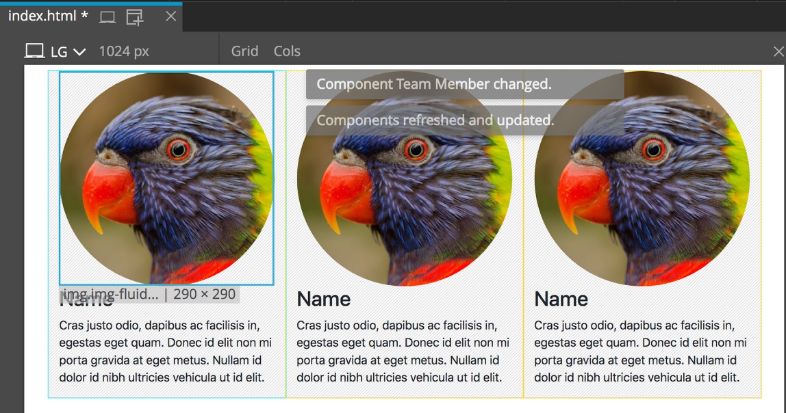
From the Library panel you can add the component on any page in your project by drag-and-drop to either the Page View or the Tree panel, or by right-clicking the element and selecting an option from the context menu. Let’s go ahead and insert three instances of this component after the first team member.
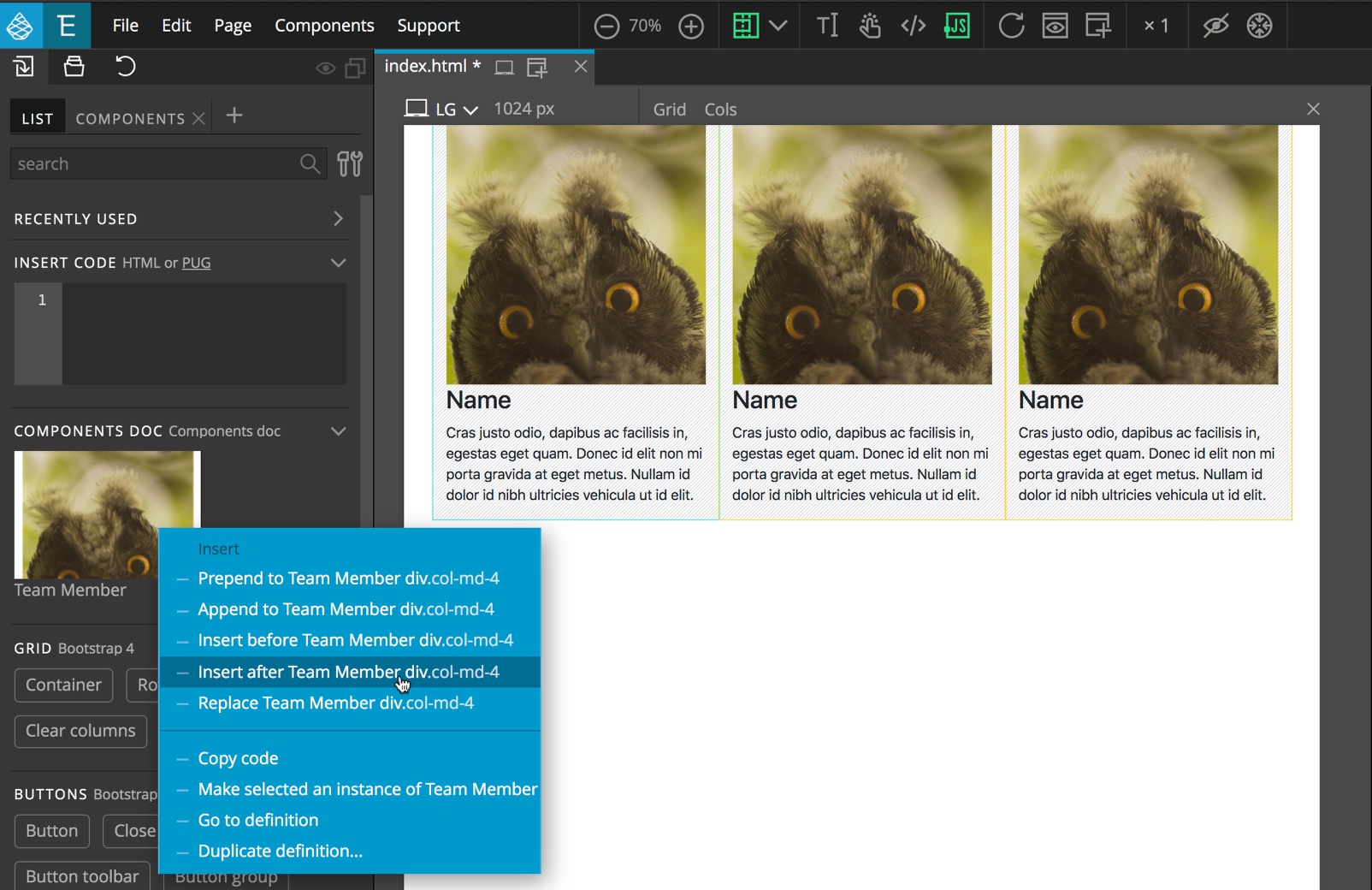
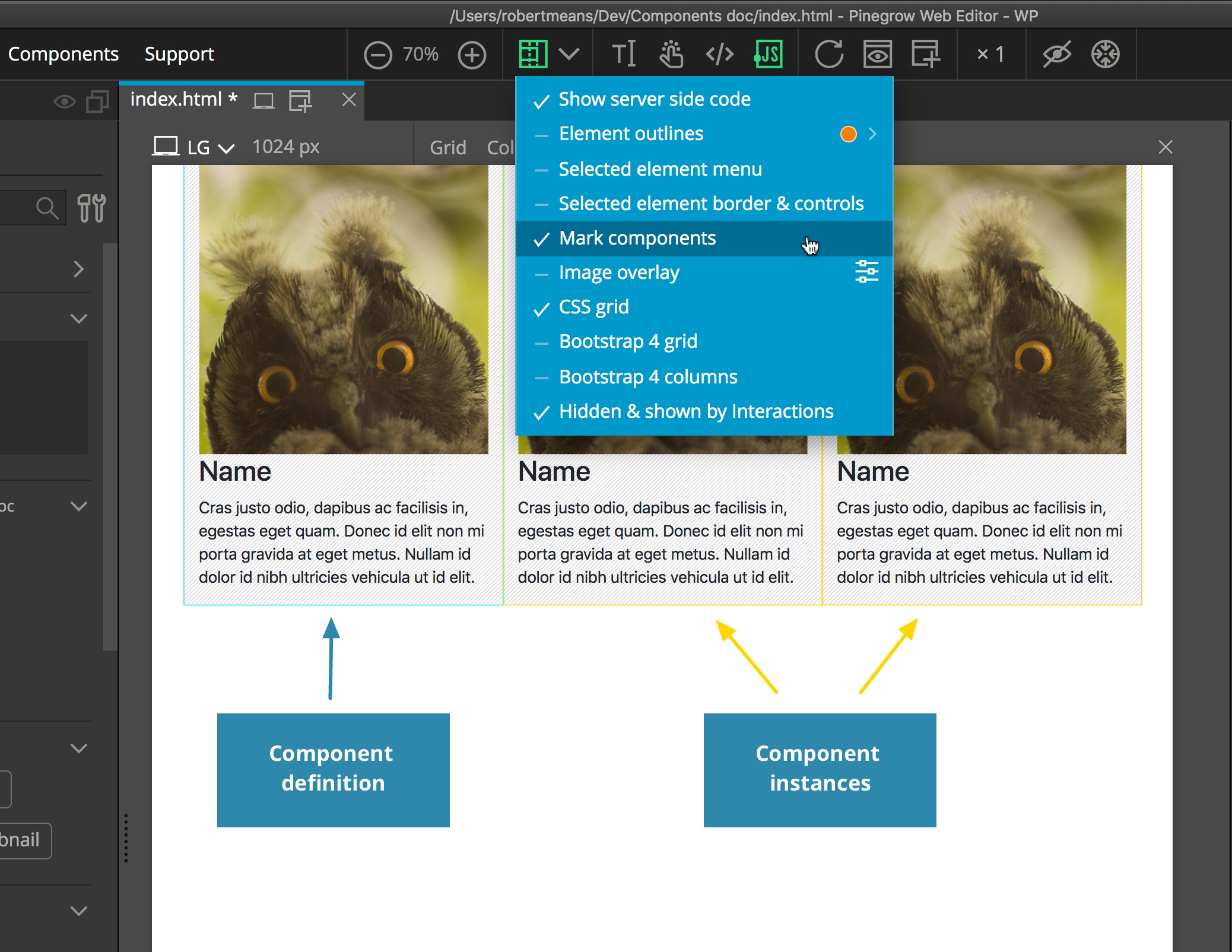
Notice that our original component definition is marked with a blue border and the subsequent component instances are marked yellow. This can be turned on and off from the Toggle visual helpers dropdown in the top bar above the Page View, or from the Components menu.
This is all quite nice, but what’s so “Smart” about these components?
First, these components are auto-updatable.
Updating components
Go back to the first team member where the Team member component is defined. Select the image and then open the Properties panel. Change the picture and set the image shape to Circle…
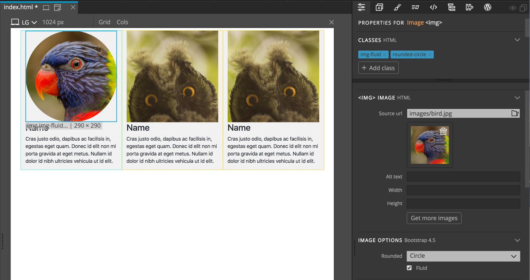
…and press the Update components button or CMD+U shortcut. The images in all instances of Team member component will become round.
“That’s so great” you might say and happily try to edit the pictures, names, and descriptions of the other team members.
But when you get to the second team member Pinegrow will not let you edit anything!
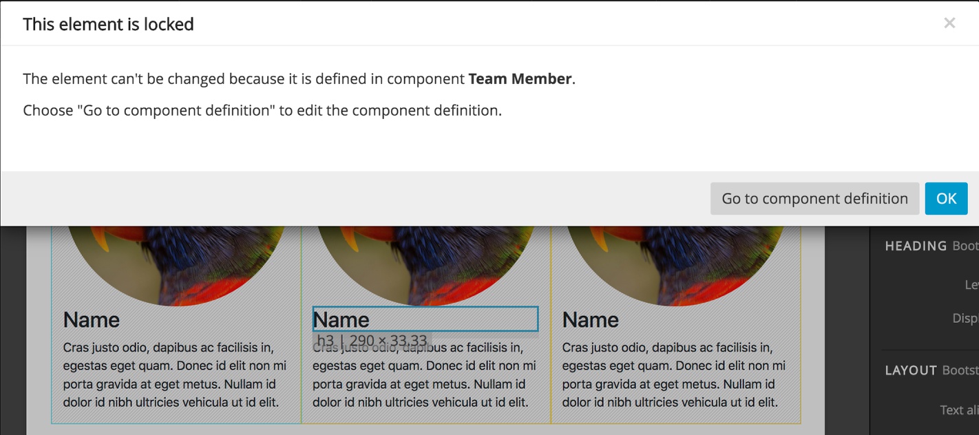
Why not? Because any changes done to component instances will be lost the next time you update components – the second, third and fourth team members (instances of the Team member component) will become the same as the first team member (definition of the Team member component).
“Oh… Such components are useless!”
You’re right! That’s why Smart components have Editable areas. More about that below. Let’s first take a look at options for controlling how component instances are updated.
Disabling auto updating
By default Smart components are auto-updatable. That means that updating the project with either the orange update button or from the Components menu will replace all instances of the component with its latest definition. That’s a very powerful feature that is useful in many situations. But sometimes we want to keep things very simple.
Blocks are one such example. We want to be able to define blocks, place them on pages in various projects and customize them according to the needs of each project, without thinking about updates and editable areas.
Option A – Disabling updates on component definition
In such cases we uncheck the “Update instances” property in the component definition.
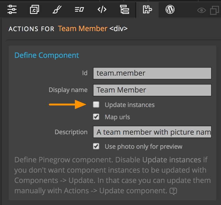
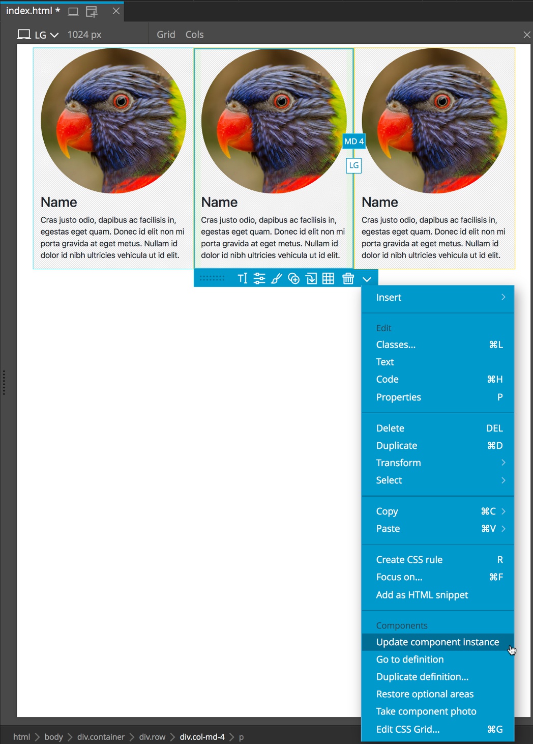
At any time you can manually update instances of such component by clicking on the down caret to get the Actions menu and then selecting “Update component instance”.
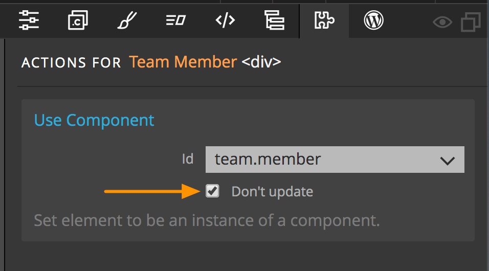
Option B – Disabling updates on instances
Another way to prevent updating component instances is to check “Don’t update” checkbox on individual component instances. In this case, all other instances except this one will be updated.
Editable areas
Editable areas define elements, attributes, and classes that can be customized in component instances.
Lots of cool things can be done with editable areas, please check out Editable areas documentation for details.
Nested component definitions
Component definitions can be nested. In most cases, you want the child components to be defined within an editable area of the parent component. This is easier to explain with an example:
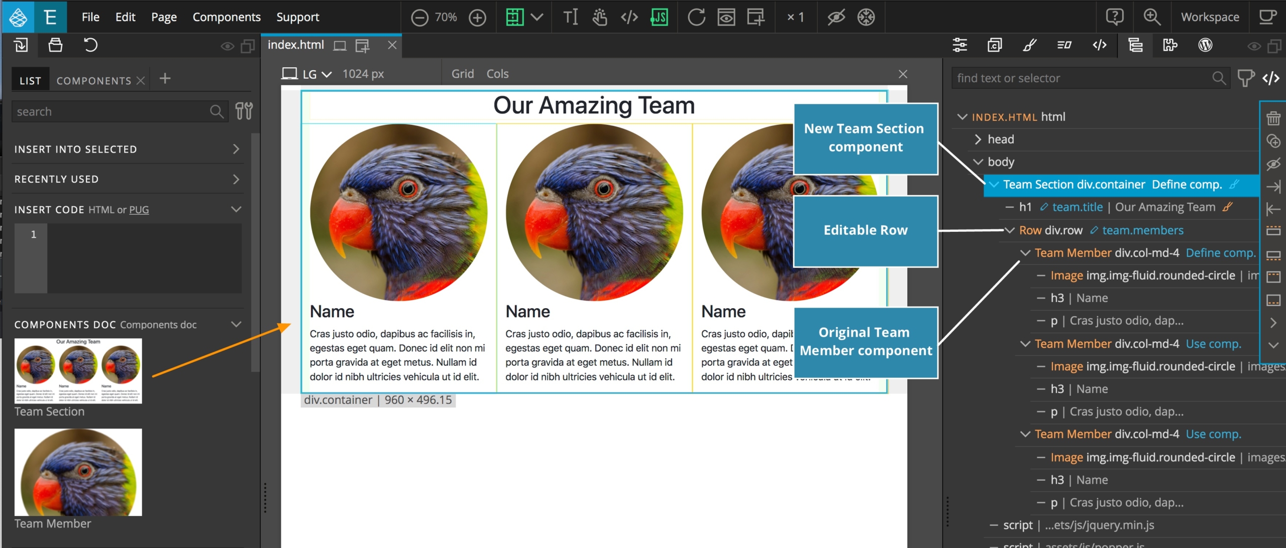
Let’s create a Team section component that will also include definition of Team member component. The benefit of this is that we will also have a ready-made team block that we can just drag on the page and customize it.
Select the container and add “Define component” action to create Team section component. Add a heading and make it editable by selecting “Editable” in the Actions panel. Then make the row that contains the team members into an editable area. This area contains the original team member component definition and two team member instances.
Elements that contains child component definitions and instances must be defined as editable area otherwise those components can’t be customized.
Update components and our new Team section component is ready for use.
Note: All of the components or HTML that you select to define in your new nested component must share a single parent. For example, you can’t select three consecutive
<div></div>elements as a component – they must be enclosed in an outer container that gets the ‘Define Component’ Action.
Organizing components into Library panel sections
Component sections let us organize components into different Library panel sections.
Simply add the “Define section” action on any element of the page. All components defined on that element or inside that element will be placed under that section in the LIB panel.
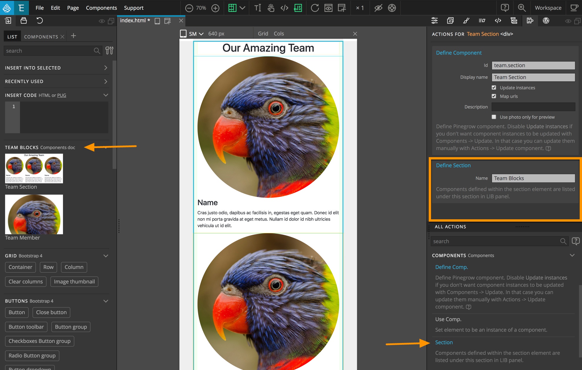
Sections can also be defined on the top page element. Then, all components on the page will go into that section. In that way, we can have each page correspond to a Library section.
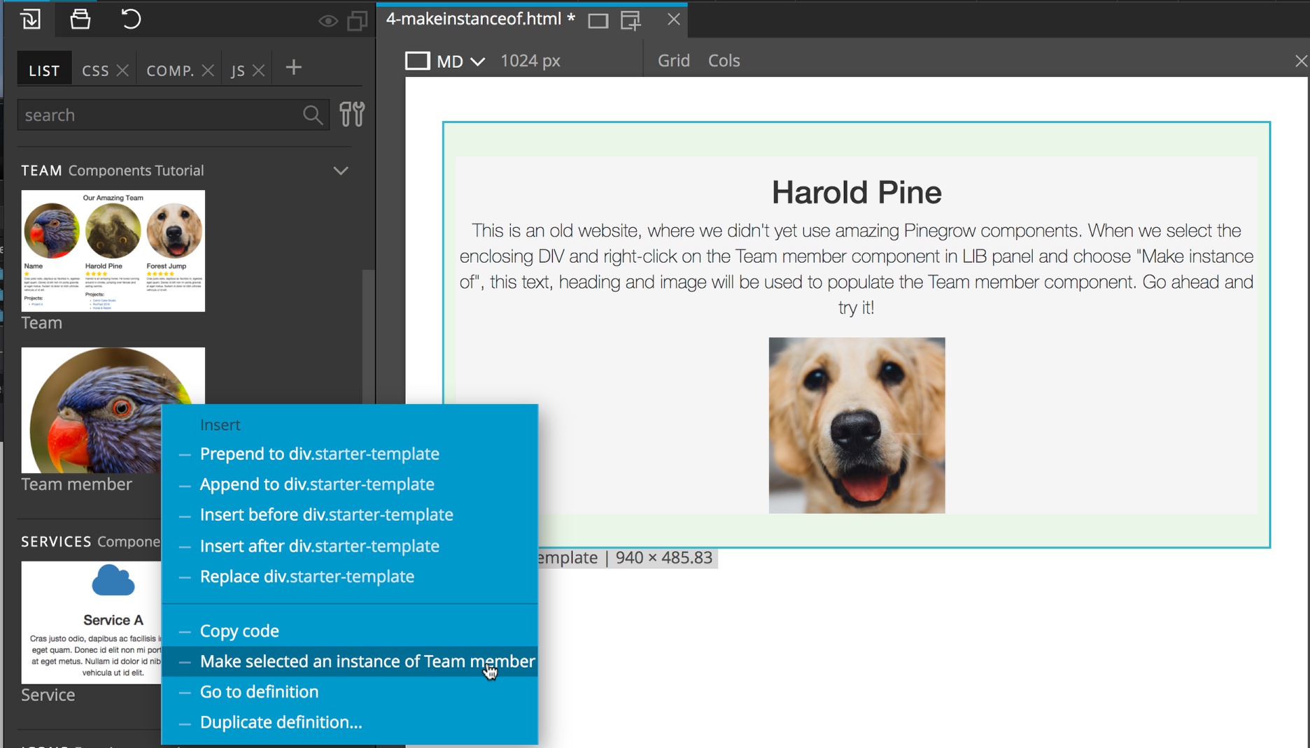
Make instance of…
“Make instance of” is a super useful feature – if you know how and when to use it.
To use it, select an element on the page, then right-click on the desired component in the Library panel and chose “Make selected element instance of …”.
The selected element will become an instance of the chosen component. Try it on 4-makeinstanceof.html.
But that’s not all. Pinegrow will also try to match component’s editable areas to appropriate elements in the selected element. That will work as long as the structure of the component and the structure of the element are compatible.
Let’s imagine we have an existing page with team members implemented as plain HTML layout, without components. We want to change those team members into instances of our Team member component.
When using “Make instance of” Pinegrow will inspect the structure of the component definition and of the selected element and try to match editable areas in the component to elements in the target element. For example, if H1 is used for the team member’s name in the definition and H1 is also used for the team member’s names on the page, Pinegrow will automatically convert the target heading into an editable area.
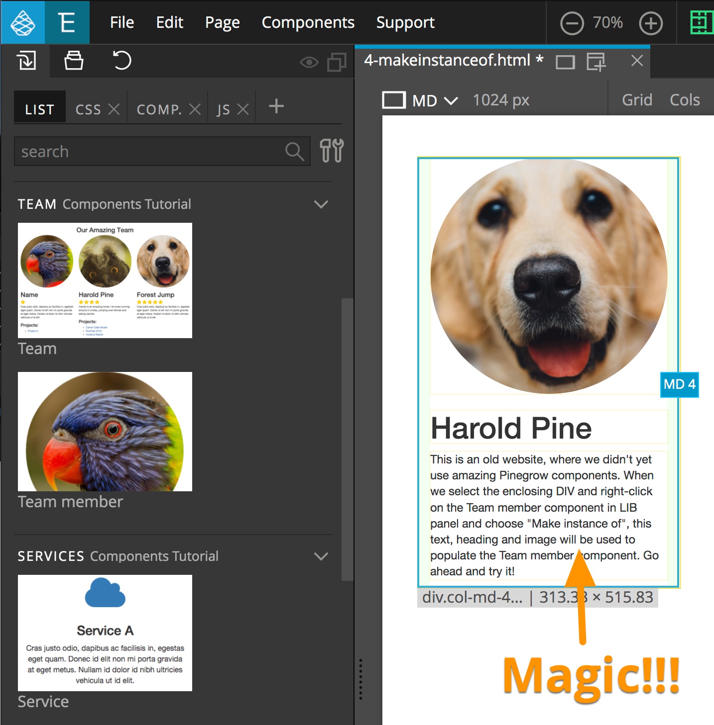
This is very handy when adding components to an existing HTML page and when changing one component instance into an instance of another component.
Go to definition…
Right-click on any component in the Library panel and select “Go to definition” to open the page where the component is defined and select the component definition.
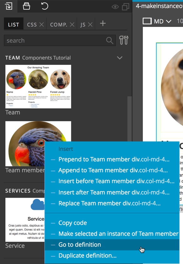
Note, this command will also open components defined in external projects. If you make changes to the definition, you will have to open the Components menu and select “Refresh loaded libraries” before updating components.
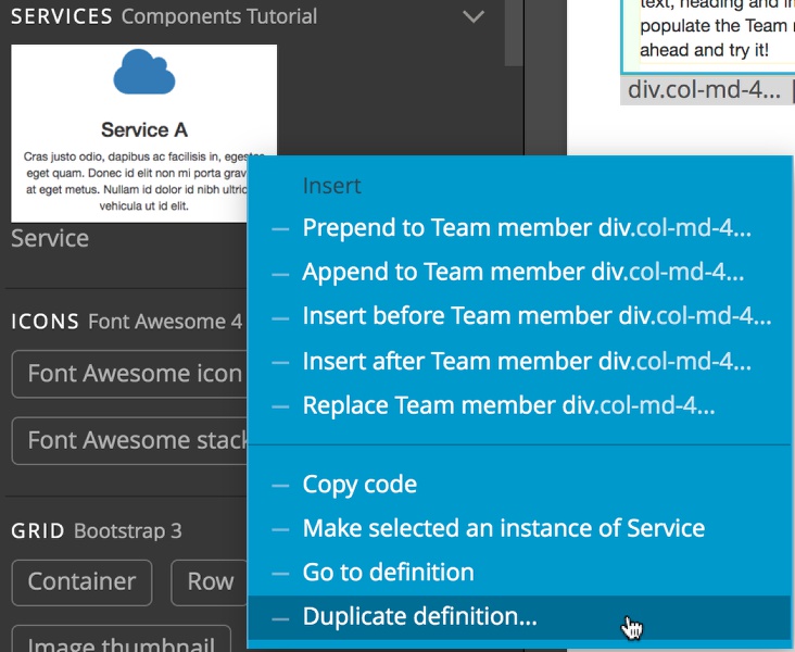
Duplicate definition…
Right-click on a component in the Library panel and select “Duplicate definition” to clone the definition and insert it right after the selected element. Pinegrow will ask if you want to change the id of the new definition. The id of the copy should be different than the id of the source component, unless you plan to delete the source definition after duplicating it.
Where to define components?
In the example above, we defined components on the page where they were also used. We defined the Team member component on the first occurrence of team member in “index.html”. Then we used this component to create an additional two team members.
Another approach would be to create a special page, for example called “lib.html” and define the Team member component there. Then we would place three instances of this component into the Team section on “index.html”.
In our experience, the special page approach is easier to maintain and reuse. Still, you can select the one that works best for your project.
Reusing components between projects
Up to now we have been using components within a single project. Let’s call it Project A. The Team member component was both defined and used in Project A.
Imagine that now we start to work on a website for another client that will also include a Team section. Let’s call this project Project B.
Wouldn’t it be convenient if we could simply use the Team member component from Project A in Project B?
We can do that with Pinegrow!
All we have to do is open Project B and then either open or create the page where team members will be listed.
Next, under the File menu select “Load project as library” to load Project A as a component library.
The team member component is now listed in the Library panel. Simply place team members on the page just like you would any other element from the Library panel.
What should we do if we need to change the component defined in the library panel?
Imagine that we want to change the Team member component by adding the job title of each member under the name. Because the component is defined in Project A, we have to open Project A and make the change there.
No need to close Project B to do that! Select “File -> Open project in new win…” and open Project A in a new Pinegrow window.
There we make the necessary edits (add <p class=”job-title”> under the <h3> and make the element editable with Editable area action) and save changes.
Back in Project B we choose “Components -> Refresh loaded libraries” and then Update components. This will reload the components from Project A and update the components on open pages.
Component library resources
In many cases components rely on CSS stylesheets, Javascript files, images, and other files to display and function correctly. These files are called component library resources.
Imagine that we add team.css to Project A. This CSS file includes CSS rules for styling team members. We also add a folder assets/images/team with placeholder images for team members.
We want these resource files to be included in Project B (or any other projects that will use the Team member component).
But first we have to set which resources are required for Project A component library.
To do that we open Project A, and in the Project panel right-click on team.css file and select “Add to resources”. That will open the Resource editor dialog and add team.css to the list of resources. There we can set the type of file, reorder resources to set the correct order for how they’ll be included on pages. For Javascript files we can also choose to include them in the footer of pages (by default CSS and Javascript files will be included in the <head> element).
The same can be done the same for assets/images/team folder – right click on the folder in PRJ view and choose “Add to resources”.
Click on “Save” in the Resource editor window to save changes.
Back in Project B choose Components -> Refresh loaded libraries and Components -> Add or update resources from libraries. A dialog window will open. Under the Project A section choose either “Add to or update all files in <project name>” or “Add to or update <page name>” to copy resources to Project B and include them on pages. Library resources are placed in the folder “components/<library name>” in order to avoid conflicts with existing files.
These steps are needed only when library resources change and need to be updated or added to the project that is using the library.
If we would now open Project C and load Project A as library, Pinegrow would ask us immediately if we want to add Project A library resources to Project C.
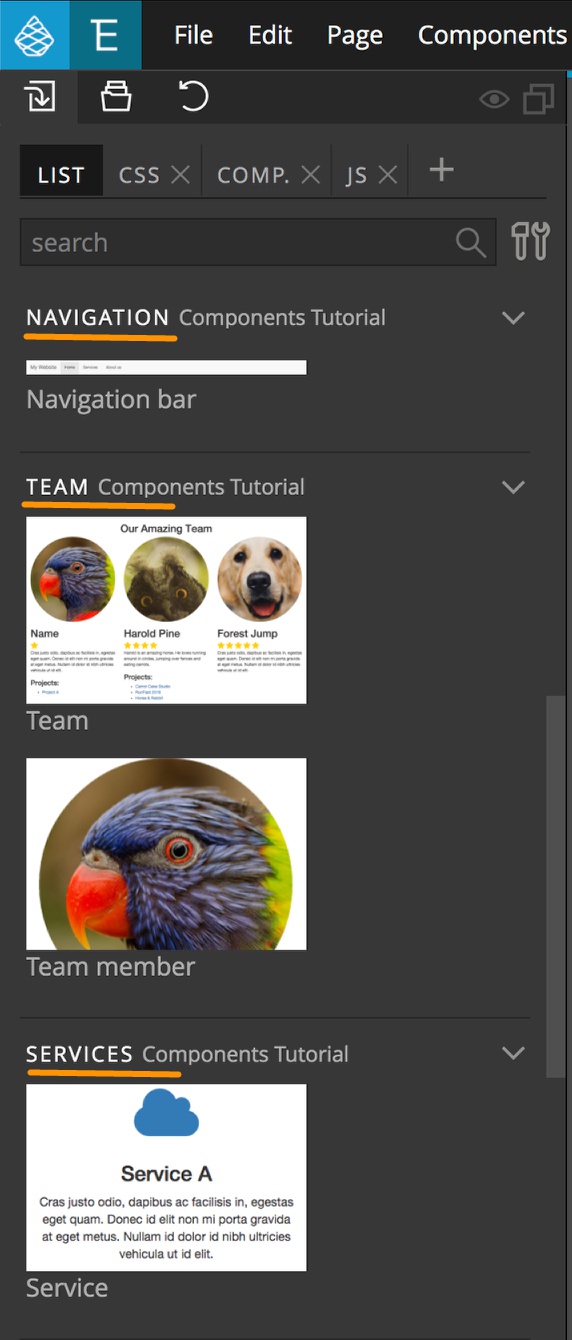
Tutorials and sample projects ComponentTutorial – Sample project with examples mentioned in this document.
Download the sample project used in this article with Team members, Navbar and Service components.
Did you know?
- Every project is its own library. (Open Project A and check File -> Manage libraries and plugins and you’ll see Project A listed among the loaded libraries).
- Every project can be loaded as a library of another project.
- Use “Update components” button or ‘Components -> Quick update (only open pages)’ to update components on all open pages. Use ‘Components -> Update the whole project’ to update components on all files in the project.
- Components are a powerful feature. A change to the component definition will affect the whole project. Sometimes that has unintended consequences. It is strongly recommended that you use some kind of source control (Git, for example) with your projects.