See all the new features in the latest Pinegrow Interactions update.
What are Pinegrow Interactions?
Pinegrow Interactions is an add-on that transforms Pinegrow Web Editor into a powerful visual editor for creating web animations and interactions. Interactions are powered by GreenSock (license included) and can be integrated into any project – be it based on plain HTML, Bootstrap, Tailwind CSS or anything else.
Show & tell
Pinegrow Interactions 2.0 let you visually create complex web interactions like sliders, presentations, tooltips, complex scroll animations, same-page navigation with soft scroll and history states and more – all without coding and without dependancies on any other JavaScript library.
A good example is worth a thousands words. Let’s take a look at what you can build with Pinegrow Interactions.
None of these examples are using any custom JavaScript code.
Slide into the infinity
Here is an example of a custom slider, created 100% with Interactions 2.0, without any custom code. Notice these details:
- Horizontal infinite slider, the first slide is cloned and added to the end.
- Slider automatically moves to the next slide, but only if user is not active over the slider.
- Pagination items are dynamically created for every slide and animate to show the current slide. They are also used as navigation.
- Navigation buttons can be used to move the slider.
- Slides have reveal animations.
Learn about how this slider was made and how you can use it to create your custom presentations.
When one is not enough
Use the new DOM manipulation transforms to clone, animate and remove HTML and SVG elements:
Click the dot to create more.
Stand by me
Dynamic positioning lets you position elements relative to each other:
What do you get if you combine DOM cloning with dynamic positioning?
Tooltips!
Here is another example, custom tooltips using:
- Cloning a tooltip template to display a tooltip.
- Dynamic positioning the new element in relation to the target.
- Using variables to use an attribute value as the content of the tooltip.
- Having different reveal animations depending on the position.
- Controlling position with a data attribute on the tooltip target.
I have a very cool tooltip.
And I have a different tooltip.
The position of my tooltip is…
Tell a story, one step at the time
Presentation is a group of slides or scenes with custom transitions and reveal animations. Interactions 2.0 let you create controls that iterate through a set of elements.
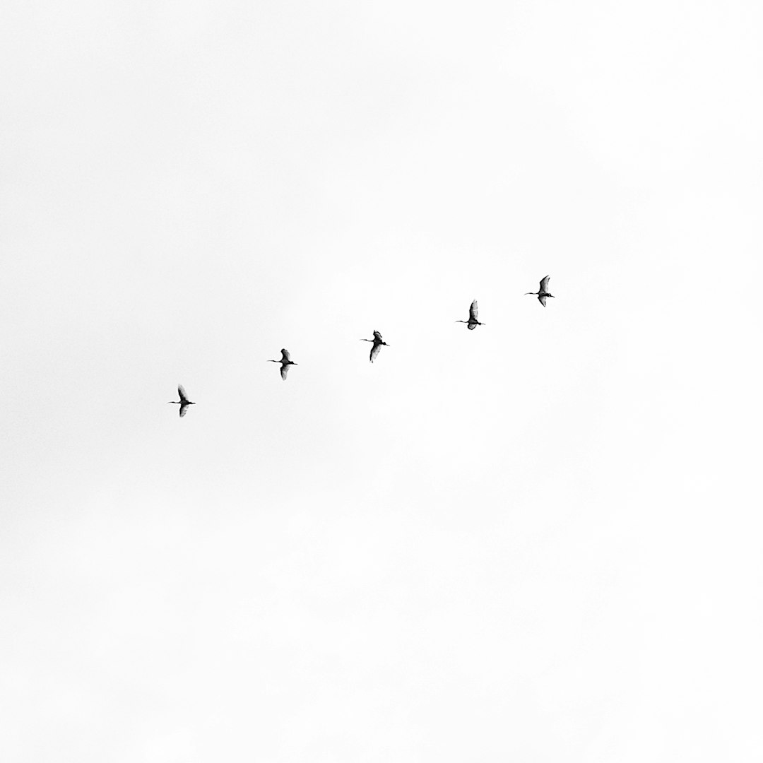
“Where are we going?”
asked the youngest bird.

The old bird replied:
“Over the snowy mountains…”

“…to the magic winter tree.”
And the birds flew through the clouds.
Learn about how this presentation was made and how you can use it to create your custom presentations.
Do you like fruits?
A similar approach of iterating through a set of elements is used here to implement an image gallery that opens enlarged images in a light-box with navigation controls. Images have custom reveal and hide animations.
Remember, everything in these examples is custom built. There are no frameworks or prescribed layout that would limit your creativity.
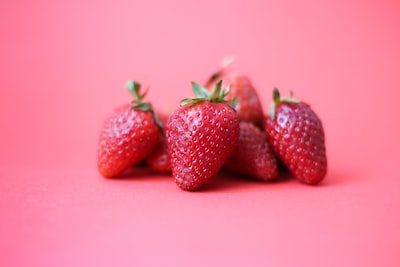


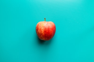


Take a look at this guide to get a tour of how these image galleries are built and how you can customize them.
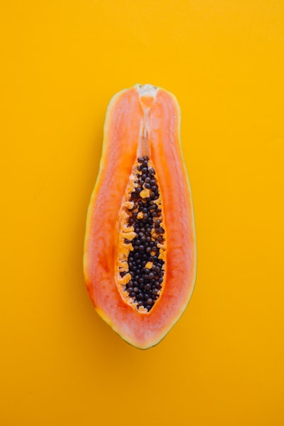
Still hungry?
This example displays image thumbnails in a scroll container and scrolls to the thumbnail of the selected image.
Let’s animate a SVG
Here we are animating the dash-array and offset to get a line drawing effect, using the smart % based values of both properties.
But we can go even further with SVG images.
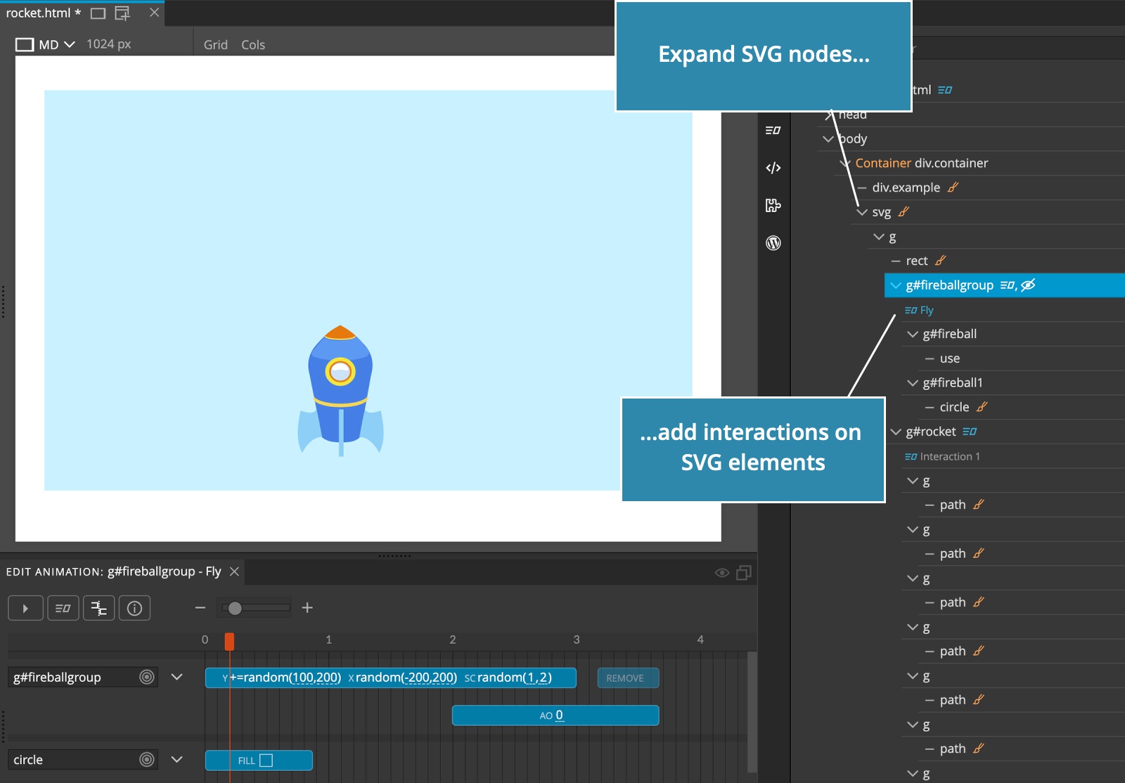
Let’s make an interactive SVG image
What happens if we add Interaction actions on individual SVG elements, inside a SVG image? Take a look:
Three, two, one… SVG Lift-off!
How about using DOM cloning transforms and random transform parameters with SVG images?
Click on the rocket and see what happens!
To create interactive SVGs, expand the main SVG element and add interactions with triggers to paths, rects and other SVG sub-elements:
Animating SVG images if great, but what if we need really complex animations?
Have fun with Lottie
Control Lottie animations with Interactions transforms using any of the supported (or custom) trigger events, synced with a timeline with other interactive elements.
Move the mouse from left to the right edge to control the animation:
Note, including Lottie JavaScript library and animations is done in the usual Lottie-way, not through Pinegrow Interactions.
Interactions Blueprints
No need to build complex interactions like sliders and presentations from scratch! We added a library of ready-to-use blueprints that you can use as a starting point for creating your custom interactions.
Open the Interactions tab in the Library panel and drag components to your project.
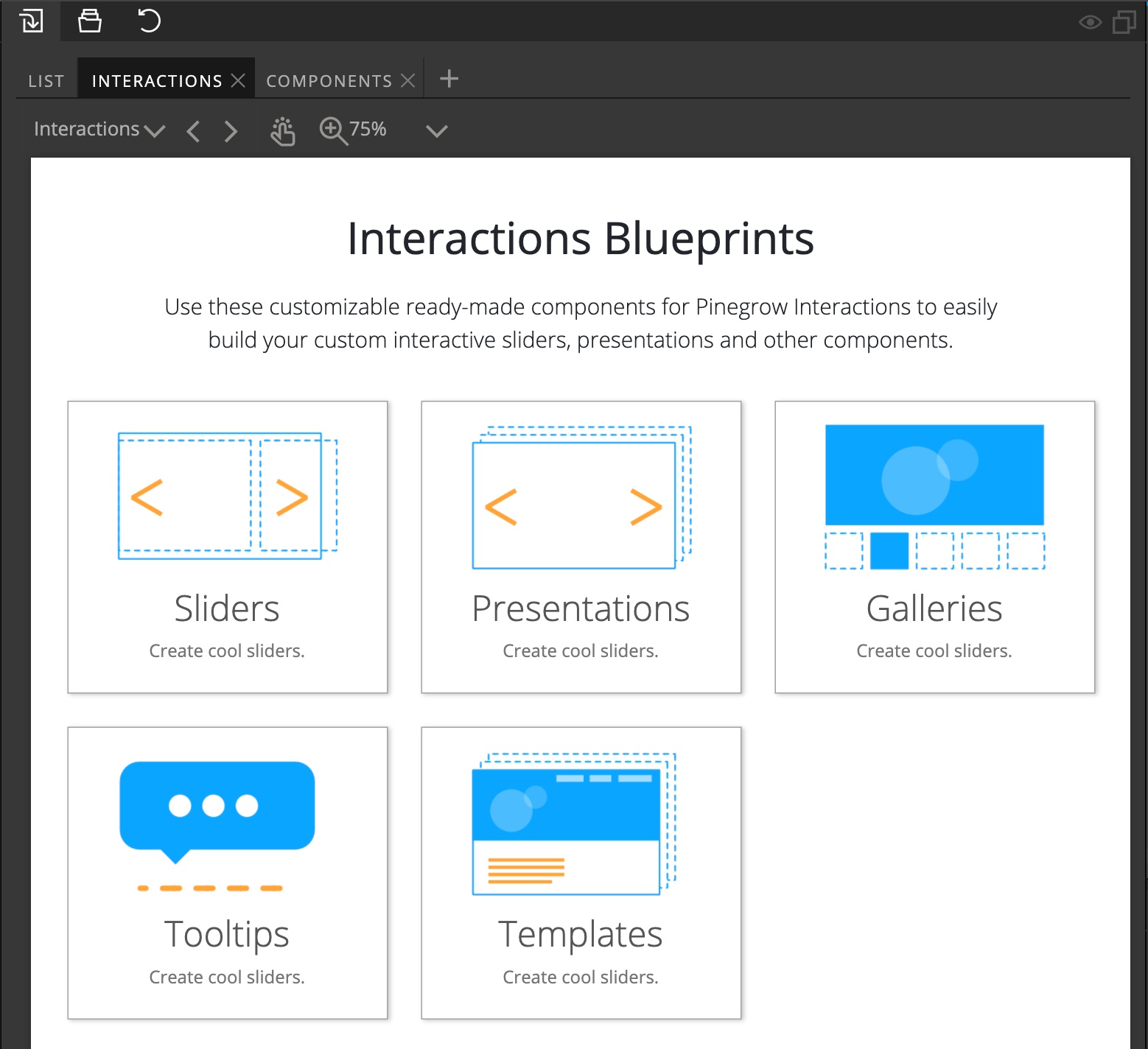
Blueprints come with helpful guides that explain how the components are built and how to customize them.
Full page templates
Interaction blueprints also include full page starting templates that let you quickly get started with creating a new project.
Click on New page and select the Interactions Blueprints tab:
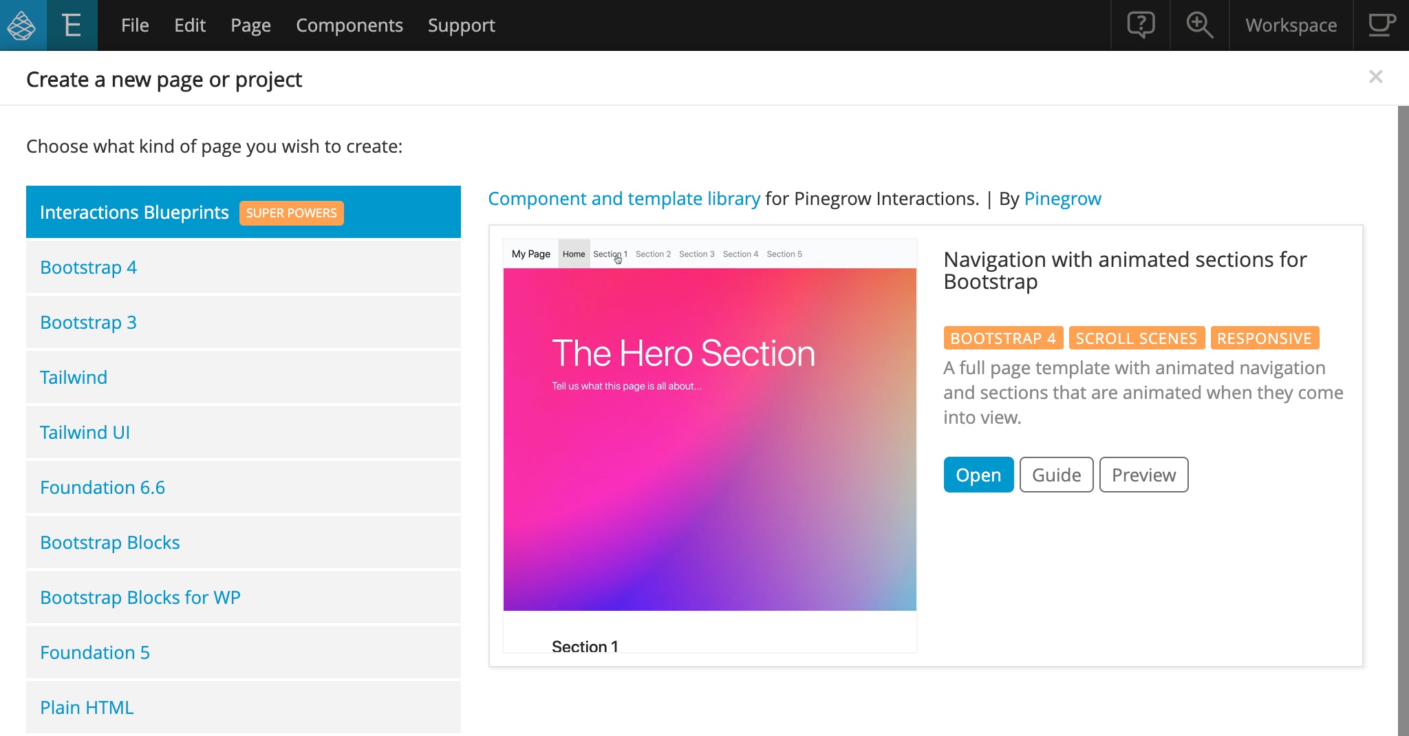
At the moment we only have one template but will expand both the component and template library in the future.
API and JavaScript code generation
API was expanded with high-level functions such as pause and seek.
Pinegrow can now generate a JavaScript file that adds the interactions to target elements. This is a convenient way to add interactions to existing projects or to create reusable libraries.
You can also customize the criteria for Mobile / non-mobile condition by setting media query values to variables pgia_small_mq and pgia_large_mq.
For example:
<script>
//Include this before the Pinegrow Interactions code in the Head element
pgia_small_mq = '(max-width:500px)';
pgia_large_mq = '(min-width:501px)';
</script>
Interactions UI map in the Tree panel
As interactions created in Pinegrow became more complex, we made the UI snappier and more efficient.
The best feature is showing Interactions in the tree panel. This view is a map of all Scroll scenes and Interactions, and editing any of the animations is just a click away.
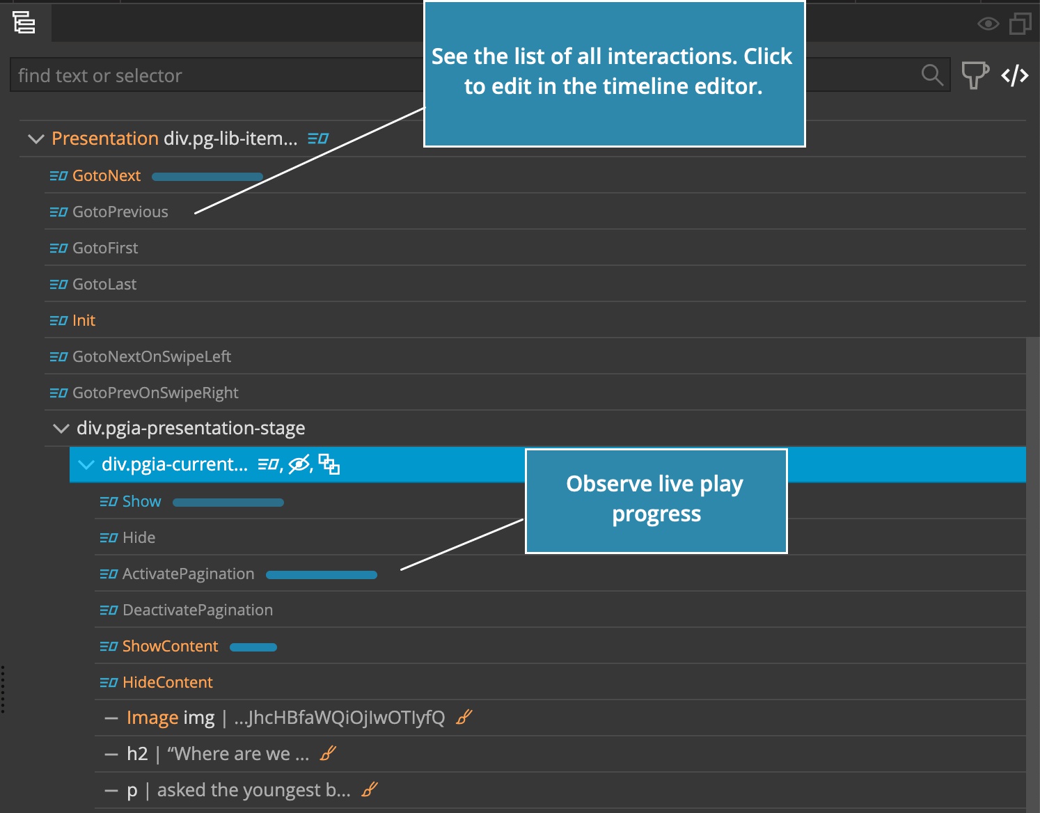
The progress of played animations is also shown there to help you understand what’s going on.
Do I have to change my existing projects?
There are almost no breaking changes. That means that most your existing interactions will work without any changes. See migration notes at the bottom for details.
GreenSock 3.x and ScrollTrigger
GreenSock GSAP library that powers Pinegrow Interactions was upgraded to the latest GSAP version 3.6.
ScrollMagic was replaced with GreenSock’s ScrollTrigger. As a result, Scroll Scene action is now much more powerful.
How many MBs of JavaScript bloat will Interactions add to my projects?
Sometimes you can have your cake and eat it too!
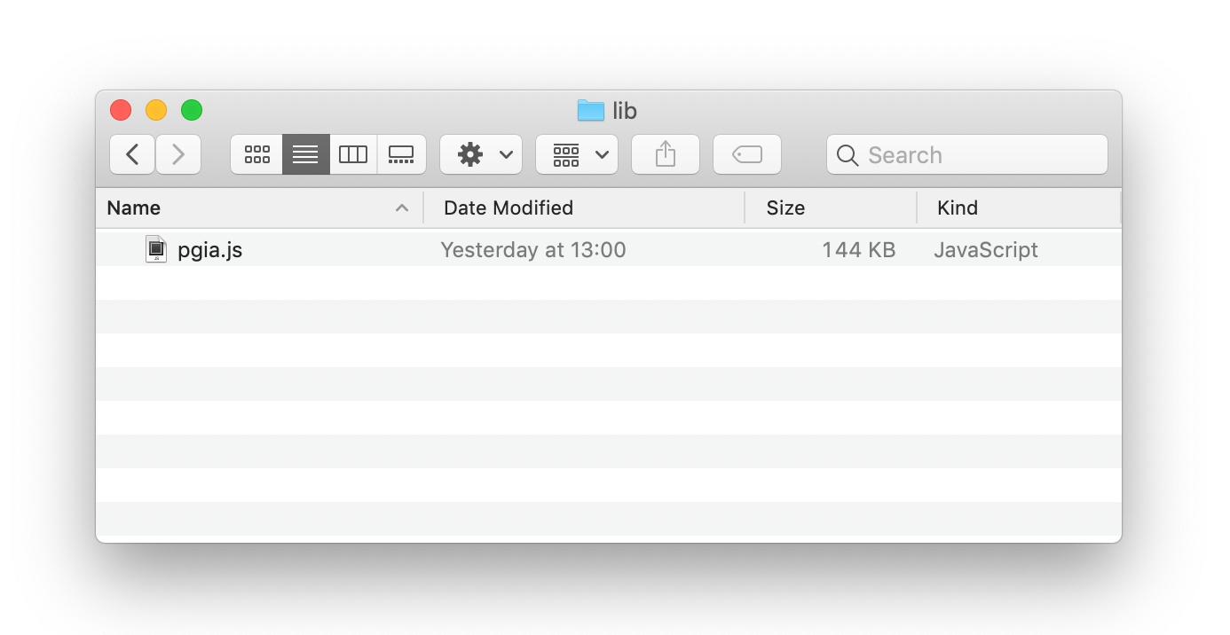
File size of Interactions JavaScript library that needs to be included in your project WAS REDUCED from 208 KB in Interactions 1.0 to only 144 KB (50 KB gzipped) in Interactions 2.0, including GreenSock library and without any external dependencies.
Take Interactions 2.0 for a spin!
If you are already an Pinegrow Interactions user, just download the latest Pinegrow Web Editor release.
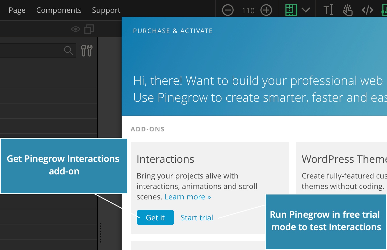
If you use Pinegrow already, but don’t have the Interactions add-on, download the latest Pinegrow, install and run it, then go to Support -> Purchase & Activate and click on Start trial under Add-ons Interactions.
If you don’t have Pinegrow yet, download the latest version and start a free trial.
Want to know more about what is new?
Continue to read this article for details:
Interactions action
Improvements of the Interactions action:
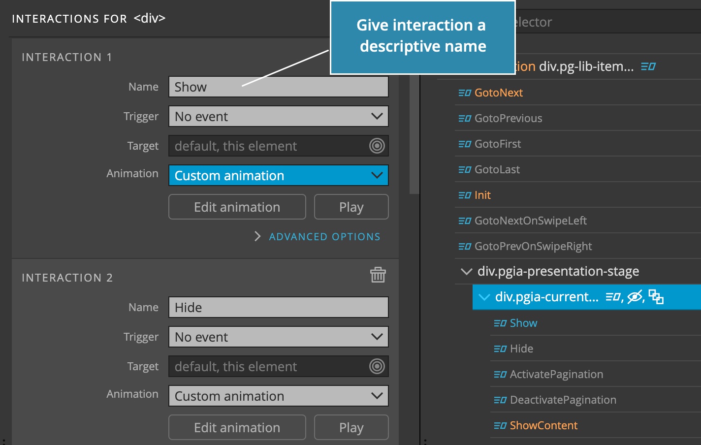
Named interactions
Individual interactions can now be named and these names are then used to reference the animation, instead of using indexes like 1, 2 and so on.
Stop other animations -> Animations to stop can use names instead of listing animation indexes you can now list interaction names.
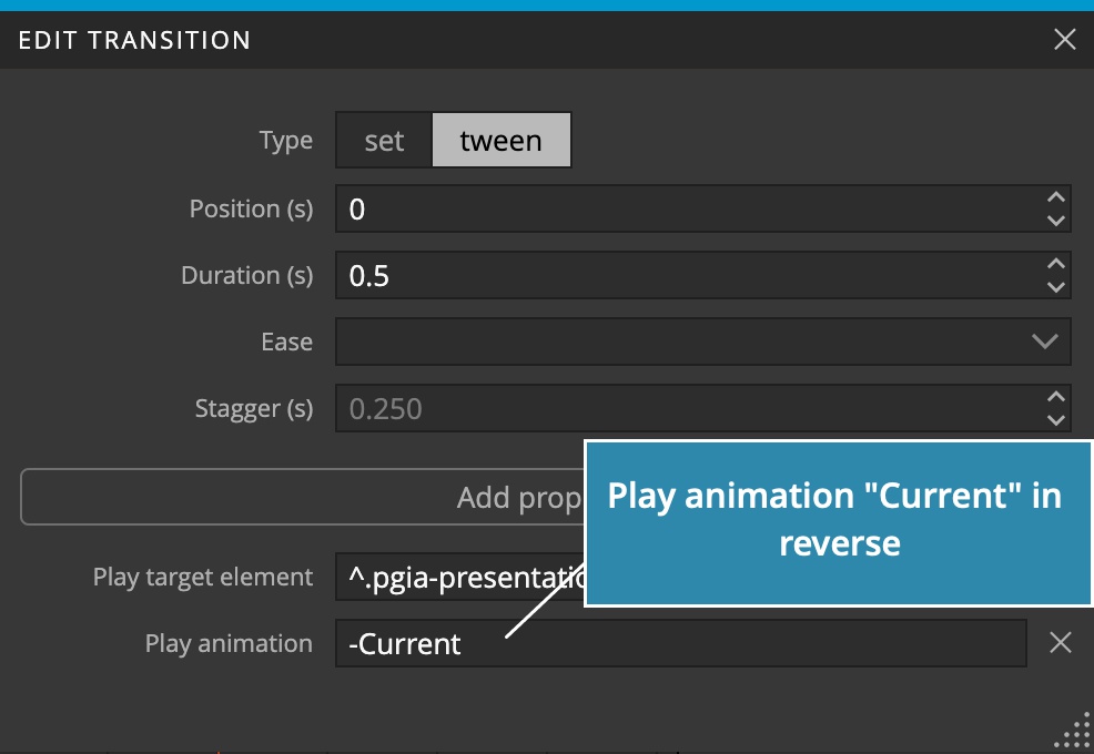
Using “-” to play animations in reverse
In addition when playing the animation from another animation or Scroll Scene the animation name and index can be prefixed with the minus sign to play them in reverse.
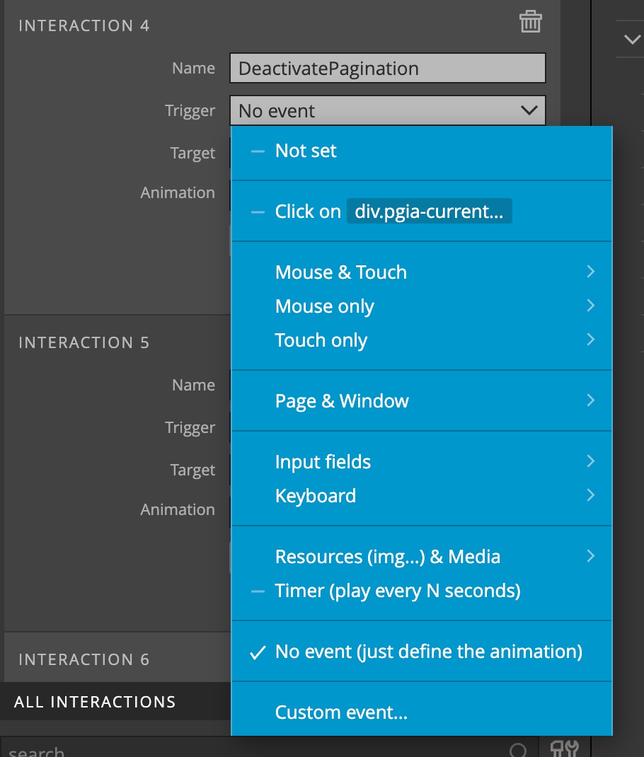
New trigger events
New trigger events were added:
- Separate mouse and touch events for situations where mouse and touch events need to be handled differently.
- Swipe gestures to trigger animations when user swipes left, right, up or down over the element.
- Page resized event.
- History changed when a state is pushed on a history stack.
- Input field events, including input, change, focus and blur. It is also possible to scrub animation with a field value.
- Keyboard events.
- Resources (image, iframe…) load event.
- Timer will play the animation every N seconds.
- No event is used to just define the animation and play it later, from transforms or Scroll scene pagination.
Recreate on play
Checking this option will recreate the animation every time it is played. This is useful if target elements of the animation change dynamically, for example if they are dynamically added or removed from the page. Recreating the animation also evaluates all its targets at the time the animation is played.
Scroll Scene
Scroll Scene action has become much more powerful. One reason is switch from ScrollMagic to GreenSock’s ScrollTrigger and the other reason is that we added a lot of extra functionality that let you create custom sliders, pagination and more.
Horizontal scrolls
Horizontal scrolls are now fully supported. Scroll direction can be auto-detected.
Defining the start and end of the scroll scene
For compatibility reasons we left Start on Start, Center and Leave settings intact.
But the new Scroll Scene lets gives you full control over selecting the scrolled element and defining when the scene starts and ends.
To do that select the Describe option. This will reveal a group of fields that lets you define scroll scene with a human-understandable sentences.
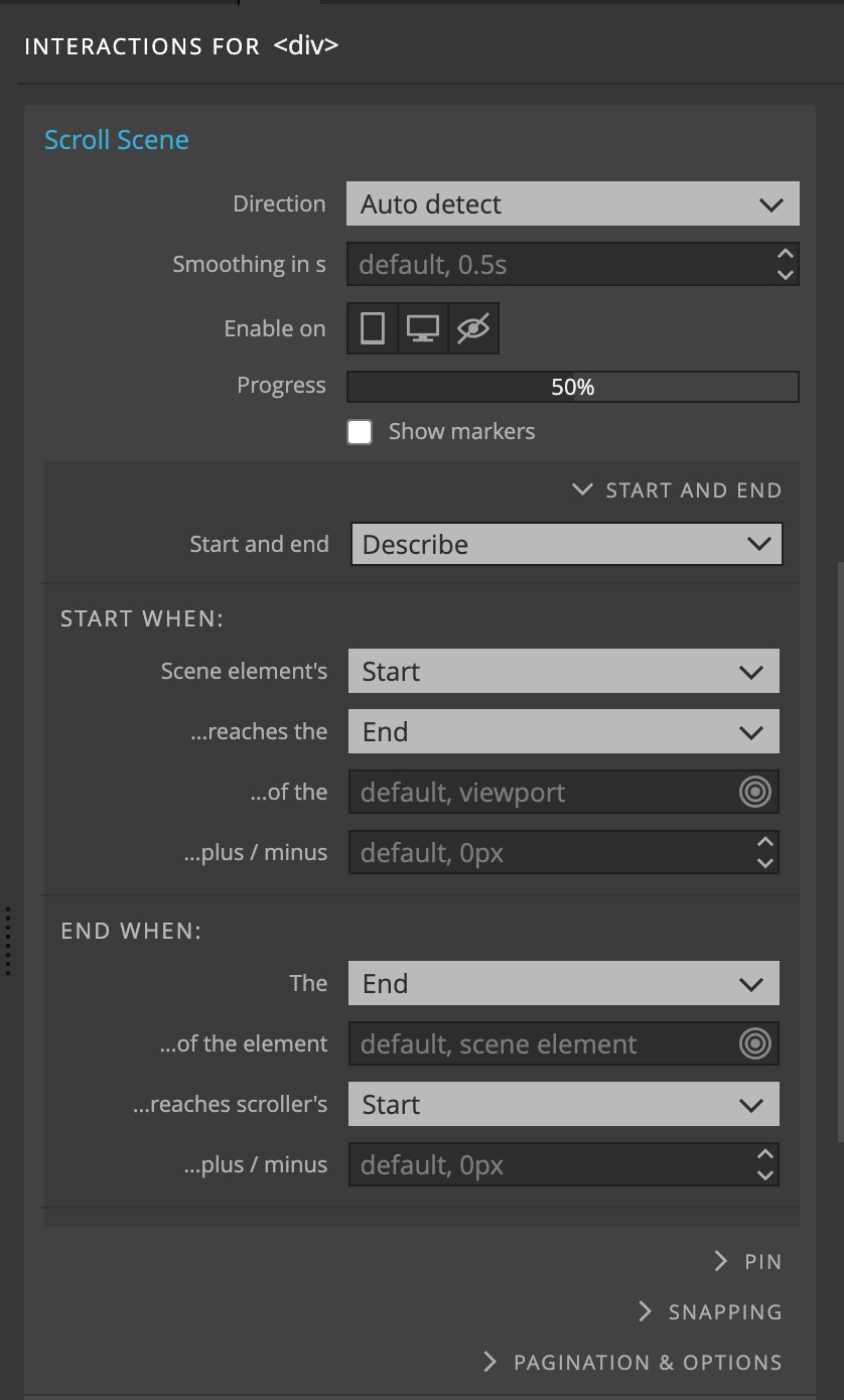
For example:
Start the scene when Scene’s element Top reaches the Center of the div.scroller, plus / minus 100px.
End the scene when the Bottom of the element section.last reaches scroller’s Top, plus / minus 25%.
Whole scroll area
A convenience setting for running the animation through the whole scroll area was also added.
This is the same as saying: Start the scene when the Top of the element reaches the Top of the scroller (viewport by default) and end when the bottom of the element reaches the bottom of the scroller.
Smoothing
Smoothing animates the scroll movement. This makes the animations run much smoother.
Advanced pinning
Pinned elements are fixed in place during the duration of the scroll scene. Additional settings let you fine-tune the pin and solve any issues with conflicting CSS code:
Pin element selects the element that will be pinned. By default, that is the scene element itself.
Pin type lets you choose between the position:fixed and translate modes, in case of issues with the pin. Automatic selection is on by default.
Append to Body re-parents the pinned element to the Body element. Use this in case of issues with the default settings.
Pin spacing tells the library how to create space after the pinned element. Choices are auto, padding, margin, none.
Snapping
Snapping moves the scroll into selected positions after the user stops scrolling. We have a bunch of predefined values like Start, End and so on.
But the most useful setting is to snap the scroll to positions of selected children elements. This is great for sliders.
The snapping animation can be fully customized with duration, delay and ease.
Pagination
Pagination is used to indicate current Scroll scene element, for example the current slide.
To use it you need to select the elements that represent the scene elements and elements that represent pagination items (bullets, or links 1, 2, 3 and so on).
Next, you specify one or more animations that are played when the item becomes current and ceases to be current.
Pagination items can also scroll to their element, see Scroll To feature below.
Replay independent animations
Replay each time setting on independent scroll animations will cause the animation to be replayed every time the scroll scene becomes visible.
Normally, the animation is played just once, unless it has the Reverse in opposite direction checked and it has reversed previously.
Why can’t I name scroll scene animations?
In Interactions 1.0 each Scroll Scene could have up to 10 animations, some controlled with the scroll or played independently at set positions.
This options still remains in Interactions 2.0, but the recommended approach for building Scroll scene animations is to have just one main timeline, controlled by scroll, spanning the whole scroll duration.
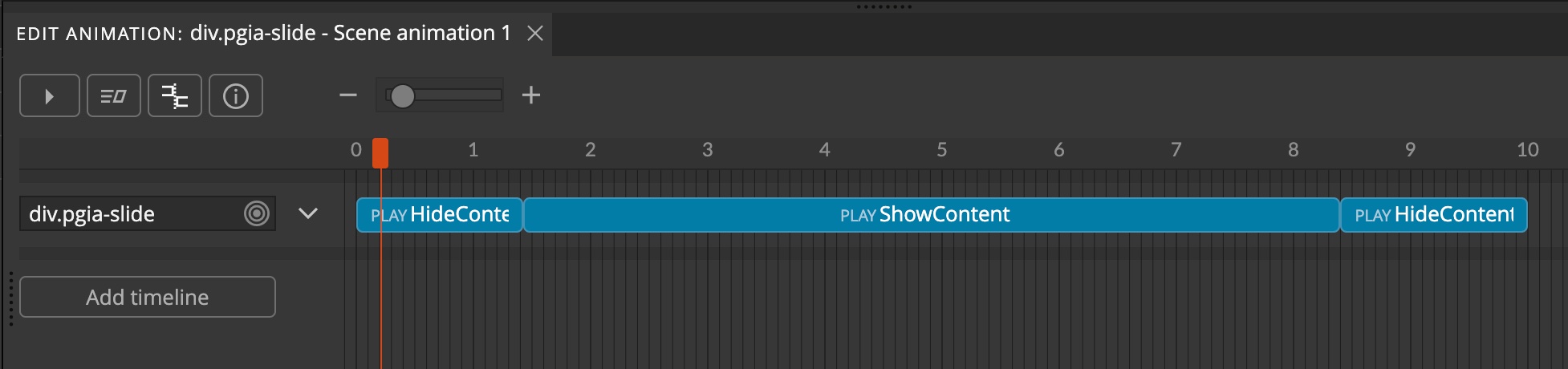
From this timeline we can then scrub or play other animations that are defined with the Interactions action.
Take a look at the Slider blueprint for an example of this approach.
The benefit is that such scroll scenes are much better organized and flexible. The main animation gives an overview of everything that happens during the scroll duration.
Timeline editor
The set of properties that can be animated has been expanded:
Position -> Relative position
Dynamic position lets you dynamically position transform elements on the top, bottom, left, right or center of the target element. The size of the element can also be adjusted to the size of the target element.
Elements are repositions on window resize and scroll events.
Example of use are tooltips or a tile that slides under the active menu item.
Current position is set in the data-pgia-position attribute and can be used for styling the element in different positions (see tooltips above for example).
DOM -> Create elements
The group of Create properties creates new HTML elements by cloning an existing element or creating them from a HTML template.
Click the dot to create more.
The content of the new element can be dynamically substituted with the value of attributes of the target element.
One or more elements can be created with one transform. The creation of multiple elements is animated. The count can be evaluated based on the element selector, to create as many new elements as there are existing elements on the page (for example, to dynamically create a pagination item for every scroll scene slide).
New elements can be dynamically positioned in relation to the target element.
Animation can be played on the new element when it is created. Cloning the element from existing element with interactions will also clone the interactions.
DOM -> Reparent elements
Append elements to different parents.
DOM -> Remove elements
Remove element removes the element from the page.
DOM -> Push history state
Push state pushes a history state to the page history stack. This is useful for implementing in-page navigation.
Classes -> Add and remove classes
In Pinegrow Interactions 1.0 adding or removing a class also animated the style changes between the two states. This feature was dropped from GSAP 3 due to performance reasons and is therefore also removed from Pinegrow Interactions.
Classes are still added and removed, but the style changes are not animated.
Transform -> Translate %
Translate X% and translate Y% are added to Transform properties. They move the element over the X and Y axis based on the percentage width / height of the container element.
The main benefit is that Translate % can be combined with the regular Translate properties, for example to center the element with %X=50 and %Y=50 and then use X,Y and Z with pixel values to offset the element from the center position.
Scroll to
The group of Scroll to properties lets you animate the scroll to an element, to a fixed position or to the next, previous (and so on) elements.
The Scroll to transform needs to be added to the element that is scrolled. To scroll the window add it to the Body or Html element.
Scroll to can be:
- an element selector,
#about-us - a fixed pixel number,
200 - a fixed percent value based on the viewport size,
50% - relative pixel or percent value,
+=100% maxto scroll to the endfirst,last,next,prevfor scrolling between the elementsitemoritem<number>for scrolling to the referenced element,item0,item1…${target.href}(and similar, see Variables below) for scrolling to the element referenced in the link
In this example we have navigation links that scroll to their respective sections. The Scroll to is set to ${target.href}, so that we only need one Interaction action that we then apply to all navigation links.
Child element selector chooses the set of elements that are referenced with next, previous and similar scroll destinations.
Scroll offset offsets the scroll destination. Scroll scene’s Pagination Top covered area is used if set for the element.
Scroll direction, either vertical or horizontal.
Infinite scroll will simulate the infinite scroll by jumping to the start of the scroll when scrolled past the last element. Same when going backwards.
Note, for this to look good, you have to duplicate the first element and place it at the end of the slider, either directly in the HTML layout or using the DOM -> Clone transform.
Connection with Scroll Scene
If the slider element has a Scroll Scene action Scroll to transforms will use Scroll Scene’s settings for scroll direction, offset (top covered area) and infinite scroll.
Scroll transforms are very powerful in combination with Scroll Scenes. It is possible to implement fully-featured sliders, same page navigation with animated menus and much more.
Animating SVGs
Pinegrow Interactions can be used to animate SVGs as well. A group of useful SVG transform properties is now available:
Stroke dasharray and Stroke dashoffset are used to animate path drawing. Both properties also accept % values that are evaluated based on the total length of the path. For example, 100% refers to the complete length of the path. Setting both to 100% and then animating the Stroke dashoffset down to 0 creates the effect of a progressive path drawing:
Remaining SVG transform properties refer to stroke and fill color, opacity and size.
Interactions can be added to individual elements within a SVG image to bring SVG graphics to life:
Using CSS variables
Wouldn’t it be nice to be able to use CSS variables instead of hard-coding colors and other values?
You can! Just use ${--css-var} instead of the value. For example, to transform text color to Bootstrap primary color, set the property to ${--primary}.
Using attribute values
How about using attribute values?
Use ${this.<attribute>} to access transform element’s attribute, for example ${this.href}.
Use ${target.<attribute>} to use the attribute value of the interaction target, for example ${target.data-color}.
Using style properties
You can also use the computed style values, for example: ${this.style.color} or ${target.style.backgroundColor}.
JavaScript Variables
You are not limited to CSS variables, attributes and style. Access any JavaScript value with:
${myVar}– global variable${location.href}– href property of the location object${target.innerHeight}or${this.innerHeight}– property of a HTML Element${theme.colors.active}– object property
Random
Now it is easy to generate random values for transform properties:
random(0,100)will return a random value from 0 to 100random(0,100)%will return a random value with the value %random([1, 2, 3])will return one element from the list
You can combine random statement with variables, for example random(${theme.size.min}, ${theme.size.max})
Example values
Double click in any transform property field to get a list of example values.
Custom ease functions
You can define and use custom ease functions by setting the properties of the CustomEases global object to ease functions that take the tween progress (from 0 to 1) as an argument and return a transformed value from 0 to 1.. The object needs to be defined before pgia.js is included.
Here is an example of there custom ease functions:
<script>
var CustomEases = {
    viceVersa: function(r) {
    	return 1 - r;
    },
    random: function(r) {
    	return Math.random();
    },
    meetTheGhost: function(r) {
    	return Math.round(r * 100) % 2 === 0 ? r : (1-r);
    }
}
</script>
Custom eases defined on the selected page are listed in the Ease field menu.
Note, references to custom eases that is not defined on the page (for example, if you copy-paste the interaction from another page) are ignored at the moment, but can break the animation in the future. Make sure that you are only using custom eases that are actually defined on the page.
Apply to Many
Apply to Many will now merge interactions if the targeted element already has interactions.
Show hidden elements during editing
In Interactions 1.0, showing the elements hidden with the Hide at Strat action was controlled through the Toggle Visual Helpers icon and menu in the top toolbar. Because of that, turning the visual helpers off (so that you can see the edited element better) also turned off showing the hidden elements. In most cases that was not what the user wants.
So we now moved the option to Show hidden elements into the Settings & Tools menu in the Interactions panel.
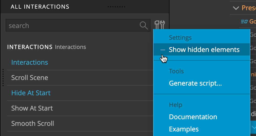
That means that you can now switch off the Visual helpers when editing an element that is using Hide at Start action.
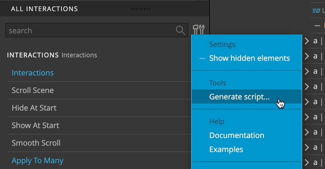
Save code
In the bottom part of the Interactions panel, click on the Settings & tools icon and choose Generate script to scan the project and extract all interactions with Apply to Many action into a JavaScript file that can then be included into any project.
Migration notes
Interactions 2.0 are almost fully compatible with earlier version. That means that you can simply replace the Interaction resource file and your old interactions will work as before.
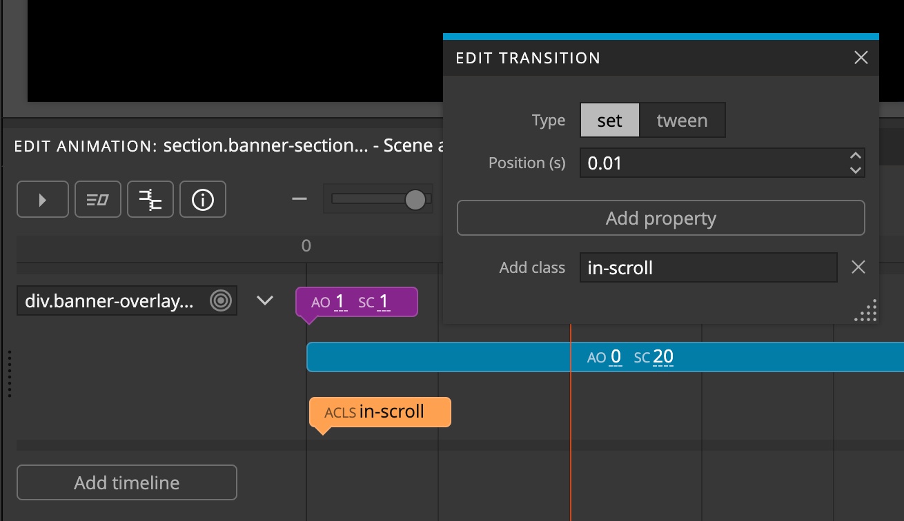
Set at position 0
GreenSock GSAP changed the way how Sets at the start of the timeline are rendered when the animation is reversed back to the starting position.
Until now the initial state of such sets was restored when backing up to start. For example, take a timeline with Set AddClass in-scroll at position 0. The class in-scroll would be added when the animation started playing and would be removed when the animation was reversed back to start.
This behavior can be confusing and was therefore changed by the GreenSock team, so that Sets at 0 are no longer reversed. In our example, this means that the class in-scroll will not be removed.
There are two ways to have this happen with the new behavior:
- Put the set slightly after start, for example at
0.1s. When the animation reverses back at 0 it will correctly restore the state to the state before the Set. - Use Tween transform instead of a Set. Tweens animate elements from the initial state to the target state, and when replayed backwards, animate the element back to the initial state.
This change affects the WildMusic example. There the Set that adds the in-scroll class was moved slightly after the start of the timeline.
Classes
One difference is when adding or removing classes – style changes between the two states are no longer animated.
Auto opacity
In Interactions 1.x, Auto opacity had a bug where in some situations it didn’t correctly set the visibility to hidden when opacity reached 0. So if you implemented any workarounds or interactions that relied on the incorrect behavior you will have to update them now.
Changes to tutorials
Our tutorials are a good measure of backward compatibility. So far, only these changes had to be done:
WildMusic
Mouseover and mouseleave animations on the Wildmusic heading must use Opacity instead of Auto opacity because Auto opacity=0 sets the element’s visibility to hidden and thus disables pointer events. So, the mouseleave event no longer happens and the heading does not become visible again.
The Set class in-scroll in the header scroll scene animation was moved to position 0.01 because Sets at 0 no longer restore the initial state when the animation reverses to 0.
Getting started
Download and install the latest Pinegrow Web Editor, start a new project and add Interaction blueprints to the page.
Take a look at the slider and presentation guides to see how interactive components are created and used.