Visual controls are the core of Tailwind Visual Editor. They are located in the Properties panel.
The Properties panel has two parts:
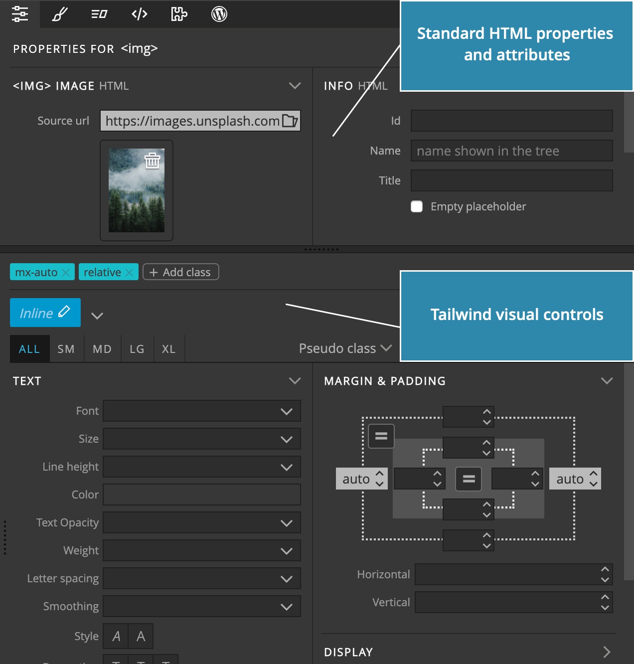
The top part contains non-Tailwind element properties: its HTML attributes, id, internal Pinegrow name and so on.
The bottom part contains the Tailwind controls.
Use the horizontal divider to resize the both panel parts.
Let’s take a look at the Tailwind controls.
Classes
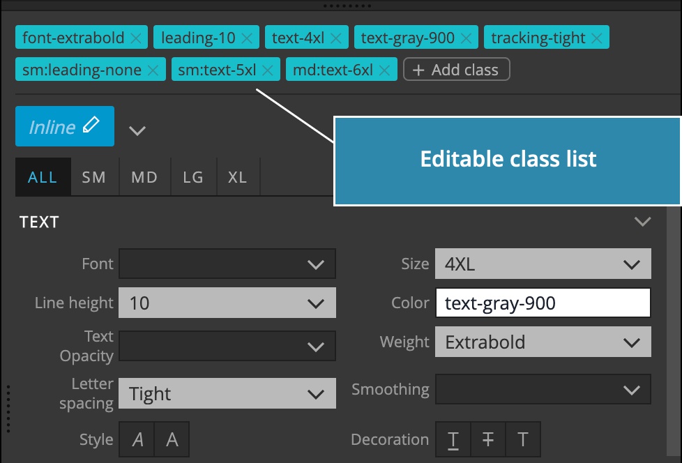
At the top we have an editable list of element’s classes; both Tailwind and non-Tailwind classes are listed there. Tailwind classes are colored with the Tailwind teal color, the rest are blue.
There you can:
- Click on a Tailwind class to jump to its visual control.
- Remove a class from the element.
- Add a new class. This is suitable for non-Tailwind classes. Tailwind classes are manipulated with visual controls.
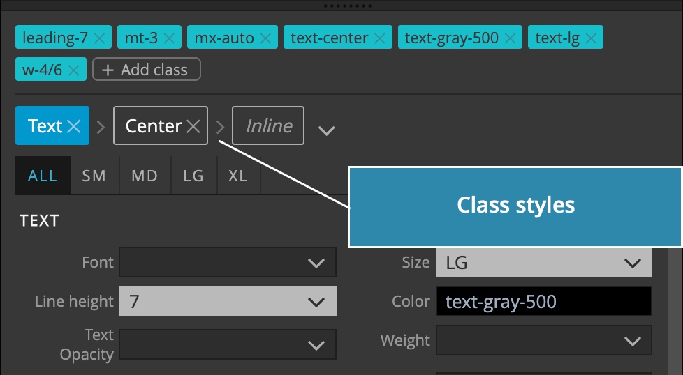
Class Styles
We’ll take a look at Class Styles in a separate guide.
Device size selector
Here we set what responsive size and pseudo state combination of the selected element we are editing.
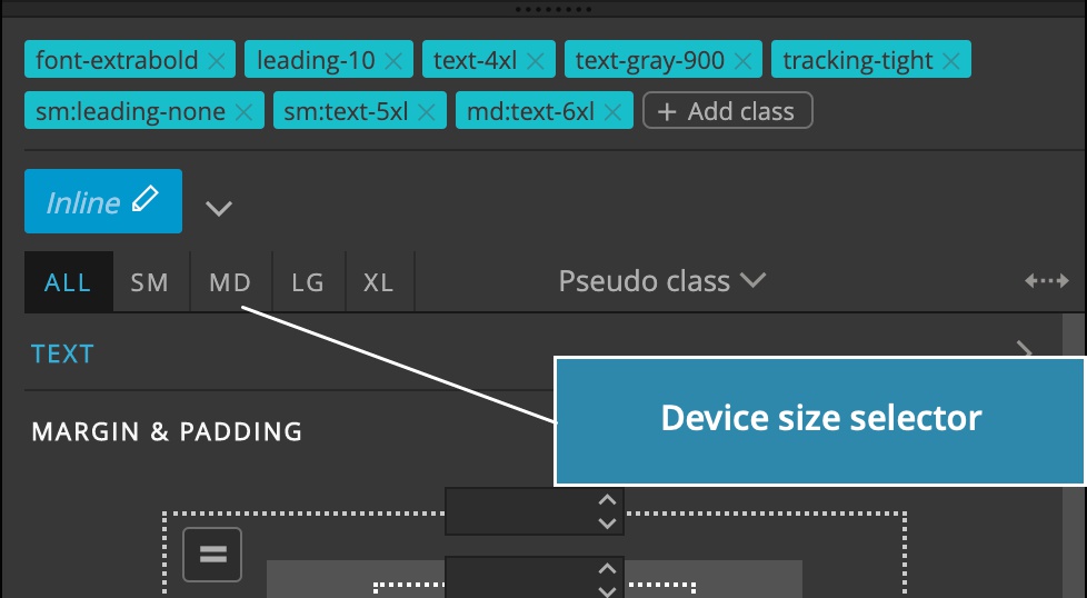
TailwindCSS uses the mobile-first approach. That means that properties set on any responsive size affect the element on that size and up – unless another property is set higher up.
For example, whatever we set on ALL (the smallest size and up) will affect the element on all device sizes. If we set a different property value on MD that value will affect the display on MD and up.
Visual controls display values that are set on lower sizes with blue color:
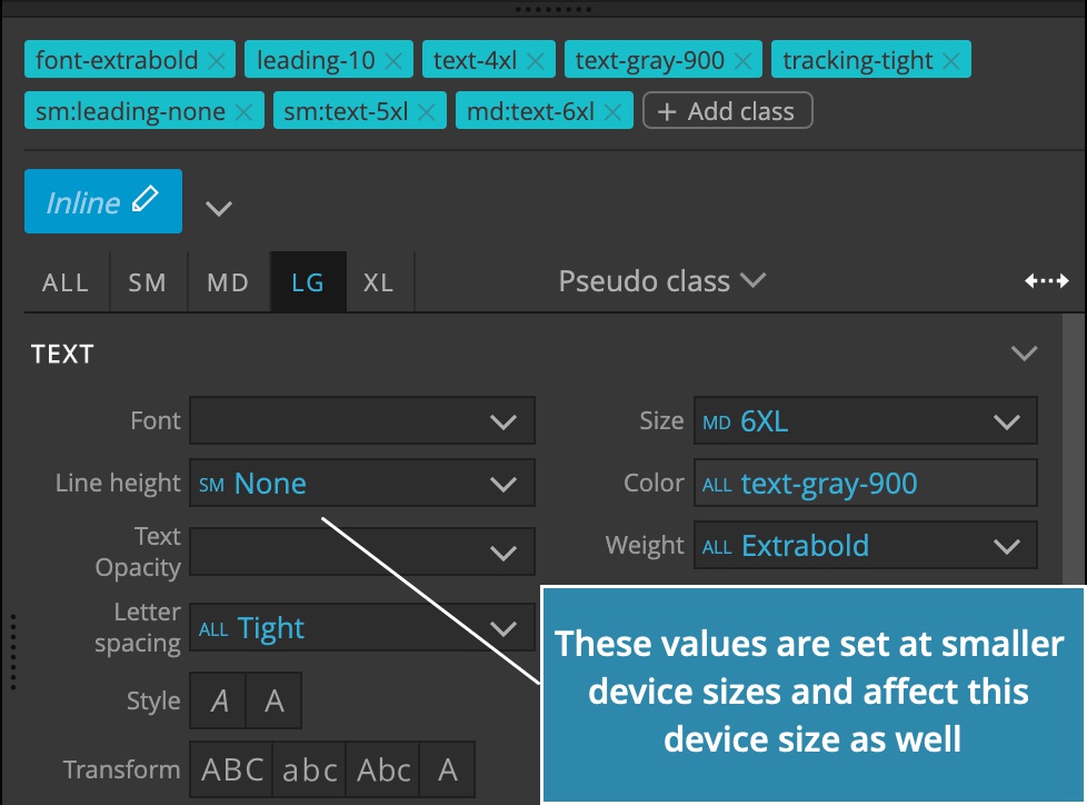
That makes it easy to see what properties affect the current device size, so that we can override them to modify the responsive behavior.
Device size selector can be synced with the page view by toggling the Sync icon. When synced, the page view is automatically resized when you change the selected device and vice versa.
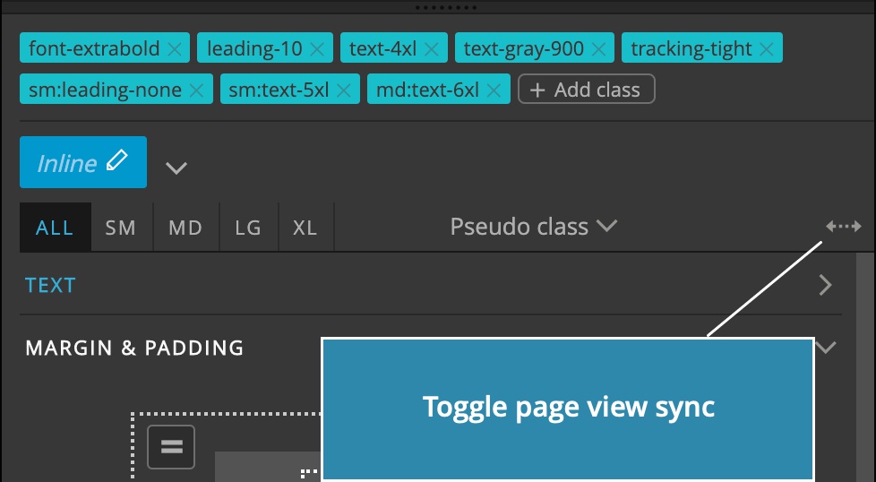
This works nicely with multi-page views editing. In Pinegrow Web Editor you can open multiple page views displaying the page at different sizes. Device size selector will switch between page views.
Pseudo class variants
Here we select the pseudo state that we wish to edit. For example, switching the element to Hover will display the element in hovered state and whatever editing we do in visual controls will affect only that state.
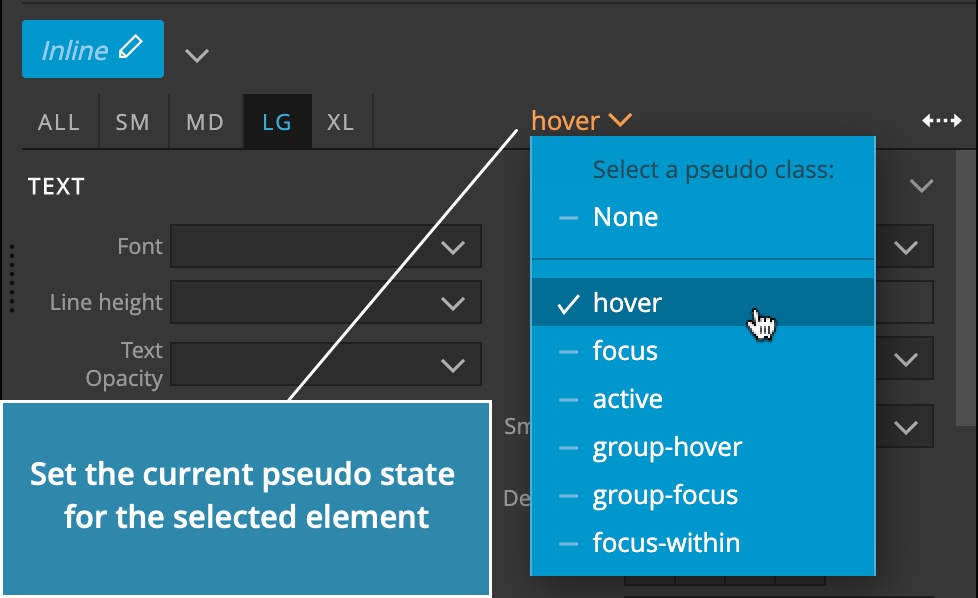
Please note that in default TailwindCSS build not all pseudo variants are defined. At the moment Pinegrow doesn’t detect what classes are defined and simply displays the full range of visual controls.
The sign that the class is not defined is that it has no effect when selected. To fix that enable the variant in your TailwindCSS custom build or use another property.
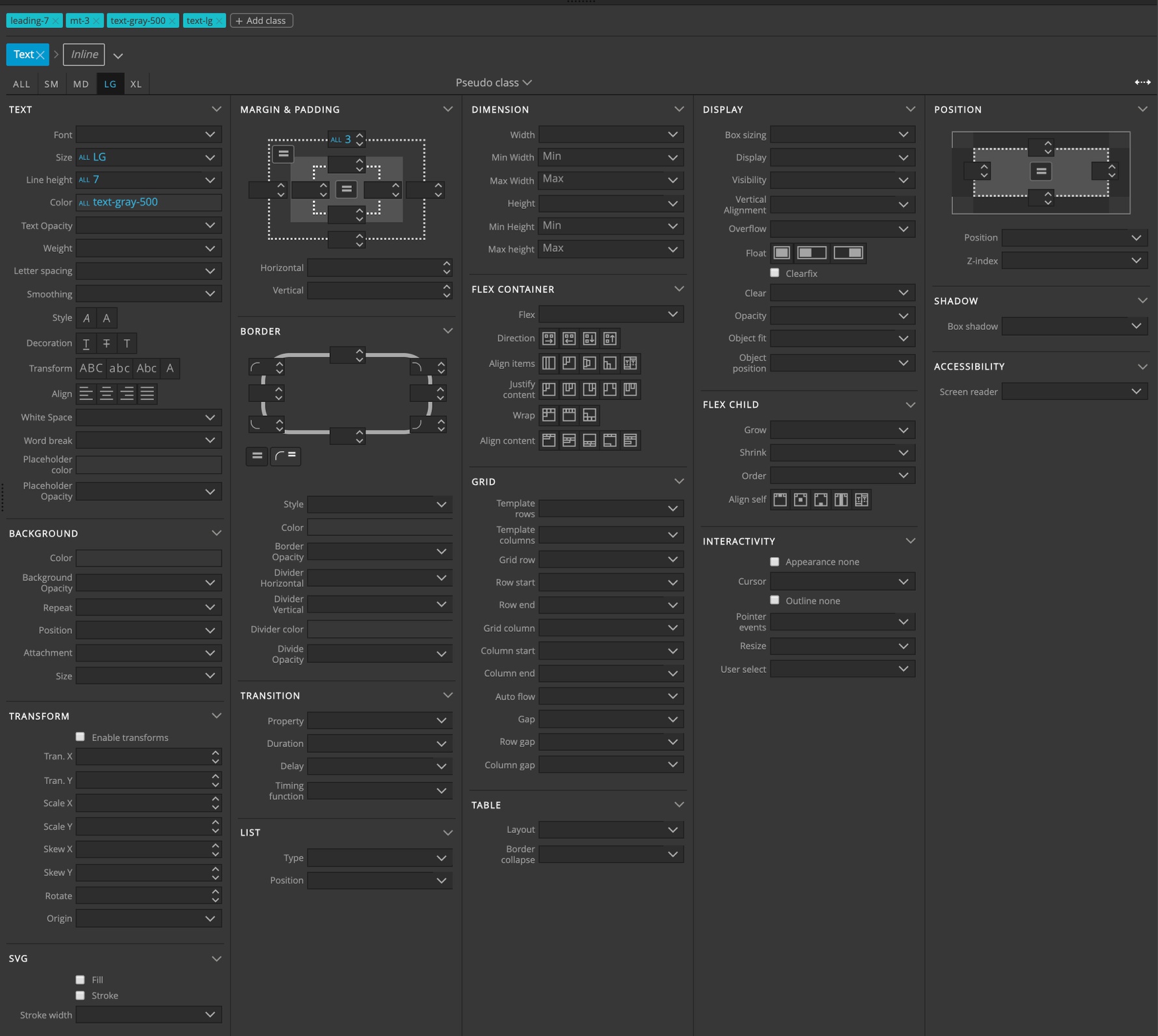
Visual controls
Visual controls for text, dimensions, spacings and so on directly correspond to TailwindCSS classes. Please see TailwindCSS documentation to learn more.
Custom TailwindCSS themes
Use Customize visual controls feature to adjust visual controls to your custom TailwindCSS theme.
Examples
Building a team member card with visual controls:
Making the card responsive:
Styling the hover state:
Customizing visual controls: