CSS dividers help with sectioning your content both making your pages more readable, but also enhancing the visual appeal. This tutorial shows how easy it is to add custom page dividers in Pinegrow.
Mr. Pine Cone
Something about me…
Page dividers play a number of roles in web design. They can help to separate different blocks of content and also help lead to user down the page. Graphical dividers can make your page pop and look more dynamic. The Pinegrow Bootstrap and Tailwind blocks templates contain a number of dividers for use in your projects. In addition, there are a number of divider builders available on the web that can be used from within Pinegrow to build custom geometric dividers. Numerous non-geometric designs can be found on the web and you can even create and use your own.
In this tutorial we will explore usage and modification of the dividers built-in to Pinegrow, as well as how you can tap into the wealth of files available on the web.
Let’s get started!
Prefer to read? Scroll past the videos.
This tutorial is available in video and textual form. Watch the two videos, or continue reading if you prefer to read. Of course, you can also do both!
Video – Using page dividers
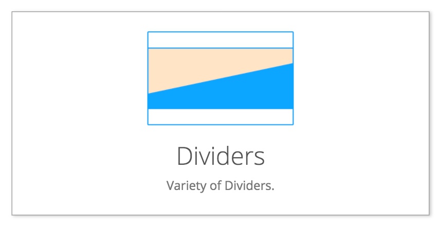
The Pinegrow divider blocks
Simple dividers
Pinegrow has a number of dividers within the Tailwind Blocks and both Bootstrap 4 and 5 libraries. There are some differences in the selection of dividers. Primarily, they are for use within the indicated frameworks – the majority of the blocks have classes that will only work with the correct framework loaded. The dividers are a little different though. All of the graphical dividers (waves and triangles) are mostly plain SVG with just framework-specific colors, so they can be used in any type of framework – even plain HTML.
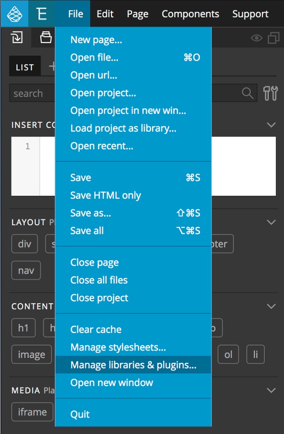
If you open one of the pre-made Blocks templates, the Blocks tab will be automatically added to the Library panel. In any other framework they can be loaded in by going to the file menu and selecting “Manage libraries & plugins…”.
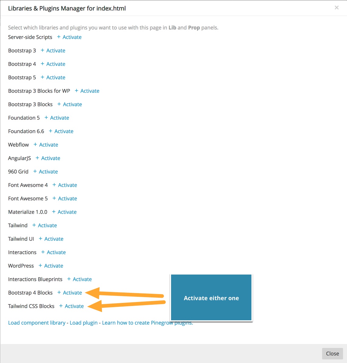
From the resulting modal activate either the Bootstrap 4 or Tailwind Blocks by clicking on the activate link – unless you are using a specific framework like Bootstrap 4 or Tailwind, it doesn’t matter which you select. The modal can then be closed. Looking at the Library panel you will now see a ‘Blocks’ tab at the top.
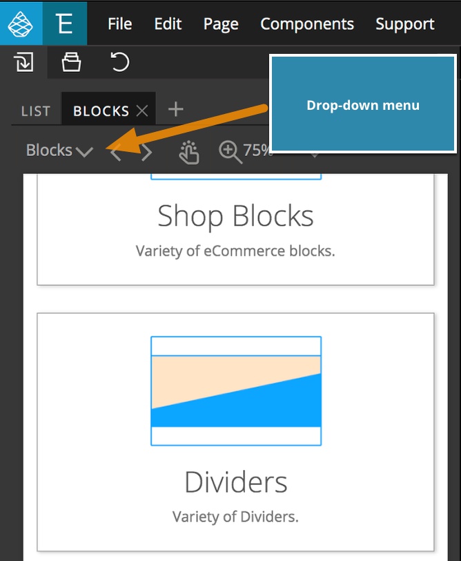
To access the dividers, either use the drop-down menu at the upper-left, or scroll the window down to the dividers section. Clicking on this section will bring up the built-in dividers. As with all of the elements in the Library panel, the dividers can be added to your page simply by dragging them to either the Page View, or the Tree panel, your choice.
Note any of the dividers with a line interrupted by text or a graphic can only be used within a specific framework. However, any of the geometric shape dividers are SVG and can be used in any project.
For this tutorial I’m using Bootstrap 5, so the example images will show that block library and any of the dividers will function. When using a non-Bootstrap framework, only the graphical dividers will function as expected.
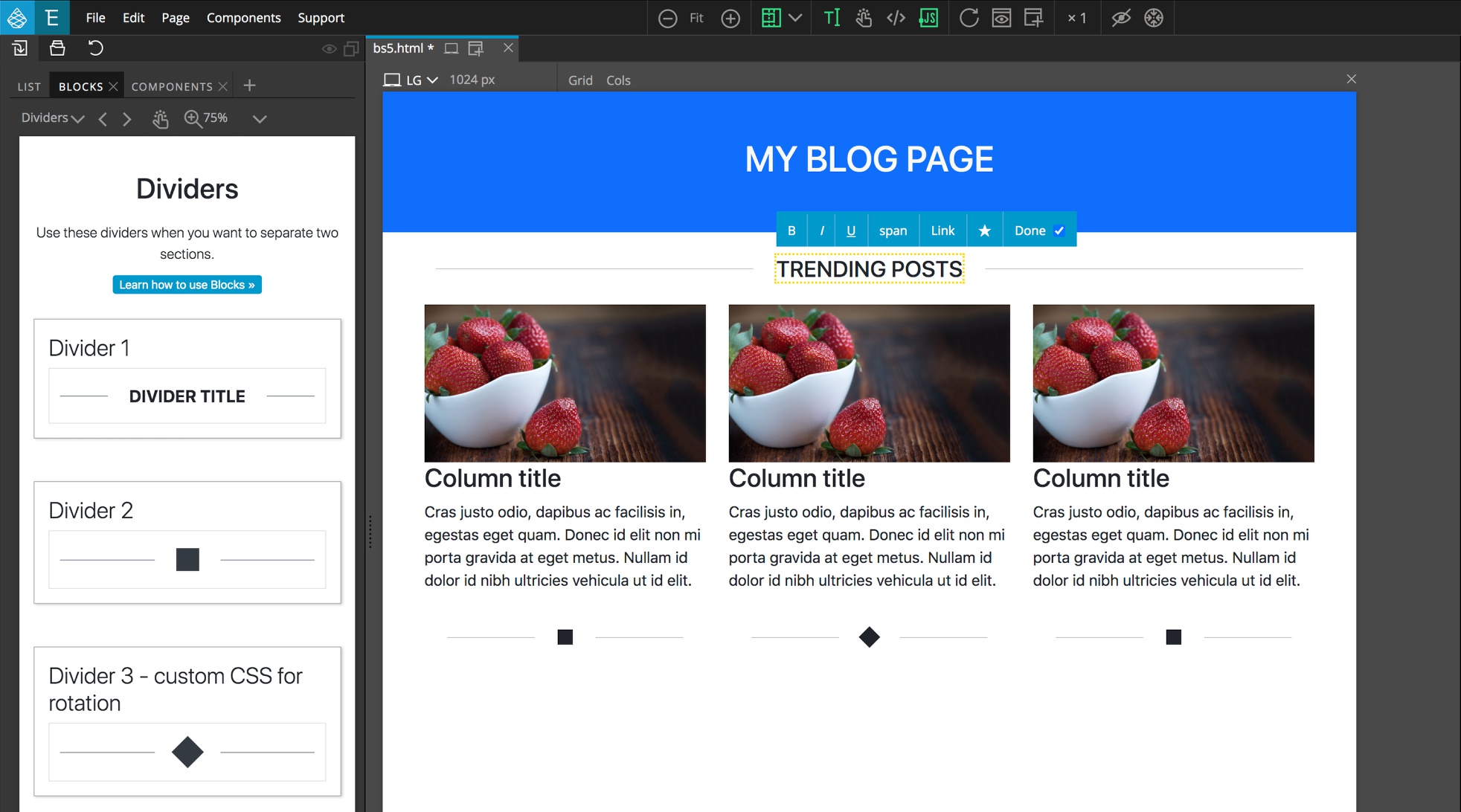
The first available divider is a text divider that can be used to both separate content areas but also give them a title, like “Trending Posts”. The text in the middle can be altered and styled like any other text. Here, the text has been transformed to show in uppercase, we could easily change this, the color, or even the font.
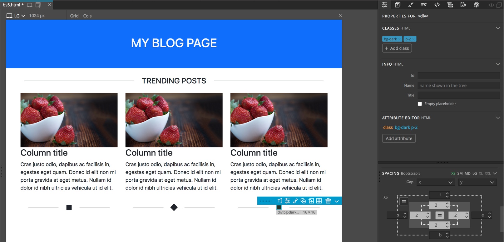
In addition to adding the divider to the whole width of the row, you can also add dividers to individual columns. In this case, after dragging the dividers into the columns, I changed the padding of the center symbol to reduce the size.
Line dividers with SVG
Three of the built-in line dividers use SVG (scalable vector graphics) images to give them extra character. The first, uses an SVG icon to replace the symbol in the middle. In fact, you can do this with any of the built-in dividers.
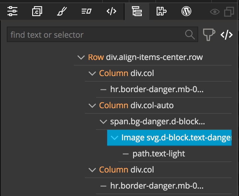
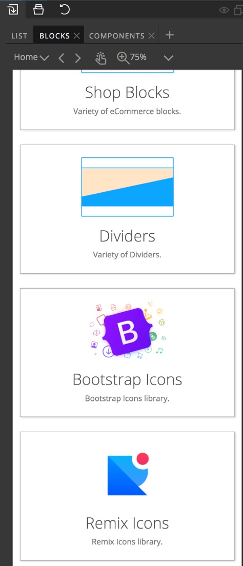
Once you add this to the page you can alter the icon by selecting the image element within the span. That icon can then be replaced with the icons that are built-in to the Pinegrow Blocks – either Bootstrap or Remix icons – or any icon loaded from an outside source.
To replace with a remix icon, for example, you would select the remix icons from the Blocks tab.
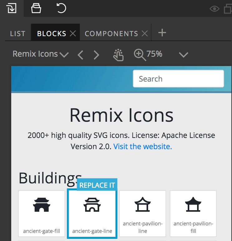
Then, you hover over the desired icon and click the “Replace it” tag that appears. Once you new icon is placed in the divider you can change the color. Typically this is accomplished by opening the image tag and selecting either the ‘path’ or ‘g’ tag inside. Next, navigate to the Properties or Style Panel and change the text color to the desired icon color.
The background color, size, and shape can be altered by selecting the ‘span’ tag surrounding the SVG.
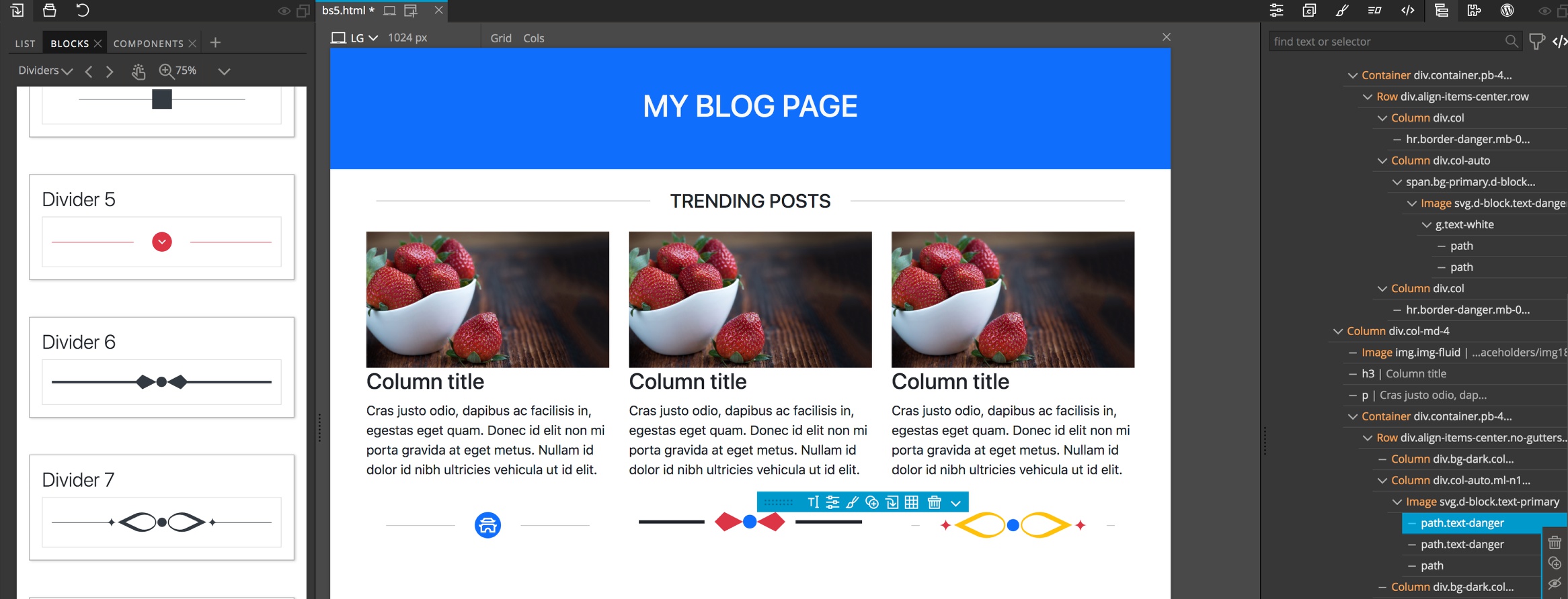
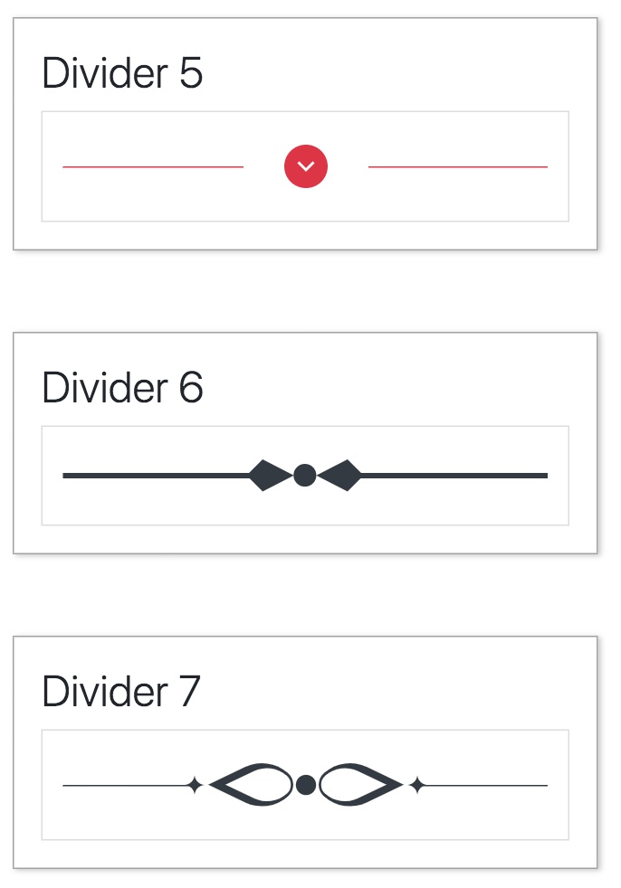
The next two line dividers both contain more complex SVG at the center. These can be customized by selecting either the image tag and, for example, changing the text color. You can also open the image tag and select individual paths inside to make the SVG multi-color!
SVG only dividers
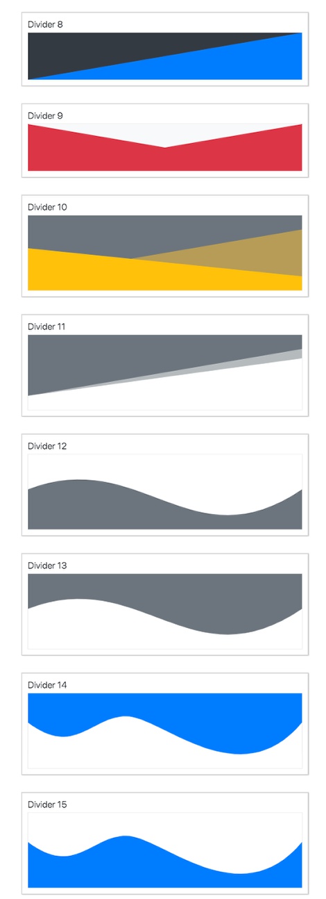
In addition to the line dividers, Pinegrow has dividers composed of geometric shapes – either waves or triangles. These dividers are best used to transition between two sections with different background colors. Like the line dividers, these can be customized to fit your site.
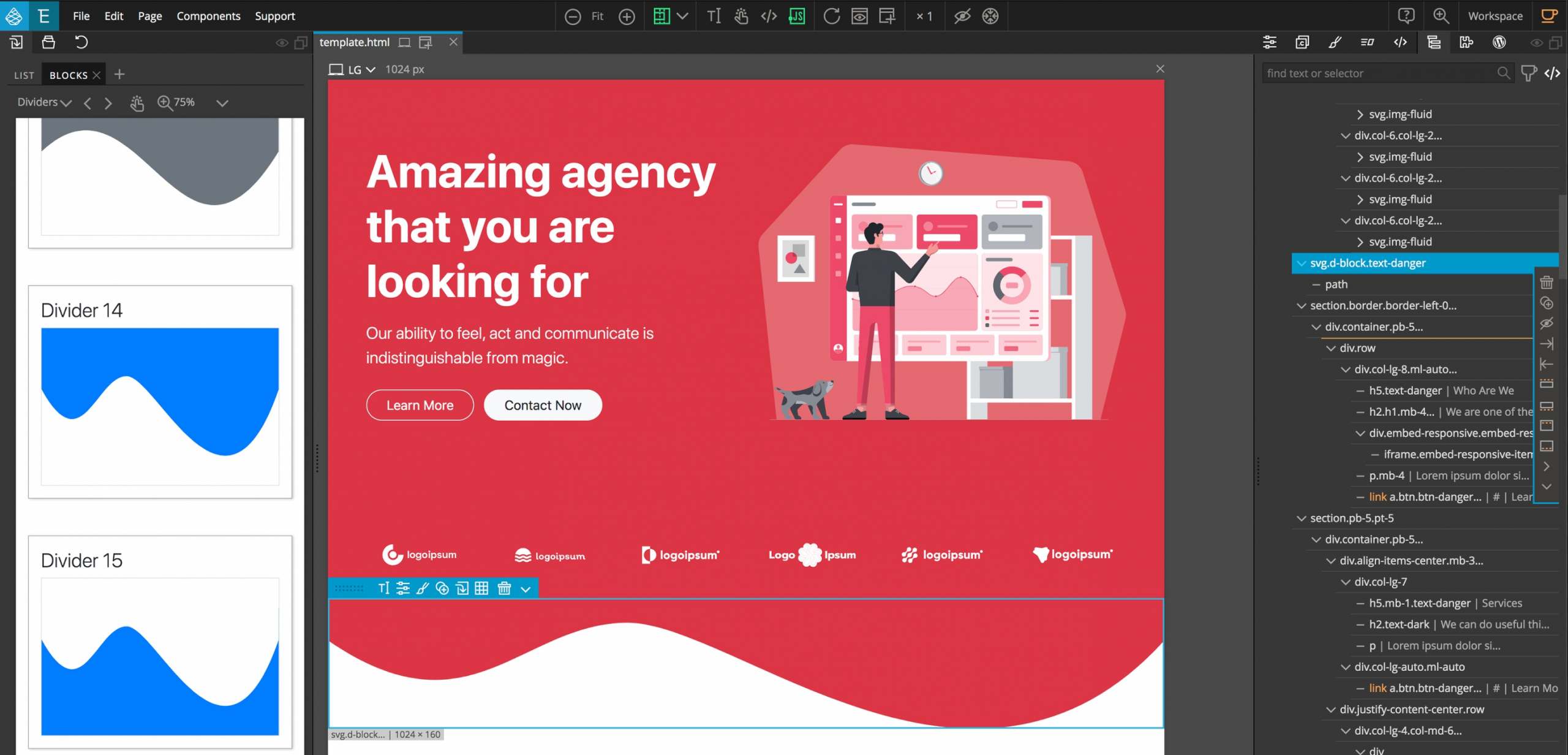
The wave dividers are used in the pre-made Agency template of the Bootstrap and Tailwind Blocks pages. For example, the bottom of the top hero section is a modified divider 15. To achieve the correct colors, the color for the main SVG was set to the red color of the hero section by adding the text-danger class in a Bootstrap block, in Tailwind it is text-red-600. However, it could have been changed to any color by simply setting the font color in the style panel. The built-in divider also has a class of bg-primary to give the blue color on a Bootstrap page or bg-blue-600 in a Tailwind block. Removing these classes will change the area to the same as the background color of the main page. For all of the dividers, changing the background color or text color on the main div, an enclosed path, or g will allow you to customize all of the pieces.
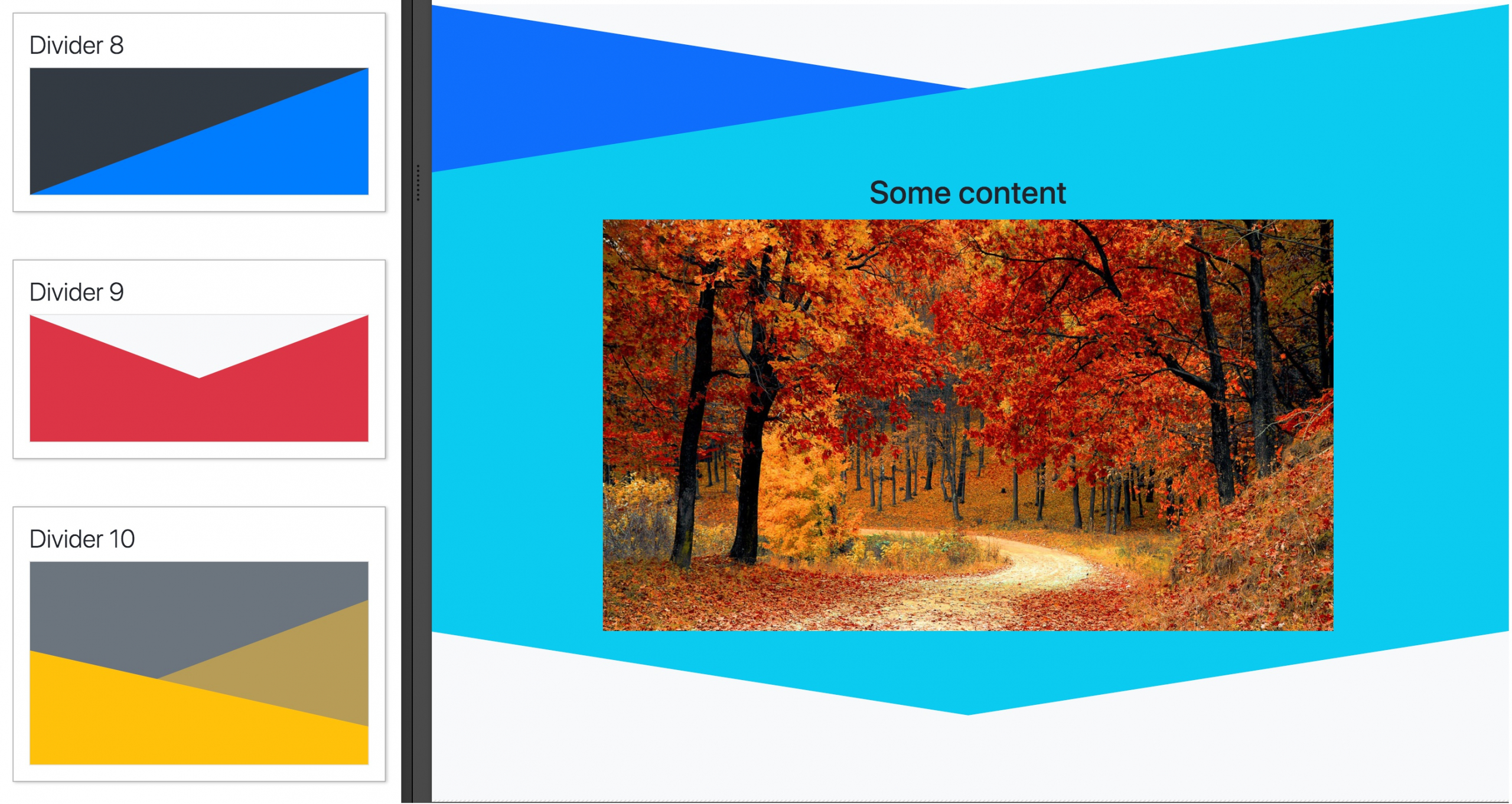
The wave dividers can be used at the top or bottom of a section by changing the colors. With the triangle dividers you may wish to change the “directionality” depending if it is at the top or bottom. Adding Bootstrap Divider 9 to the top and bottom of a section and altering the colors gives us a chevron-like look that may not be what we want. If instead we want the top and bottom dividers to be mirror images, we can duplicate the top divider, move it below our content, and then apply a transform.
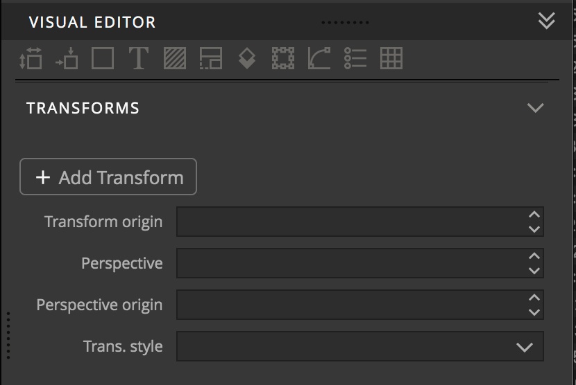
 With the surrounding div selected, navigate to the ‘Transforms’ section of the Style Panel. Once there, click the ‘+ Add Transform’ button.
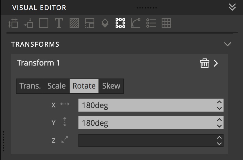
Next, click on the ‘Rotate’ button and enter ‘180deg’ into the ‘X’ box and the ‘Y’ box.
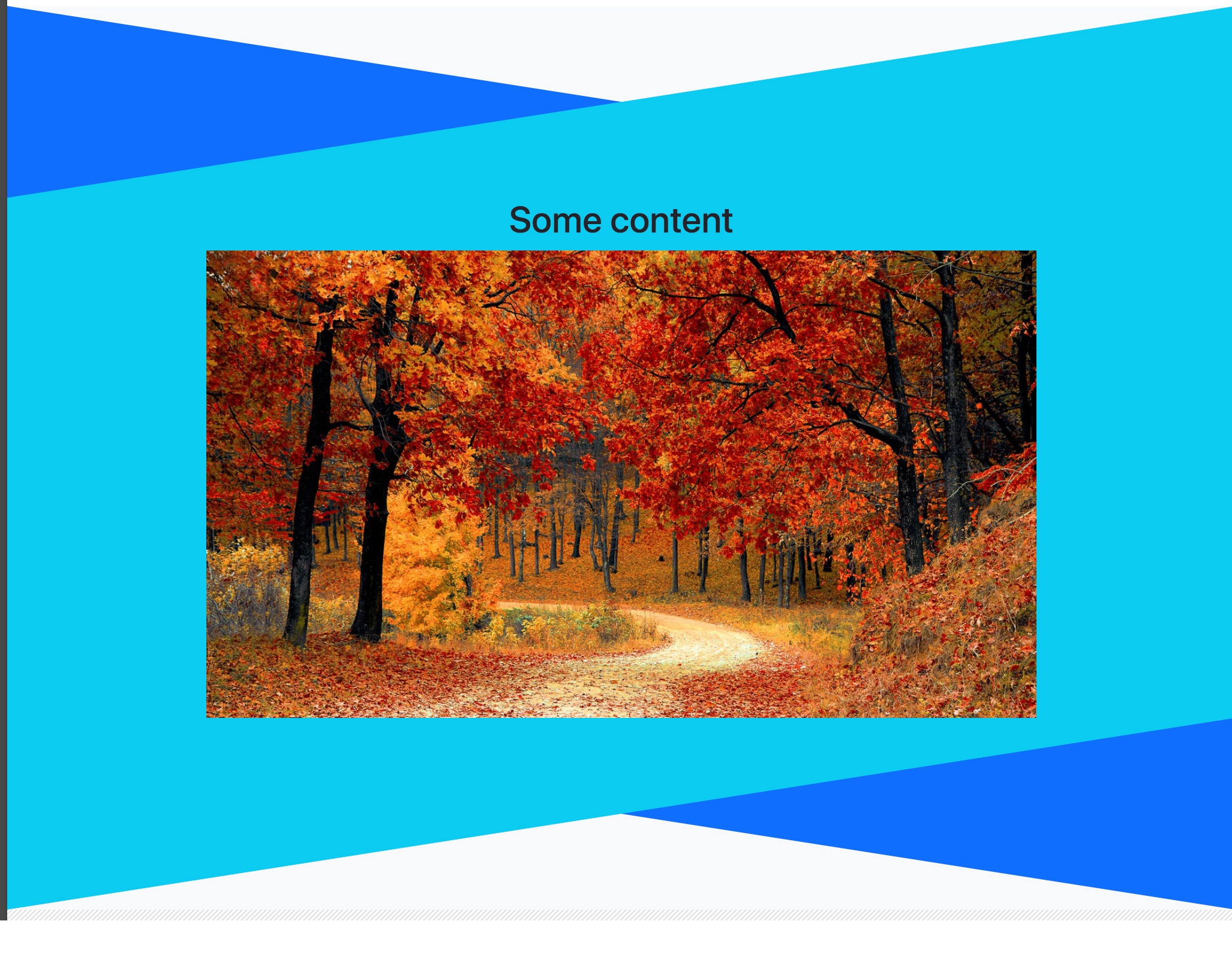
Voila! Mirror image dividers.
Generating custom dividers
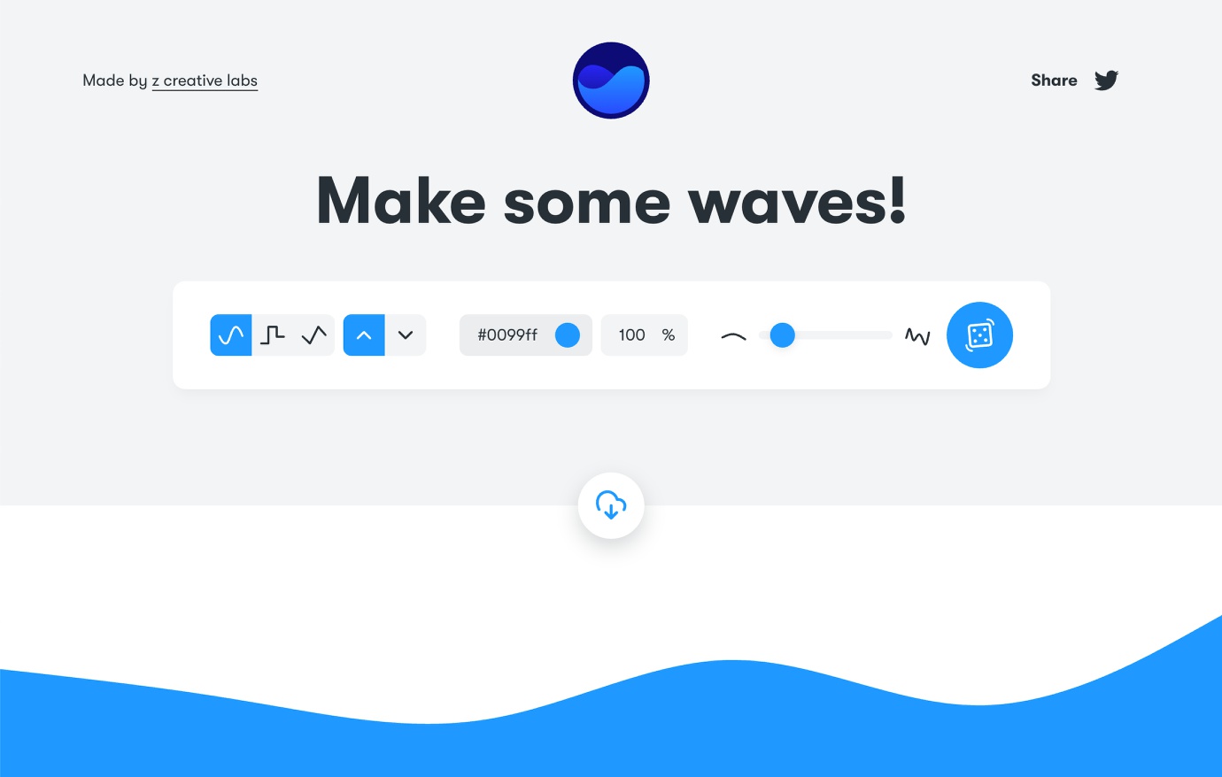
While both the Tailwind and Bootstrap Block dividers look great, sometimes they don’t match the project we are putting together. Luckily, Pinegrow makes it easy to bring in dividers from other sources. One good site is getwaves.io. This site allows the construction of simple square, triangle, and square wave dividers. Disappointingly, it doesn’t allow for the construction of more complicated multiple overlapping figures.
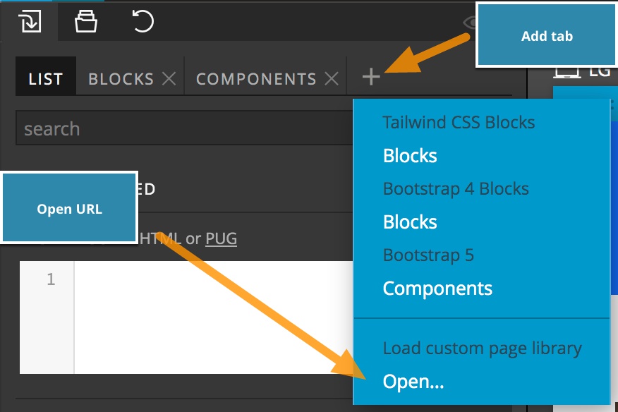
To utilize this (or most any similar site) in Pinegrow, the easiest way is to navigate to the Library panel and then click on the plus icon to add a new tab. This will bring up a menu. Select “Open…” to add the site to your Library.
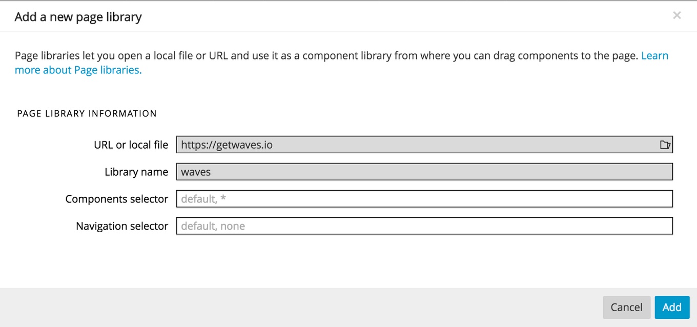
In the input boxes add the site URL, along with a short name to easily identify it. Finally, click the “Add” button. This will open the site within your Library panel. We can then manipulate the various inputs until we get a divider that fits our project.
Note: Make sure that the click icon at the top of the panel is highlighted to allow you to interact with the site.
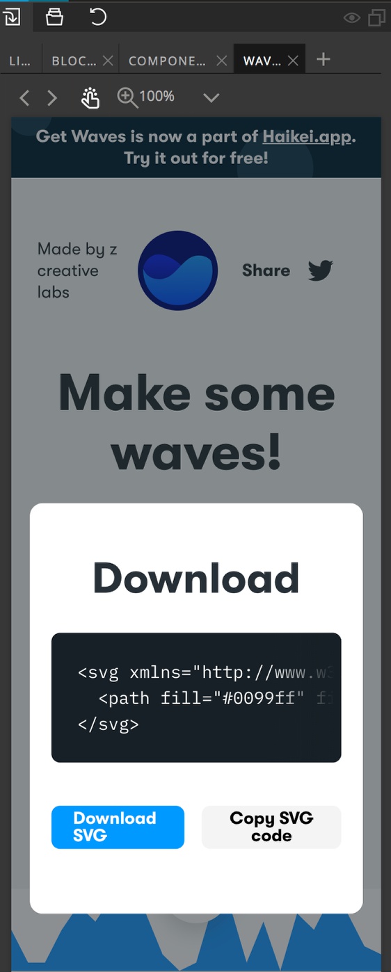
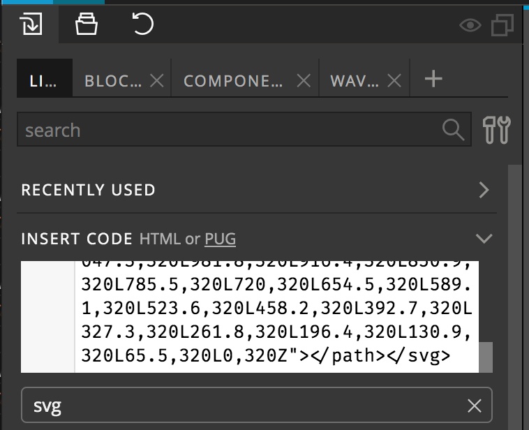
To add the newly generated SVG to our page we can click on the cloud icon and the click on the “Copy SVG code” button. Next, navigate back to the “List” tab of the Library panel and paste the copied code into the Code box.
You can then drag the new SVG element to your page and give it any further styling you wish. As with the built-in dividers, you can change the background by styling the parental SVG element. The path color, however, is typically altered by changing the ‘fill’ attribute on each path by selecting the path and then editing the attribute in the Properties panel.
Adding graphical dividers
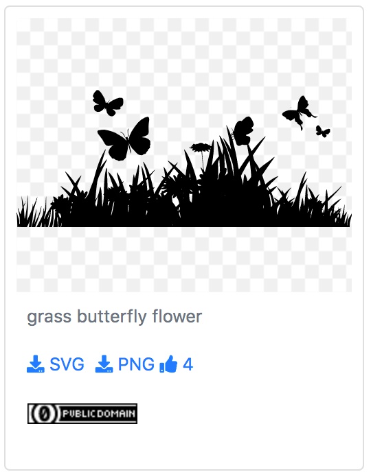
In addition to simple geometric shapes, there are also a wealth of more complex dividers available on the web. For example, svgsihl.com has a wide variety of different SVG images that can easily be adapted to use as dividers. This is useful for holiday or themed pages. Searching for the keyword ‘grass’ brings up a some great potential images, including one with some butterflies mixed in.
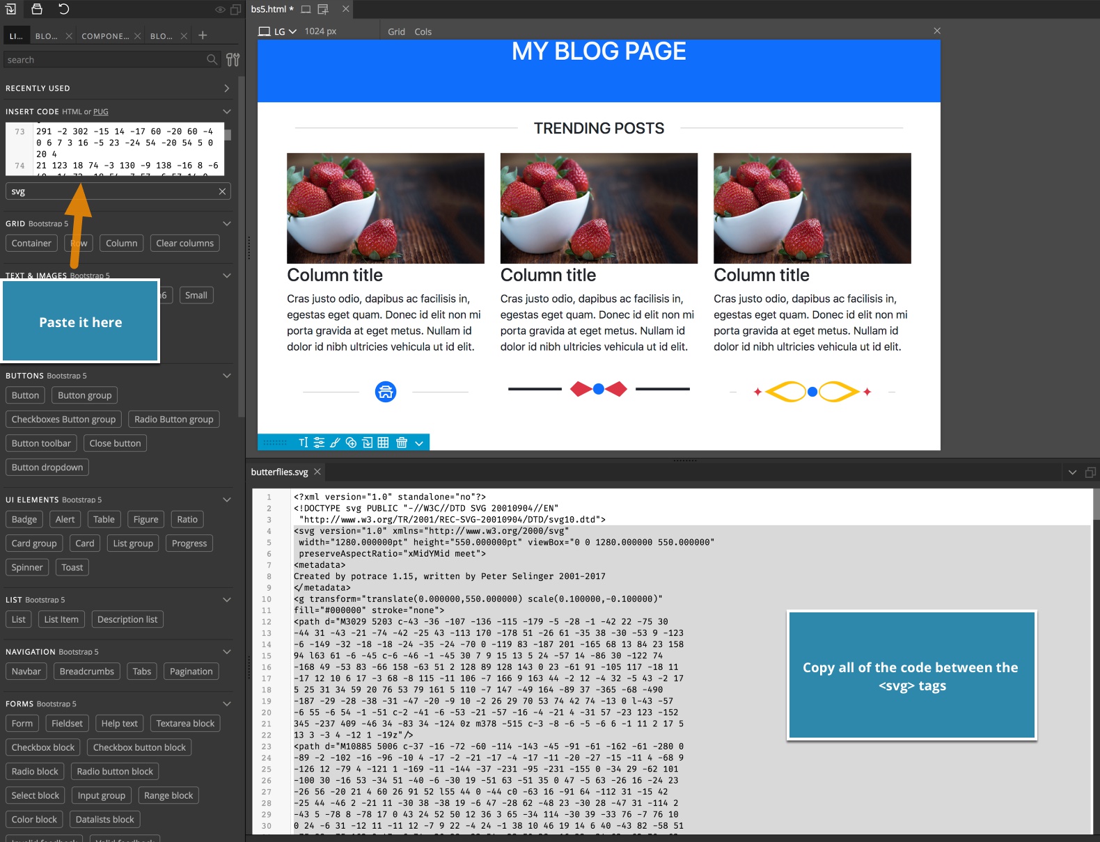
For this type of resource you will want to download the SVG version. I usually download the file into a folder within my current project. You can then click the file in the Project window and open it in the Pinegrow code editor. Once open, copy the <svg></svg> tags and all code in between. Navigating back to the Library panel, paste this code into the Code box and then drag the resulting element to the page. Typically, the image won’t be the desired dimensions.
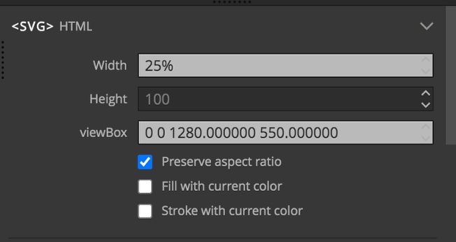
In the Properties panel you can set the width as desired and just delete any height value. Decreasing the width below 100% will also decrease the height. A good trick for full width dividers is to place the SVG into a full width container and each SVG a portion of that width, like 25%. You can then duplicate the image an additional three times to take up the full width of the container.
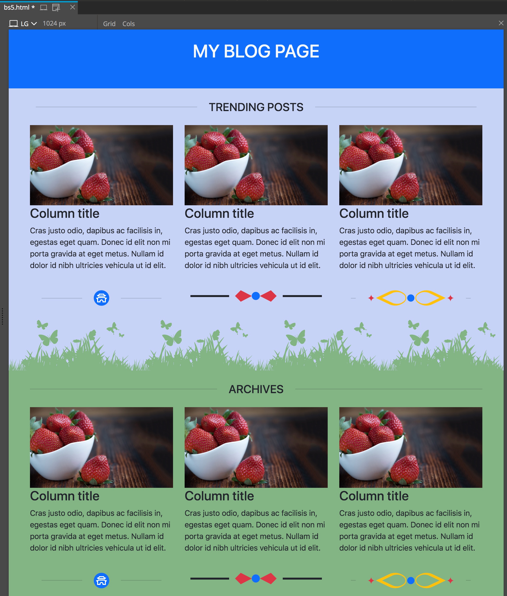
Typically to change the colors of these types of images you need to alter the fill attribute to the desired color. The color of the negative area is usually set by setting the background color of the parent section, or may be already set to transparent.
That is it for this tutorial! Hopefully now you feel comfortable working with the different types of dividers available in Pinegrow. As always, the visual nature of Pinegrow invites you to experiment with different settings and see how they impact your page.
Discuss this tutorial
Have questions or comments about this tutorial? Let’s talk about it on our forum.
Get in touch
Would you like to see your favorite theme or blocks library featured in the next tutorial? Let us know in the forum or by email!