Creating a Slider with Pinegrow Interaction 2
A step-by-step tutorial about creating custom sliders with Pinegrow Interactions 2.
Before we start
What you’ll learn?
By following this tutorial you will learn how to:
- Use scroll interactions
- Create Scroll scenes with snapping and pagination
- Add smart auto play to the slider
- Animate individual slides with Scroll scenes and custom animations
- Working with custom selectors
- Using data attributes in animations
- Reusing interactions on multiple sliders
- Generate standalone JavaScript file to power sliders without using Interactions data attributes and more!
What you’ll need?
Of course, you can just watch the tutorial to see how Pinegrow Interactions work. But we recommend that you follow along the tutorial, doing all the steps on the provided landing page. To do that, you’ll need:
- Pinegrow Web Editor, either a free trial or activated license that includes Pinegrow Interactions.
- Download the starting project without interactions. Unzip the file and open it as a project in Pinegrow Web Editor.
- You can also download the finished project as a reference and the the example slider with animated slides.
If you already have Pinegrow Web Editor, but don’t have the Interactions add-on you can start a trial in Support -> Purchase & Activate under Add-ons: Interactions.
Want to know more about Pinegrow Interactions?
Visit the Pinegrow Interactions Documentation portal to learn more about Interactions, actions, licensing, API and more.
Need help?
Post any questions and feedback about this tutorial to a dedicated Pinegrow Forum topic.
Watch the whole tutorial
The tutorial has 10 parts, total length is around 50 minutes.
We recommend that you watch the whole tutorial and follow along with the provided project.
Alternatively, you can scroll down past the video to watch and read transcripts of individual tutorial parts.
The following section contains the videos and transcripts of individual parts of the tutorial:
1. Introduction
Hi there, today we’ve come up with a super cool tutorial! In this tutorial we will use Pinegrow Interaction 2.0 to create a custom slider.
Pinegrow Interaction 2.0 gives you the power to add custom animations and interactive components to your web projects, all without coding and without dependencies on any other JavaScript libraries.
This is only one of the capabilities of the new Pinegrow Interactions 2.0. Here is a preview of the end result of the slider that we are going to build. Our slider will auto play, it will pause when the user interacts with it and it can be controlled by control buttons.
On touch enabled devices users will be able to navigate using touch gestures.
In addition, we also have pagination dots, which are clickable and will take us to the associated slide.
This is a pure HTML & CSS slider. It doesn’t depend on any CSS framework. The layout and styling used is completely up to you. Pinegrow Interactions works with any HTML project.
You can use this slider as a starting point for your own custom sliders, or just as an example of what can be built, as well as how to build it with Pinegrow Interactions.
The ready-made slider is also available in Interactions Blueprints from where you can easily add it to your projects.
That being said, nothing beats looking under the hood to learn how things are made and unlock the full power of Pinegrow Interactions.
Now let’s build this slider with Pinegrow Interactions. For this tutorial we have already prepared the layout for you to get started. Please get the starter project from the link in the description and follow along this video tutorial.
2. Layout for the slider
Open your Pinegrow Web Editor
- Click on Open Project
- Now choose the starter project folder
- And click Select
- Now click on the index.html file to open it
Now you should see a block with horizontally scrollable contents, which are our slides. At the moment this is built with just HTML and CSS.
Now let’s check the HTML layout, the div with class name .pgia-slider is our slider block. It has 3 main child blocks with the class names: .pgia-slides-container, .pgia-controls and .pgia-progress
As you might have guessed,
.pgia-slides-container – contains the main slide blocks with class name .pgia-slide, you can have any number of slides here and each slides can contain its own contents
.pgia-controls – contains all the control buttons and .pgia-pagination block. Control buttons are the 2 links for triggering the slider to go to previous and next slides. And .pgia-pagination block has only one item initially, later we will dynamically add more pagination dots depending on the number of slides, with the help of Pinegrow Interactions.
.pgia-progress – contains .pgia-progress-bar block which will be used as an indicator for slides
The CSS styles applied to these blocks are pretty simple. In any subsequent project you should modify the height of the .pgia-slider block and alter the .pgia-slide blocks to work with your contents. It is best to keep the rest as it is but you can modify CSS to change the placement or styles of slider controls and pagination dots.
Now I want to show you something interesting in the style.css file. In the Project panel click on the CSS folder, then click on the style.css and it should open in the code editor.
Now if you check the code, classname .pgia-slides-container has overflow: hidden so that the scroll bar will not be visible.
But this prevents scrolling with touch gestures on touch enabled devices. So, we used the media query any-pointer: coarse to set the overflow to auto for devices with touch pointers.
We also have a neat trick that makes it easier to edit the slider in Pinegrow. We are targeting the .pgia-slides-container with a data-pg-id attribute and applied overflow: auto, making its scrollbar visible.
data-pg-id is a special attribute used by Pinegrow during editing. This will make the scrollbar visible only when we are viewing the slider in Pinegrow. The scrollbar will make it easier to navigate around the slider when we are working on it. But it won’t be shown in the browser.
The CSS file on this starter project only contains CSS for this slider and there is no extra CSS applied.
So that is it for the layout of our slider, let’s close the code editor and start adding interactions to it.
3. Adding navigation to the slider
So let’s start adding interaction to the slider controls. Slider controls will be used to move the slider to the next or previous slide.
We already have the slider controls layout in place, as you can see this has 2 .pgia-control links that will be used for moving our slider, so let’s add interaction to the first control link
- Go to the tree panel and select the .pgia-control link with class name .prev
- Go to Interactions panel and click on Activate Interactions if it is not enabled
- Now go to the Actions List and click on Interactions, interaction settings should appear
- For Name enter ScrollTo
- For Trigger > select Click on…
- Leave the Target blank
- Click on Edit Animation and the Timeline editor should appear
- Go to the Timeline Editor, on Selector > click on Edit selector
- On the popup field enter ^.pgia-slider|.pgia-slides-container, this is a very useful selector.
First part of this selector has caret ( ^ ) which goes up the tree to target the closest matching parent in this case .pgia-slider and the pipe character ( | ) is used to look for the .pgia-slides-container within that element.
- Now press Ok
- Now click on the blank space of the Timeline editor to create new transition and a transition settings should appear
- For Type keep it as Tween
- On Position enter 0
- For Duration keep 0.5
- Now click on Add property > go to Scroll > select Scroll to
- For Scroll to we can set any of the options available here, but for this button it we should select prev_page
- Lastly click on Advanced Options and enable Prevent default action, this is usually done when we don’t need the link to go anywhere. Our link has # as the href value, so if we don’t apply prevent default it will scroll to the top of the page.
Save and refresh the page and we can test the button now. But as we are already on the first slide, let’s manually scroll the slider. You can just click on the empty space of the slider. If you are on a laptop with a touchpad, you might easily do a horizontal scroll with a swipe on the touchpad.
Now the slider is on the last slide, let’s test the interaction. Press the Alt key on the keyboard and click the control link on the left and it should take you to the previous slide. This way we can set next for Scroll to value on the second control link.
But let’s use a trick so that we can work with just this one interaction and apply the same interaction to all .pgia-controls.
- Go to the Timeline editor and click on the Transition bar to edit the transition settings
- For ScrollTo value enter ${target.data-scroll-to}
Now let’s add Apply to many interaction to integrate same interaction to other pgia-control
Go to Actions List and click on Apply to many
- Go to Apply to many settings
- On Target select Edit selector
- On the popup field enter $.pgia-control and press Ok
Now save and refresh the page. Click on each slider control to check their functionality; don’t forget to press the Alt key on your keyboard if you have page clicks turned off. You should be able to see that next.pgia-control and prev.pgia-control should work as intended.
Instead of creating different interactions – one for each button – we created just one interaction and assigned scroll transform to read the scroll destination from data-scroll-to attribute of the link target element. This is done with the statement ${target.data-scroll-to}. Target refers to the target element of the interaction and data-scroll-to is the attribute name.
With this setup we just need to set the data-scroll-to attribute on each link. We can do that in the Attributes editor in the Properties panel, or use the Edit element code editor and do it in the code.
Note that after editing the code of elements with interactions we have to refresh the page view to refresh interactions on these elements.
4. Making the slides snap
Now we have a working slider that moves when we click on the control buttons. But wouldn’t it be nice if the slides snapped in place when we horizontally scroll the slide? This will be most useful for the touch devices.
Now let’s start by applying interactions to our .pgia-slides-container, this is the main container block that contains the slides so the sliding interactions should be applied to this block.
Go to the tree panel and select .pgia-slides-container and go to Interactions panel
- Now go to Actions List and click on Scroll Scene, Scroll Scene settings should appear
- For Direction select Auto detect
- Now click on Start and End and select Whole Scroll Area from the dropdown
Now the .pgia-slides-container will work like a slider and we can add more interactions to this. So let’s add snapping to this.
- Now click on Snapping, some options should popup below
- For Snap to select Elements
This tells the scene to snap to its child elements, in this case slides.
There is duration, ease and other options that you can play with to change the snapping behaviour.
Now manually scroll the slider or click on the empty space of the scrollbar and it should snap to the sides so we can always see the full slide contents. Test this with a mobile or a touch device if you can.
5. Adding pagination
Now our slider is all set, let’s enable pagination as well.
We have our layout for pagination inside .pgia-control block, which has a link within a div with the class name pgia-pagination. First we are going to add interaction to make the active pagination item stand out from the other dots.
On the tree panel now select the .pgia-pagination-item link. Now go to the Action List and click on Interactions, the interaction settings should appear
- For Name enter Current
- On Trigger > select No event, as this will automatically triggered as the slider scrolls
- Leave the Target blank, as we are targeting the element itself
- Now click on Edit Animation and Timeline editor should appear
- Now click on the blank space of the Timeline editor to create new transition and a transition settings should popup
- For Type keep is as Tween
- On Position enter 0
- For Duration enter 0.2
- Click on Add property > go to Transform > select Scale
- For Scale enter 1.5
Now this is the interaction that should be applied to the active slide. We will do this next while enabling the pagination on our slider. This is on the same Scroll Scene settings which were applied to the .pgia-slides-container. Here we need to do 3 things; enable pagination, generate pagination items as the same number as the slides and apply animation for active pagination item.
So select .pgia-slides-container on the Tree panel and go to scroll scene settings.
- Click on Pagination & Options
- Now some settings will appear
- For Paginate > select .pages
- For Items click on Edit Selector
- On the popup field enter ^.pgia-slider|.pgia-pagination-item
This selector targets all pgia-pagination-items inside the .pgia-slider element.
- Now press Ok
- Next we should enable Create Items below, this will automatically generate pagination items by detecting number of slides on the slider
Now let’s apply animation for the active pagination item, we have already created an interaction on pgia-pagination-item with the name Current. Now let’s use it
- On Activate item animation enter Current
- On Deactivate item animation enter -Current, to play the same animation in reverse.
Now we are done with the pagination setup. Also you can check the first pagination item is 1.5 times larger than others, because this is running active item animation. Check this by clicking on the slider control buttons. Press the Alt key on your keyboard and click on any of the control buttons. And you should see the pagination item moving to the active item as well. This will be useful when we set our slider for auto play later.
Now pagination dots will show which slide we are on, so let’s add one more interaction to make it work on click. We can make it go to the particular slide when we click on any of the pagination dots.
On the tree panel select .pgia-pagination-item link and check on the interaction panel, we already have one interaction applied to it. Now click on the Add Interaction button and new interaction settings should appear.
- For Name enter ScrollToSlide
- On Trigger > select Click on…
- Leave the Target blank
- Click on Edit Animation and Timeline editor should appear
- Go to the Timeline Editor, on Selector > click on Edit selector
- On the popup field enter ^.pgia-slider|.pgia-slides-container. This selects the slides container within the closest slider block
- Click on Ok
- Now click on the blank space of the Timeline editor to create new transition and a transition settings should appear
- For Type keep it as Tween
- On Position enter 0
- For Duration keep 0.5
- Now click on Add property > go to Scroll > select Scroll to
- For Scroll to select or type item
Using the value item will auto detect the index of the pagination item and matches the same index of that slide.
- At last click on Advanced Options and enable Prevent default action
Now save and refresh the page and click on the pagination item and it should take you to that particular slide. To click on the pagination item press Alt key on the keyboard and click on one of the pagination items.
6. Creating auto-play animation and making the slider infinite
Now we have a working slider that works when we slide or click on the controls. We can add one more important interaction to our slider, to make it slide automatically.
We will create AutoPlay interaction, but before that let’s create a separate interaction for the slide to go next.
For this go to the tree panel and select the div with the class name pgia-slider. Now go to the Action List and click on Interactions, the interaction settings should appear
- For Name enter GotoNext
- On Trigger > select No event, as this will be automatically triggered by AutoPlay interaction that we are going to create next
- Leave the Target blank
- Now click on Edit Animation and Timeline editor should appear
- Go to the Timeline Editor, click on Selector, on the popup select div.pgia-slides-container
- Now click on the blank space of the Timeline editor to create new transition and a transition settings should popup
- For Type keep it as Tween
- On Position enter 0
- For Duration enter 0.5
- Click on Add property > go to Scroll > select Scroll to
- For Scroll to enter next
Now let’s create a new interaction for .pgia-slider on the interaction panel click on Add Interaction, new interaction settings should appear
- For Name enter AutoPlay
- On Trigger > go to Page & Window and select Load – Immediately
- Leave the Target blank
- Click on Edit Animation and Timeline editor should appear
- Now click on the blank space of the Timeline editor and a transition settings should popup
- For Type select Set
- On Position enter 2, this will be the time interval for our slides to go next so you can set it as you prefer
- Now click on Add property > go to Interactions > select Play Animation
- For Play Animation enter GotoNext
GotoNext is the name of the interaction we created before which triggers the slider to scroll
By default this interaction is played only once but we need to repeat this so the slide can go next infinitely.
- For this go to the interaction panel, on AutoPlay interaction settings click on Advance Options, other settings should appear below
- For Repeat enter -1, to repeat the interaction infinitely value of Repeat should be set to -1
Now save the project, hit refresh and you should see our slider automatically slides.
But another thing is that our slide stops at the end. Now we need to make it slide in a continuous loop. For this we should enable the Infinite Scroll option on our main Scroll Scene settings.
For this select .pgia-slides-container and go to scroll scene settings.
- Check under Pagination & Options and enable Infinite Scroll
Now check the slider and it keeps sliding in a loop, but after the fourth slide it goes to the second slide. So what we need to do here is to clone the first slide and add it at the end.
On the tree panel select .pgia-slider again and go to the Interactions panel then click on the Add Interaction button, new Interaction Settings should appear
- For Name enter CloneFirstSlide
- On Trigger > go to Page & Window and select Load – Immediately
- Leave Target blank
- Now click on Edit Animation and Timeline editor should appear
- Go to the Timeline Editor, on Selector > select first.pgia-slide block
- Now click on the blank space of the Timeline editor to create new transition and a transition settings should popup
- For Type select Set
- On Position enter 0
- Click on Add property > go to DOM > select Create Clone
- Again click on Add property > go to DOM > and select Create insert at
- For Create insert at enter Append
Now refresh the page and check our slider should go from 1, 2, 3, 4 and 1 again as we need it.
Now let’s make it more interactive by enabling the progress bar. We already have .pgia-progress-bar block at the top, we need to make it go from 0 to 100 to show the slide progress.
We need to implement this inside the AutoPlay interaction, as this interaction triggers the slide to go next.
- So let’s go to the interaction panel, on AutoPlay interactions settings click Edit Animation
- Now go to the Timeline Editor and click on Add Timeline, new selector should appear
- Click on selector and select div.pgia-progress-bar
- Now click on the blank space of the Timeline editor to create new transition
- For Type select Set
- On Position enter 0
- Click on Add property > go to Dimension > select Width
- For Width enter 0
Now create another transition, so the our progress bar would have width 100% at the end
- For Type keep it as Tween
- On Position enter 0
- For Duration enter 2, this duration should be the same value as Position of our GotoNext interaction above
- For Ease > go to Linear > and select Linear.easeNone, this is to remove the default ease effect
- Click on Add property > go to Dimension > select Width
- For Width enter 100%
Now refresh the page and check, for every slide our progress bar should go from 0 to 100% width.
7. Stopping the auto play on user interaction
Our slider is quite complete but we can make it more interactive. What if the slider stops when we hover over the slider and continues to play when we do not. Let’s do that, for this we need to create 2 interactions, one to pause the slider and another to play again. Let’s start with the first one, we are already working on .pgia-slider
- Now go to the Interactions panel and click on the Add Interaction button. New Interaction settings should appear
- For Name enter UserActive
- On Trigger > go to Mouse & Touch > select Mouseenter/Touchstart
- Leave the Target blank
- Click on Edit Animation
- Now click on the blank space of the Timeline editor and transition settings should appear
- For Type select Set
- On Position enter 0
- Click on Add property > go to Interactions > select Pause Animation
- For Pause Animation enter AutoPlay
- Now go to the interaction settings again > click on Advanced Options and enable Restart on play
Now if you hover over the slider, it should stop sliding. As this is done, now we need to do a similar interaction to start the slider again.
Go to Interactions Panel, and click on the Add Interaction button to create new interaction
- For Name enter UserInactive
- On Trigger > go to Mouse & Touch >select Mousleave/Touchend
- Leave the Target blank
- Click on Edit Animation
- Now click on the blank space of the Timeline editor to create new transition
- For Type keep it as Tween
- On Position enter 0.5, this is to add little delay to start the animation
- On Duration enter 0.5
- Click on Add property > go to Interactions > select Play Animation
- For Play Animation enter AutoPlay
- Now go to the interaction settings again > click on Advanced Options and enable Restart on play
Now hover over the slider and check, it should stop and it should run again as we hover out of the slider. You can know the AutoPlay interaction is paused by checking it on the Tree panel.. For this one we also have the progress bar that stops as we hover over the slider.
So this is how to create a fully custom slider with Pinegrow Interactions 2.0.
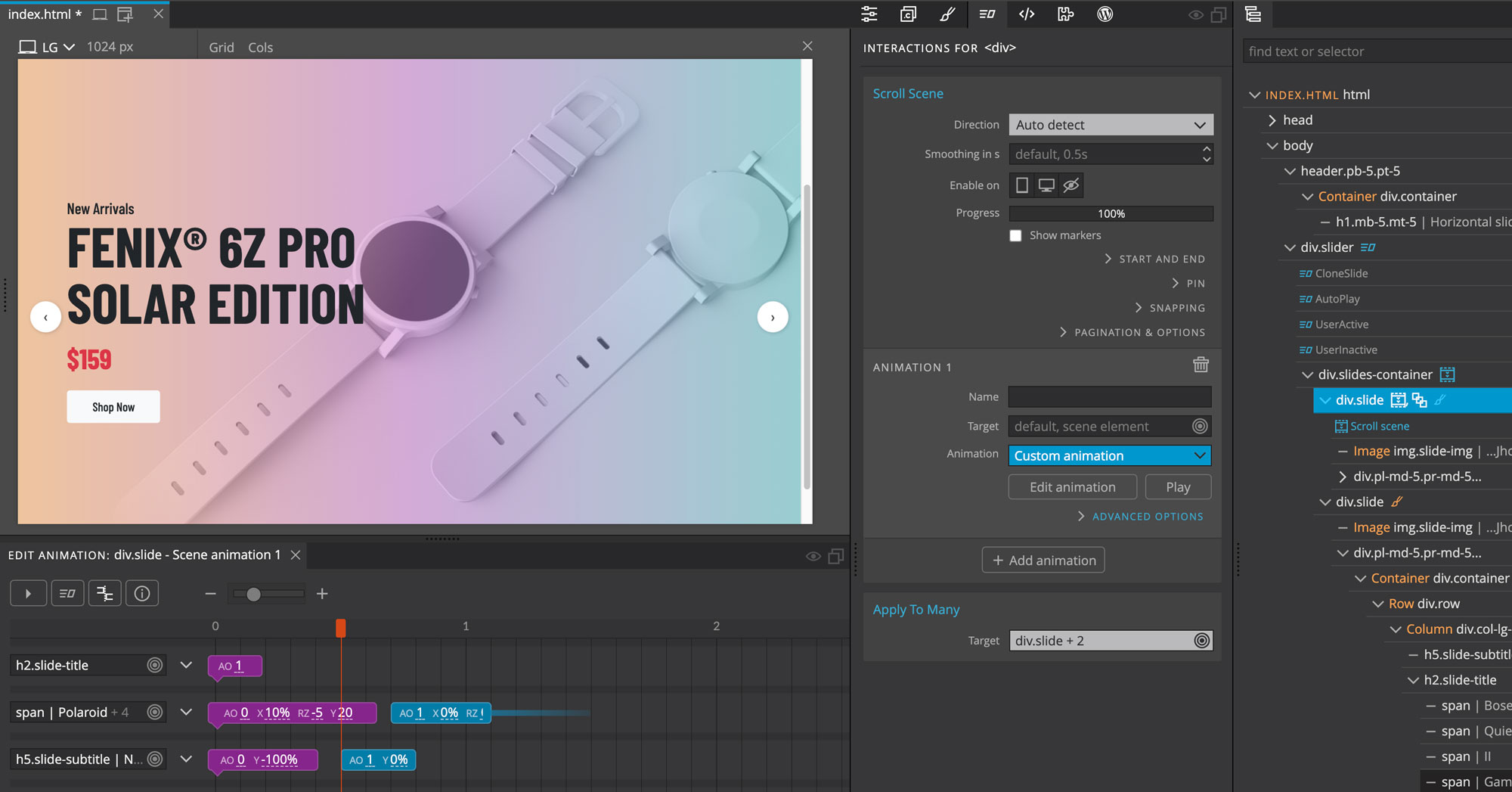
8. Adding interactions to individual slides
We’ve completed building a fully custom slider with Pinegrow Interactions 2.0. But still there is a lot we can do here. For example we are going to add an animation to the slider contents so that on each slide, the contents will have some animation.
We need to apply scroll scene interaction to our slides. Before that let’s create 2 interactions for ShowContent and HideContent that will be used on the scroll scene settings. This will be our fade-in effect for the slider content.
- Go to Tree panel and select first .pgia-slide
- Go to Interaction panel > go to Actions List and click on Interactions, new interaction settings should appear
- For Name enter HideContent
- On Trigger > select No Event, as this will be handled by the scroll scene later
- Leave the Target blank
- Click on Edit Animation
- Go to the Timeline Editor > click on Selector, on the popup select h2.placeholder
- Now click on the blank space of the Timeline editor to create new transition
- For Type keep it as Tween
- On Position enter 0
- For Duration enter 0.1
- Click on Add property > go to Opacity > select Auto Opacity
- For Auto Opacity enter 0
- Now go to the interaction settings again > click on Advanced Options and enable Restart on play
Now let’s create ShowContent interaction.
- Go to Interaction panel > click on Add Interactions, new interaction settings should appear
- For Name enter ShowContent
- On Trigger > select No Event, as this will also be handled by the scroll scene later
- Leave the Target blank
- Click on Edit Animation
- Go to the Timeline Editor > click on Selector, on the popup select h2.placeholder
- Now click on the blank space of the Timeline editor to create new transition
- For Type keep it as Tween
- On Position enter 0.4, to add a little delay for the animation
- For Duration enter 0.6
- Click on Add property > go to Opacity > select Auto Opacity
- For Auto Opacity enter 1
- Now go to the interaction settings again > click on Advanced Options and enable Restart on play
Now let’s apply scroll scene interaction
- Go to Interaction panel > go to Actions List and click on Scroll Scene
- For Direction select Auto Detect
- Click on Start and End, for Start and End select Describe, some new settings will appear below
- For Scene Element’s select Start
- For reaches the select End
This means when element’s strat is at the end of the view
- Now for The select End
- For reaches scroller’s select Start
This means when element’s end is at the start of the view
- Now go below to Animation 1 settings
- First let’s set how the scroll scene will work, click on Advanced Options
- For Play select with scroll
- Now click on Edit Animation above
- Go to the Timeline Editor and create new transition
- For Type keep it as Tween
- On Position enter 0
- On Duration enter 0.5
- Click on Add property > go to Interactions > select Play Animation
- For Play Animation enter HideContent
- Now add new transition to show content
- For Type keep it as Tween
- On Position enter 0.5
- On Duration enter 9
- Click on Add property > go to Interactions > select Play Animation
- For Play Animation enter ShowContent
- Again for the end add new transition same as the first one
- For Type keep it as Tween
- On Position enter 9.5
- On Duration enter 0.5
- Click on Add property > go to Interactions > select Play Animation
- For Play Animation enter HideContent
Now refresh the page and check, content on the first slide should have a fade-in effect and it will re-animate when it appears again. This way you can create advanced animations even if you have multiple elements inside the slide. You can even add different animations for different elements.
Now we need to apply this same animation to other slides as well. For this we can simply add Apply to many interaction.
- Now keep .pgia-slide selected > go to Actions LIst and select Apply to Many
- Apply to Many setting should appear above
- On Target click on Edit Selector
- On the pop filed enter ^.pgia-slider|.pgia-slide, with this we are selecting all the slides within the .pgia-slider
- Now press Ok
Now save and refresh the page, content on each slide should fade in when it comes into the view.
9. Reusing the interaction on multiple sliders
Now we’ve completed building a custom slider and you may be thinking; Do I have to create a slider every time I need it? Of course not! Pinegrow is here to help you. You can reuse these same interactions within the same project but also for a different project.
To reuse the interactions, the layout of the slider has to be the same. You can just copy and paste the same layout or make it into a component, it is that easy
So to reuse the slider in the same project we can simply add Apply to Many wherever the interactions are applied. This is very helpful since we only have to edit interactions on one slider only.
Let’s do this, first duplicate this slider and remove all the interactions from it. On the tree panel select .pgia-slider and press right click on it and select Duplicate. You can also do this by pressing Ctrl + D on Window or Cmd + on Mac from your keyboard.
Now remove all the interactions form all the elements on the second slider. And you should see that the second slider is just the basic layout without the interactions.
So let’s work on the first slider and add Apply to many, on all the elements where interactions are applied.
First select the .pgia-slider block on the tree panel
- Go to Actions list > click on Apply to many
- For Target > click on Edit selector
- On the popup field enter $.pgia-slider and press Ok
Now select the .pgia-slides-container block on the tree panel
- Go to Actions list > click on Apply to many
- For Target > click on Edit selector
- On the popup field enter $.pgia-slides-container and press Ok
Now go to .pgia-slide block on the tree panel, this already have Apply to Many interaction so we just have to edit it
- Go to Interactions panel
- Go to Apply to many settings
- On Target > click on Edit selector
- On the popup field replace with $.pgia-slide and press Ok
Similarly select the .pgia-control block, this also have Apply to Many interaction so let’s just edit it
- Go to Interactions panel
- Go to Apply to many settings
- On Target > click on Edit selector
- On the popup field replace with $.pgia-control and press Ok
Now for the .pgia-pagination-item select it on the on the tree panel
- Go to Actions list > click on Apply to many
- For Target > click on Edit selector
- On the popup field enter $.pgia-pagination-item and press Ok
Now we’ve applied Apply to Many to all the blocks with interactions. The $ sign in front of a class name means this will target any elements on the page with that class name.
Now save the project and refresh the page. The second slider will function just like the first one, click on control links and pagination items and it will work. This way you can have as many sliders as you need.
10. Generating reusable Javascript code & Conclusion
Pinegrow provides another very efficient way to reuse your custom built slider. There is an option to export the interactions that has been applied to the slider. And you can use the same interactions for other projects just by importing the exported JS code. You do need to duplicate the layout for it to work in the same way, but this will eliminate the process to add interactions on all the elements.
- To export these interactions, first select one of the elements which has at least one interaction applied
- Go to Interactions panel
- Go to Actions list
- On the top beside the search box there is a wrench icon, click on it
- And click on Generate script
On the popup enter a file name for the file that will be exported but at the end of the filename add .js. As exported code is javaScript code this will help when using in another project. I’m naming my file myslider.js
If you want to export to a different location you can click on the folder icon and select where you want to export the code. If not this will be exported to the same project folder.
- Now click on Generate Interactions Script
Now your interactions script should be exported and it should also appear on the Project panel. You should see the file myslider.js, let’s check the code. Click on the and it should open in the code editor.
You do not need to understand the code, but to reuse this, you can just copy and paste this code inside your JS file. If not you can directly link your myslider.js in your HTML, like any other JS file.
This slider runs on Pinegrow Interactions, so the pgia.js file should be included before your custom JS code.
So let’s try this. For this example I’m going to create a new HTML page inside this same project.
To create a new page
- Go to the top menu > click on File > click on New page
- You should get the same popup when you create a new project
- We just need a basic html page so click on Plain HTML and select index.html
- On the next popup enter the name for the file, here I’m going to enter newpage.html
- Now press Ok
Now this new page will open automatically, you can see this file on the project panel. Next we’ve to copy the layout and CSS. Since we have created this new HTML file following the process, style.css is already included in the code.
Press Ctrl + E or Cmd + E on Mac and you can view the code on the code editor. There you should find style.css included at the end of the Head tag. When you are done, press Ctrl + E or Cmd + E on Mac again to close the code editor.
Now let’s go to index.html and copy the layout.
- From the Project panel click on the index.html, page should open in the viewer
- Now go to the tree panel and select the second slider block, you can press Ctrl + C or Cmd + C on Mac
Now we need to paste into the new page, go to the project panel and click on newpage.html and it should appear
- Go to the tree panel and click on body tag
- And you can simply press Ctrl + V or Cmd + V on mac
Now our layout should appear and CSS should be already applied to it.
Now instead of applying interactions again let’s use our generated JS script. And before including our JS script we need to first include Pinegrow interactions file, and that can be done by just activating Interactions for this page.
So let’s go to the interactions panel and click on the Activate Interactions button. Let’s check the code by pressing Ctrl + E or Cmd + E on Mac and go to the bottom of the page and you should see pgia.js file included at the end of the code.
As pgia.js file is included, now we can include our script. Since we already have saved it as a JS file, we can include it similar to other JS files.
On the code editor, just below where the pgia.js file is included, type <script src=”myslider.js”></script>
And as soon as you finish typing, your slider should start sliding and you will know that it works. And do save the project when you are done.
Conclusion
This concludes our tutorial for creating Slider with Pinegrow Interactions 2.0.
In this tutorial:
- We created a powerful slider based on our custom HTML layout and styling.
- We also learned how to reuse this interaction to power all slider instances in our project.
- And we did all of this without writing any Javascript code.
There is a lot more customization that we can work on. And we can use this as the base for our customized sliders. I’d like to show another custom slider that we’ve done. This uses the same layout but some CSS is customized and there is additional content inside the slides. Almost all interactions are the same except the interactions for the slide contents.
So this is how you can create your own custom slider with the new updated Pinegrow Interactions. Pinegrow Interactions 2.0 brings a lot more amazing updates, do not forget to check our other videos and our website.
One new feature is that we’ve prepared a pre-built library of most useful interactions, we call it Interactions Blueprints. Blueprints have components like sliders, galleries and tooltips. So now you don’t have to create components from scratch. Instead you just use a blueprint and customize it according to your needs.
You can access Interactions Blueprints by going to the library panel and clicking on the Interactions tab. Here you can find all different types of blueprints and most of them have multiple components of different types.
Now let’s check the slider blueprints, to do that click on the Sliders.
Currently, you should find 3 types of sliders
- Horizontal with 1 slide per page
- Horizontal with 4 slides per page and
- A Vertical slider
To use one of the sliders just click and drag it inside the page where you need it. This way you can insert a slider in any page in no time. Do remember Blueprints are prepared with their own CSS styles and the CSS files are placed inside the PGIA folder.
That is it for this tutorial, I hope the video was helpful.
Also do check the finished project, you can reuse the code or customize it as you need.
If you’ve any questions please feel free to contact us via email or through the Pinegrow forum.
We will be coming up with more videos related to Pinegrow Interactions and How to videos for creating more interactive animations. So keep watching and following.
Thank you for your time and we will see you in the next video.