Creating a reusable navigation component in multi-page projects
A step by step guide to defining and using reusable navigation with Pinegrow Components.
Keeping common page elements like navigation menus and footers organized and up-to-date with changes in a multi-page HTML project can be a challenge. Luckily, the Pinegrow Web Editor provides a solution in the form of Components. In this tutorial I’ll introduce them and outline some reasons you would want to use Components in your next project.
Let’s get started!
Download the project
Download the project used in this tutorial and follow along. Unzip the archive and open the folder in Pinegrow Web Editor with Open project.
Watch the video
Prefer to read? Scroll past the video.
This tutorial is available in video and textual form. Watch the video, or continue reading if you prefer. Of course, you can also do both!
Making a code block into an editable component
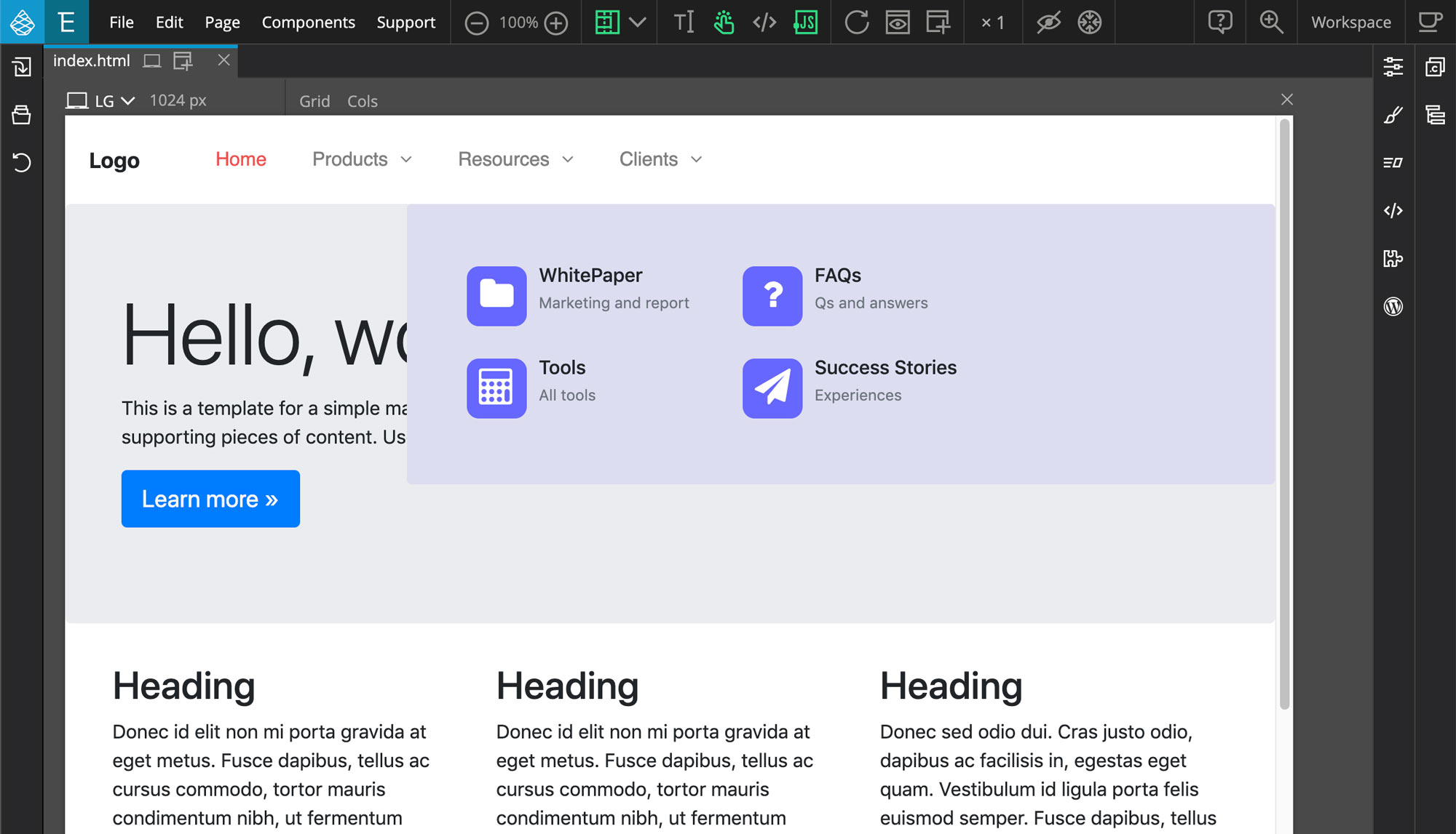
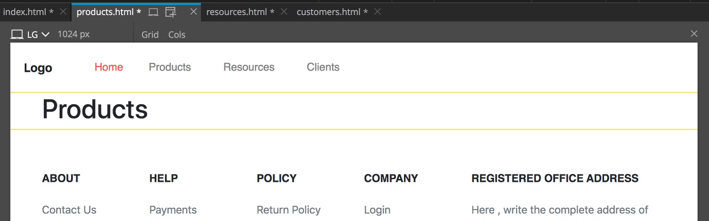
For this tutorial, I have already opened a Bootstrap 4 Project and added both a fairly complex Navbar and footer from BBBootstrap.com. The three top menu items are dropdowns with multiple links, each with an icon.
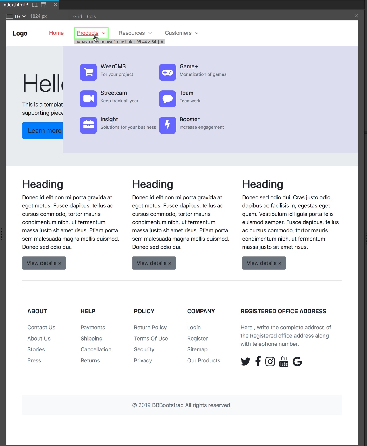
The top menu items receive a class of `active` that adds styling when we navigate to that specific page. Currently we are on the base `index.html` page that we are using for the home page, so the ‘Home’ link is styled red.
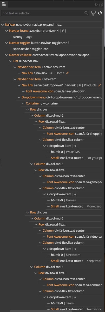
If we examine the Tree panel for this code we can see how extensive it is. We can only see a small portion of the header code without scrolling. Looking through the code in an external editor we can see that it is about 160 lines long!
While the footer isn’t as complex, it is still about 100 lines long. Now we would like to use this same navigation menu and footer on multiple pages within our project. We could copy and paste the code to the ‘Products’, ‘Resources’, and ‘Customer’ pages. However, this is tedious and error prone. Alternatively, we could select either element in the tree or on the page, right-click for a context menu, and then select “Add as HTML snippet”. That snippet would be added to our Library panel and can be dragged to each subsequent page. However, Pinegrow provides a third powerful way to add reusable and very importantly, selectively editable and up-datable code to our pages – Components.
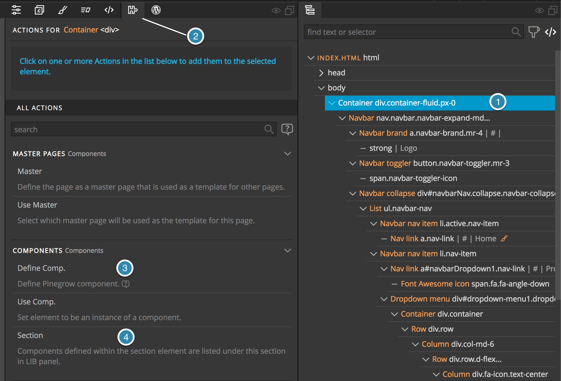
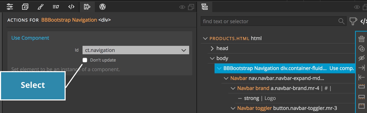
To make our new menu into a Component, start by selecting it in the Page View or the Tree panel. Here, I have selected the topmost container that holds the Navbar component. Then open the Actions panel. Next, click on “Define Comp.”.
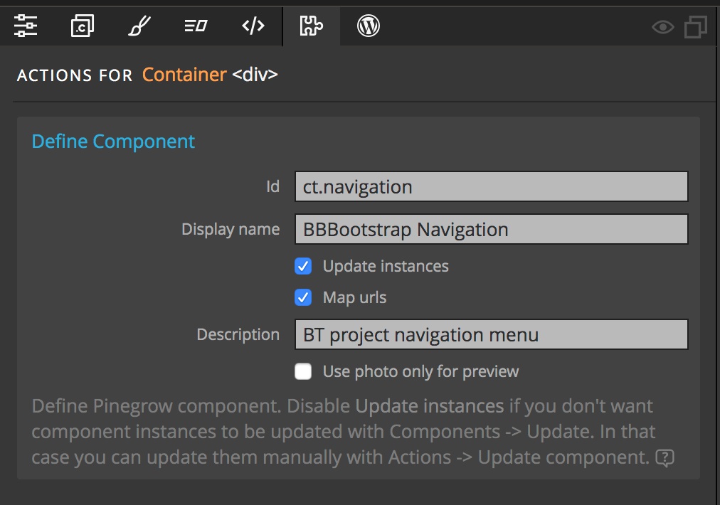
A new section will appear at the top of the Actions panel. Add a descriptive Id into the top box – it must be unique. Best practice is to add a prefix that is unique to this project, in this case I will use “ct” for Components tutorial, so “ct.navigation”. We should also add a Display name – I’ll use “BBBootstrap Navigation”. Optionally, you can add a description – this is used to keep track of your Components if you load them into other projects, for example. Note the other three checkboxes. We will touch on these briefly further into the tutorial.
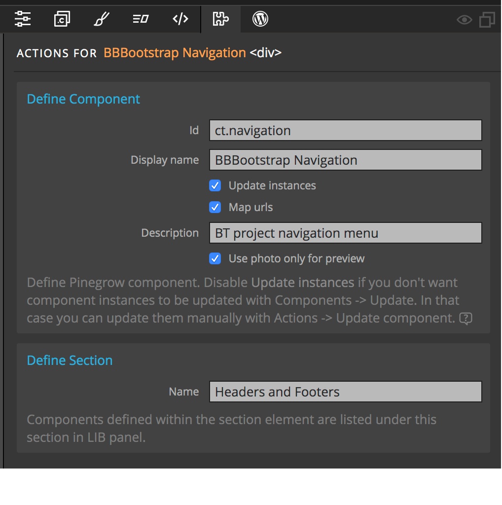
Optionally, you can also add a section name for where your new Component will be displayed within the library. To do this keep the menu selected and then click on the “Section” action. You can then give a name for that section, for example, since we are going to also going to add our footer as a component, “Headers and Footers”. You can add multiple components to the same section.
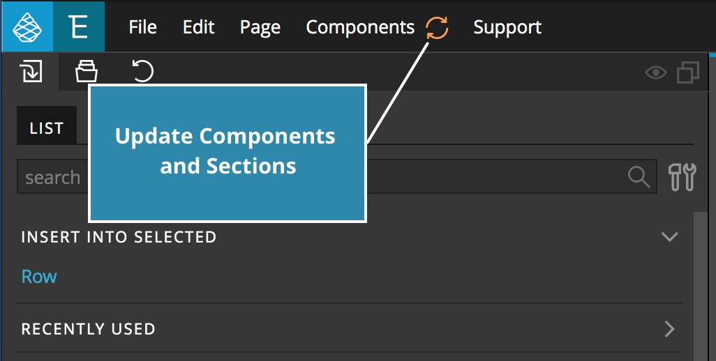
In order to begin to use our new Component and make it show up in the Library panel, we need to refresh the project by clicking on the orange arrows in the top bar next to the Components menu. This can also be accomplished by clicking `CTRL+ U` or `CMD + U` depending on your OS.
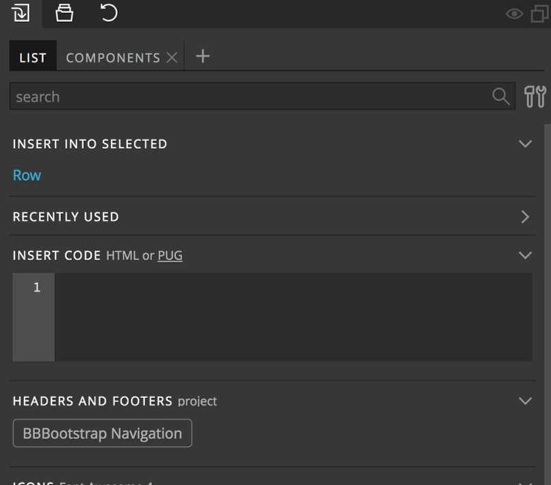
Now if you look in your Library panel you will find your new custom section and component!
Let’s go ahead and add the footer to our Components. Just like with the Navigation, we select the footer container, either from the Preview page, or in the Tree panel. Then from the Actions panel select “Define Comp.” Within the “Define Component” pop-up give the Component a unique ID – I’ll use `ct.footer`. I will also give it a display name of `BBBootstrap Footer`. To get it to show up in the same section as our navigation component, we need to also add a section.
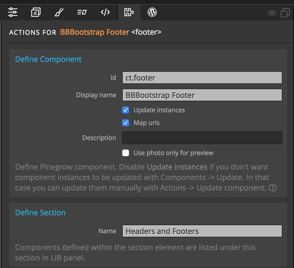
With the footer still selected, click on “Section” from the Actions panel. For section name use `Headers and Footers` like we did for the navigation. Click on the orange arrows and you should see the footer added to the Library panel.
Using Components on additional pages
Okay, now that we have our navigation and footer components set up, let’s put together the rest of the project pages. Based on the navigation there should be three additional pages, ‘Products’, ‘Resources’, and ‘Customers’.
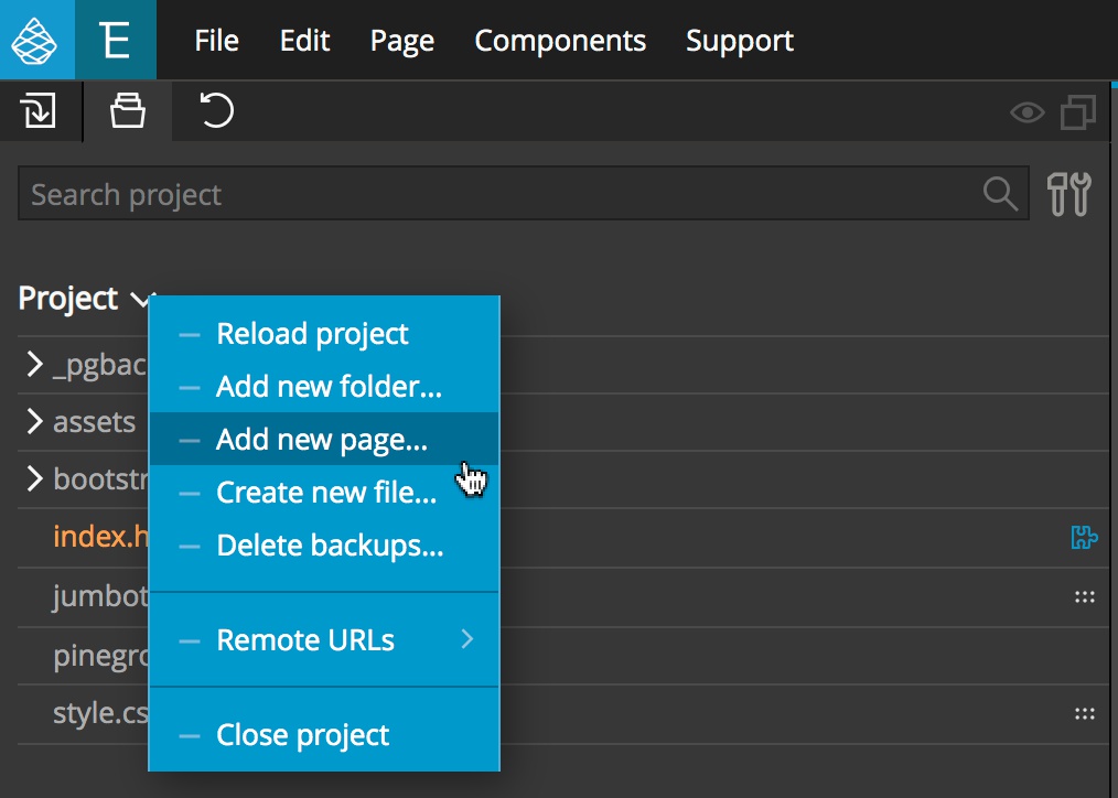
We will create three quick pages by navigating to the Project panel and clicking on the caret next to the project name and clicking on ‘Add new page…’. I’m using the blank ‘index.html’ template to create each of them.
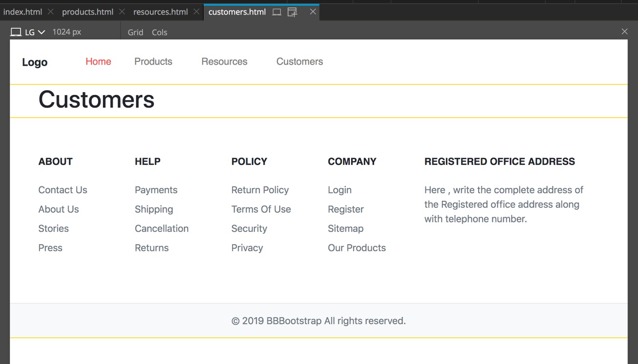
Adding our navigation and footer to each page is simple. Just open the Library panel and drag each of our components to the appropriate places on the screen.
Simple and quick!!
Why Components?
Okay, I can hear you saying, this is a lot of work for something I could do with a cut and paste, what are the advantages?
- Components throughout a whole project can be updated in one place.
- Components are locked from accidental editing preserving the look of our design.
- Components can be loaded and used in multiple projects.
Let’s briefly look at each of these advantages.
Easy Updates
The first advantage will let us make sure that all the pages in our project remain synchronized. For example, if a client decides that they prefer ‘Clients’ rather than ‘Customers’ we don’t have to sort through multiple pages to make changes.
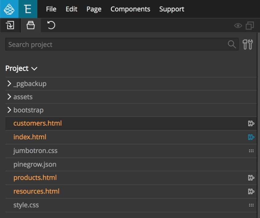
If we look at the Project panel we can easily pick-out which pages have Components. The index.html page is where our Component was first defined, so it gets a blue puzzle-piece icon next to its name. Each of the other three pages in the project get white puzzle-piece icons indicating that they are utilizing Components. So, we could just click on the index.html page and then find the original Component. However, Pinegrow provides a much simpler way. From the Library panel you can simply right-click the Component and then select “Go to definition…”. Pinegrow will then switch to the page with the original definition and select the element.
Once Pingrow switches to the Component definition, we can simply edit it – in this case swapping ‘Clients’ for ‘Customers’ in the Navigation section. Once that is done we need to click on the orange arrows next to the Components menu item to update all the instances of the component within our project.
Along the same lines of keeping everything in-sync throughout multiple project pages, the ‘Map urls’ checkbox pointed out earlier in the ‘Component Definition’ settings will make sure that even if the page we add our Component to is in a different directory than our original page the URL will point to the correct file. You can see this control by switching to the Actions panel.
Checking one of the pages, we can see that the update took place. If we had elected to either cut-and-paste or use HTML snippets to accomplish this it would have taken a significant amount more of work.
Component Locking
If you were to try and change a footer item on the ‘products.html’ page you would get an error and telling you that you must edit this element in the component definition. This might seem like a liability, but it allows us to make sure that if we have a complex design we don’t accidentally make a change that alters the layout. No worries, Pinegrow gives us a couple of options for being able to make non-breaking edits in Components!
Using our menu as an example, on each page we will want the correct menu link to be highlighted by adding a class of “active” and the same class removed from the “Home” link that was originally active. Because the component is locked, we can’t add or remove classes from the elements. To accomplish this we need to make our individual menu items editable.
This can be accomplished in a few ways. First, we could uncheck the box to the left of ‘Update instances’ when defining our original Component. This will disable updating of this Component on any page it is added to. Occasionally this functionality is needed, but it largely obviates the advantages of using Components!
Another way is to disable updating of Components on selected pages. This can be accomplished by selecting the component and then from the Actions panel selecting ‘Don’t update’.
However, Pinegrow also makes available a number of additional Actions to be used with Components. One of the major ones is ‘Editable’, which allows you to designate certain areas as modifiable in the child Components. Note- there are also the ‘Repeat’ and ‘Optional’ actions that we won’t cover in this tutorial.
Editing Components
In our menu example when we go to each of the pages we will want the correct menu link to be highlighted. This is accomplished by adding a class of “active” to the correct menu item and removing the same class from the “Home” link that was originally active. Because the component is locked, we can’t add or remove classes from the elements. Editable to the rescue!
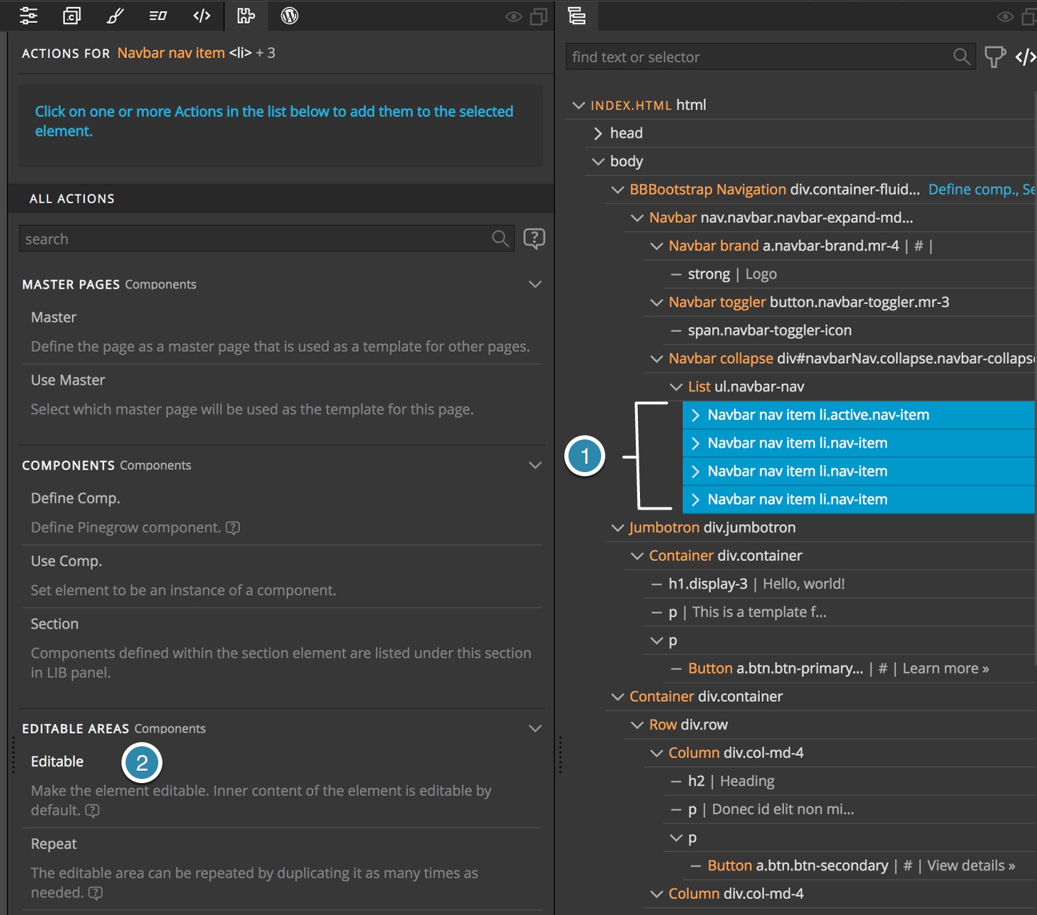
To make our navigation Component items editable once again open the index.html page, or use the context menu to go to the Component definition. Now select each of the ‘Navbar nav items from the Tree panel or Page View – remember that multiple items at the same level in the Tree hierarchy can be select by holding the SHIFT key and clicking on the first and last items. Next, open the Actions panel and click on ‘Editable’.
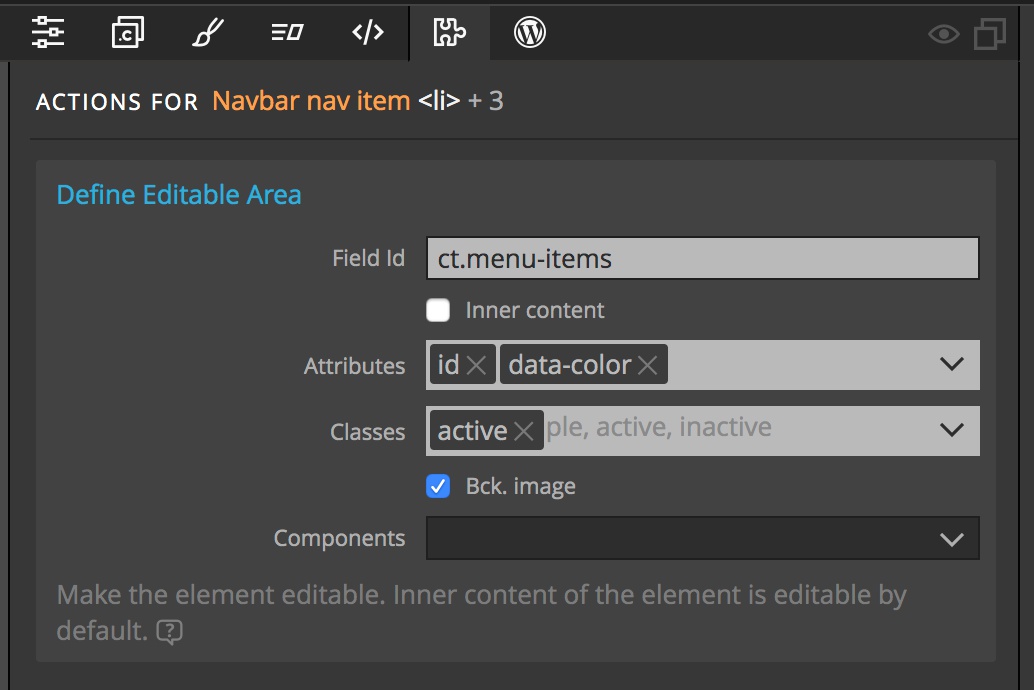
From the ‘Define Editable Area’ give the items a unique id – I’ll use `ct.menu-items`. Click off the ‘Inner content’ checkbox. Leaving this on would mean we could edit individual menu items within each dropdown.
We now have three additional basic choices and one advanced choice. Our focus here is to make the ‘class’ attribute of the elements editable, but we will also look at the other options available to us. First, if we wanted to change an attribute other than class on the item we would add the attribute name into the input box next to ‘Attributes’. Note, we could add multiple attributes like `id`, or `data-color`. Simply add the first attribute, hit return, and then add the next.
If we wanted to be able to add or remove a class – which is the case in our example – we would type the class name we wanted to change into the input box. In this case we want to add or remove the ‘active’ class. We can add or remove multiple classes, just like with attributes, by entering each name followed by a return or comma.
Finally, we can elect to be able to change the background image by clicking on the ‘Bck. image’ checkbox.
The final field in this settings area is the ‘Components’ input box. This allows us to create nested Components where the Components inside the outer container are limited to only those we select. You can read more about this in the documentation.
Now let’s see what impact our choices have made when we go to edit our Component on the other pages.
First, click on the orange arrows in the menu bar to update our project and then open one of the other three pages, for example the ‘products.html’ page.
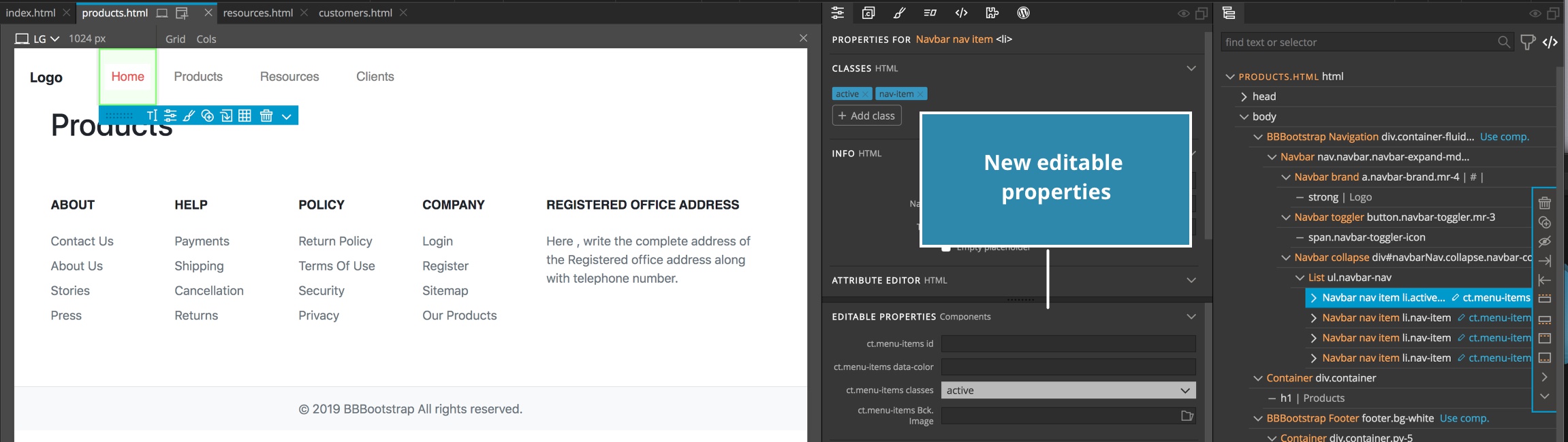
If we select the ‘Home’ menu item and then open the Properties panel we will see a new section. Within that section there are four setting boxes. The top one will allow us to add/change the id of the menu item. The next down let’s us add a ‘data-color’ attribute, and the fourth would let us select a file to use as a background image. The third field is the one most important to this example. This allows us to toggle the `active` class on and off. In this case we will use the pulldown to select the empty space above active, which will remove the class. If we had put multiple class names there would have been an ‘X’ next to the `active` class to remove it.
To add the active class to the ‘Products’ menu item, select it on the Page View or Tree panel and then select the class name in the Properties panel.
As we can see, the ‘Home’ link is grey and the ‘Products’ link is now red indicating it is the active page. We can quickly perform the same steps on our other two project pages to indicate the active link.
Other Advantages
We don’t have time in this tutorial to cover one other advantage of Components. Unlike HTML snippets, you can bring Components into multiple projects, along with supporting JavaScript, images, and stylesheets. Additionally, you can use Components to convert existing content to match your component. This is really useful when converting an existing page to a new design. We will dedicate a later tutorial to different tools that Pinegrow provides for re-working existing content.
This tutorial has just scratched the surface of the uses for Components in Pinegrow. Components also open the door for using Pinegrow as a content management system (CMS) similar to Drupal or WordPress. I hope this tutorial has helped you to get the most out of Pinegrow!
Discuss this tutorial
Have questions or comments about this tutorial? Let’s talk about it on our forum.
Get in touch
Would you like to see your favorite theme or blocks library featured in the next tutorial? Let us know in the forum or by email!