How to create a language dropdown with flags in Bootstrap 4
A step-by-step guide to creating a Bootstrap 4 navigation bar with drop down menu for language selection.
Bootstrap is a great framework that lets you put complex pages together quickly. Over the years it has evolved and added in a number of features. Currently Bootstrap 4 has about 1500 classes! The Pinegrow web editor has a number of custom controls that allow you to better harness the power of Bootstrap.
Even with these great tools, understanding how various elements are put together in Bootstrap can still be a little daunting. In this tutorial, I’m going to provide a simple step-by-step guide to putting together a navbar with dropdown menu for language selection.
Let’s get started!
Download
Download the project files for language navigation dropdown with language flags for Bootstrap 4 to play along the tutorial and use it as a code snippet library for your projects.
Prefer to read? Scroll past the video.
This tutorial is available in video and textual form. Watch the video, or continue reading if you prefer to read. Of course, you can also do both!
Watch the tutorial
Starting a new Bootstrap project
For this project I’m going to start with a blank Bootstrap 4 page and save it as a project.
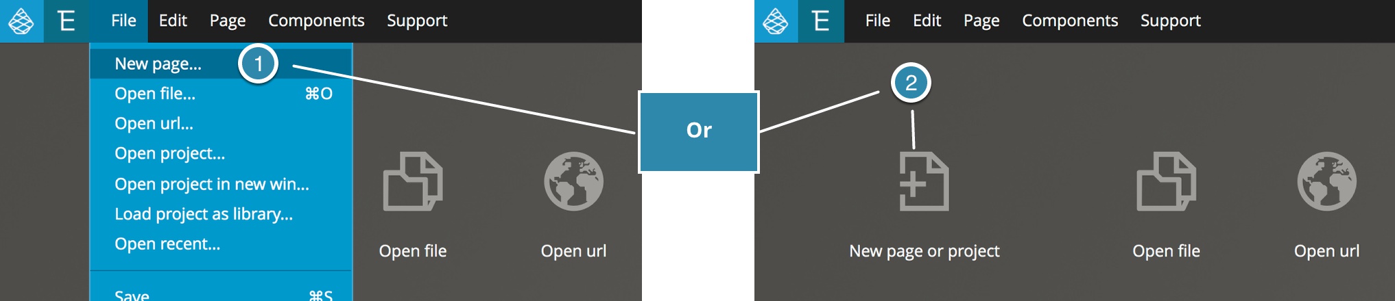
- From the Pinegrow start page select either the “New page or project icon”, or select “New page…” from the File menu.
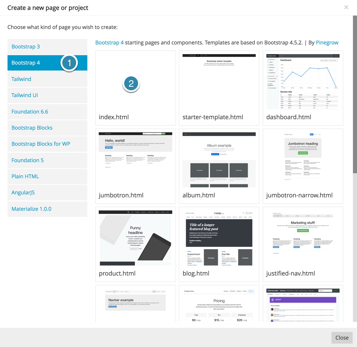
- In the resulting modal select the Bootstrap 4 framework and then the index.html template.
- Next, save the page into a new folder – I’m going to keep the file name as “index.html”, but you can choose any name you would like.
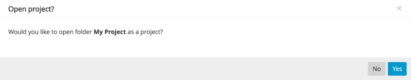
- Once you save the file Pinegrow will display a modal asking if you want to open the new folder as a project – click “Yes”.
Adding the navbar
Now that we have our project saved we can add a navbar to our page in two different ways using the Pinegrow built-in library. Either using the Components tab or the List tab. In this case we will use the List tab, which includes a Bootstrap navbar with all of the features, including a dropdown menu.
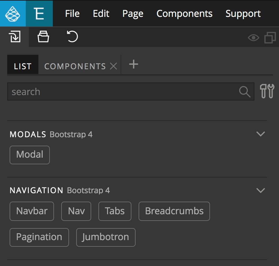
- Open the Library panel and select the List tab.
- Scroll down to the Navigation section.
- Drag the navbar element to the Page View or Tree panel.
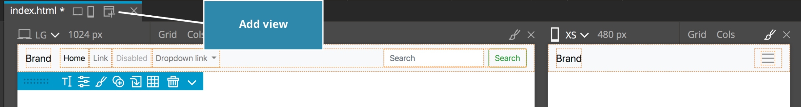
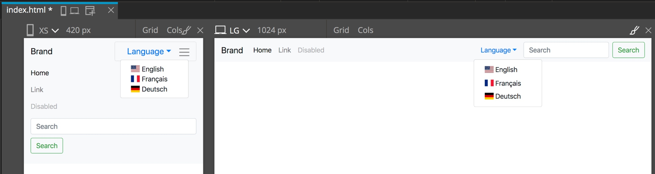
If we open an additional Page View by clicking on the window-plus icon in the Page View tab we can see how our navbar would look in both desktop and mobile view.
Formating the dropdown
Now, let’s format the dropdown item to make it into a trigger for changing the page language. It would look great with some flag icons!
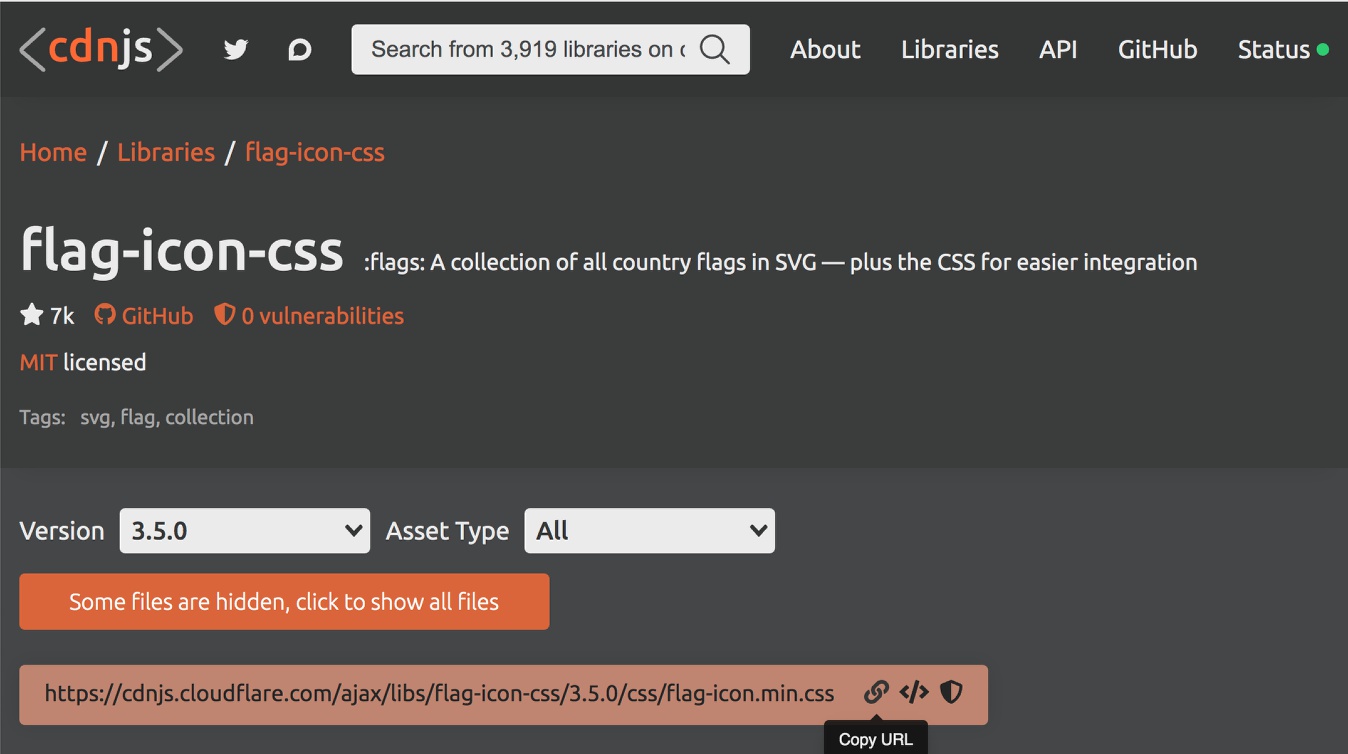
Github has a great asset for this in the form of a project called “flag-icon-css” started by an author named “lipis” but containing contributions by a number of authors. This repo also happens to be hosted by a number of content delivery networks (CDN), making adding it to our page fairly easy.
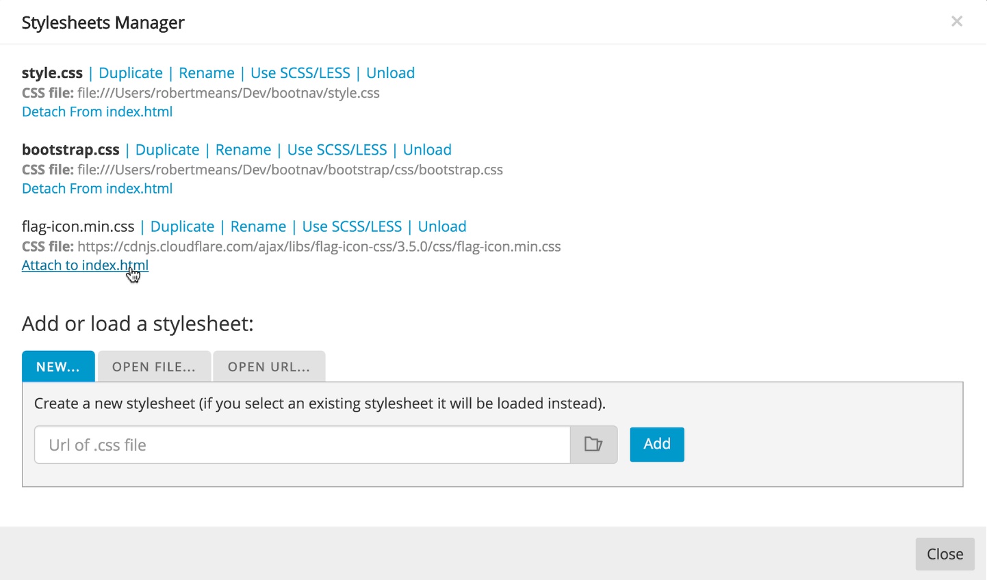
- Navigate to the CDN for this repo and copy the link.
- Since this particular resource is a stylesheet, in Pinegrow open the file menu and select “Manage stylesheets”.
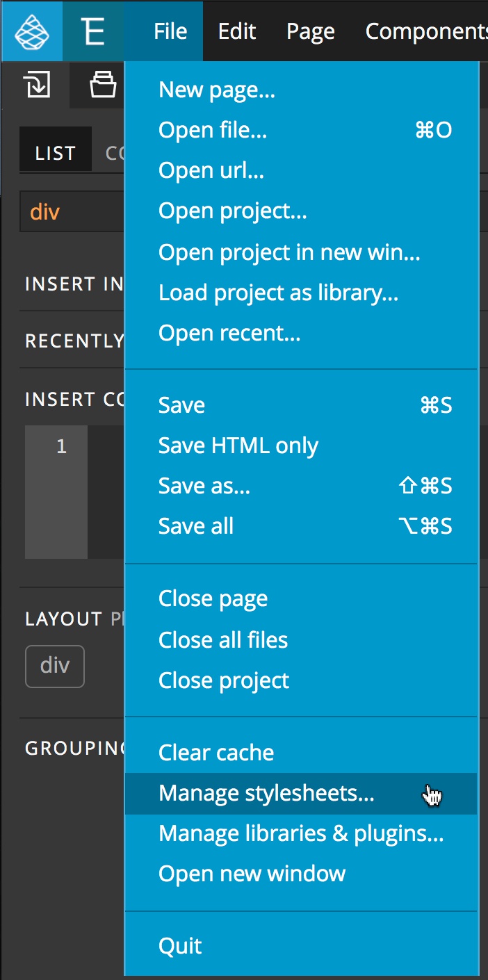
- From the pop-up click on the “OPEN URL…” tab and paste in the copied url, then click the “Add” button.

- After clicking the add button you will get a notification – click “OK”. Next, click on the “Attach to index.html” link below the “flag-icon-css” stylesheet.
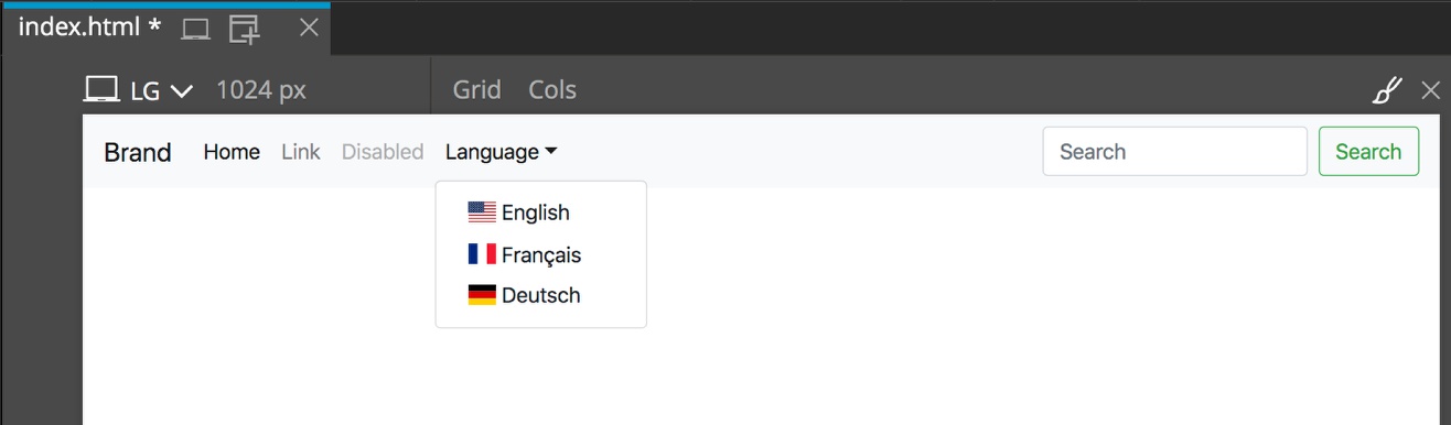
Now that we have our flags to use we can change up the styling of our menu. The flags in this library are added using two classes – flag-icon and flag-icon-xx, (where xx is the ISO 3166-1-alpha-2 code of a country).
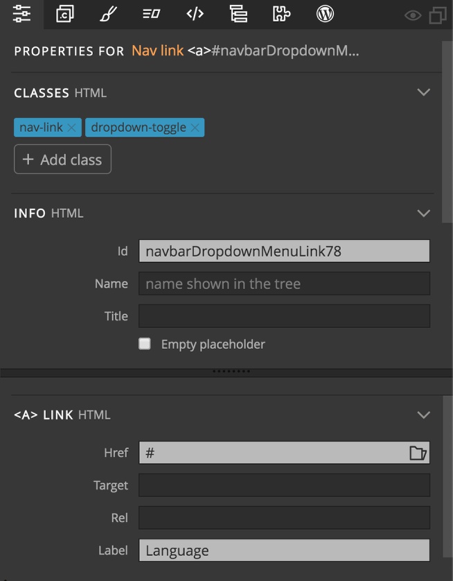
- Select the dropdown link in the Tree panel.
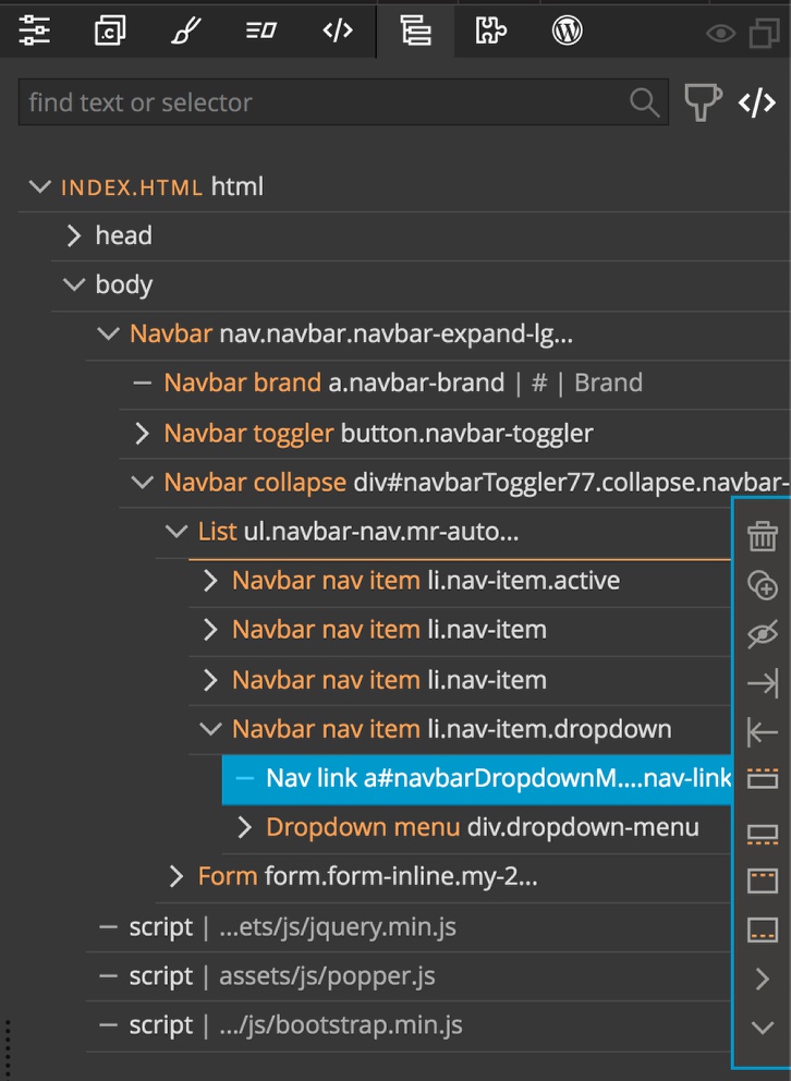
- Open the Properties panel and change the label of the
<A> LINKto Language.
- Return to the Tree panel and select the first Dropdown item from the Dropdown menu
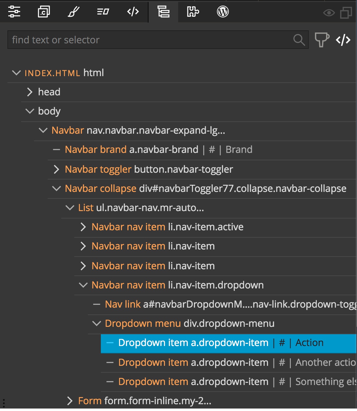
- Next, open the Properties panel and replace the label with :
<span class="flag-icon flag-icon-us"></span> Englishto add a United states flag and label.
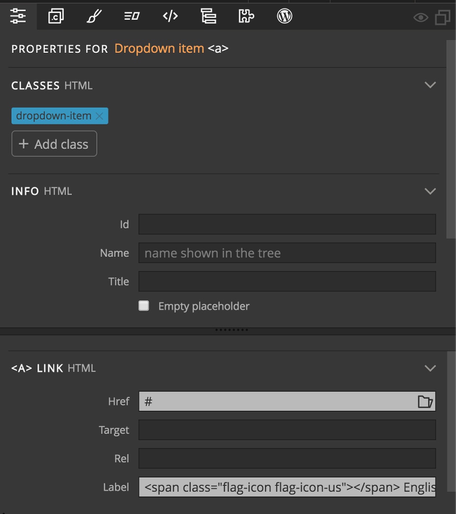
- While we are in the Properties panel, we can also change the link (Href) to point to the current page, which is our English language home page,
index.html. - Now, let’s replace the labels of the other two dropdown items in the same manner. With the second dropdown item selected, open the Properties panel and add
<span class="flag-icon flag-icon-fr"></span> Français, plus change the Href tofr/index.html, for example, to load in our french home page. - Finally select the third dropdown item and change the label to
<span class="flag-icon flag-icon-de"></span> Deutschand the Href tode/index.html.
Altering the desktop and mobile views
At this point we could leave the styling as it looks. However, if we want to use the existing dropdown as a language selector it would probably be better set off to the right side of the page and still available in mobile view.
Let’s take a look at the code and cover how Bootstrap handles navbar collapse in mobile view.
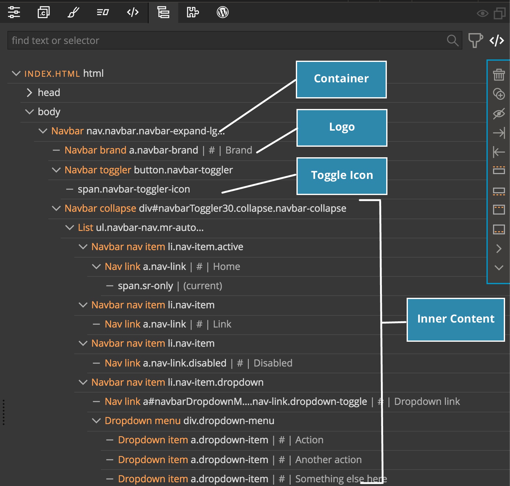
Looking at the Organization in the Tree panel, we can see that the entire navbar content is wrapped within an outer nav container with a class of .navbar.
Just inside the container is our navbar brand section – this is a link where our logo should be placed.
This is followed by the navbar toggler button. Inside of this is is the hamburger menu that appears in mobile view and toggles the visibility of the menu.
Finally, all of the menu items that disappear and appear on toggle when in mobile view are contained within a navbar collapse div. This div has two important classes and an id. The two classes, collapse and navbar-collapse give the navbar the correct visibility based on screen-size. The id, navbarToggler30 is used for targeting the menu by the toggler.
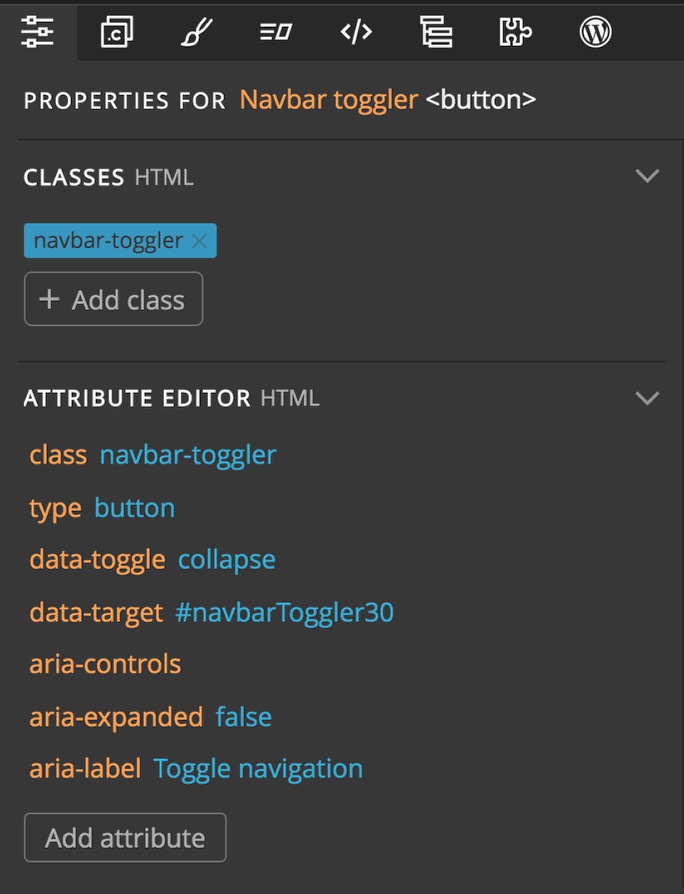
If we select the toggler button element and then examine the properties we can see that the “data-target” attribute is set to this id (note – the id is preceded by a hash ‘#’ to indicate it is an id).
So, basically anything within the navbar collapse container will be hidden in mobile view until the hamburger is clicked. Since we want the dropdown visible in mobile, we have to move it outside of this container.
Moving the dropdown
At the end, I want the dropdown at the right side on the navbar before the search element on the desktop, or just before the toggle in mobile, so we are going to have to rearrange the order of our elements and alter the visibility on mobile.
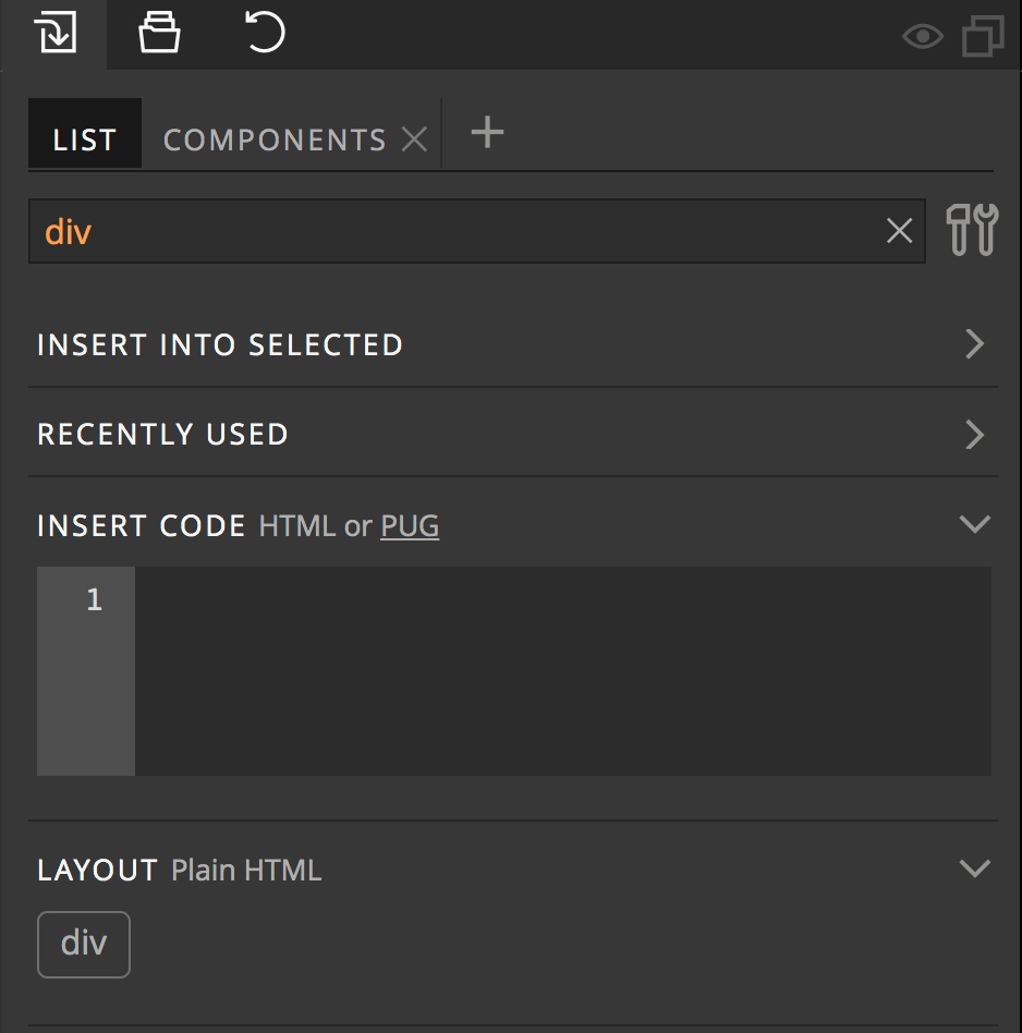
- Add a “div” element to The navbar before the Form element by typing “div” into the Library panel search box and then dragging the element to the Tree panel. Make sure that it has the same indentation as the form element.
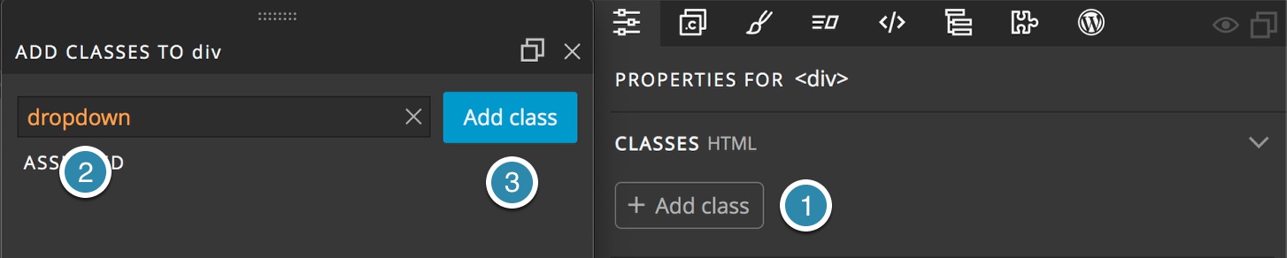
- Next, with the div still selected open the Style panel, click the “+ Add class” button, type
dropdownin the input box and click “Add class”.
- Next, in the Tree panel, select the Nav link and Dropdown menu items. This can be accomplished by holding the shift key while selecting them.
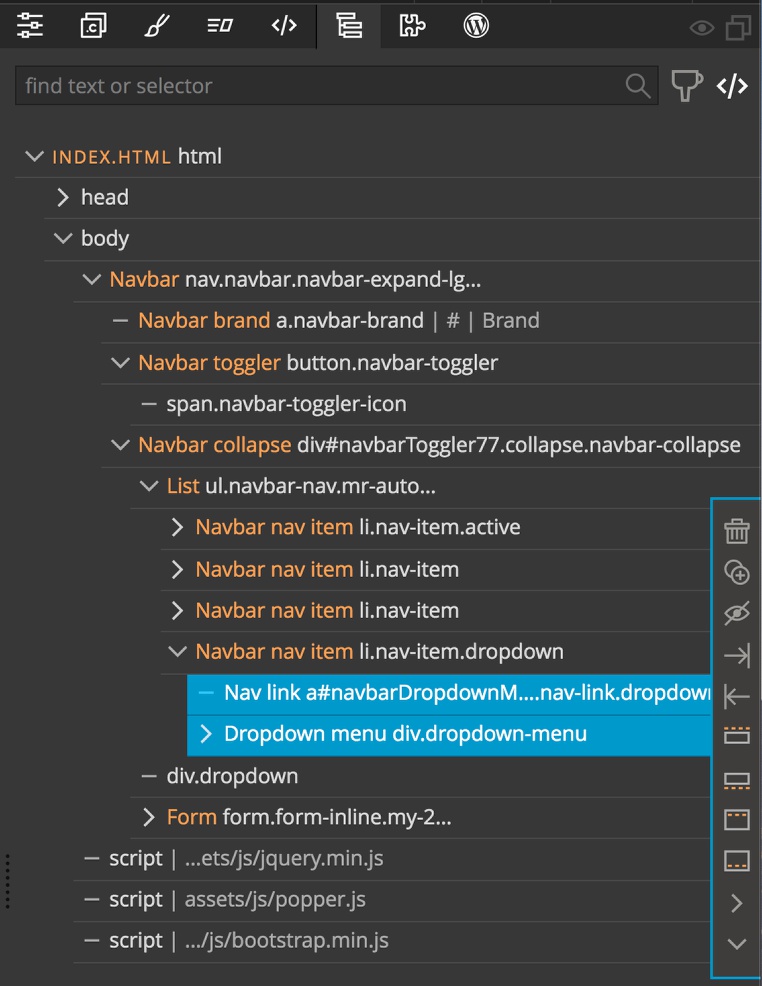
- Drag the selected items into your newly created div. This will place the link after the form item in the navbar.
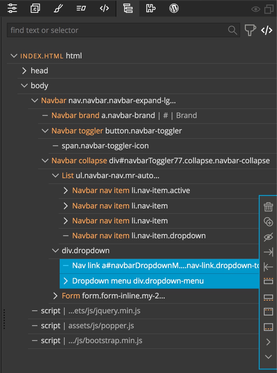
- Lastly, delete the navbar nav item that previously contained the dropdown menu.
Now we have our dropdown positioned correctly for the desktop view. How do we get it displayed for mobile?
Adding the mobile dropdown
- Select your newly added div in the Tree view and then click on the duplicate icon from the small menu on the right side of the panel
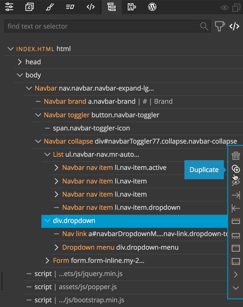
- Drag the newly created item inside the navbar toggler, but before the span element.
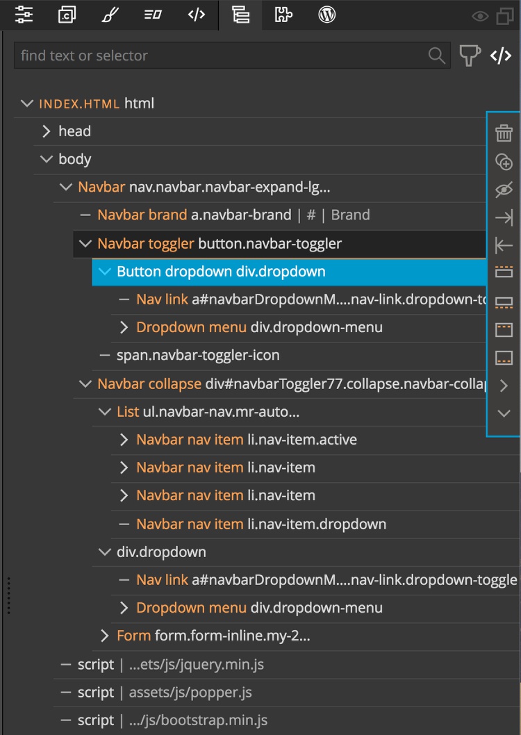
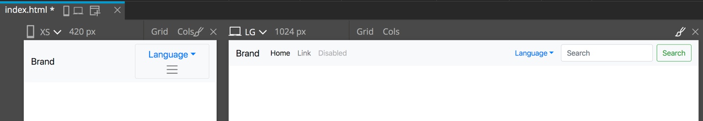
- If you look at a the page with mobile view triggered, you can see that the dropdown isn’t quite in position. It needs to be positioned in front of the toggle, not on top of it.
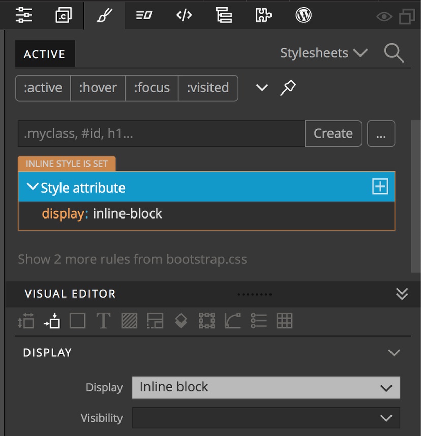
- With the dropdown button within the navbar toggler selected, open the style panel. We will add an inline style, rather than adding to our stylesheet. Within the Visual Editor, scroll down to the Display section and from the Display dropdown select “inline-block”.
Hiding the desktop dropdown on mobile
While that puts our dropdown in the correct position now, if we click on the toggle to open it we will see that we have a duplicate language dropdown at the bottom. Let’s hide that by adding some Bootstrap classes.
- Select the dropdown button that is before the form element in the navbar collapse container.
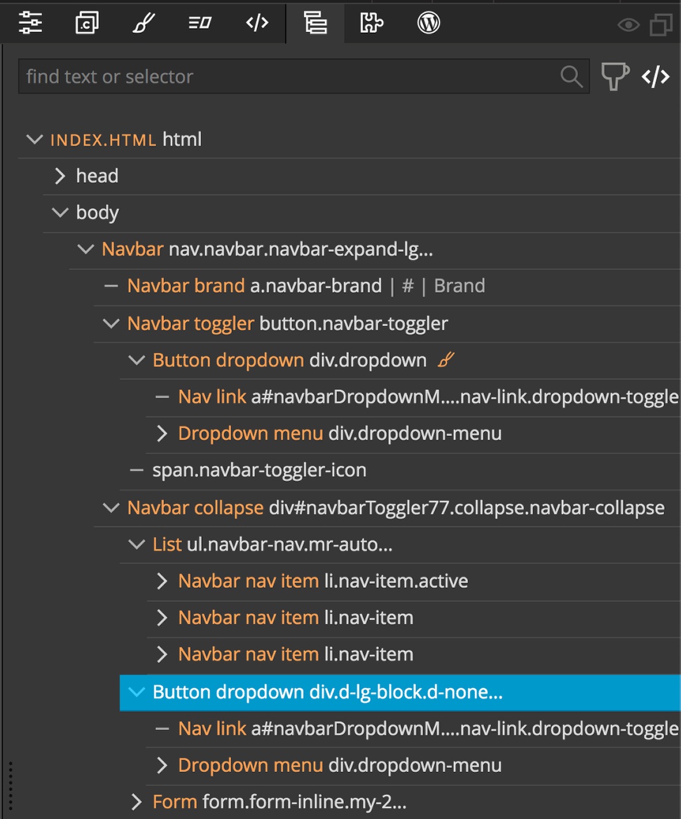
- Open the Properties panel, click on the “+ Add class” button, add the “d-none” and “d-lg-block” classes to the input box and then click the “Add class” button.

If we take a look now we can see that our language menu is just where we want it and only shows up once in the mobile view.
Final thoughts
While getting the styling exactly how we wanted it took some rearranging, I hope you can appreciate how easy it was to put together a dropdown menu in Bootstrap using Pinegrow. While this tutorial specifically put together a navbar dropdown menu to change the site language, you could use these same steps to change the theme of your site. Additionally, we elected to redirect users to different pages for each language. Instead, we could have used JavaScript to change the visibility of alternate language sections, or to toggle different color sets. This was a little beyond the scope of this tutorial, but we can discuss it further in the Pinegrow forum!
I hope this tutorial will help someone in putting together a great looking dropdown using the Pinegrow web editor. Until next time, have fun designing with Pinegrow.
Discuss this tutorial
Have questions or comments about this tutorial? Let’s talk about it on our forum.
Get in touch
Would you like to see your favorite theme or blocks library featured in the next tutorial? Let us know in the forum or by email!