NEW: Bootstrap Blocks
Use the new Bootstrap Blocks library and a simple three step process to easily create uniquely designed websites.
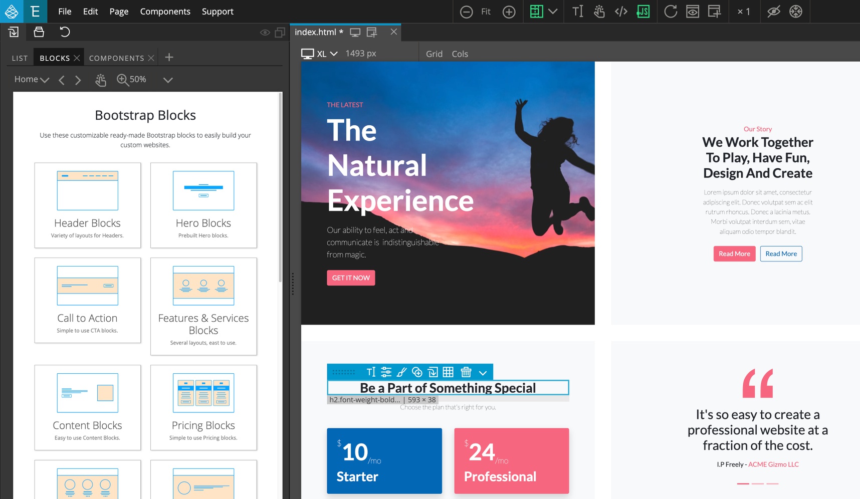
Updates
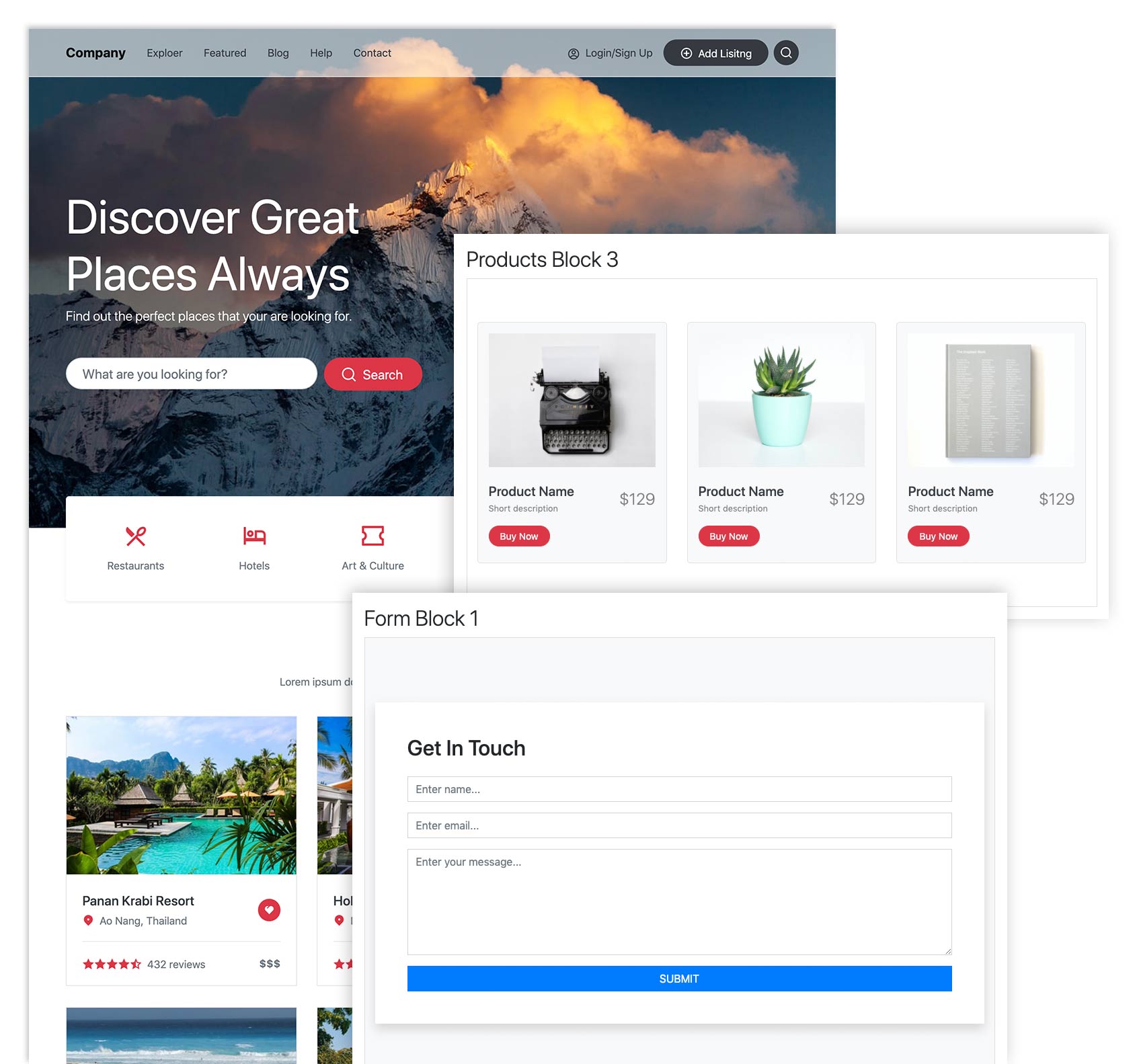
March 3, 2021 – Added Directory template and new blocks categories Shop and Forms.
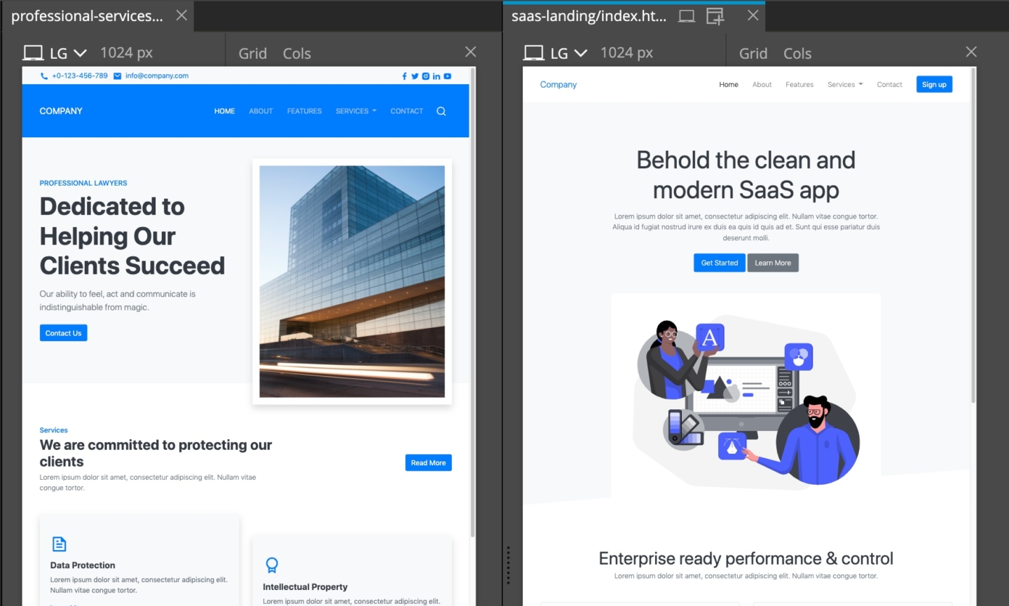
January 28, 2021 – Added two templates: SaaS landing and Professional services.
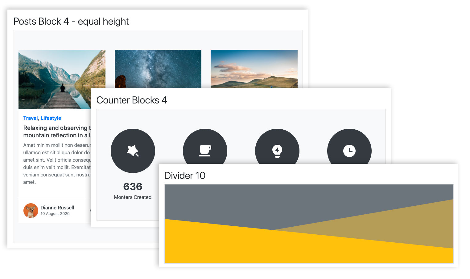
January 20, 2021 – Added Partner blocks.
December 30, 2020 – Added Blog posts, Counters and Dividers, 40 blocks all together.
A bit of history
In 2015 we added Bootstrap 3 Blocks to the Pinegrow Web Editor. The blocks were a very popular feature that let users quickly build good looking websites.
However, under the hood, the blocks were hard to maintain and more importantly, something felt wrong with having an ever growing collection of blocks that are so tightly coupled with their design.
Going down this road, you end up with many different sets of blocks, designed for different styles and industries, for example Elegant Restaurant Blocks, Modern Restaurant Blocks and so on.
We wanted to find a better way.
The essence of blocks are content and structure
At their essence, blocks represent content and structure. Their visual style is something that should be added on top of that, to match the visual language of every individual project.
That is exactly the concept behind our new Blocks library.
Our new blocks represent the content and structure of a website.
They are good-looking but under-designed on purpose.
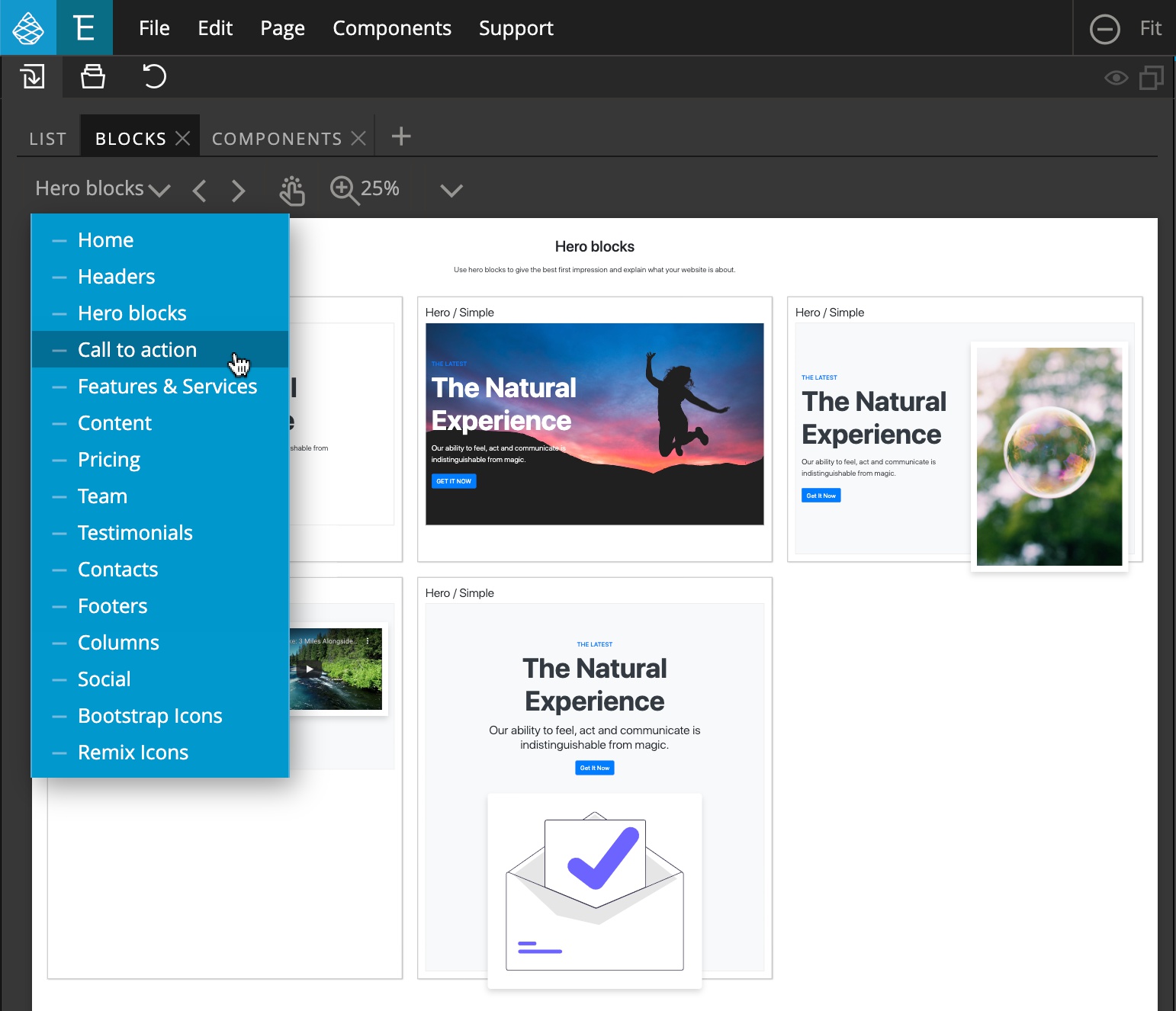
Why don’t the blocks have a fancier design?
Every project has unique visual requirements. Coupling the blocks with one particular style – no matter how pretty – would make the blocks unusable on projects with different design needs.
How do we then create unique designs? Do we have to tweak hundreds of CSS rules for each project?
The best approach is that the bulk of the visual styling happens through theming – customizing a design system according to the brand and purpose of each individual project.
Theming the design system can then be accomplished with Pinegrow’s built-in support for customizing Bootstrap themes.
Customizing colors and fonts is very easy and powerful. You can create unique designs by just changing the colors and fonts.
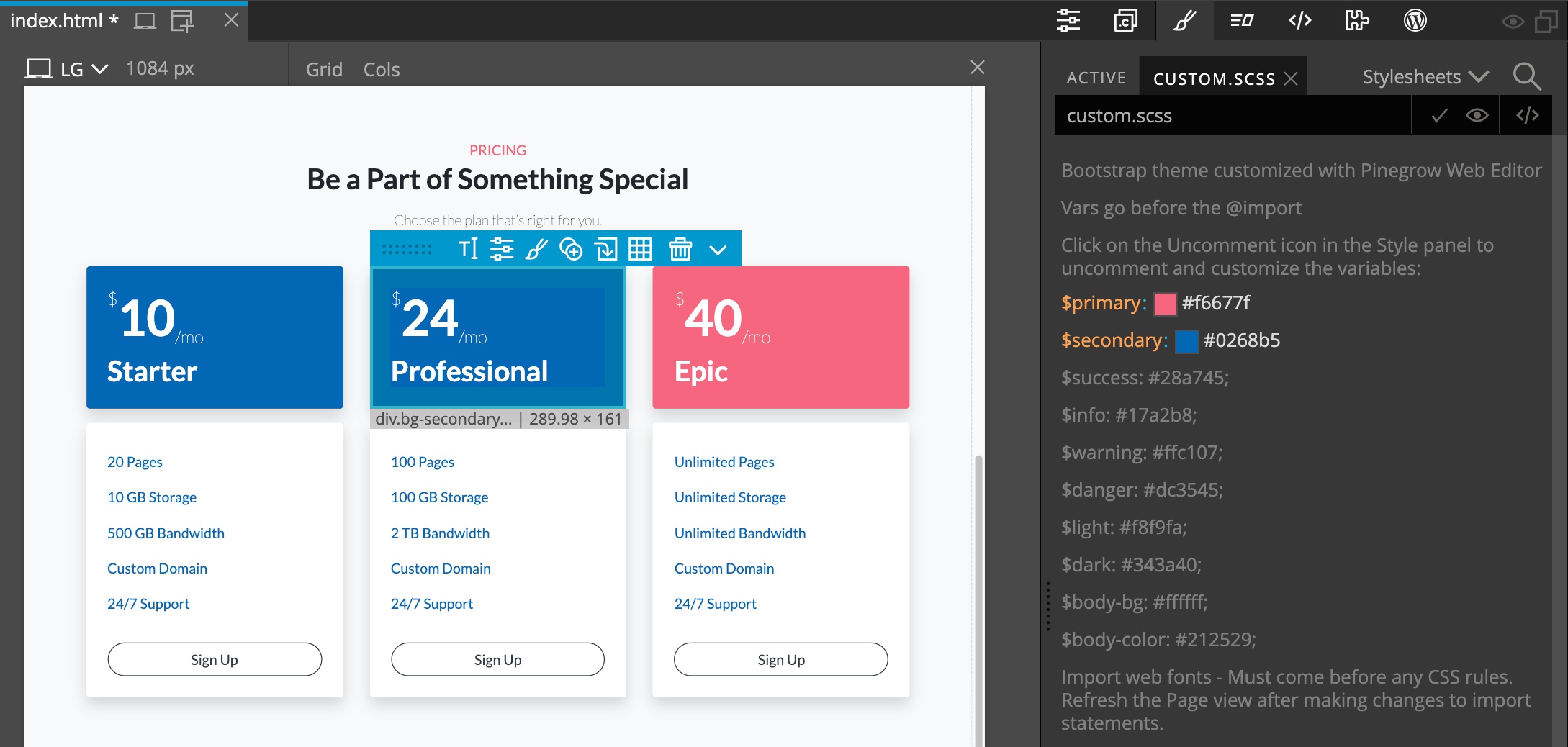
That said, the customization process could be even easier and that’s something we are already working on.
Doing these two steps – creating the structure with content and customizing the theme – can get us very close to the finished project.
If needed we then use custom CSS styling to perfect the details.
Add custom CSS to spice up the design
And, for the third step, fully-featured CSS styling is already a core feature of the Pinegrow Web Editor. But the idea is to limit the need for custom CSS styling with having a flexible theming solution.
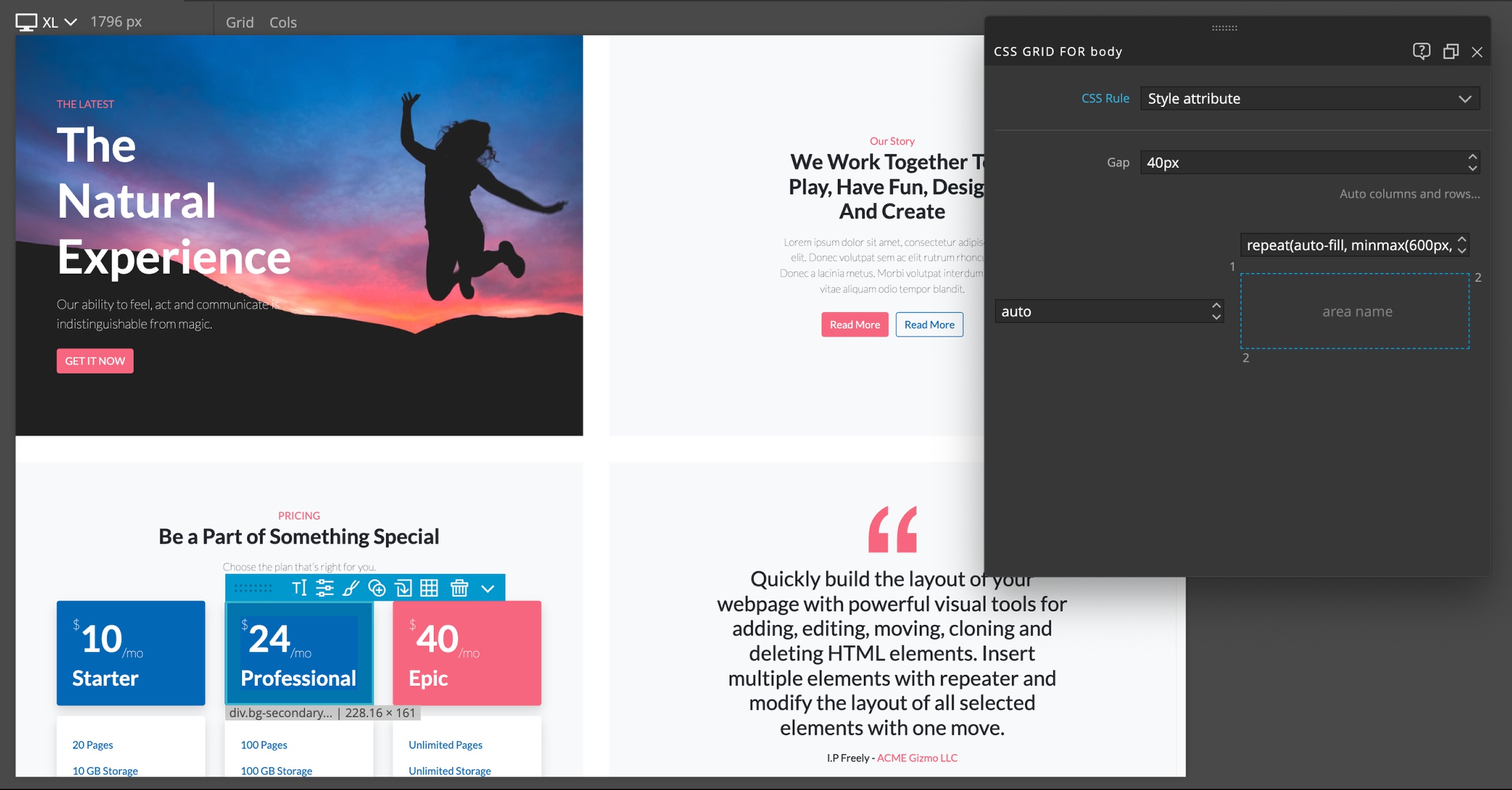
Here, you can also use CSS grid to create out-of-the box layouts:
The three steps workflow
This gives us a well-defined three step process:
- Creating the content with structure
- Theming the design system
- Using CSS styling to perfect the details, if needed.
Our new blocks are designed with this workflow in mind.
How are the blocks built?
The Blocks are currently available for Bootstrap 4 or 5.
Most of the styling is accomplished with Bootstrap utility classes, plus a very short blocks.css stylesheet that adds a couple of classes that are missing , for example, setting the width of the border.
SVG images are great for icons
The blocks library comes with two huge collections of SVG icons:
- Bootstrap icons
- Remix Icons
Between them they have almost 3000 icons for every occasion.
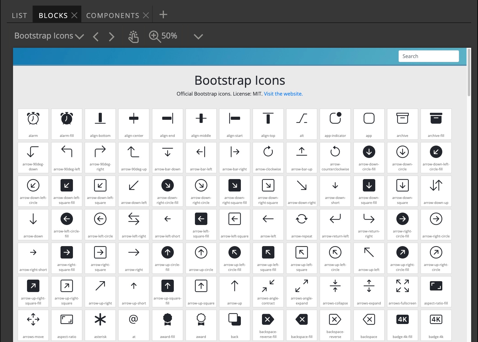
In the past we used icon font files from Font Awesome and similar. But SVG images work amazingly well for icons:
- They are tiny and you need to include only those icons you actually display.
- SVGs can be colored, styles with CSS, scaled and so on.
Of course you can still use Font Awesome or any other icon library with Blocks.
Pinegrow has support for manipulating inline SVG images, for example it is easy to expand the SVG image, select one of its sub-elements and set the fill or stroke color to the current CSS text color.
What about WordPress blocks?
The original Bootstrap 3 Blocks library came with blocks that already had WordPress actions assigned to them. At that time we didn’t yet have Smart WordPress actions, so it made sense to have pre-made components for WordPress themes.
With Smart actions, creating a custom HTML -> WordPress transformation is much easier. Also, each theme uses customizer fields, ACF fields and custom post types in a different way. So, having such blocks might not be that helpful because you would then end up spending time to modify the default behavior.
We are open to ideas and feedback on this topic.
Activating the Blocks for your project
The Blocks tab should be automatically shown in the Library panel for all Bootstrap projects.
If it is not for some reason, you can activate it in File -> Manage libraries & plugins:
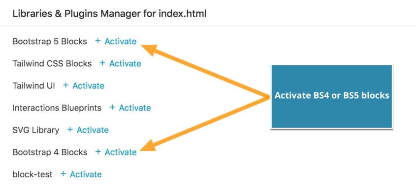
Note: Activating the blocks does not add the Bootstrap resources to the page. You must also activate the correct framework from this same modal.
The license
You can freely use the blocks for any purpose, including selling themes created with them in marketplaces.
The only limitation is that you are not allowed to redistribute and resell the blocks collection as a library, or to integrate the blocks library into a website builder.
How about Tailwind CSS?
We have a similar set of Blocks built with Tailwind CSS.
The blocks library is online
The Blocks library is not installed locally and is instead served from our online server. The benefit of this is that we can easily update the library without releasing new Pinegrow versions and requiring users to download and install Pinegrow each time.
This also means that you can preview the Blocks online:
Next steps
Check out the guide about using and customizing Bootstrap Blocks.
We will be adding more blocks and improving the theming process. As mentioned before, a similar library for Tailwind CSS is coming as well.