Happy Plants
A free plant-based design and template for Bootstrap 5 and Tailwind CSS.
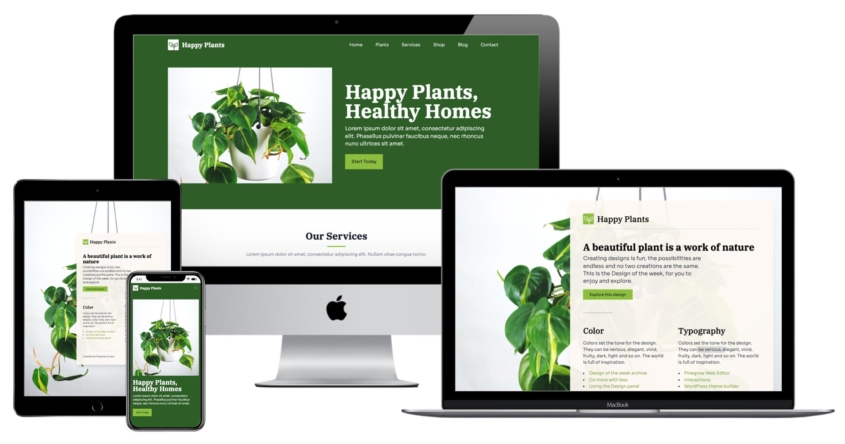
About the Design of the Week
This project is a part of our Design of the Week series. Every week we create a unique custom design theme for Bootstrap 5 and Tailwind CSS and give it away for free.
Creating custom design themes for Bootstrap and Tailwind CSS is fun and easy with the Design panel in Pinegrow Web Editor 6. For example, you can just click on the Surprise me button and Pinegrow will come up with a unique design that you can use as it is, or tweak further.
You can download the project and use it for any purpose you want, with the exception that you should not resell the template as it is, or share it for free without attribution to Pinegrow. No attribution is required if you use the design or template to create your own projects.
This week’s design is called Happy Plants.
The project is available in two versions: using Bootstrap 5 and Tailwind CSS.
The inspiration behind Happy Plants
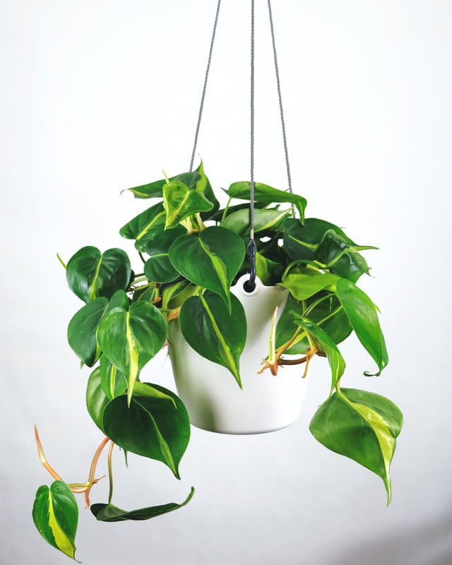
The main inspiration for the design is the photo of a house plant Philodendron Scandens Brazil by Severin Candrian. The image comes from Unsplash.
The project has two pages. Both are fully responsive with the help of responsive on different screen sizes.
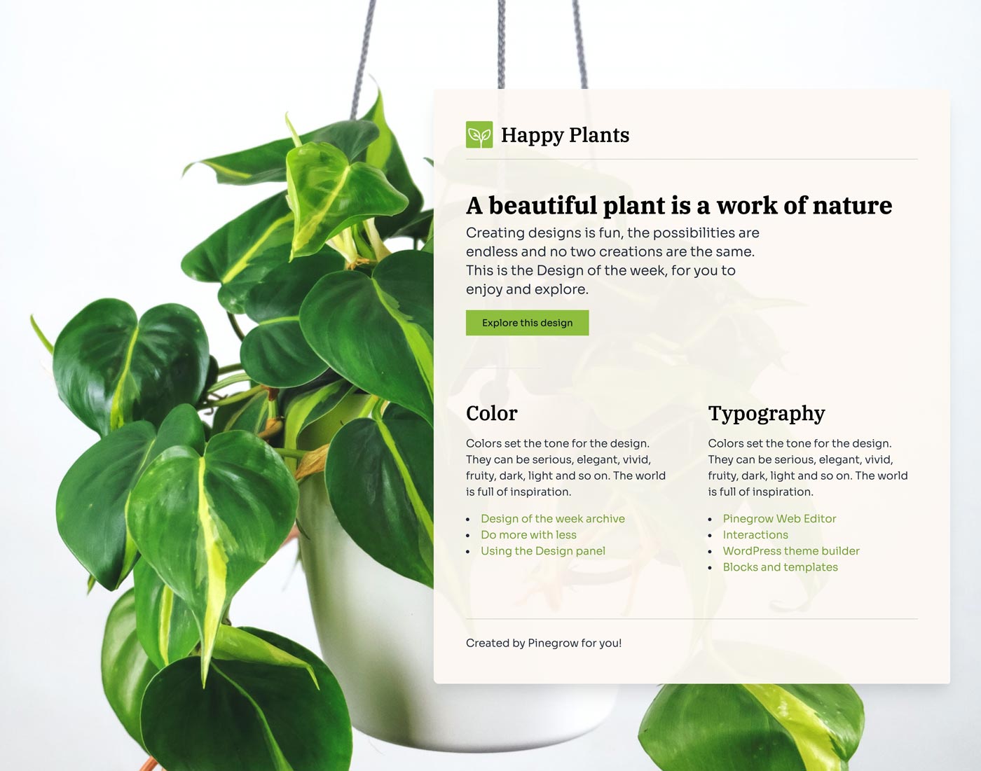
The splash page
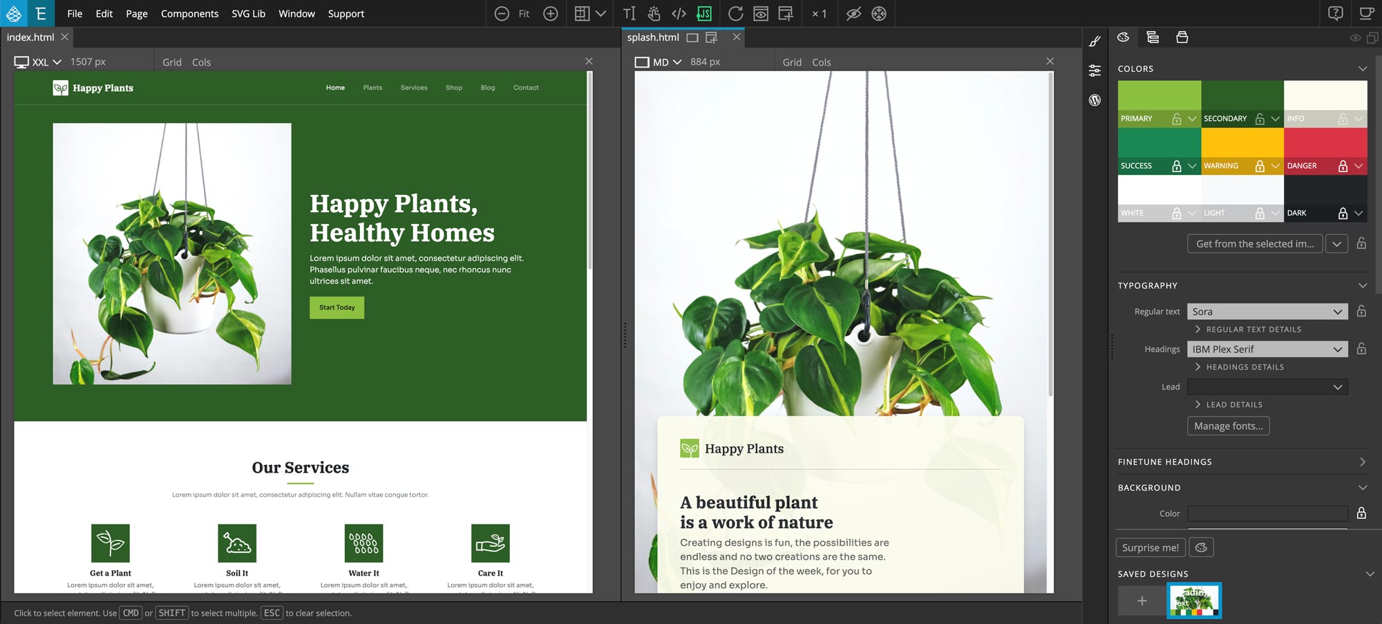
The splash page has full background image and minimal content.
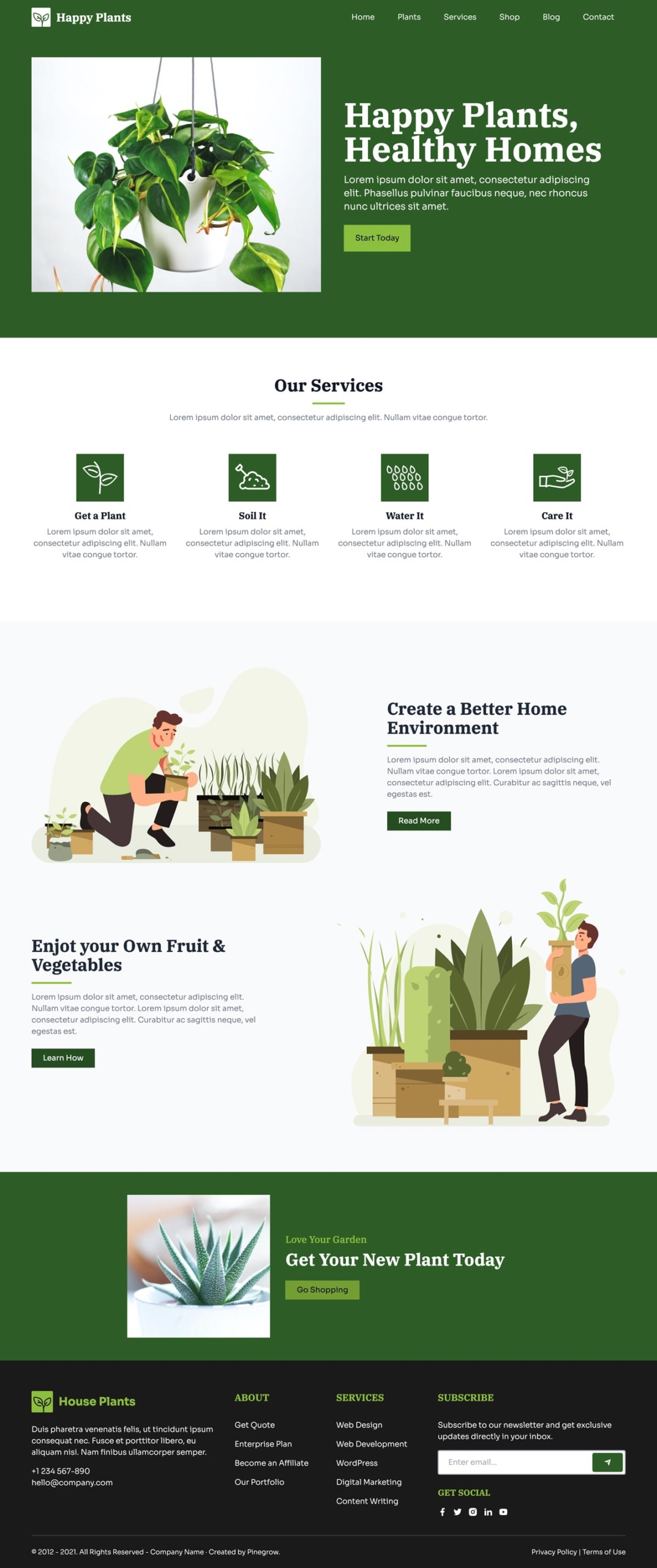
The landing page
The landing page displays the design image in the hero section and contains a variety of content sections.
Colors
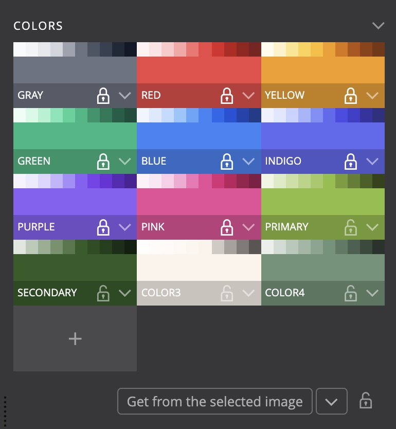
The primary and secondary colors were automatically selected by analyzing the image colors. They are both shades of green and work nicely together without having to tweak them further. The third color is used for the warm and slightly transparent background on the splash page.
Typography
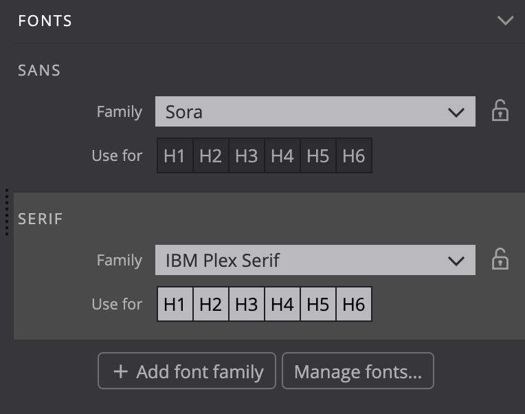
Font types were selected to represent natural playfulness and contrasts.
Fonts hosted on Google Fonts are used for both the regular text and headings:
- Sora is used for the regular text
- IBM Plex Serif for headings
Background
The background image options use a simple trick that lets us use the selected image in different ways within the same project: selector is set to .poster, instead of the default body. This gives us the control over where to display the image:
- Adding the class
posterto the body element displays the image as the full page background. - Adding the class
posterto any other element displays the background image in that element. - Not adding the class
posteron the page lets us have pages where the image is not displayed.

One detail to keep in mind is that Pinegrow adds the background-attachment: fixed only if the default body selector is used because normally we would want the background image of a content element to scroll together with the rest of the page.
To fix the background to the page view on the full background page we added the CSS rule:
body.poster {
    background-attachment: fixed;
}
Download and use
Download and unzip the project files. Pinegrow works with standard HTML & CSS files. This means that you can use HTML and CSS files from this project anywhere, even without Pinegrow.
To explore and play with the design, open the unzipped folder as project in Pinegrow Web Editor 6 or newer.
Download the Bootstrap 5 project
To use the theme in your project just copy and include the bootstrap_theme/bootstrap.css file.
Download the Tailwind CSS project
Tailwind CSS theme file is optimized to only include the CSS rules that are used in the template. To generate the full CSS file, disable the Just in time compiler option in Tailwind CSS options dialog in the Design panel.
Don’t have Pinegrow Web Editor yet? Download Pinegrow for Mac, Windows or Linux. Full trial version is included.
Learn more
Take a look at the tutorial on using the Design panel:
Submit your own design
Did you use the Design panel to come up with a great looking design? Get in touch. We love to showcase inspiring projects to our community.