The Pinegrow Design panel for the Bootstrap framework allows you to easily set up a custom theme without editing any base files or setting up a complex compiler. It also allows you to test alternative designs for your whole project quickly and easily.
The Pinegrow Design panel provides a central location for you to set a number of base stylings for your web project. You can customize your Bootstrap theme without editing config files, or setting up complicated compilers. The panel allows you to quickly modify and compare design changes throughout your whole project. Colors, fonts and multiple Bootstrap options can all be tweaked in this panel and the customizations will carry through all of the pages in your project. Let’s take a walk through to see what powers this gives us!
Note: The Design panel is also available for Tailwind CSS projects. See the documentation here.
Activating the design panel
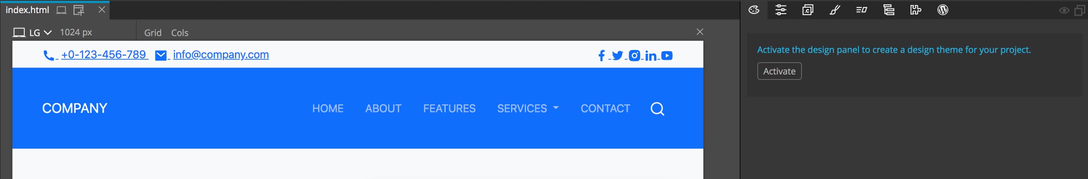
After opening a Bootstrap Block template or plain Bootstrap page you need to save it as a project before you can start using the Design Panel. Once saved the Design panel will display a button for you to active the panel for the project. After activation, it is recommended that you save the open page once again. This results in the creation of a theme folder, ‘bootstrap_theme’. In this folder is a ‘bootstrap.css’ file that is now the main stylesheet for your project.
Take note, the Design panel will also work if you elect to convert your theme to using SASS. In this case the ‘bootstrap_theme’ folder will already exist and any Design panel changes will be added to the ‘custom.scss’ file, but compiled into the final `bootstrap -> css -> bootstrap.min.css’ file in your project.
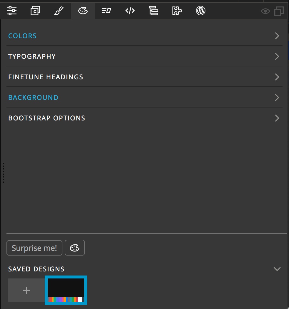
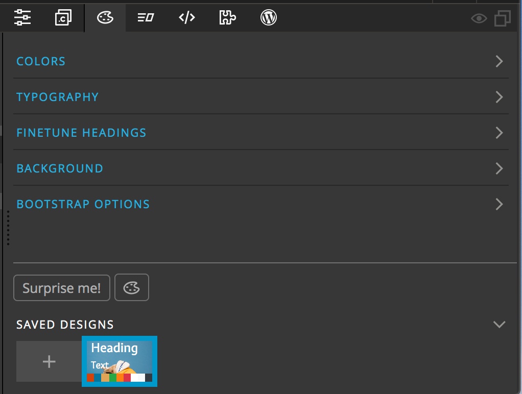
After activation of the Design panel you will see five categories of theme changes that can be made, as well as a section at the very bottom of the panel with a list of saved designs, a tool toggle and the very special “Surprise me!” button. Let’s walk through each.
Colors
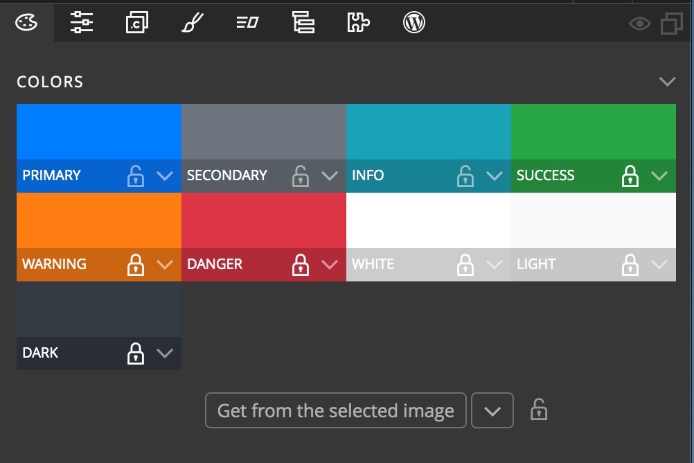
The Bootstrap framework pages come standard with nine different colors. You can elect to change any of these pre-selected colors simply by clicking on them and choosing a new color from the picker.
Any of the colors can be swapped by dragging one of the colors over the other. For example, if you want to see what your design would look like with the “primary” and “secondary” colors swapped. If you want to keep a color, but with a different class name, just hold down the alt/option key and drag the color to whichever slot you choose and it will be copied there – but note, it will overwrite the existing color. Luckily this can be undone if necessary.
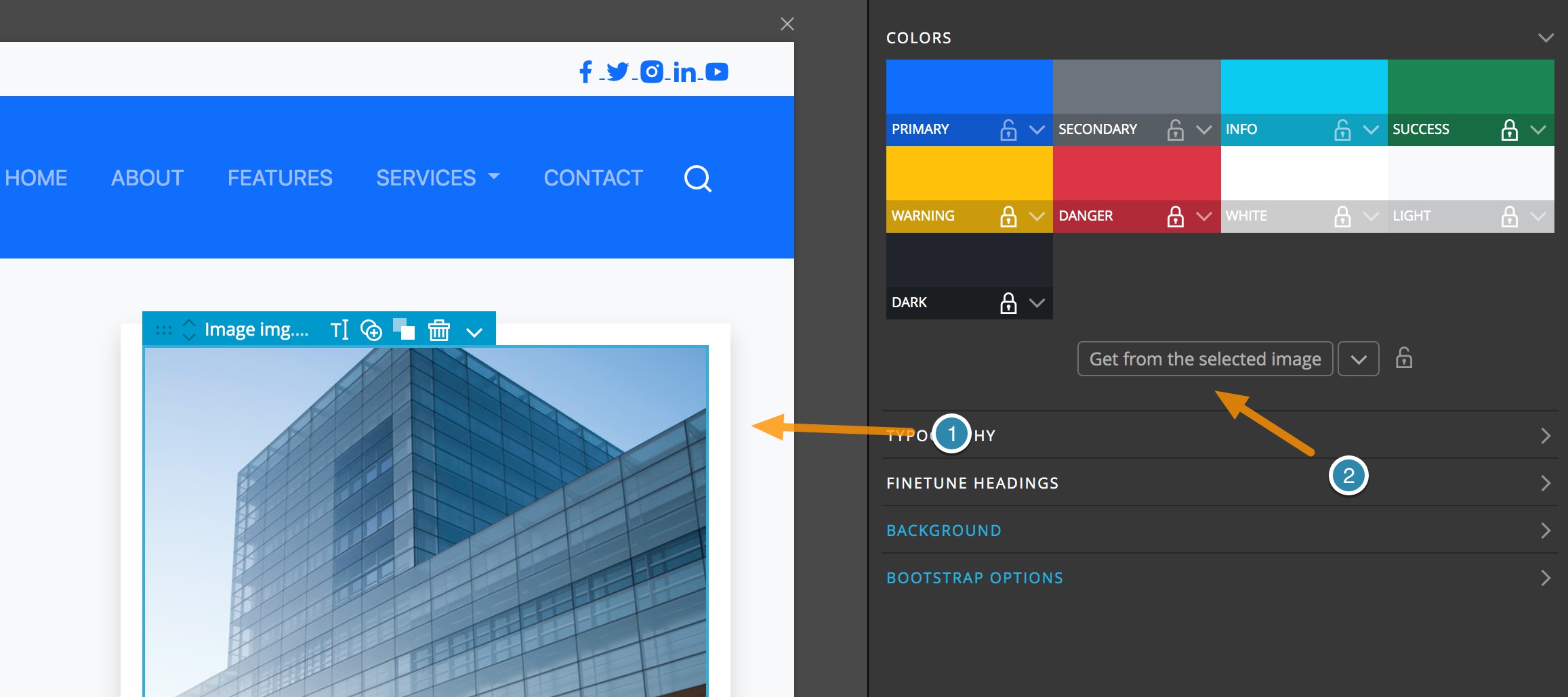
You can also repopulate the colors to fit with an on-page image, such as the main hero image, or the background of any element. To accomplish this, just select the <img> or element with background either in the Page View or the Tree and then click the “Get from the selected image” button. If you only want selected colors changed you can toggle the lock icon and it will preserve the existing color. There is another “surprise” use for these locks I will cover later.
Note: By default the ‘utility’ colors, “success”, “warning”, “danger”, “white”, “light”, and “dark” are locked. If you want to change these using colors from an image you will have to unlock them first.
Typography
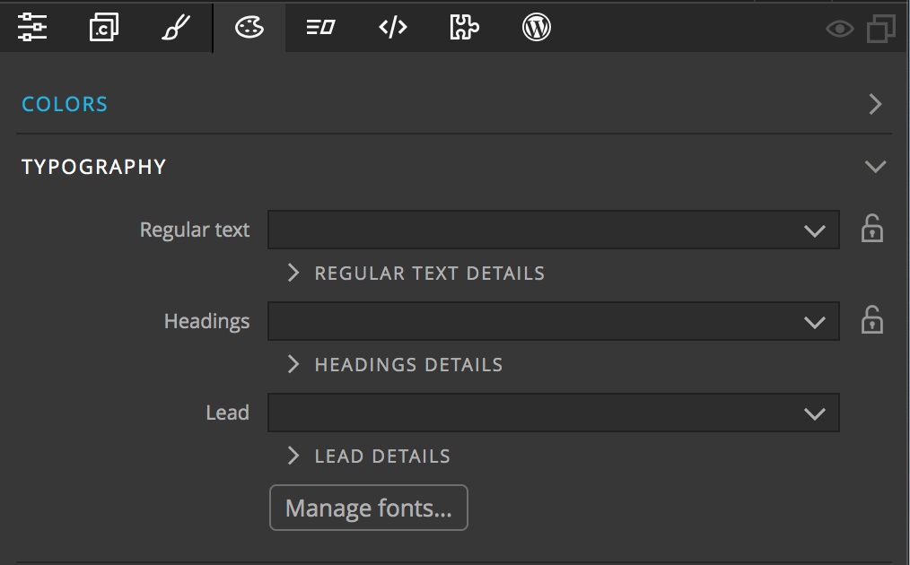
The next section down, typography, lets you set project-wide fonts. There are three input drop-downs. The first is for setting the font that is being set as the base font used on the body. The next input, ‘Headings’ can be used to change the font being used for all of your <h#> tags, e.g. <h1> if you would like a different font family than the other text on the page. The final drop-down sets the font family for the “lead” class.
Note: You can still add any font to text within your pages through the style panel. For example, if you want some decorative text on one word. Setting the fonts in the Design Panel won’t interfere with this.
Adding custom fonts
The drop-downs are already populated with a large number of popular fonts. However, if you want to use an unlisted Google font, or a custom font file you can click on the “Manage fonts…’ button or select “Manage fonts” from the bottom of the drop-down list. This will bring up a modal that lists all of the fonts. In addition to adding fonts, this control panel will also allow you to remove fonts from the drop-downs and manage which drop-downs display each font.
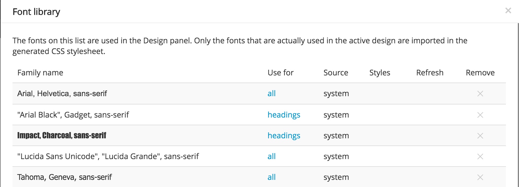
The first column of the Font Library lists the name of the font. Clicking on a value in the second column, “Use for”, will bring up a context menu that has four possible values to select. The “all” value means that font will show up for all three typography drop-downs. The “text” value will add the font to both the “Regular text” and “Lead” drop-downs. The “headings” value adds the font to only the “Headings” input. The final value “h1, h2” is for use in the next Design panel section and will not impact display in this section at all. Lastly, the final column will let you remove any fonts that you do not want displayed in the drop-downs.
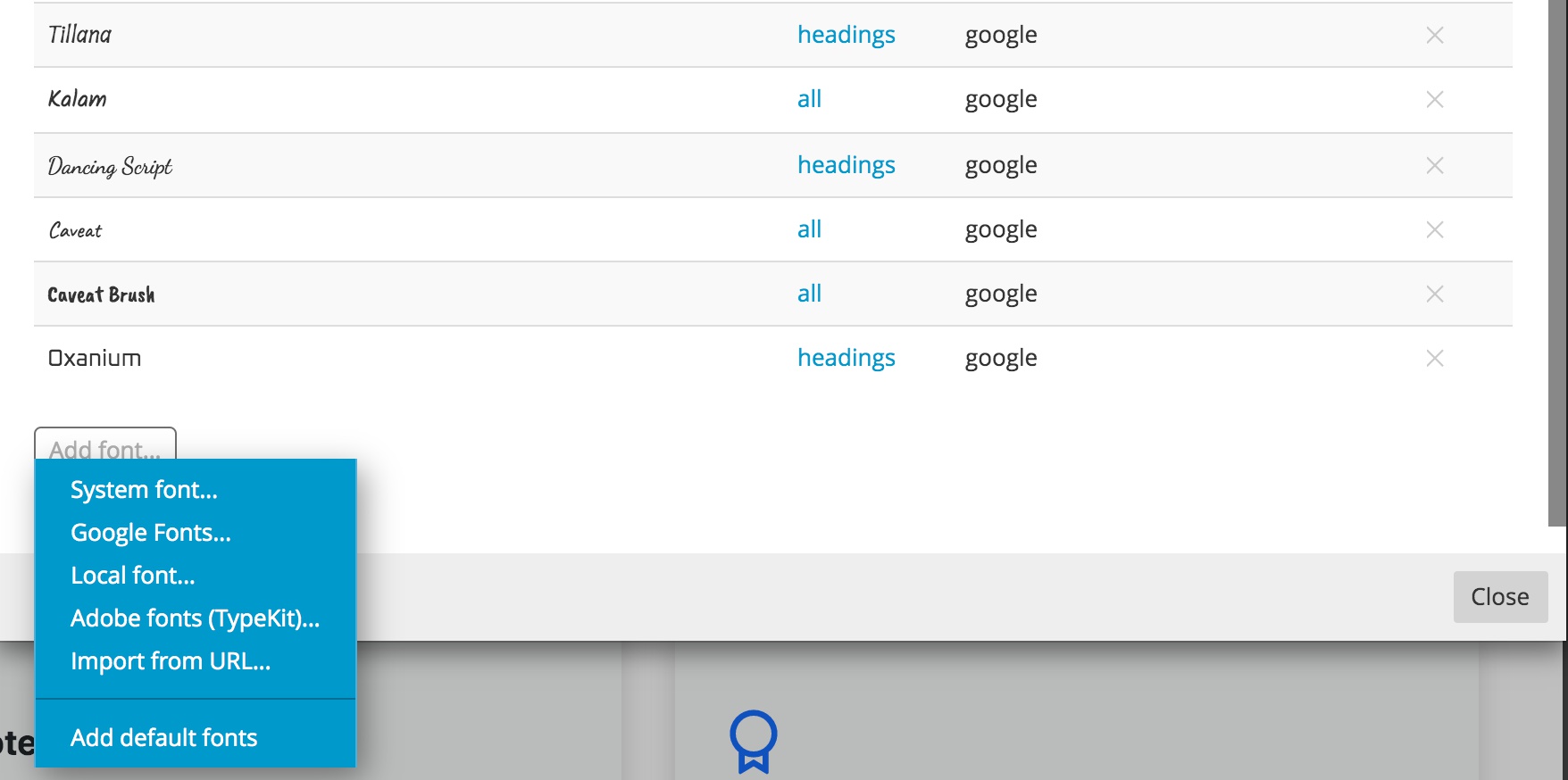
In order to add a new unlisted font, scroll to the very bottom of the Font Library. There you will find a button that when clicked will bring up a context menu. This will allow you to load in fonts from a wide variety of sources, such as Google and Adobe TypeKit. The final selection, “Add default fonts” will add any removed font back to the list.
Note: In order to add local fonts, you will have to create a folder containing your fonts and a stylesheet to import them into your project. The easiest way to accomplish this is by using a site like the Font Squirrel Webfont Generator. Uploading your font file will generate the .woff files and stylesheet. This folder can be copied into your folder and then targeted in the font manager. You may need to change the stylesheet with the correct path once your project is loaded onto your hosting site.
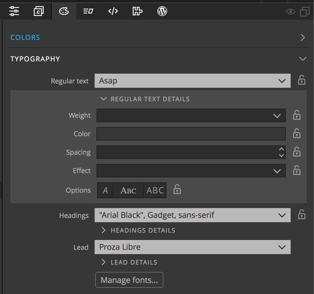
In addition to setting the fonts for each text category, a further section for each allows you to add additional styling. This includes the font weight, color, default spacing, a shadow effect, and italics or capitalization.
Notice that each of the settings has a lock. I’ll save what these are for until the “surprise” at the end.
Finetune Headings

This section of the Design panel is much like the Typography section, but allows you to select the font family and set the stylings for each individual heading tag. The font manager has a value of “h1, h2” in the “Use for” column that will control what fonts additionally appear for the H1 and H2 dropdowns. Again, we will come back to the lock, but note that in this case it locks the value for both the <h1> and <h2> fonts.
Background
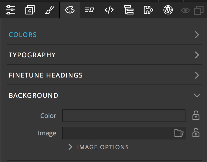
The Background section has a few different uses. Firstly, the color input is populated from the theme colors set in the first section of the Design panel. Selecting a color here will add it as a background color for all of the pages in your project. Secondly, you can do the same thing with an image. Clicking on the folder allows you to select an image file from your project or retrieve a file from Unsplash. However, by default the image isn’t used to set a background, but for the surprise at the end. In the next set of controls we will see how to use this image as background, or to replace any image on the screen.
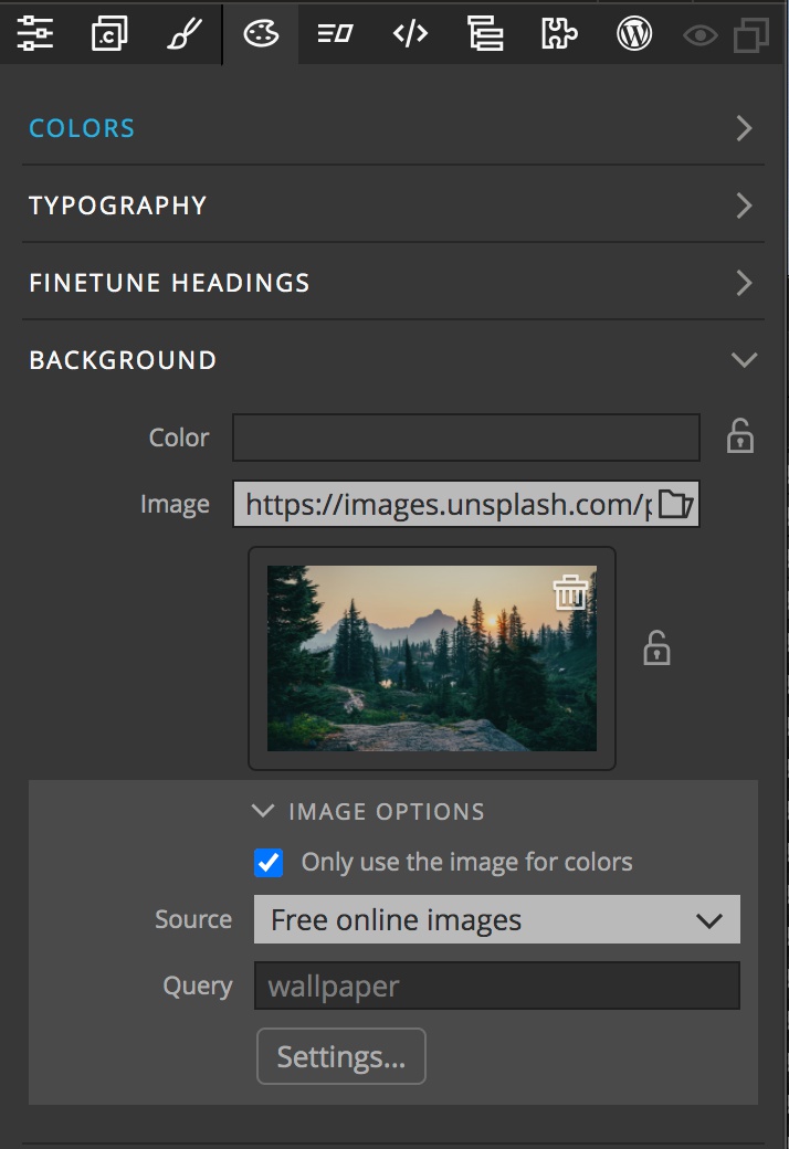
Opening the “Image Options” reveals an additional set of controls. By default, the top checkbox, “Only use the image for colors” is ticked. The other two controls in this section, “Source” and “Query” will be covered at the end. To use the image as a project wide background simple untick the checkbox.
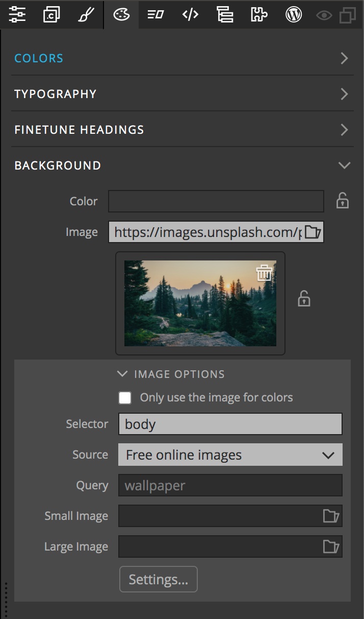
Electing to use the image on the page unlocks some additional features. At the top is the “Selector” input. By default it is set to “body”. This means that the selected image will be added to the body element and act as a background to the page. Instead, you can add a class or id, like #hero-image to have the background image added to a specific element. You also have the option to set a different image for small and large screens through the other two inputs and the settings button.
Images for the large and small screen sizes are added by clicking on the input box folder icon and either selecting a project local file or from Unsplash. Any valid URL will work. The images will be added to the element targeted by the selector using media queries that can be customized by clicking the “Settings…” button.
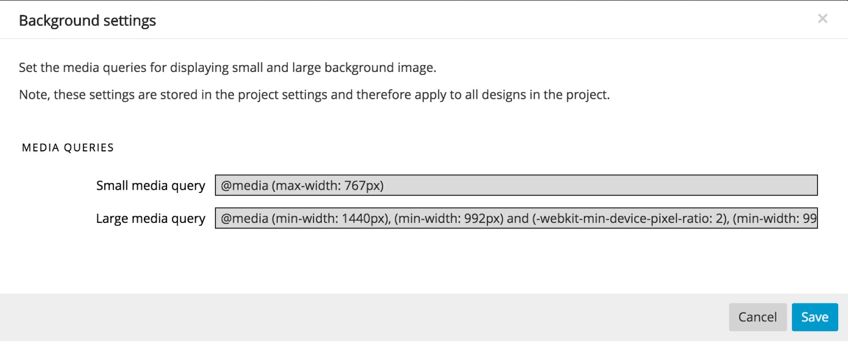
The default media queries target screens less than 768px, and any screen larger than 1440px or retina screens larger than 992px. You don’t need to add both a small and large image, you can elect to use only one. The image in the main background area will be used for all other sizes.
The remainder of the Background controls are for use with the final “surprise” and we will come back to them.
Bootstrap Options
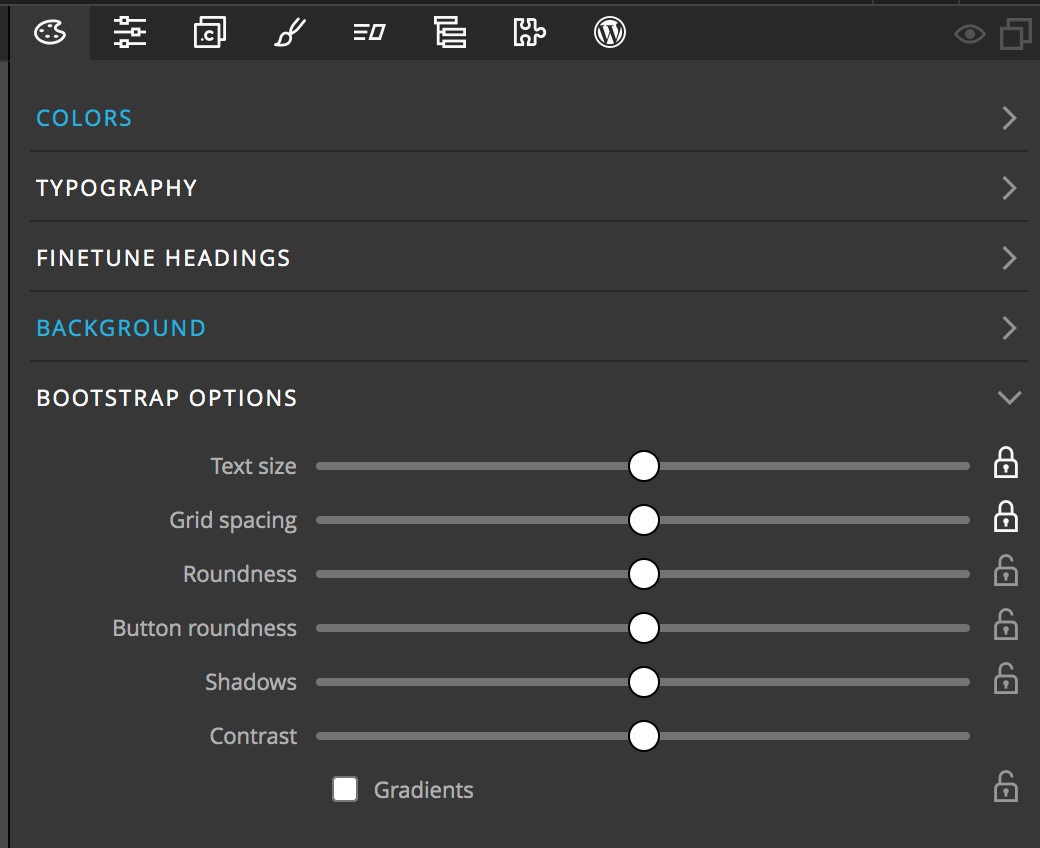
The fifth setting section of the Design panel allows you to add default values for a number of Bootstrap options. The first is “Text size” – this scales your base font size up or down. Depending on how your page is set-up this can also impact your margin and padding sizes. The “Grid spacing” impacts the gap between columns. The next two control set the roundness of either elements, like cards, or buttons. The “Shadows” control changes the base look of shadows added to navbar and card elements. Finally, the “Contrast” control governs the text color for elements like buttons to give more or less contrast.
Note: if you also add a box-shadow from the Properties panel it will override the shadow style set in the Design panel for that element. This allows you to add differently designed box-shadows to selected elements.
Surprise!
One part of the final section of the Design panel is to help wet your creative juices, a “Surprise me!” button. Clicking on this button loads a random image into the background section and uses this image to set up a new color palette. It also creates new font pairings for your regular text, headings, <h1>, and <h2>, plus the Bootstrap options. Remember the locks in the previous sections? When activated, they prevent the “Surprise me!” button from making any changes. Happy with the color palette, but not the fonts? Just lock what you like and hit the button again. All of the changes that are made in the Page View will also be reflected and automatically updates if you have the BrowserSync option turned on. The Undo (CMD+Z or CTRL+Z) and Redo (SHIFT+CMD+Z or SHIFT+CTRL+Z) both work to move forward or back through your design changes.
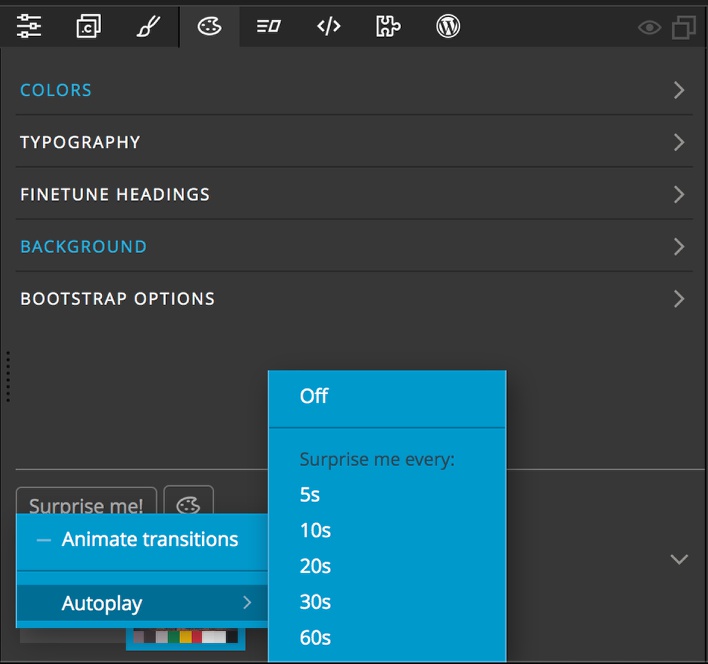
If you right-click the “Surprise me!” button you can access two additional options. One allows you to add an animation between design changes. The other turns on “autoplay” with the option to set a time delay between changes which will cycle through new images and design changes until you stop it. This allows for you to see a wide variety of different designs, almost like a slideshow! To keep a design you like while watching the show, press on the Add design button marked with a “+” icon.
Background
Coming back to the Background section. There are three other controls within the “Image Options”. The first is a checkbox. This allows you to get your theme colors from an image, but not use the image as a background. This is useful for the “Surprise me!” button, as it will change the picture, altering the color palette, but not change the actual page background. The second is a source setting. This allows you to determine where the background image is coming from – a local folder, or Unsplash. The third input, “Query” allows you to narrow the pictures returned from Unsplash by the “Surprise me!” button. Any search term will work, so play around!
Note: If you are using the image loaded into the background to actually display on the page and turn the lock on to keep the “Surprise me!” button from changing it, you will no longer get changes to the color palette. Instead, you will have to select the image on the Page View or Tree, then in the colors section select “Get from the selected image…”.
Saving and reseting your theme
The final section containing our surprise also has two other controls. One is a “Saved Designs” section. This can be used, for example, to store several slightly different design options for a client. Clicking on the “+” icon will add the current design to the saved designs. This can also be used during “autoplay” to capture any design ideas. As you accumulate designs there will be additional thumbnails that you can click to reload them. Right-clicking on the saved designs allows you to delete them or duplicate them to make minor theme changes.
Finally, the design palette icon next to the “Surprise me!” button opens the floating tools which we will cover in its own section.
Note: You can convert your Design to HTML using Pinegrow, but do you know you can also convert your HTML to a WordPress website/theme? Check our tutorial on how to convert HTML to WordPress.