Use the Library panel to add Bootstrap components to the page.
Once the Bootstrap Pinegrow tools are activated on a page, a rich set of Bootstrap elements and components will appear in the Library panel.
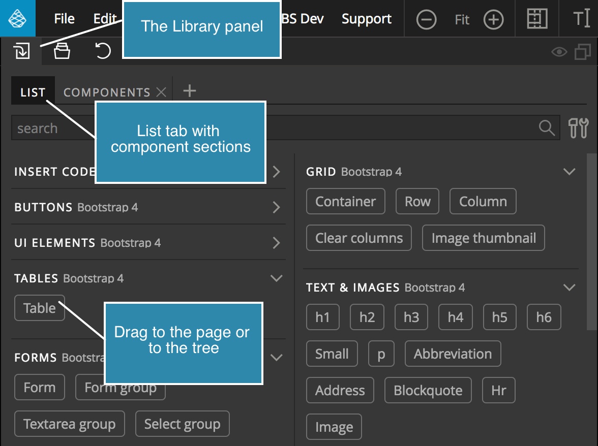
The List library tab
Components are organized in sections, like Grid, Buttons, and so on.
To add components to the page, drag them to the page view or to the Tree panel. Use the tree panel in situations when dragging to the page doesn’t give precise enough control over the placement.
Another way to insert elements is by right-clicking on them when an element is selected on the page.
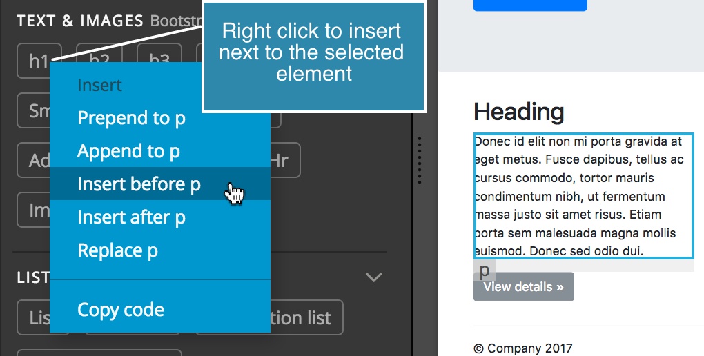
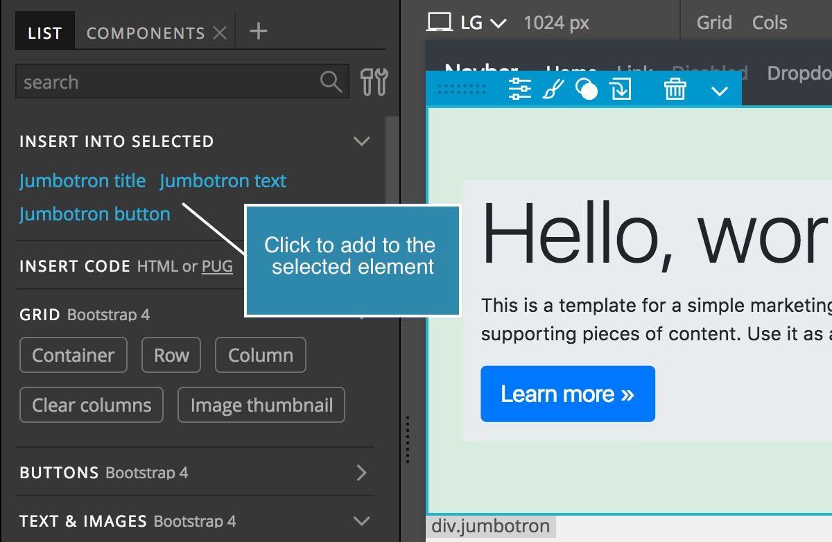
Some Bootstrap components, like Jumbotron, Cards, and Headings, let you easily insert their common child elements.
See the Pinegrow guides on the Library panel and Drag & drop for more information about placing elements to the page.
Use search to quickly find an element in the Library panel, and organize the panel by collapsing un-needed sections.
Component Page Libraries
Notice that the Library panel has a couple of tabs on the top. The first tab, List, shows the default view of the components where each item is represented by a draggable button with its name.
Pinegrow 4 introduced another view, called Page Library.
A Page Library is a normal HTML page that is loaded into the Library panel and used as a library.
Bootstrap Pinegrow tools include predefined Bootstrap Page libraries, organized according to how they are presented in the official Bootstrap documentation:
- Bootstrap 3: CSS, Components, and Javascript.
- Bootstrap 4: Components.
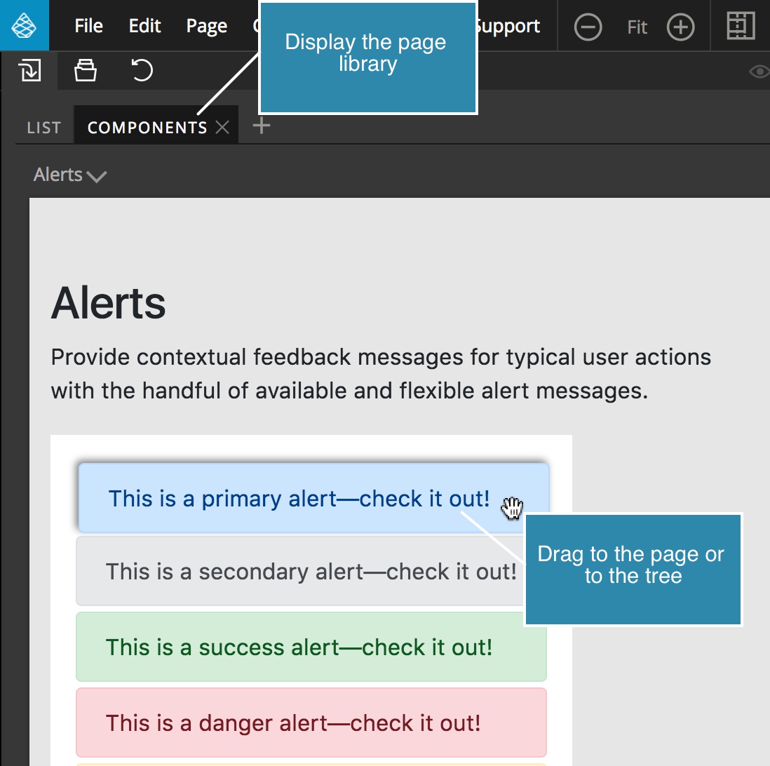
Click on a page library tab to display it.
To insert a component into the page, move the mouse over it and then drag it to the page view or to the tree.
Doing this drags the whole component to the page. But what if you want to take only a part of a component, for example, just the image from a Card?
To do that, break the component in the page library apart by clicking on it.
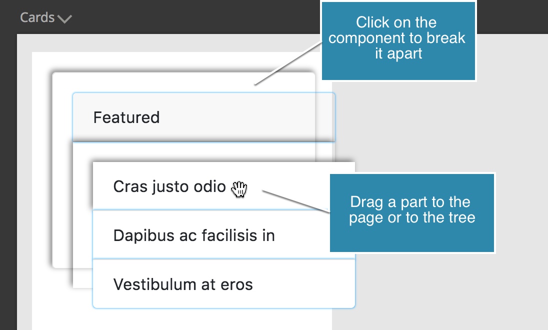
The layers of the component will be visually spaced out so that you can grab only the element you need.
To put the component back together, click on it again.
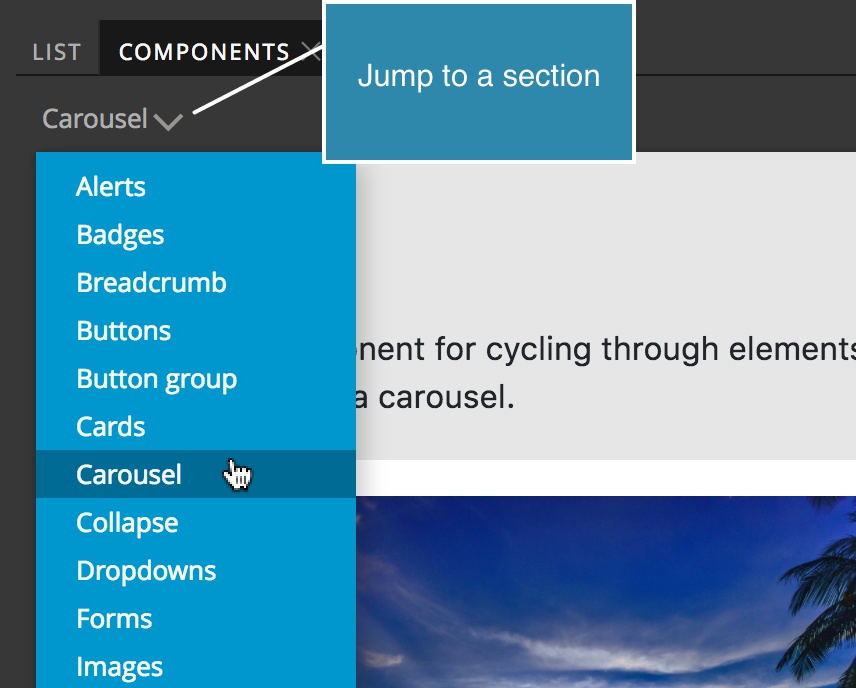
Use the Sections drop-down to quickly jump to the desired part of the library.
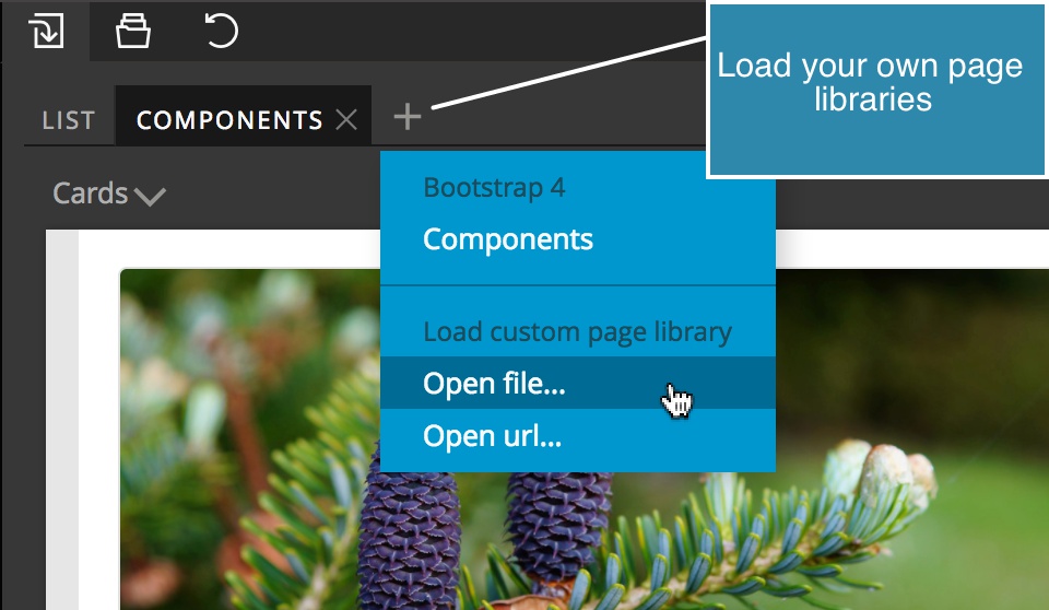
Page libraries are very handy. You can even load any file or URL and use it as a library by clicking on the icon in the tabs.
Note: Adding an element from the Page library to the page will copy the HTML code to the page. Any required stylesheets or Javascript files have to be added to the page by different means.