Editable areas are used in both Master pages and Smart components. They are layout elements that can be customized on content pages and in component instances. Different aspects of elements can be defined as editable: the content, attributes, and classes.
Use the ComponentsTutorial project to explore the examples mentioned in this document.
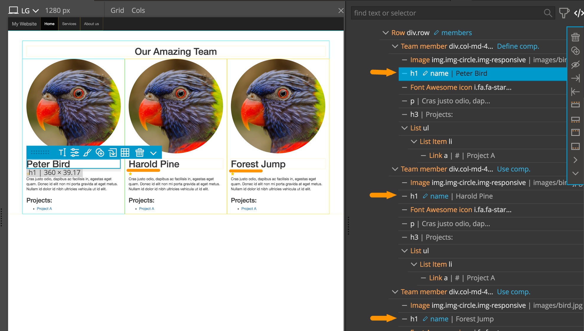
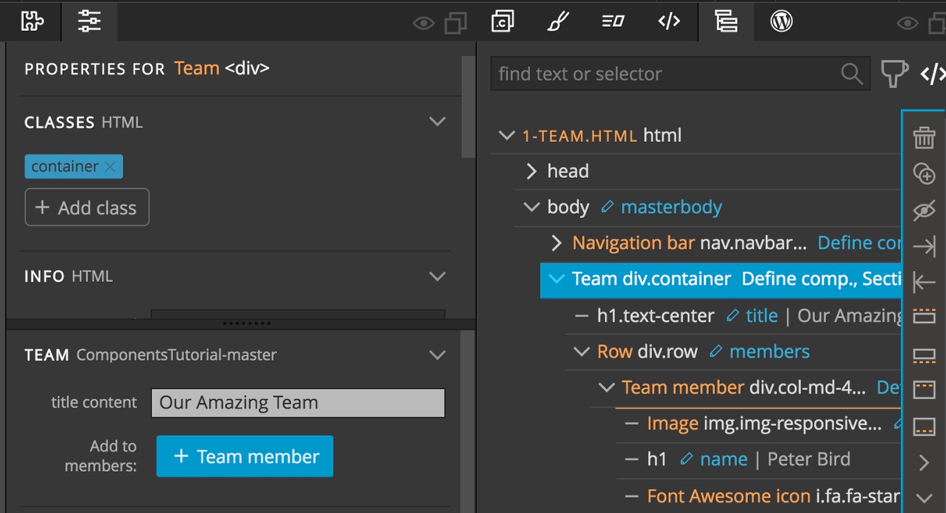
Let’s take a look at the Team member component example to explore editable areas. We’ll make name, image, description, and a couple of other elements editable so that each component instance can represent a different team member.
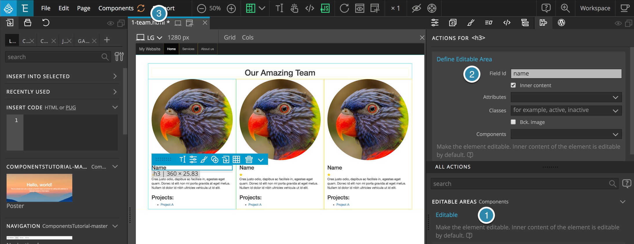
Select the name (the <h3> element) in the Team member component definition (1-team.html) and add the “Editable area” action from the Action panel.
Set the Field to something like “name”.
Field ids (names) only need to be unique within the component. That means that you can use nice Field ids like “name” for multiple components.
By default the content of an editable area is editable and the Inner content option is checked.
Now Update components to have the changes added to all the instances.
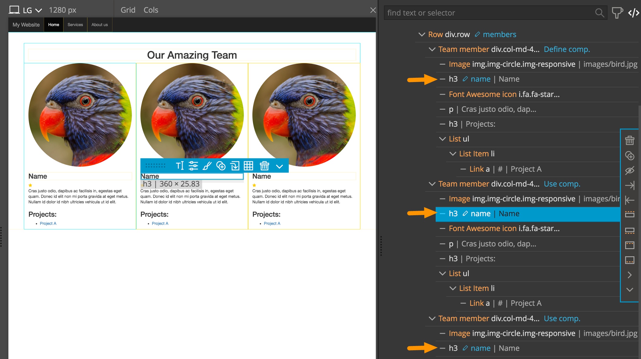
Notice that name elements are now marked in the tree view with a blue pencil icon and the field name to indicate that they are Editable. That means that the content of <h3> name elements can be edited and will not be lost when components are updated. Now we can fill in the names of our team members.
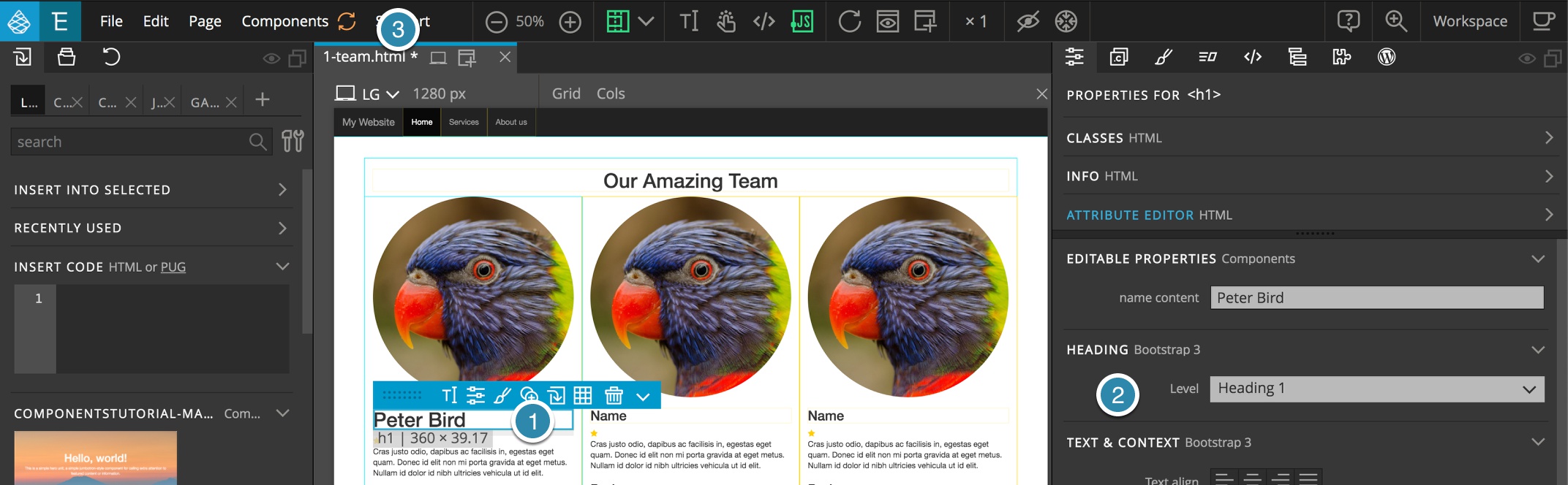
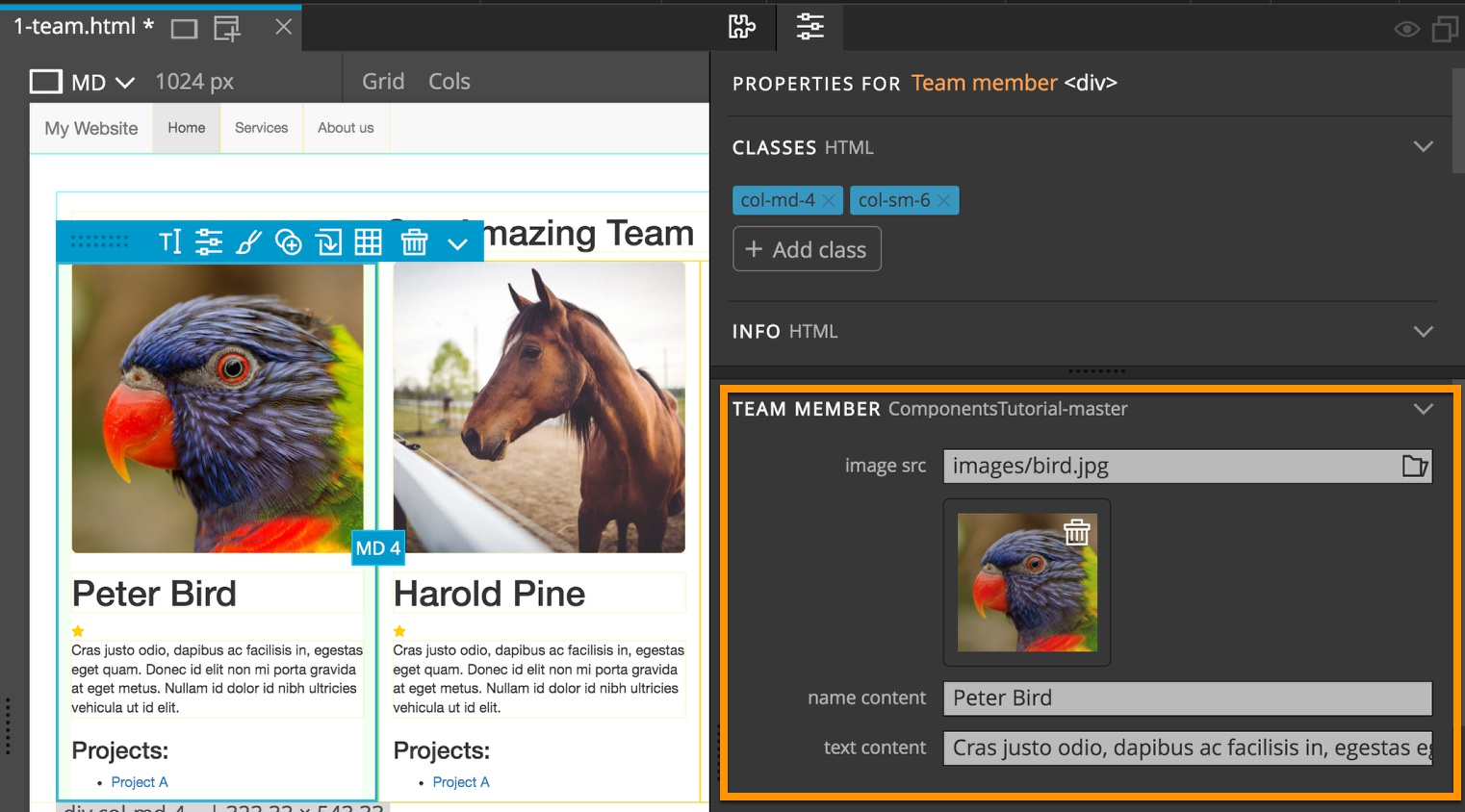
Let’s go back to the component definition (the first team member), select the name and change the heading level in the Properties panel to Heading 1 which will change it to an<h1> tag.
Note: This could also be accomplished using the context menu “Transform” item, brought up by either clicking the selected item menu (blue menu) down caret or right-clicking on the element.
After clicking the orange button to update components all the name elements were changed to <h1>, but the names of team members were preserved. Quite smart, isn’t it?
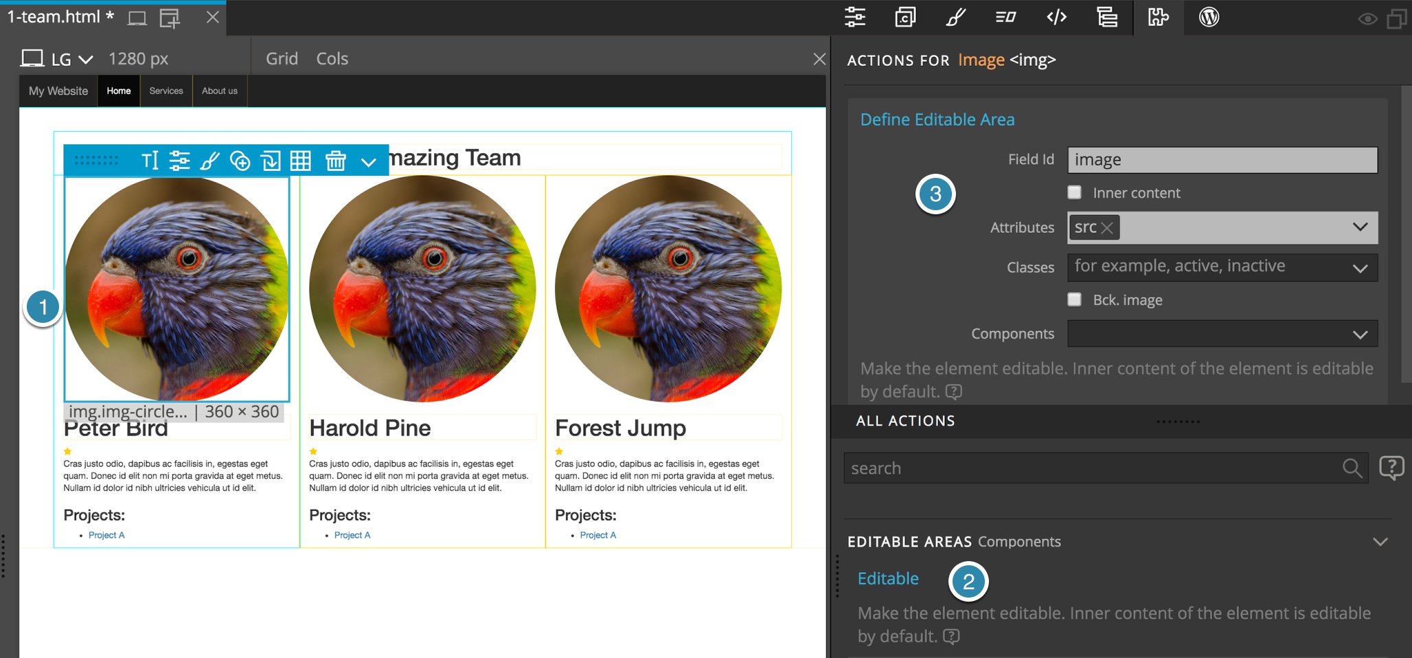
Editable images (and editable attributes)
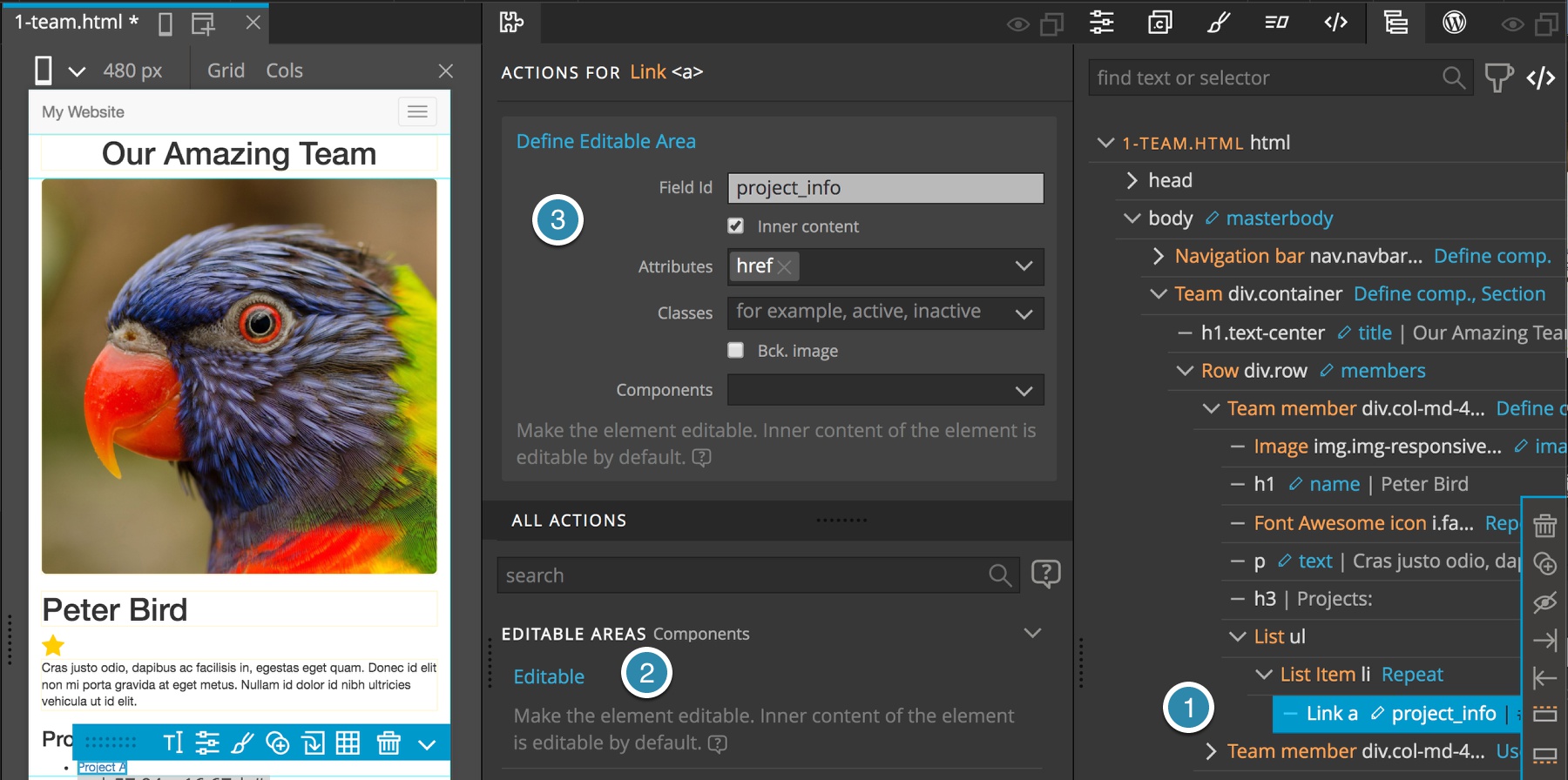
We can do the same for the team member picture. Select the <img> in the component definition and add the Editable area action to it. We will give it a Field Id of Image and because the image displayed with <img> is set with src attribute, we set the editable attributes to src.
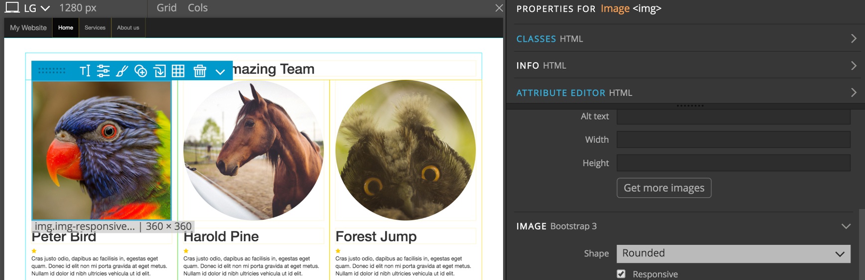
Update the components and set new images for the other team members. Like names, images will also be preserved during component updates. Let’s try this by changing the shape of the image in component definition from Circle to Rounded.
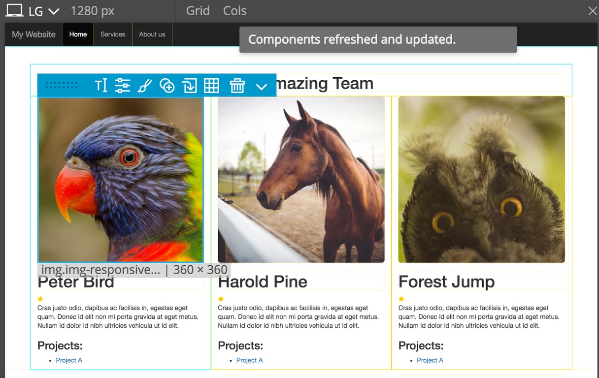
Update components and voila – all images are now rounded.
Editable classes
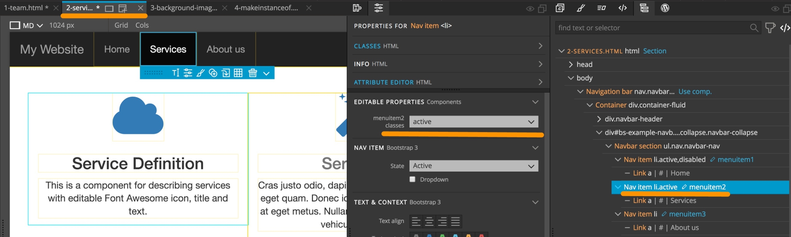
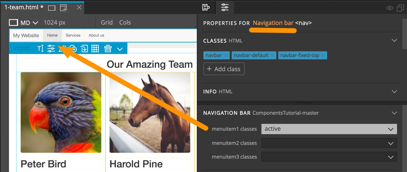
We can also declare specific classes as editable. This is very useful for menus where the active menu item is styled through an .active class. We can make each menu item Editable and set the editable class to active. This will allow us to toggle the active class on and off of the element.
Note: this will not allow us to add or remove any other classes in the component instances.
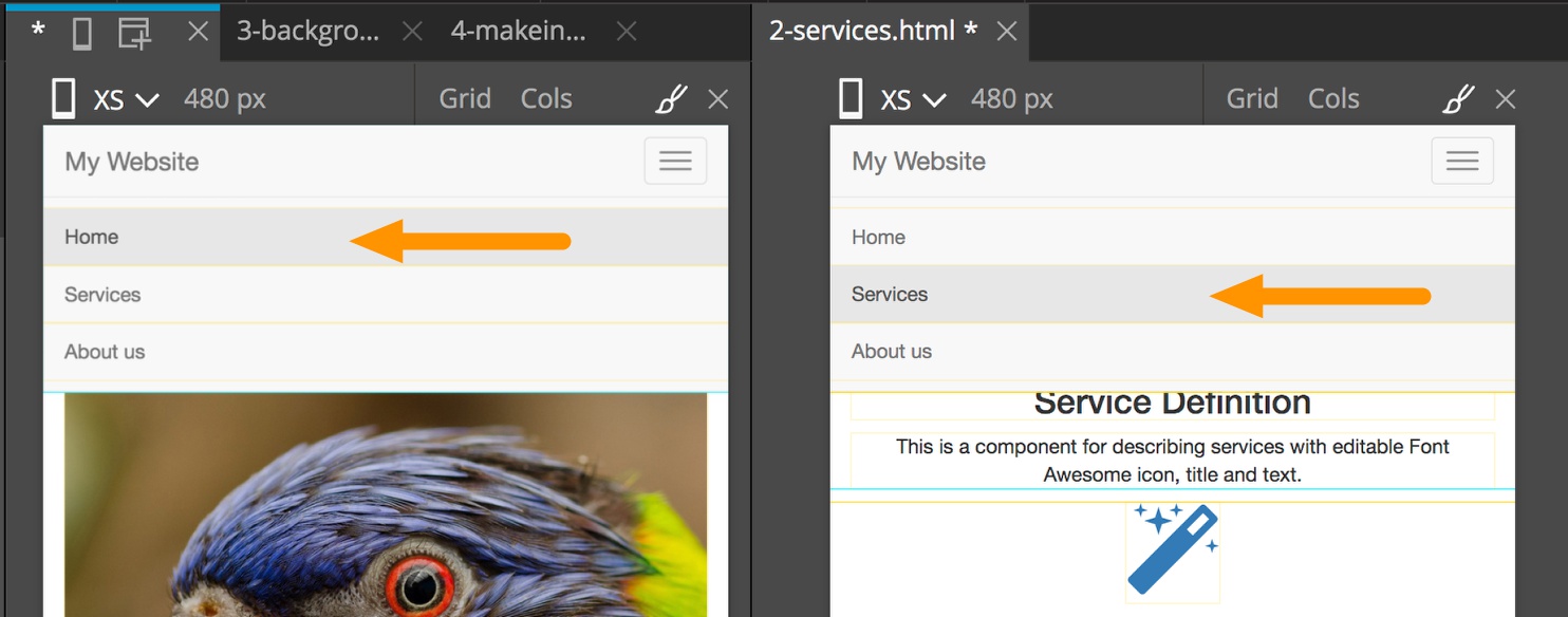
We can then place the navbar component on multiple pages and have the “active” class assigned to the correct menu item.
Example: Navbar with editable “active” class on menu items
Let’s define a Navbar component for our website. Select the outer Navigation container, open the Actions panel and apply the Define Component action, then assign an Id and Display name.
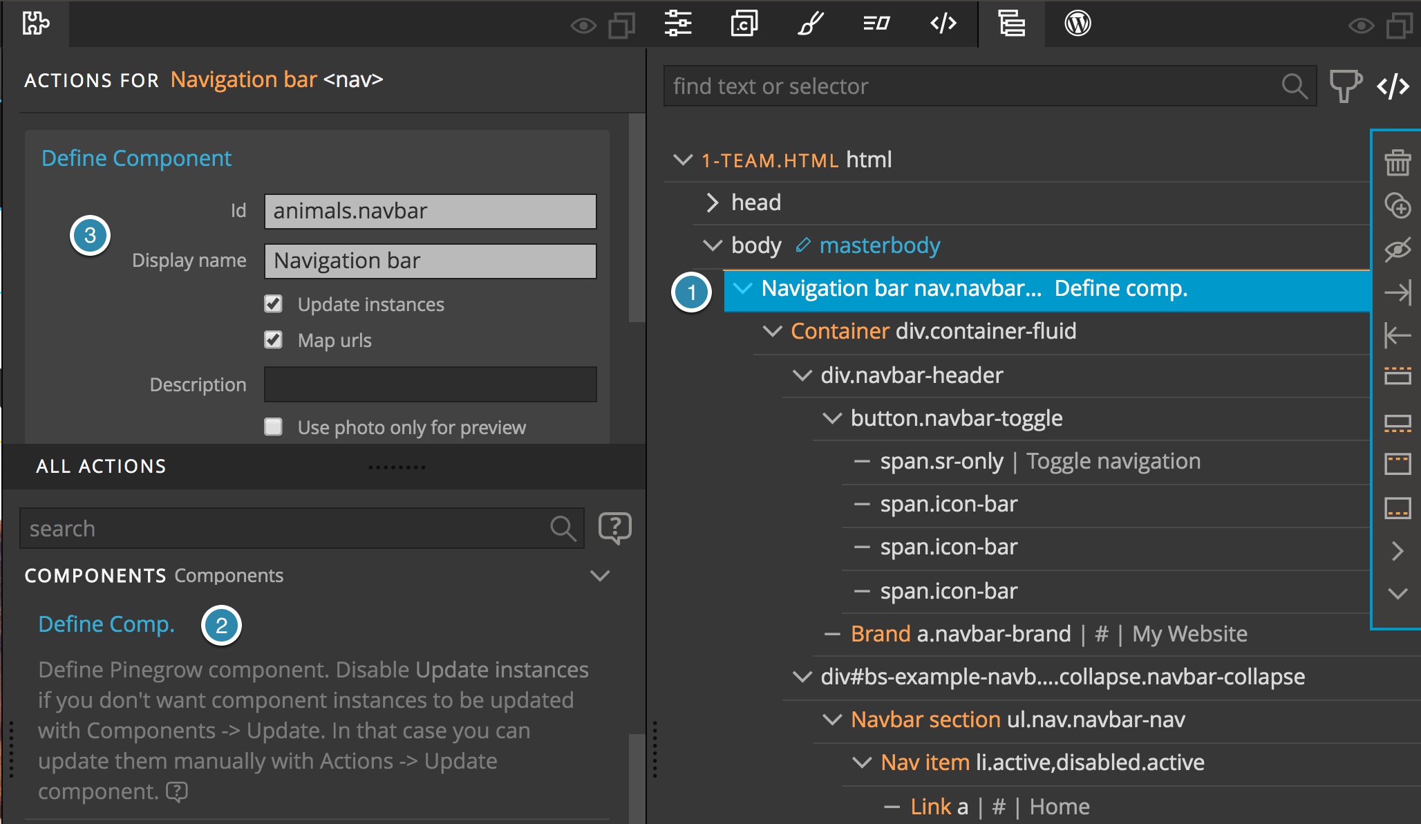
Update components and the Navbar will appear in the Library Panel.
Next we can make each of the menu dropdowns editable for the .active class.
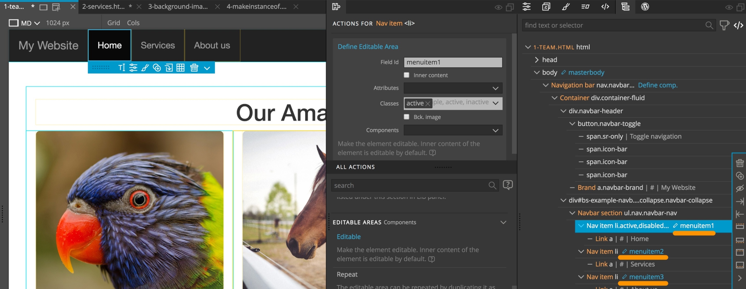
Now when we click on the update components button we will add the editable navigation component to the Library panel. From there we can place it on the Services page and mark the Services menu item as active:
Let’s switch to mobile size for better view. Then, in Navbar component definition, we change the navbar color to Inverse. Update components. See, the right menu items are still selected!
Example: Editable Font Awesome icons with regular expressions
We can use regular expressions /…/ for advanced class control – click here to learn more about regular expressions (also called regex or regexp). For example, use the following regular expression to let user choose Font Awesome icons while keeping icon sizes defined by the component.
See example in 2-services.html:
/(?!fa\-border|fa\-spin|fa\-pulse|fa\-flip\-horizontal|fa\-flip\-vertical|fa\-fw|fa\-inverse)(fa-[a-z\-]*)$/
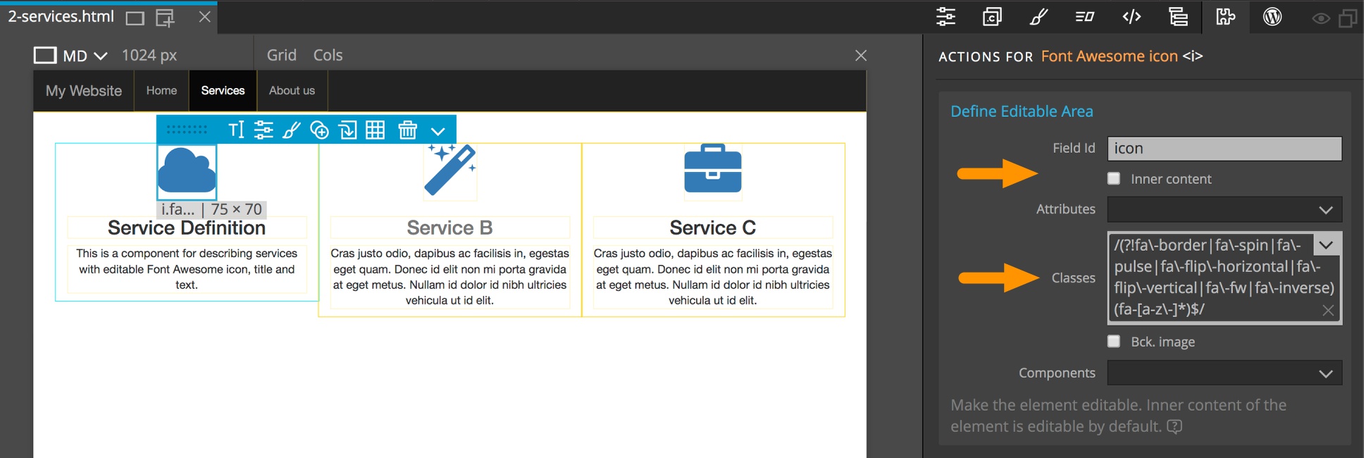
Sometimes we just want to make classes or attributes editable and the content fixed. Uncheck the “Inner content” to prevent content from being edited.
Editable background image
Background images can also be designated as editable. That’s useful for headers, jumbotrons, sections and similar elements that display a background image with background-image CSS property.
To make a background image editable select the element that will contain the background image, add the Editable action in the Action panel, uncheck Inner content if needed and then check Bck. image checkbox. See 3-background-image.html for example.
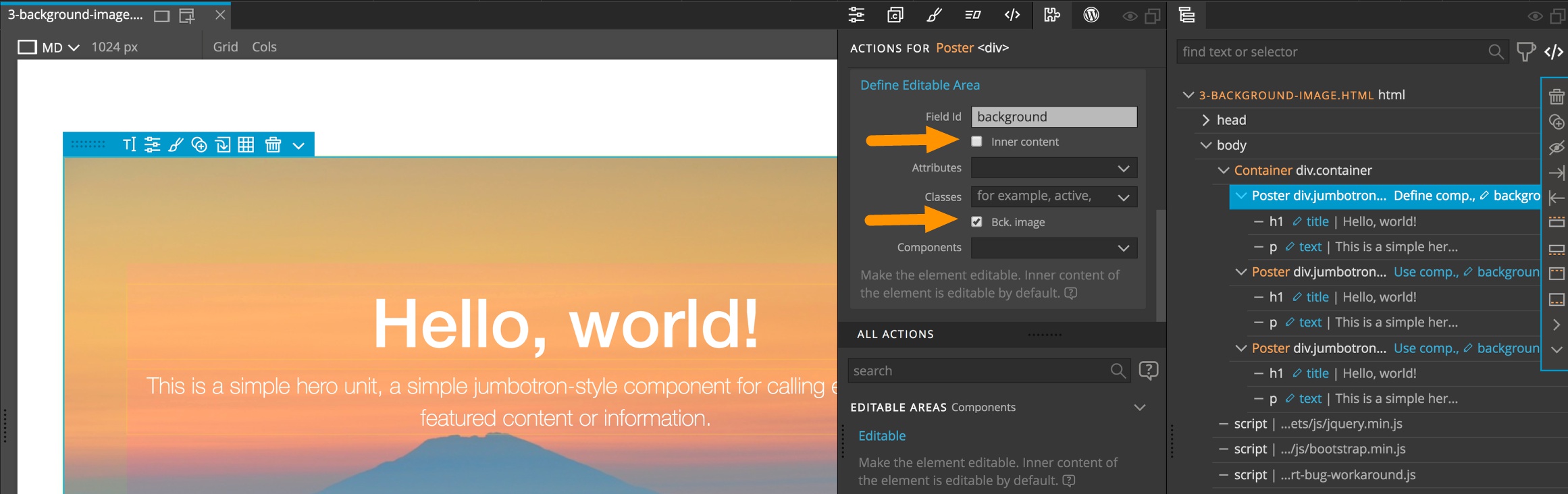
Note that in this case we have unselected “Inner content” because we don’t want to make the whole inner content of the element editable. We have separate editable areas for title and text of the poster.
Take a look in the Components tutorial project for an example of a component with editable background in background-image.html.
After updating the components, the background image of component instances can be edited either with the Component properties in the Properties panel or with the visual editor in the Style panel:
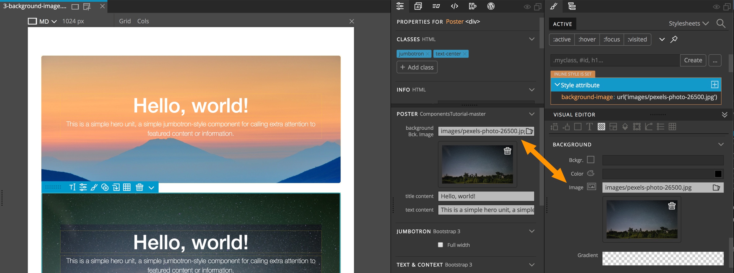
Editable background images are set with the background-image inline CSS property in the style attribute.
A default background image can be defined with a normal CSS rule for the element. This will work because background-image defined by an inline style will take precedence over a stylesheet rule.
CSS rules should also be used to define background image size, for example setting background-size to cover so that background image covers the whole element.
Collections – Specifying which component types can be used in the editable content
Pinegrow allows you to also control what components can be added to the editable inner area of a nested component.
Take a look at our Team component. It has an editable row “members” that contains instances of Team member component. Without limiting the types that can be used within this editable area the whole inner content is editable. We could add any element into it, not just team members. In most cases, that’s not what we want.
We can specify which component types are allowed inside the content by editing “Allowed components in content” property of the Define editable area action
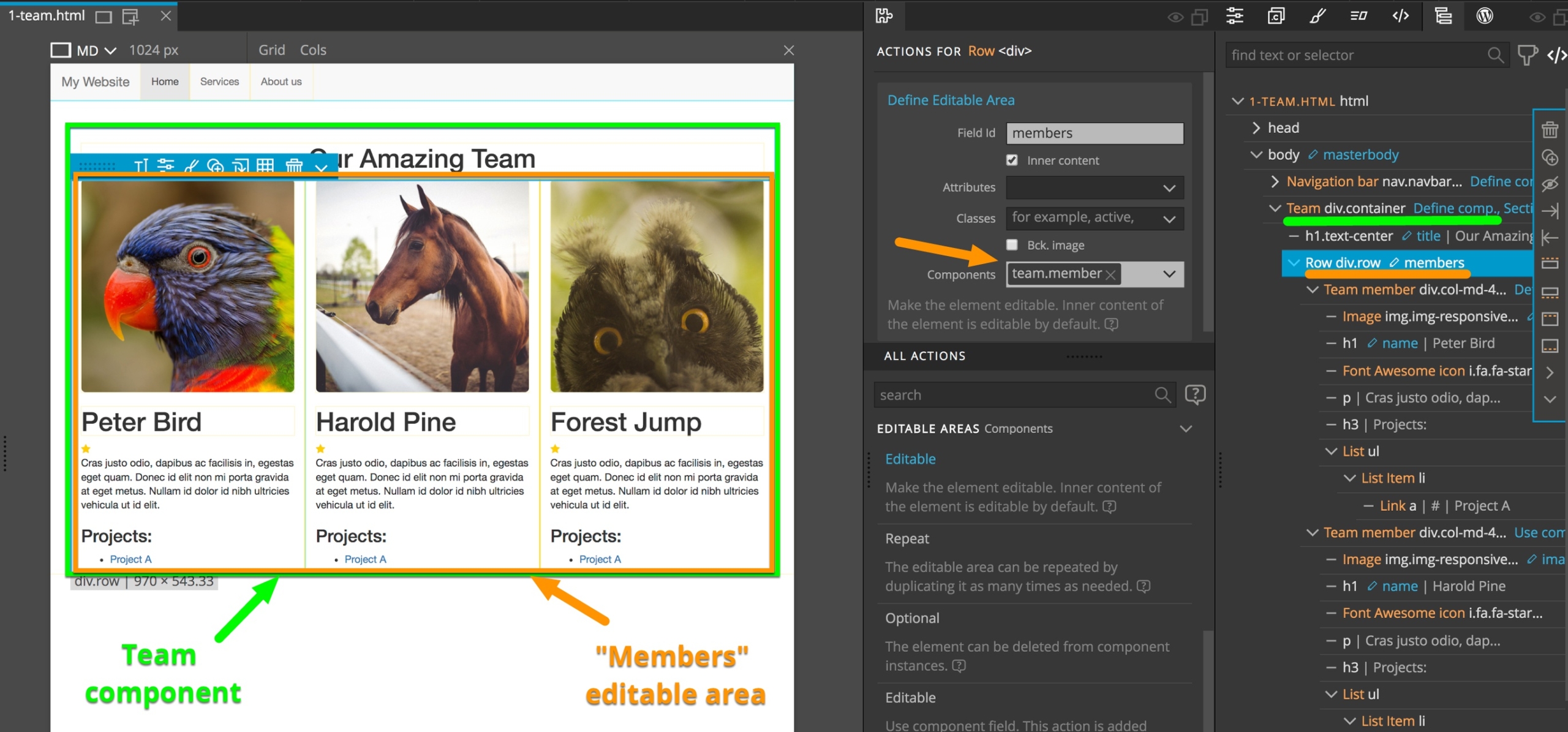
Only component types defined in the project or in loaded project libraries can be used here. To list general elements like H1 you first have to define them as components.
Here, we set that the editable area content can only include instances of Team member component. Pinegrow will let us add new Team members and duplicate, delete and rearrange the existing ones.
Component properties in the Properties panel will also get a handy “+ Team member” button that will insert a new team member into the members editable area.
Component definition can include other elements inside the editable area. But only specified component types will be editable.
Editable areas as properties in PROP panel
Editable areas are also listed as component properties in the Properties panel. That’s a very convenient way to edit component instances. Let’s take a look at a couple of examples.
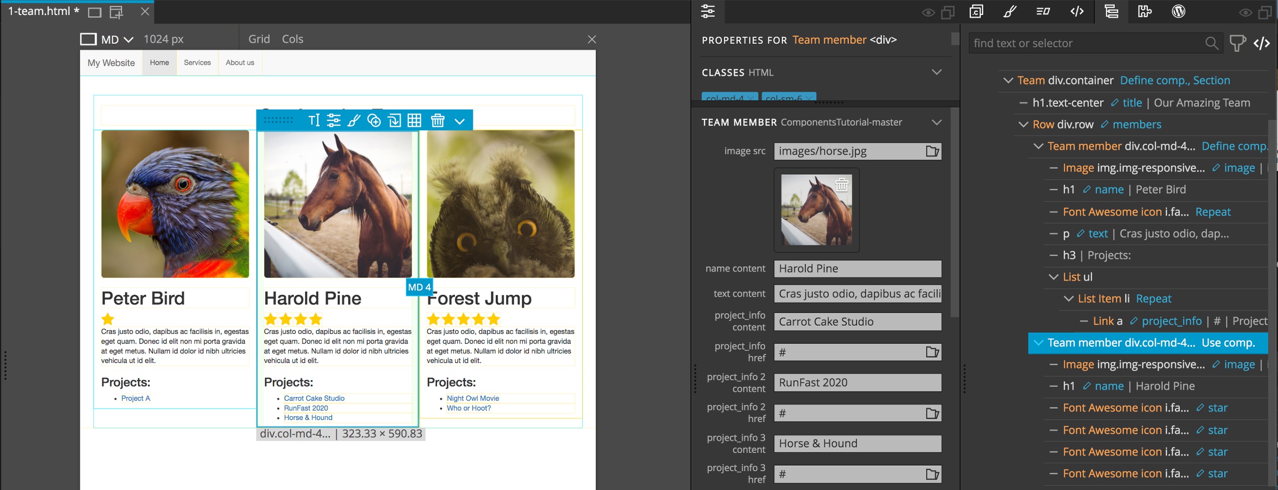
Our team member definition and instances have properties for changing the name, description and image:
Editable classes are also listed in Properties. For our navigation bar we can easily select which menu item is active:
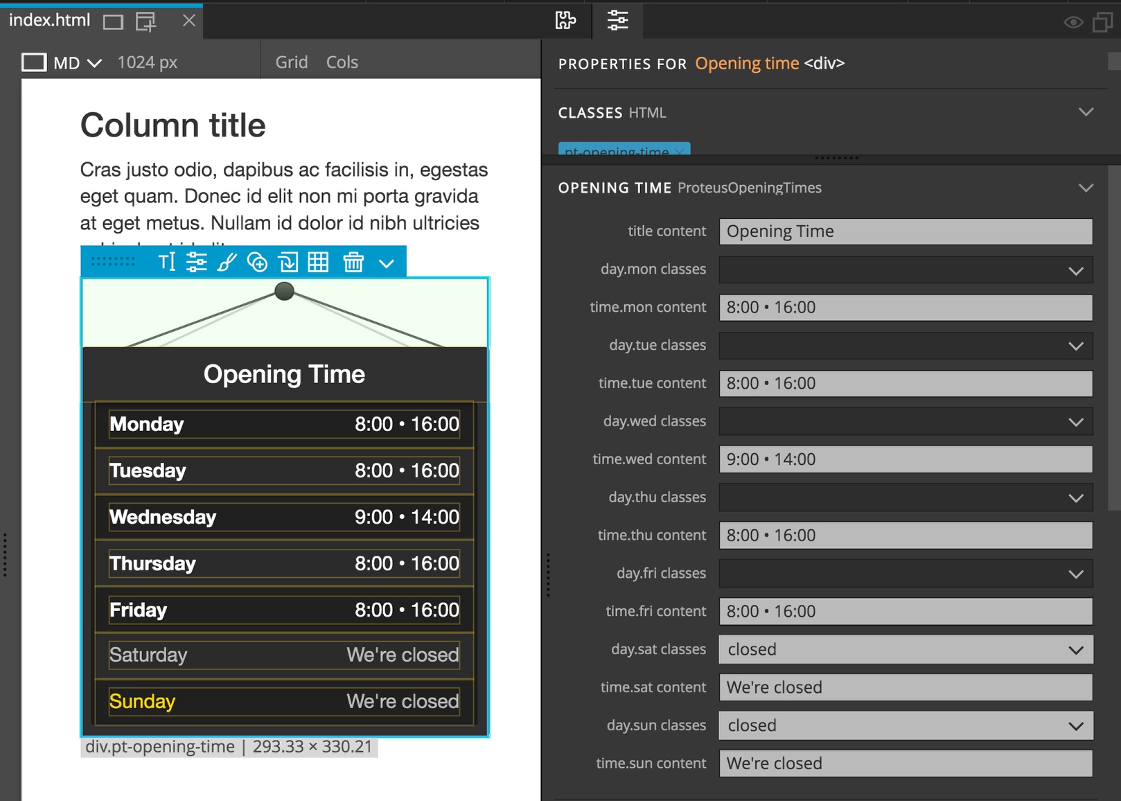
This works even for complex components like the opening times widget:
You don’t have to do anything to get editable areas listed as properties – Pinegrow does that for you.
Repeatable elements
Components can have elements that can be repeated one or more times.
Let’s add a star rating to our team member component:
Insert a Font Awesome star below the name and add a CSS class and styling to make it golden. Update the components. Everybody got a one-star rating! We can’t even duplicate stars in component instances because the star is not editable.
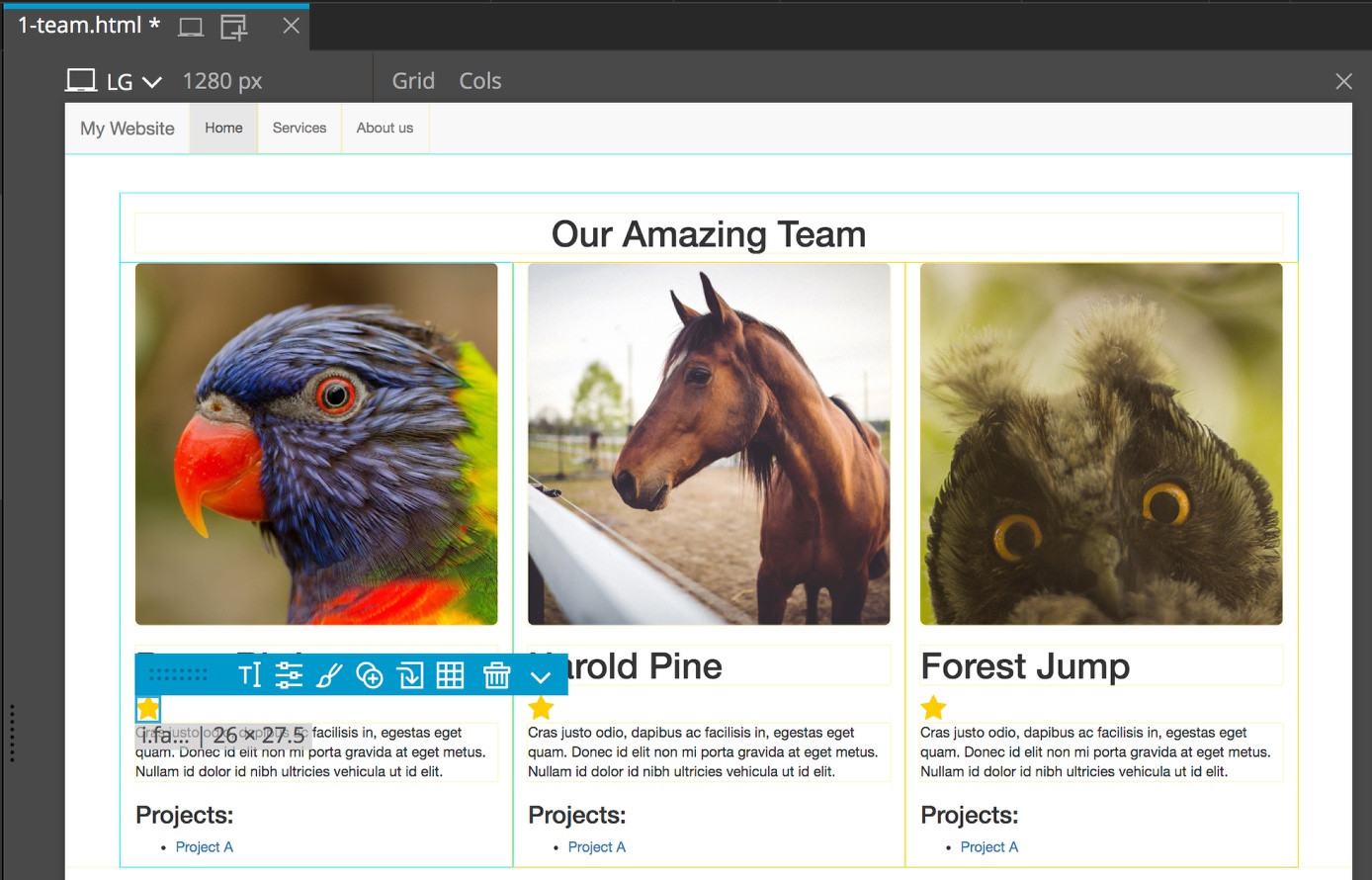
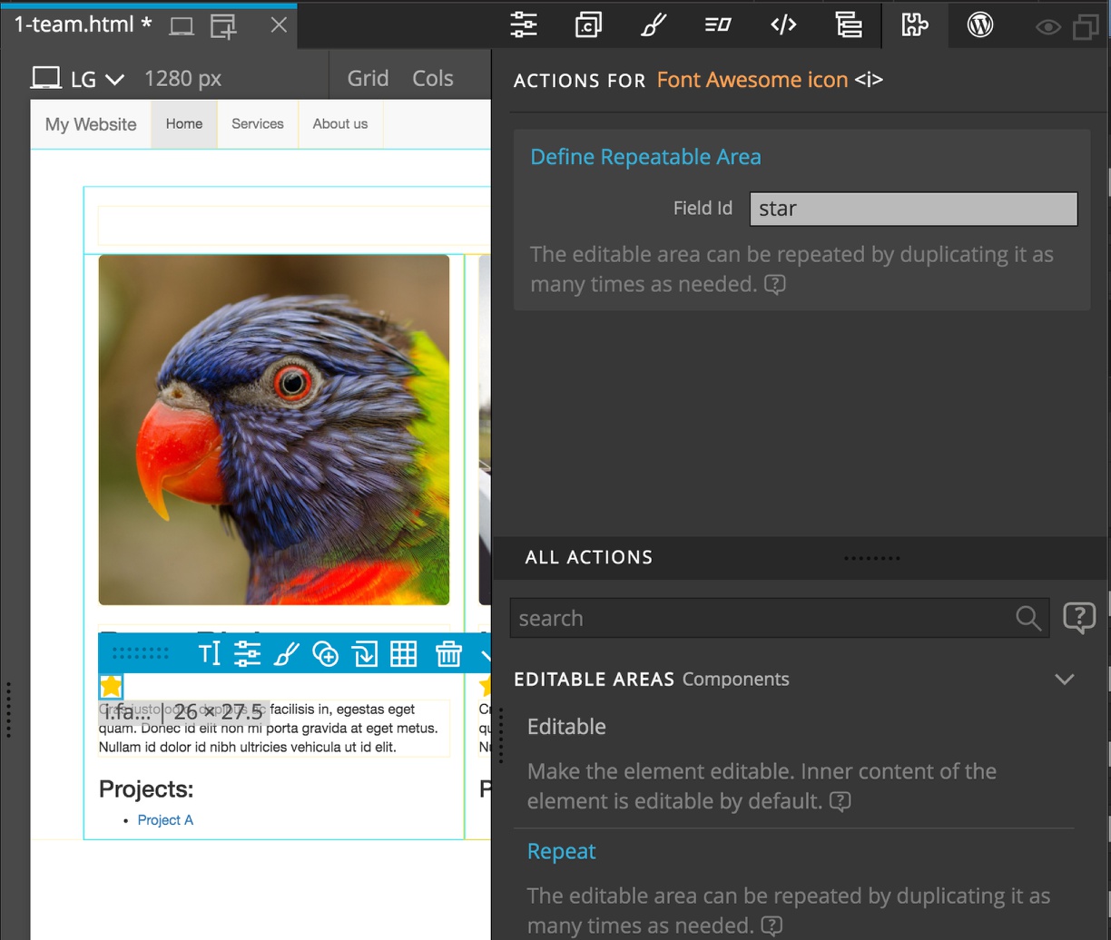
Now, in the team member definition, add “Repeatable area” action to the star and do a quick update by clicking on the orange button. We need to name the area, for example with “star”.
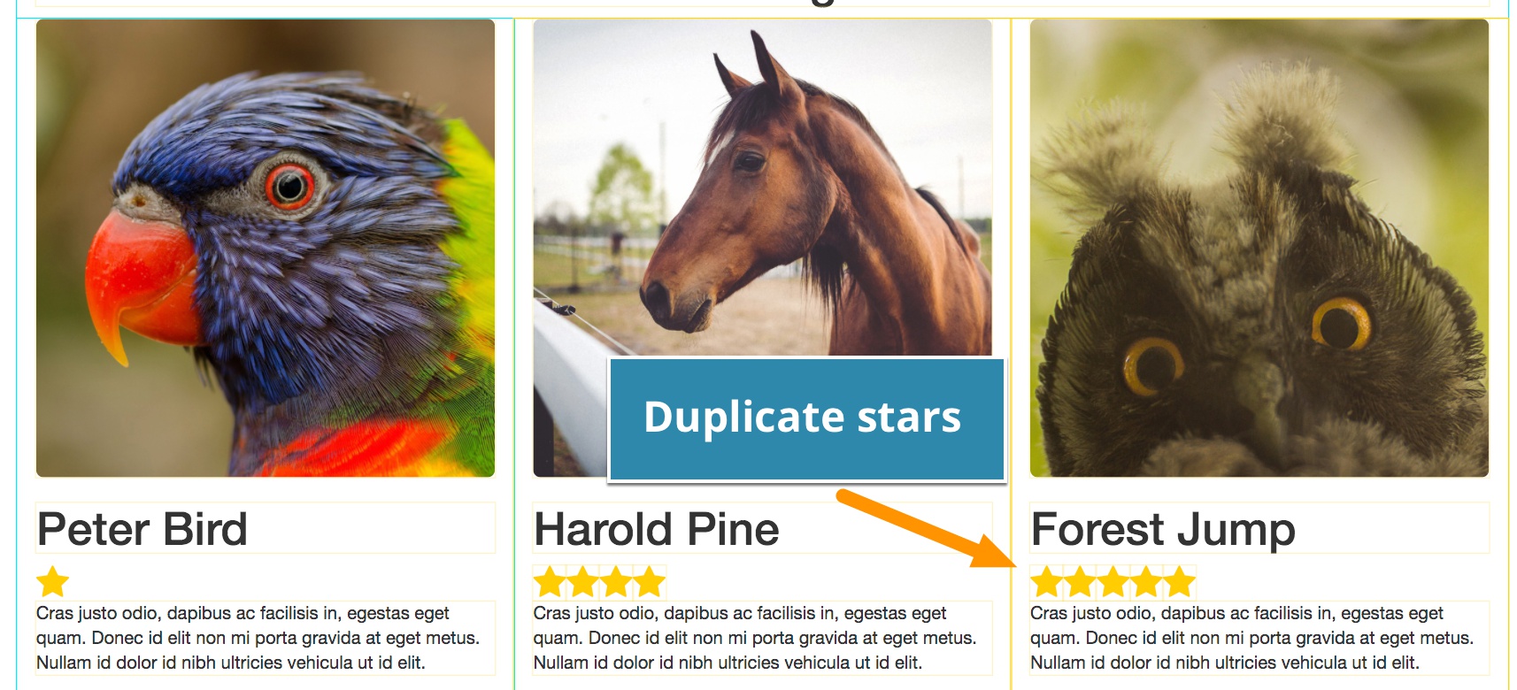
With that we can duplicate stars in component instances to create individual star rating for each team member. Updating components will preserve the stars.
Repeated elements can also be editable, or they can contain editable areas.
Let’s add list of projects to team members:
Add heading and a list with one item below the team member description. The list item contains a link to the project.
Adding “Repeatable area” action to the list item (not on the link) will let us create as many list items as needed for each team member.
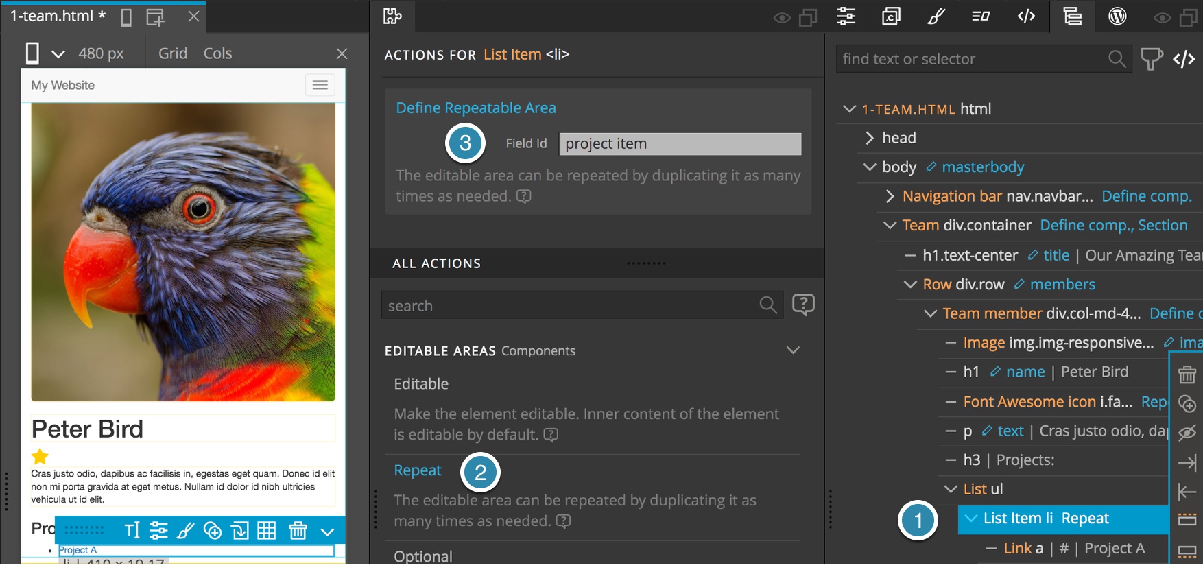
Then, we make the link (not the list item) editable by adding “Editable area” action and leaving the “Inner content” option on to edit the content of the link (it is on by default) and the HREF attribute as editable.
Let’s update the components.
Now we can go to each team member, duplicate as many list items as we need and fill in project names and links. Updating components preserves our edits.
We can now change the layout of the project list (for example, change it to columns) and as long as field ids stay the same we’ll be able to update all instances without losing any editable data.
Optional elements can be deleted from component instances and will not be restored when components are updated. To restore all optional elements in an component instance use Page -> Restore optional components.
Optional areas
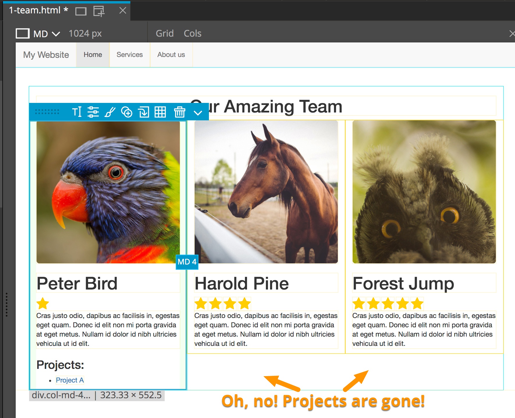
What if some team members don’t work on projects? At the moment we have no way of removing the project list from team member instances. We could define a second team member component without the project list and use it for those team members.
But, there is a better way – we’ll make the project list optional.
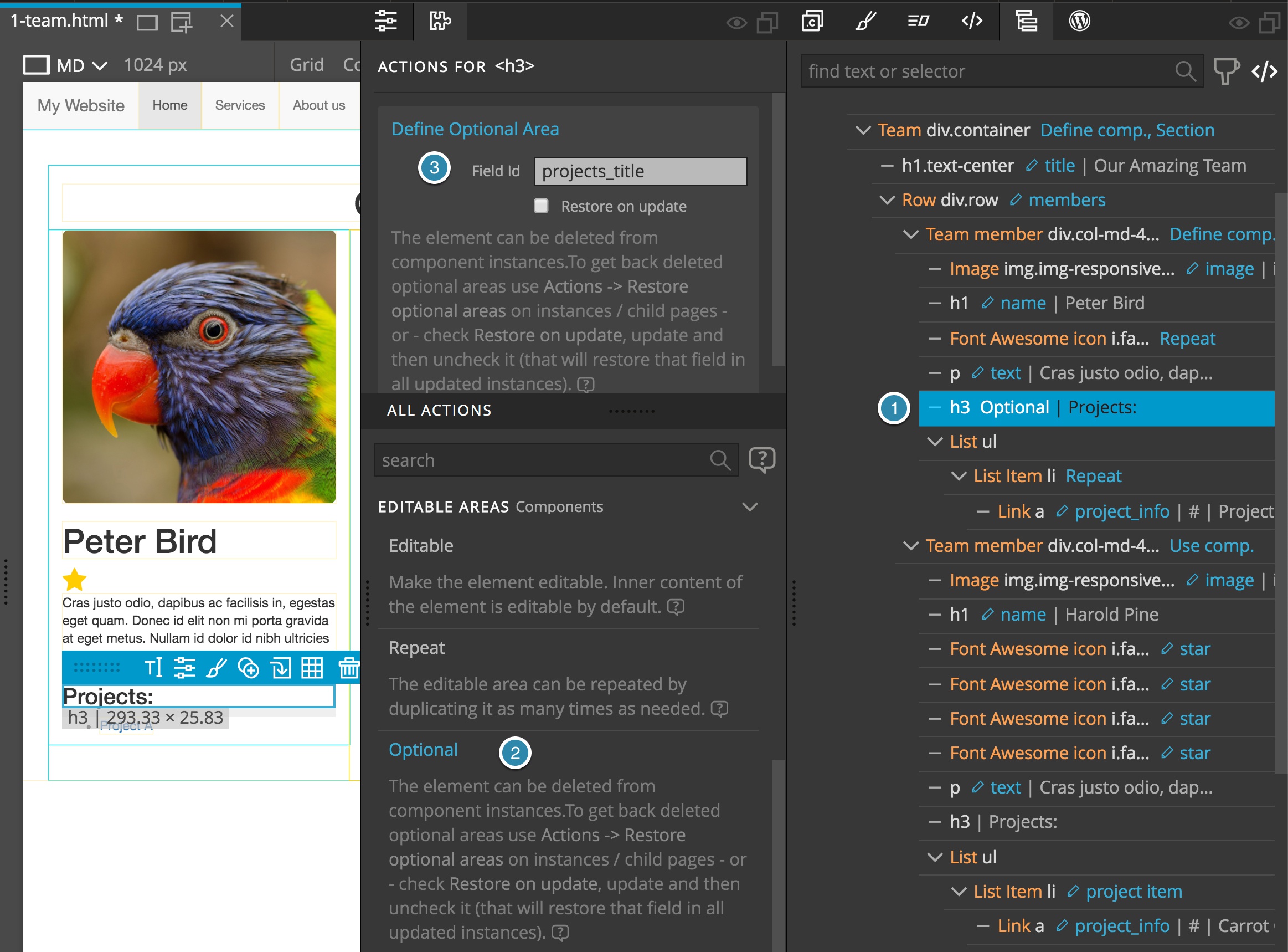
Select the Projects heading and add an “Optional” action. As with editable and repeatable areas, we also have to name the optional areas.
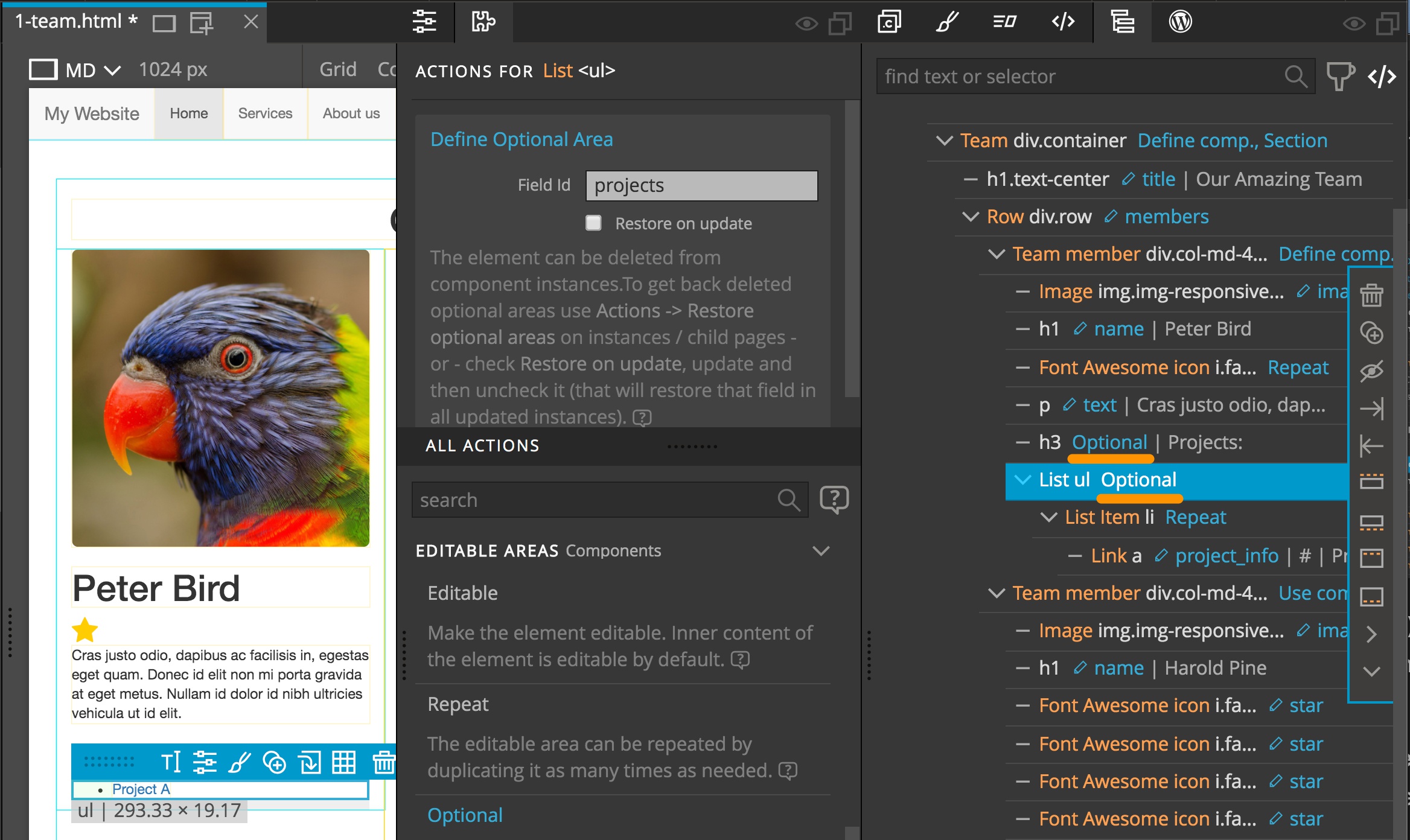
Then, add an “Optional” action to the project list and update components.
Oh no! Now projects in all team member instances are gone!
Why? The reason is that we defined elements as “Optional areas” after they already existed in team member instances. Projects heading and Project lists didn’t have the corresponding ids and Pinegrow could not correctly match the elements. The update assumed that those areas are not present in instances, and since they are optional, it didn’t add them to the instances.
In this situation – when we make elements that already exist in instances optional – we have to check “Restore on update” on the “Optional” action of the original component and then run the update. Optional elements will not be removed in existing instances.
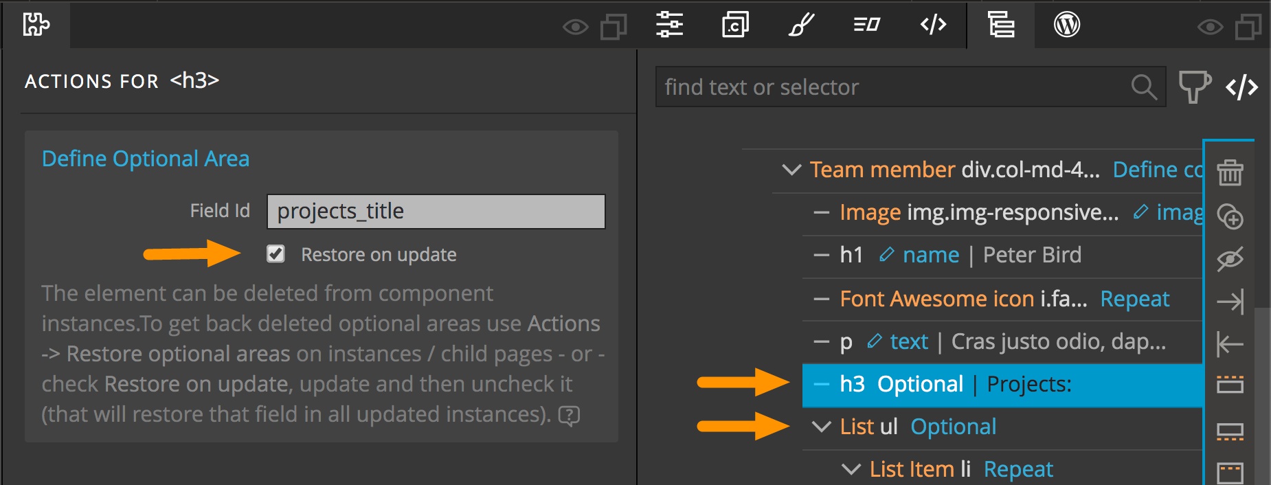
After the update is done and optional areas are marked in existing components we uncheck the “Restore on update” checkbox, update components and start using optional areas. Pinegrow will automatically add the correct field ids.
These step are not necessary if elements that are marked as optional don’t yet exist in component instances.
Now we can delete optional elements from component instances. Updating the components will not add removed elements back.
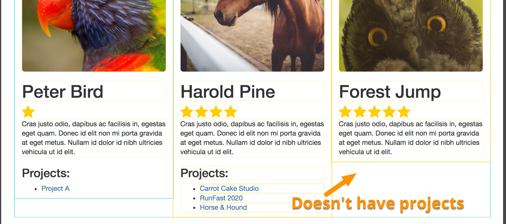
But what if we change our mind? How can we get deleted optional elements back?
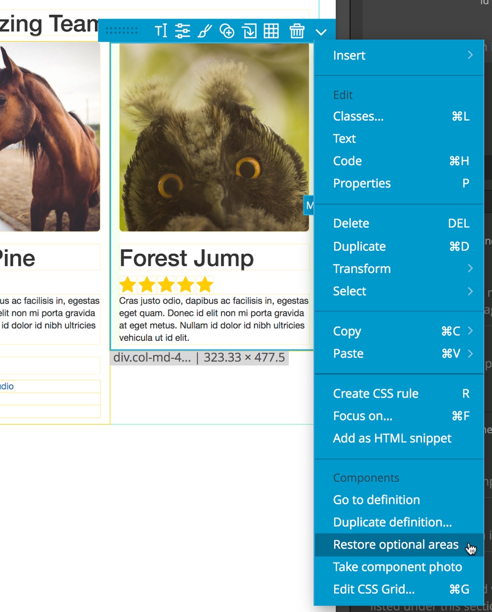
Easy. Select the instance and chose “Restore optional areas” from Selected Elements menu Actions dropdown. Note that this will restore all optional areas in the component instance.
Storing unused editable data
Some actions can lead to loss of edited information in component instances. Pinegrow saves that data so that you can easily get it back.
Deleting the editable element from the component definition will remove the element from all component instances. Let’s delete team member heading and update components. The names of all instances are gone, as they should be.
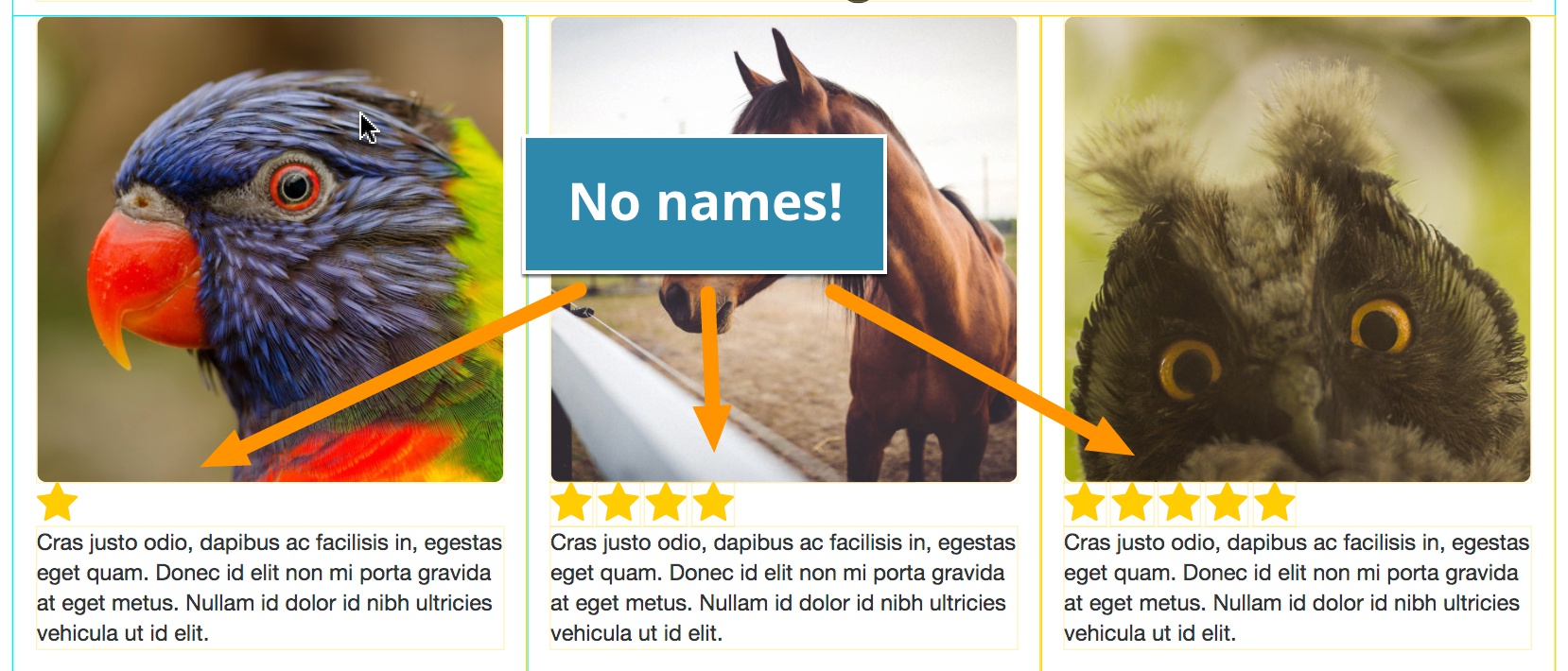
But Pinegrow doesn’t just throw the data away. Take a look at the instances source code. Unused edits are stored as HTML comments.
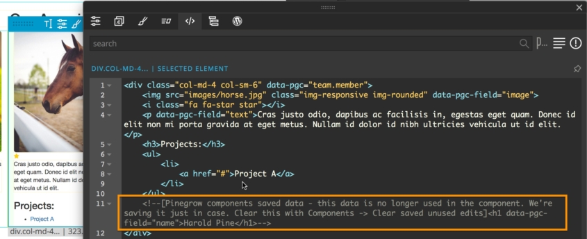
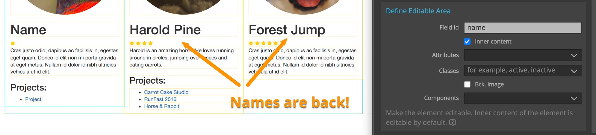
So if you add the editable area back to the component definition (or another element with the same field id) and update components, the saved edited data will re-appear.
Another scenario where edits get lost is changing the field id of an editable area and updating components without changing the field ids in component instances. Thanks to saved editable data, restoring the field id will bring the original edits back.
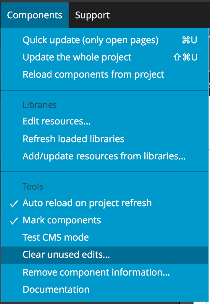
But what to do if we really don’t need the saved data anymore? Easy. Use Components -> Clear unused edits to remove HTML comments with saved edits either from the current page or from the whole project. This should always be done before deploying your project to production.