The Floating Tools panel allows you to style your Bootstrap page with many of the common classes directly within the Page View, speeding up page construction and design implementation. No more switching between the page and the Properties or Style Panel. Let’s explore just what this tool allows you to do!

Introducing the Floating Tools panel
The Floating Tools panel is automatically added to any Bootstrap project, but there are a couple of ways to get it to display if it is not visible, or you close it.
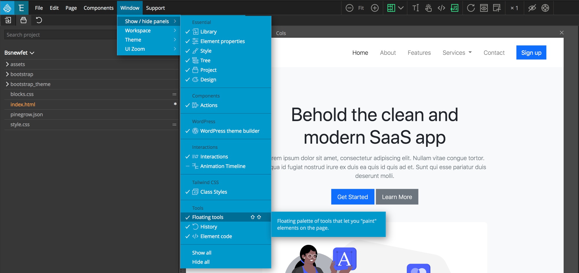
The first is through the “Window” menu “Show/hide panels” drop-down. In the tools category is a selection for the Floating Tools. This also shows the second way to get them to display – using the double <kbd>SHIFT</kbd> hotkey – just tap the shift key twice. This will also cause the Floating tools to “fly” to your current cursor location. The final way to open the Floating tools panel is only available if you have the Design panel activated for your project. At the bottom of the design panel, next to the “Surprise me!” button is a palette icon that will open the tools.
Note: For more information about the Design panel see the documentation here.

The Floating Tools can be used to add styling to your page elements in two different ways. By default, it is in “Set mode”. This means that it will add styling to the currently selected element(s). In “Paint mode” you can first select a tool and then each element you click on the page will have that styling added. The Floating Tools for Bootstrap has over 11 categories of classes that can be added. Let’s start at the left and examine each.
Text Color
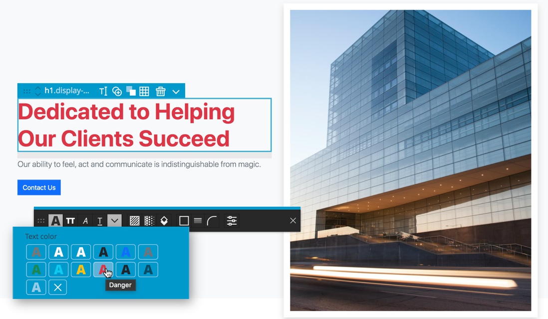
The first tool can be used adds the appropriate text color class to any selected or painted elements, for example .text-primary. All of the colors from your palette will be available, including custom colors defined through the Design panel if activated. You can also see that the styling already added to the element will be indicated in the Floating Tools if you are in Set mode. With most of the tools, in order to remove an existing styling class, click on the ‘X’ icon.
Text transformation
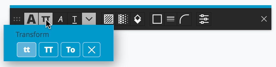
The second icon allows you to add any of the three text transformation classes – .text-lowercase, .text-uppercase, or .text-capitalize.
Font style
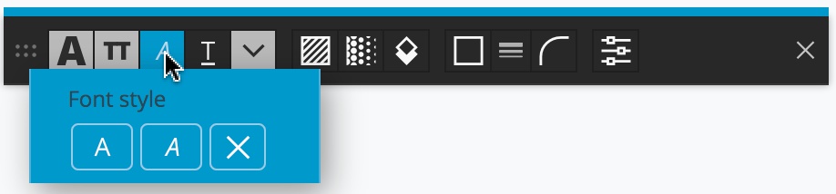
The next icon over sets the font styling. The two class choices are .fst-normal and fst-italic.
Text decoration
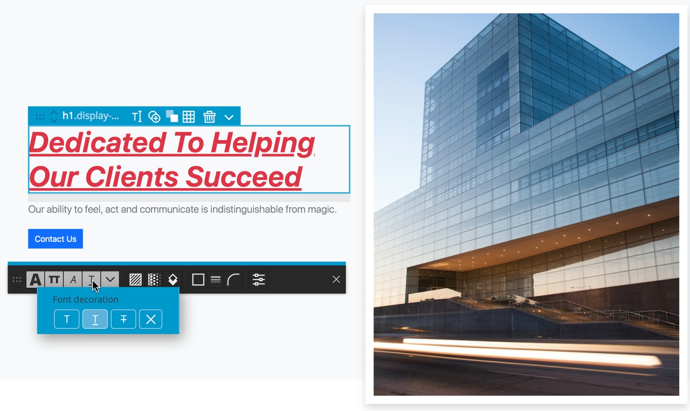
The fourth icon allows you to apply the different font decoration classes. They include .text-decoration-none, .text-decoration-underline, and .text-decoration-line-through.
Miscellaneous text styling
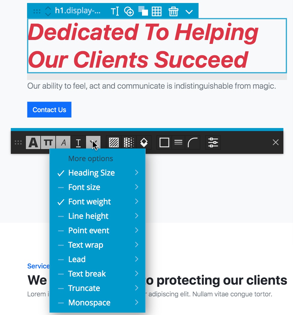
The caret next to the decoration tool opens a drop-down that contains a number of lesser used text styling options, like heading size and font weight.
Background context
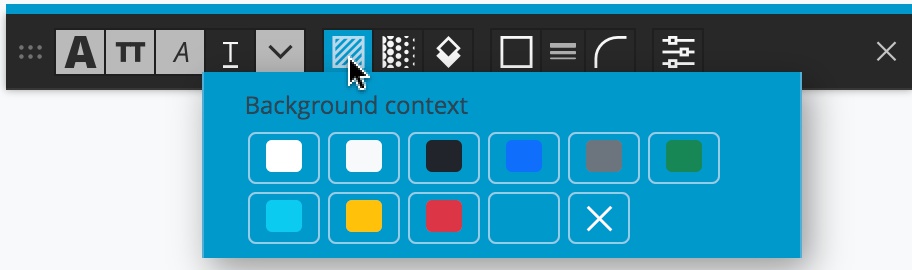
The next icon in the Floating Tools should look familiar from the Styles Panel – it allows you to set the background color of any selected elements through the .bg-color classes. Like the font color tool, this tool will display all of your theme colors, including those added through the Design panel.
Gradient toggle
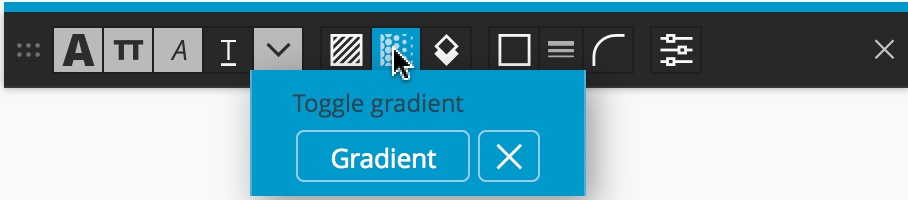
Continuing with the background controls, the next tool over is used to toggle the .bg-gradient class on the selected element(s).
Box shadows
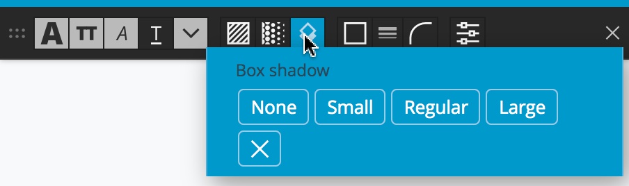
The eighth icon over is used to control box shadows being added to the selected element(s). It is used to add one of four classes – .shadow-none, .shadow-sm, .shadow, and .shadow-lg. As a reminder, as with most of the tools, the ‘X’ icon removes any of these classes from the element(s).
Border color and display
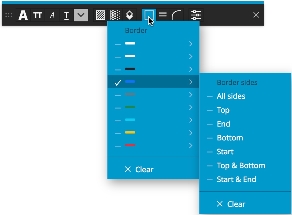
The next three icons all are used to style element borders. The first allows you to select a border color. Either the standard Bootstrap colors, or the palette generated in the Design panel if activated, can be selected. This will result in the addition of a border color class – for example .border-primary. This is a smart control, so the default .border class will also be automatically added, resulting in a border on all four sides of the element.
Hovering over the border color will bring up a further menu that can allow you to control where the border is added, for example, only to the top with a class of .border-top. The seven possibilities are .border, .border-top, .border-end, .border-bottom, .border-start, both .border-top and .border-bottom, and both .border-start and .border-end.
Border width
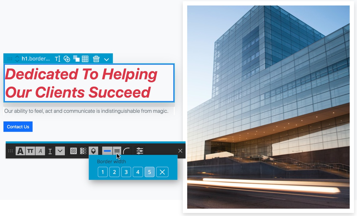
The tenth icon is the second border control and controls the border width, For example, selecting a boarder width of 5 will add the .border-5 class.
Border radius
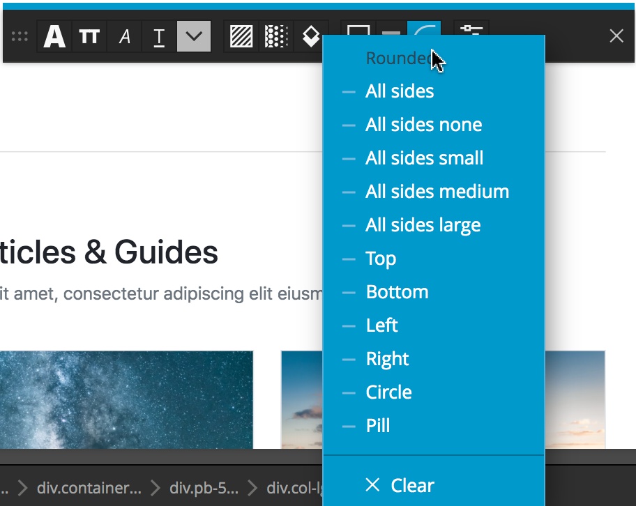
The final styling icon controls the border radius. The possible added classes are .rounded, .rounded-0, .rounded-1, rounded-2, rounded-3 ,.rounded-top, .rounded-bottom, .rounded-start, .rounded-end, .rounded-circle, and .rounded-pill.
Note: If this documentation was helpful, check out some of our tutorials for Bootstrap, like this one for working with Bootstrap modals.