See how you can use Pinegrow to customize your Bootstrap 5 theme by modifying Bootstrap SASS variables and adding CSS rules.
As of Pinegrow 6 you can customize many aspects of your Bootstrap theme using the Design Panel, including colors and fonts. See the documentation here. Other customizations will need to be performed as outlined below.
Customizing Bootstrap is normally a bit complicated because it requires setting up the SASS compilation environment, installing Bootstrap SASS sources and creating a file structure for your custom theme.
But with Pinegrow it’s very simple.
Pinegrow takes care of all these tasks. All we have to do is the actual customization.
Don’t have experience with SASS and variables? Just keep reading and you can learn along the way!
If you want you can use this article as a practical tutorial, just open Pinegrow ( download the trial version, if you don’t have it yet) and follow along.
This article is also available as a YouTube video if you prefer to watch the action:
Let’s get started!
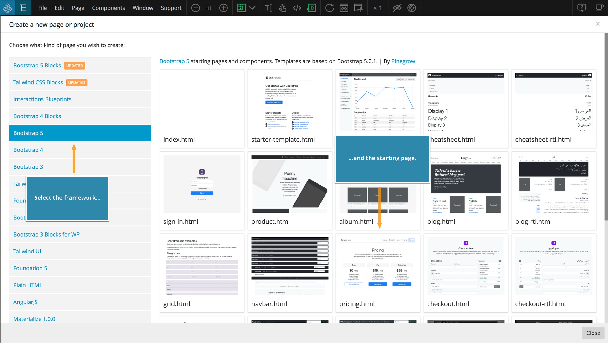
Create or open a project
First, create a new Bootstrap 5 project with “File -> New page”, or open an existing project with “File -> Open project”. You can also use the icons on the home screen to accomplish these same tasks.
Note, in order to customize an existing project, bootstrap.css (or bootstrap.min.css) needs to be included in the page locally, not remotely from a CDN.
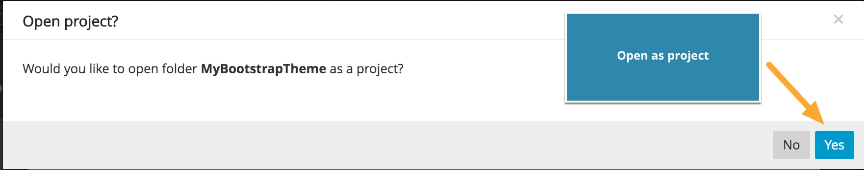
After the page opens, save it to a new folder where all our project files will be stored. After saving, Pinegrow will prompt to open as a project – select “Yes”.
Let Pinegrow setup the SASS structure for the theme
Open a page from your project and select “Page -> Customize & update Bootstrap theme”.
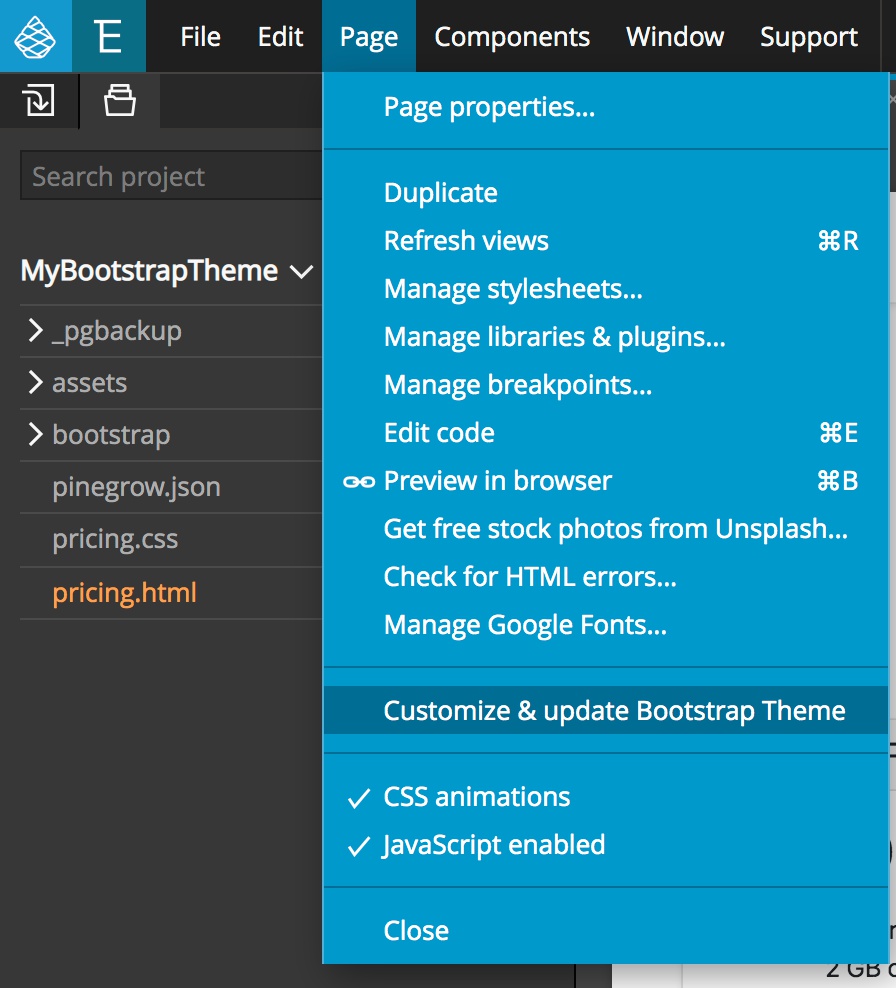
A notice will pop-up asking if we want to add the Bootstrap 5 source SASS files to our project. Click on “Sure, let’s do it!” to proceed.
Once we confirm, Pinegrow will do all of the preparatory work for us. Another notification will explain what was done
- A folder ‘bootstrap_theme’ was created in our project
- The Bootstrap 5 source SASS files were copied into the ‘bootstrap_theme/bootstrap’ folder
- Our new main theme file, ‘custom.scss’, was created in the bootstrap_theme folder. All of our custom variables and CSS rules will be added to this sheet.
This structure is set up in accordance with the official Bootstrap guidelines for customization.
When customizing Bootstrap it is important to never change the original Bootstrap source files. Why? Because all our changes would be overwritten if we update Bootstrap in the future.
With this structure, we can overwrite the files in the ‘bootstrap_theme/bootstrap’ folder without impacting our ‘custom.scss’ file containing our customized styling.
Bootstrap SASS variables
Let’s look at the Bootstrap variables available to us.
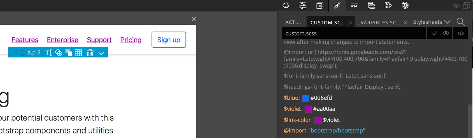
Change to the Style panel and open the Stylesheets menu by clicking on the dropdown at the upper right. This will show the structure of all the Bootstrap source files.
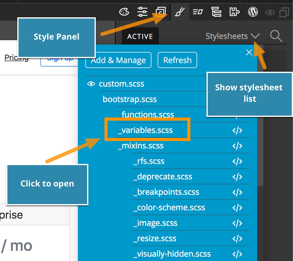
Don’t worry if it looks a bit scary. We only are interested in two files on this list.
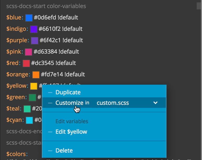
- ‘_variables.scss’ contains all of Bootstrap variables conveniently located in one place
- ‘custom.scss’ is where all our modifications will go
Click on the ‘_variables.scss’ to open it in a separate tab within the Style panel. 
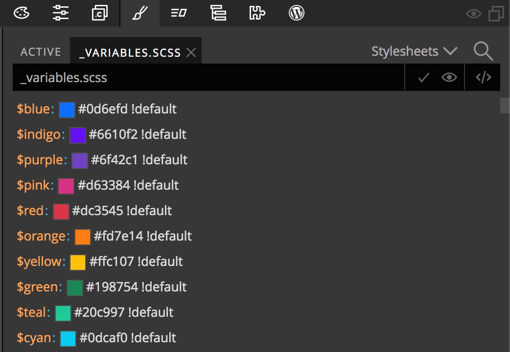
In SASS, variables are prefixed by the $ character. When SASS is compiled into CSS, the compiler will replace the variable names with their values throughout all of our stylesheets.
Pinegrow has a SASS compiler bundled in, so there’s no need to install anything else. A unique feature of using SASS in Pinegrow is that all changes to SASS files are immediately compiled and shown on the page – no need to save changes first.
Changing link colors
The Design Panel allows us to change the values for a number of different variables and we will take a look at how it works in the next section. For now, let’s change the color of our links.
Looking at the ‘_variable.scss’ file we can see that there are a large number of variables. So, how can we find the ones that involve links?
Searching for variables
The Style panel has a search function to help you find named variables quickly. Just click on the Search icon to make the search bar appear. Then add in your search term and a list of possible variables will come up. 

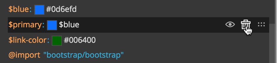
At the top of our list is a variable called $link-color. It currently has a value of $primary !default. The first part of this variable sets the value of the $link-color variable to the value of the $primary variable. The second part of this value is !default. This is a message to the SASS compiler stating that if our $link-color doesn’t already have a value, then assign it the value of the $primary variable.
So, how do we change our link color for our custom theme? We could just assign the $link-color variable a new value by typing it here in the _variable.scss file. Remember though, that is a bad idea because our custom value will be over-written with any update.
To customize $link-color, we will right-click on it and select “Customize in custom.scss”. If custom.scss is not selected yet we have to pick it from the dropdown list and then click on “Customize”. 
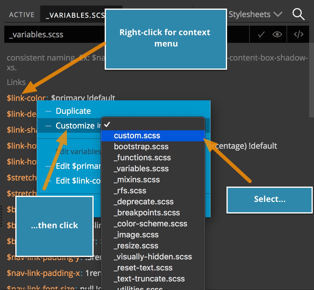
Pinegrow will create a copy of $link-color in custom.scss and will open the stylesheet in a new tab. If the particular variable contains references to additional variables, they will also be copied over to the custom.scss stylesheet.  In this case, two additional variables have been copied over,
 $blue and $primary, because $link-color is dependent on both. Without both being copied into our custom.scss file the compiler would throw an error.
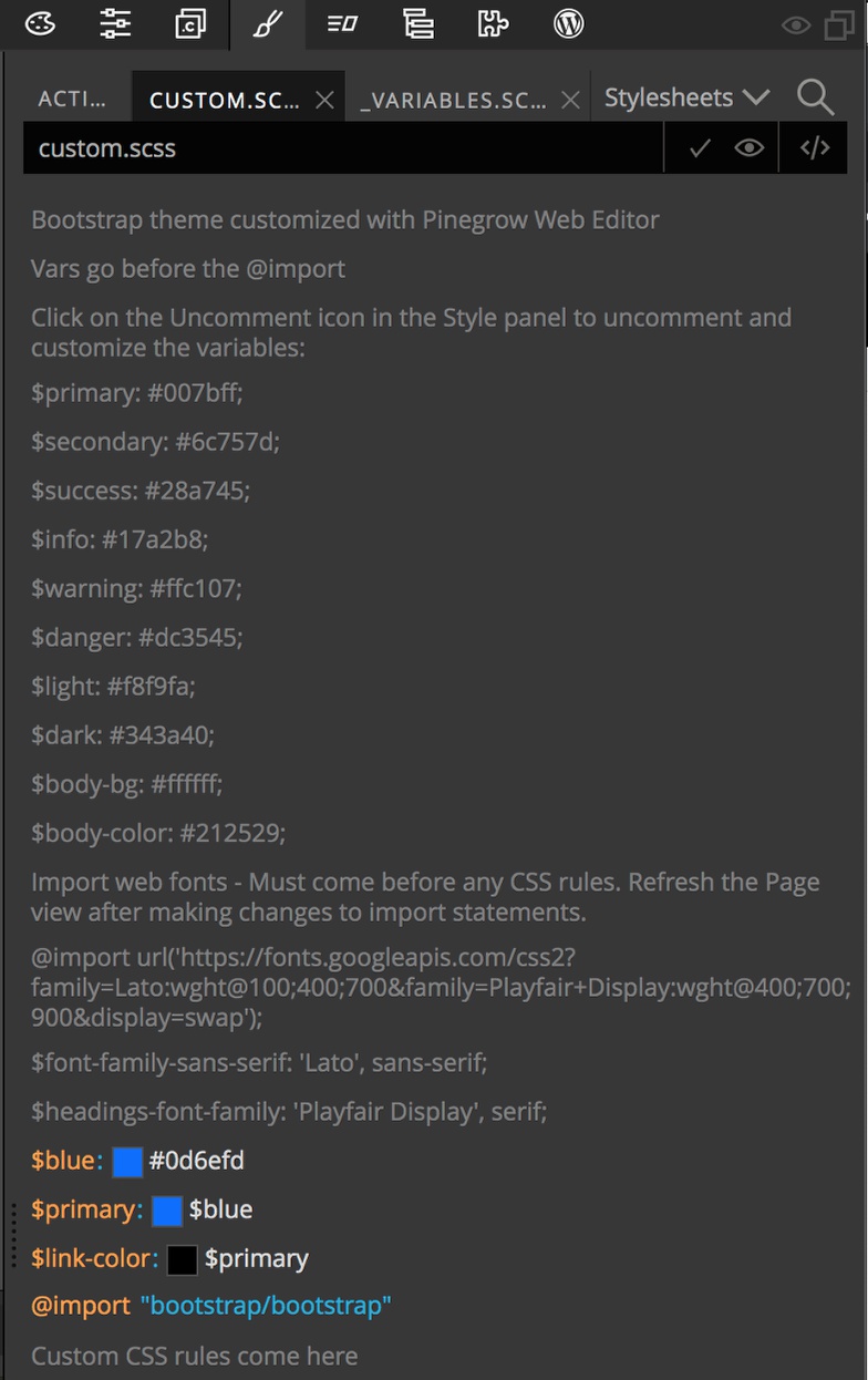
We can now go ahead and change the value of $link-color in the custom.scss tab or in the code editor. 
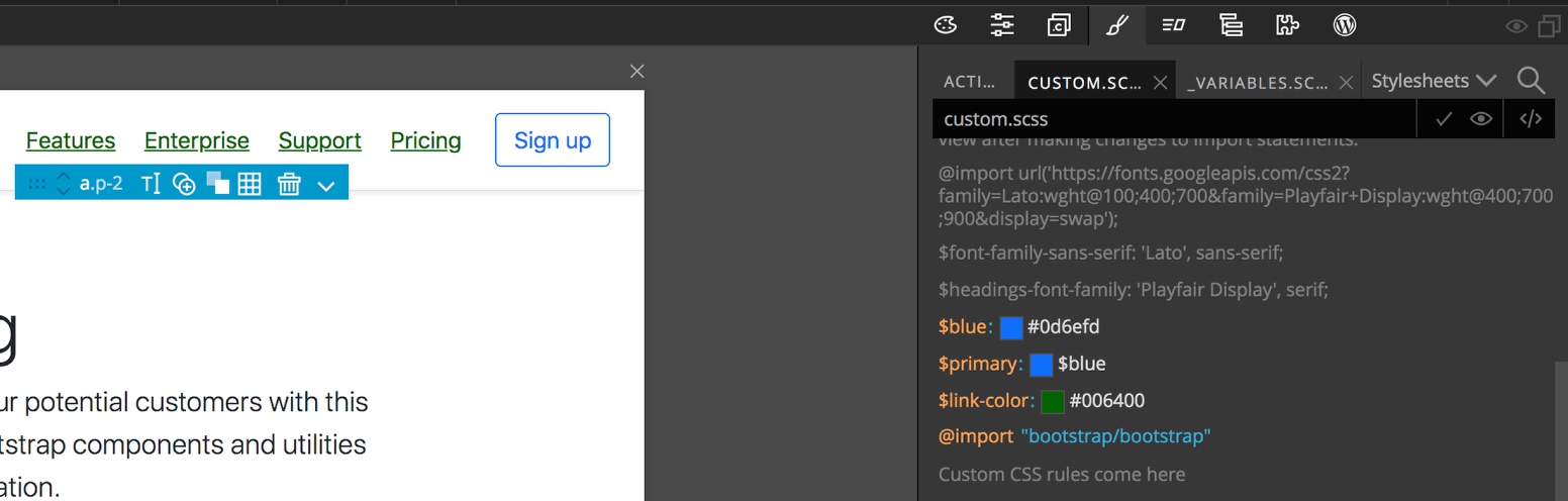
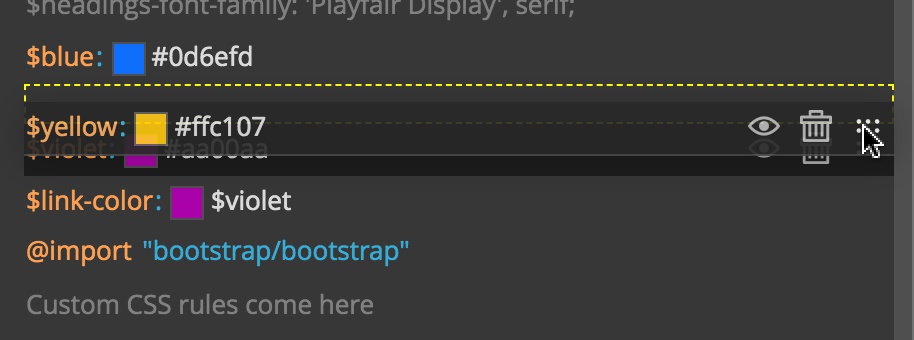
Removing unused variables
Note, for our new link color I used a hexadecimal color code. This means that the other two variables that were imported are no longer needed. We can easily delete them by hovering over the variable, then over the three dots that appear to the right side of the Style panel, and then clicking on the trashcan that appears. This will only delete the variable from our custom.scss file and not the original that appears in the _variables.scss file. 
Adding new variables
If we are going to end up using a color multiple times in our project, it can be useful to add it as a variable. To accomplish this we just have to hover in between, above, or below the existing variables in the Style panel. This will cause an orange line with plus sign to appear. Clicking on the plus will allow the entry of a new variable.
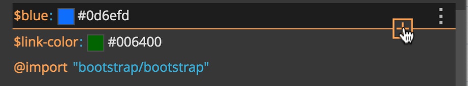
Simply type the variable name (make sure it starts with a $), hit TAB, and then enter the desired value. This variable can then be used in any of your rules.
Note, variables have to be defined before they are used or the compiler will throw an error.
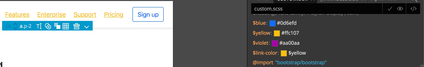
We can now use our violet color to define our link colors. 
Using an existing variable
We created a new color variable for our link color, but we could also use an existing color variable. To do this, we need to again copy that variable from the _variables.scss sheet over to our custom.scss sheet. If the stylesheet tab is still present in the Style panel we can click on it to open the sheet, or we can re-select it with the stylesheet dropdown menu. Then we right click on the color variable and select to customize it in our custom.scss sheet.
In general, Pinegrow will attempt to place the variable so that it proceeds where it may be used. If you need to rearrange so that the variable is defined earlier than where Pinegrow assigned it, hovering over the right side of the line that the variable is on will bring up an icon with two horizontal rows of dots.
You can click-and-drag to move the variable up and down in the list. Once you have the variable defined before the element you want to use it with you can simply enter the variable name. 
Note, if you copy a variable into your custom.scss file and change the value, it may impact other elements that use that variable. If it is declared with a
!defaultin the _variables.scss file, the variable in the custom.scss will override the value in _variables.scss. If it is not declared as a default, the value in custom.scss will be applied to any elements using it in the custom.scss file, but none of those in the bootstrap files because the value in the _variables.scss file will overwrite the value in the custom.scss file.
Using the Active tab to discover variables
Finding and changing the link color was fairly easy. We guessed what the variable name should be and the used the Pinegrow search box. Sometimes it won’t be as easy to guess the correct variable. Luckily, the Active tab in the Style panel not only displays active CSS rules, it also presents the underlaying SASS code.
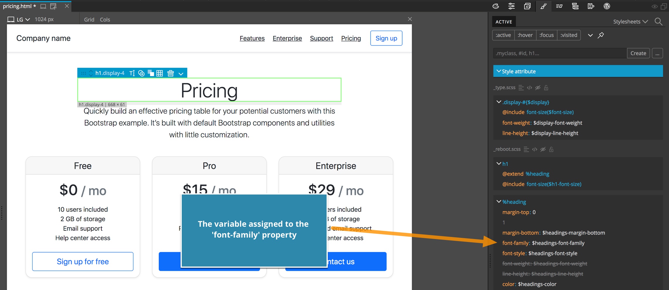
For example, if we select the h1 element page and look in the active tag, we can see the the font-family CSS property has a value of $headings-font-family. So, if we wanted to change the font used in this heading (and presumably on any page in the project) we would copy this variable to our custom.scss file and change the value.
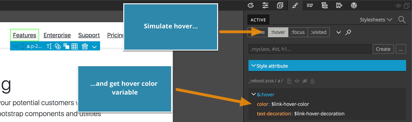
 As another example, we can get the name of the variable used for hover color throughout the project by highlighting a link on the page, clicking the ‘:hover’ pseudo-class button, and then get the variable name, in this case
 $link-hover-color.
Saving the CSS theme file
Whenever we save the page, the compiled bootstrap.css (or bootstrap.min.css, if that was used on the page) is saved as well.
At the moment, Pinegrow does not actually minify the css even if the name bootstrap.min.css name is used.
The Design Panel
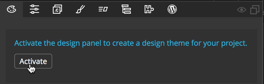
The Design panel provides a simple interface for assigning new values to a number of typical SASS variables. This includes the core Bootstrap colors and various font variables. While you can alter these manually, it is much easier to use the Design panel and avoid potential typographical errors. To activate the Design panel, first switch to the Design panel tab and then click on the “Activate” button.
Activating the Design panel will convert your project to using SASS if you haven’t already turned this feature on. It then copies 21 variables from the _variables.scss sheet into the custom.scss file. Additional variables are copied for adding and changing fonts.
The color variables
You can examine the color variables added by opening the custom.scss file in the Editor panel – just click on the file name in the Project panel.
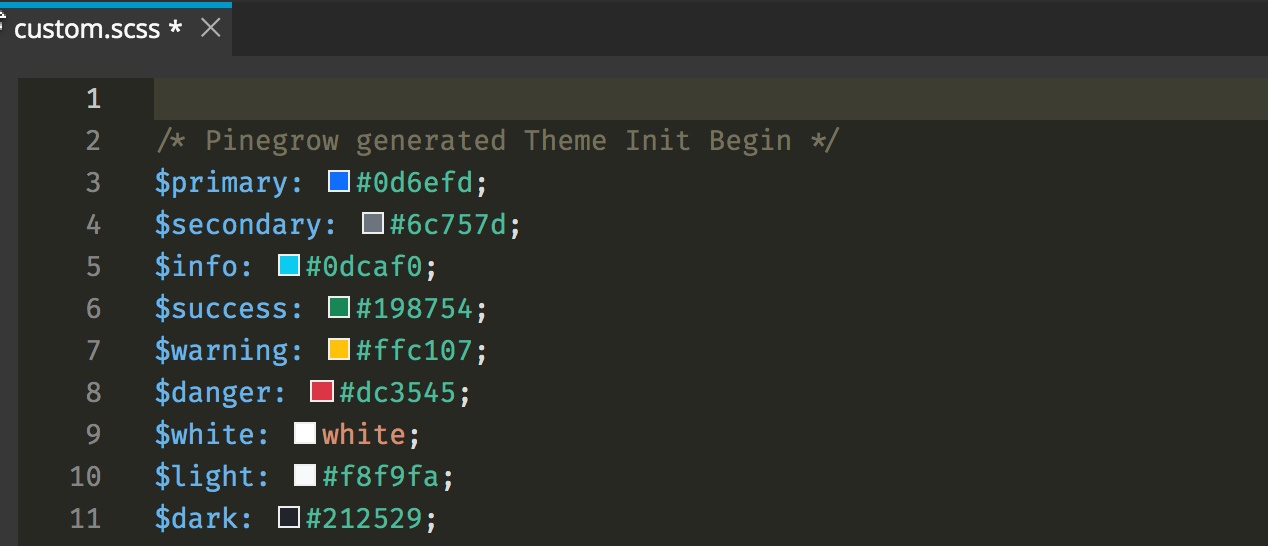
Changing colors in the Design panel changes the value of one of these corresponding nine variables.
The font variables
The $font-family-sans-serif and $headings-font-family typography variables are only copied to the custom.scss sheet when selections are actually made by the user. The rest of the typography and heading finetuning controls in the Design panel are added through standard CSS without the use of variables.
The Bootstrap options
The lower section of the Design panel allows easy alteration of 12 variables.
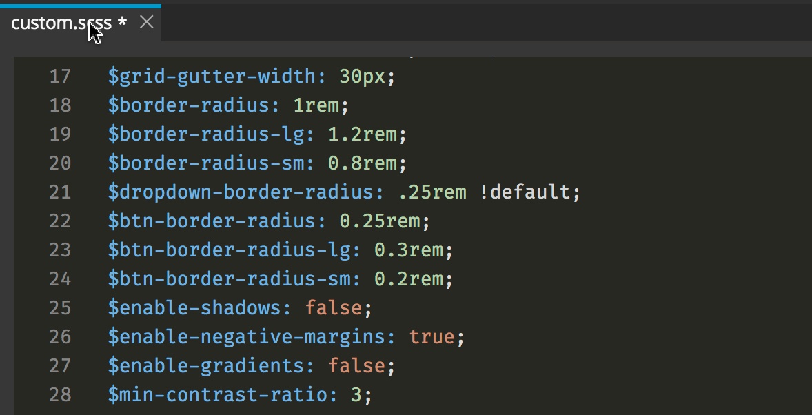
Again, Pinegrow automatically copies these variables over from the _variables.scss file into the custom.scss file. The visual controls in the Design panel allow the user to more easily edit each of these different variables without searching through all of the variables and copying each over.
Using the Design panel and manual changes together
When the Design panel is activated on a custom Bootstrap theme you can combine both approaches and continue to customize any Bootstrap variable, as described above. However, it is important to put any such changes outside of any sections marked with comments (/* … */) as being generated by Pinegrow. This includes a section at the beginning of the custom.scss file and potentially one at the end of the same file.
Working with existing SASS themes
So far we have given examples of creating a Bootstrap SASS custom theme from scratch. However, Pinegrow also allows you to add and modify custom themes created by other designers to your pages.
In this case, instead of using the “Page” -> “Customize & update Bootstrap” menu item we can just tell Pinegrow where it can find the SASS sources to be used. We do that by opening the “Page” -> “Manage stylesheets…” menu item. 
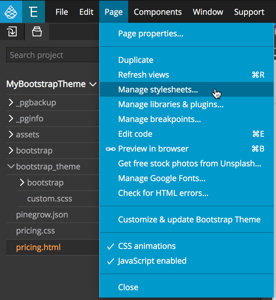
This will bring up a modal. From there, we click on the “Use SCSS/LESS” option next to the name of the final compiled CSS file that will be loaded on the page. In our previous examples we were compiling it into the bootstrap.min.css file. In this example I created a new stylesheet called ‘new-custom.css`.
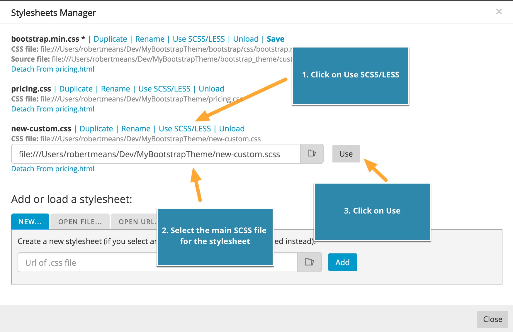
Select the file that will be compiled into the final CSS and click “Use”.
That’s it.
Hopefully this brief introduction to customizing your Bootstrap 5 theme has answered the majority of your questions. We are working on making Bootstrap customization more comprehensive, easier, and smarter – so stay in touch! If you have any additional questions please reach out to us on our forum or email support at support@pinegrow.com