The Pinegrow Web Editor is a powerful tool, but it can also be a bit daunting. This tutorial will provide a quick walk-through of the main features of Pinegrow that will let you start designing you web project quickly!
If you are new to Pinegrow this should get you operational in no time. Going forward in future guides, we will do a deep-dive into each of the various panels and tools provided by Pinegrow to make putting together web sites quick and easy. Along the way I’ll try and point out “easter-eggs”, little features nested into Pinegrow that you might not know about.
Let’s get started!
Prefer to read? Scroll past the video.
This tutorial is available in video and textual form. Watch the video, or continue reading if you prefer to read. Of course, you can also do both!
The home screen
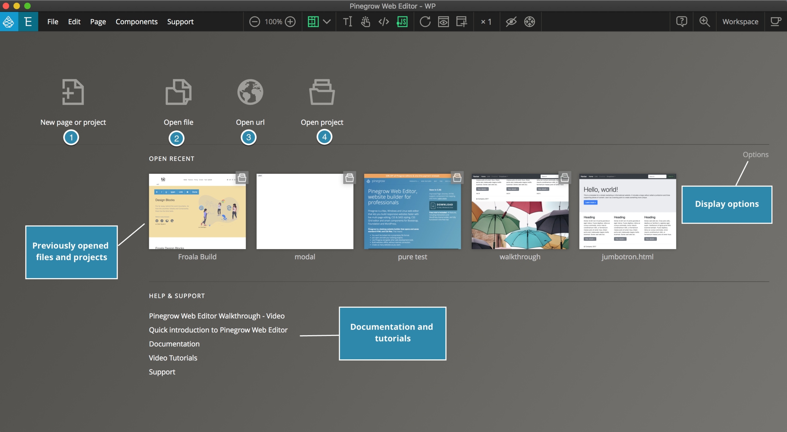
When you first open the Pinegrow App it displays the home screen, a page that will contain thumbnail images of all of your existing projects, some display options, and documentation links. Importantly, there are four large icons that give options for starting new projects.
The first icon (labelled 1) allows you to start a new page or project from scratch. We will come back to this icon shortly.
The second allows you to open an existing local HTML document – this can either be a page you’ve previously created with Pinegrow, or a page like a template, that you have downloaded from the internet.
The third icon allows you to open any website from the internet. This can be used to redesign an existing website, even if you don’t have the original HTML code.
The fourth icon allows you to open folders as Pinegrow projects, so that you can easily work with all files of the project.
Starting a new Project
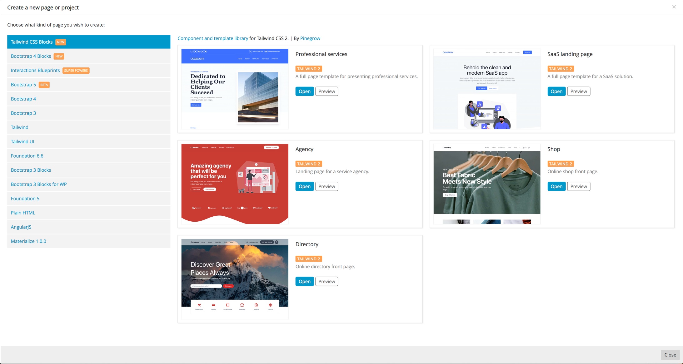
Clicking on the first icon brings up a framework selection modal. Various frameworks are listed along the left side including pre-made blocks for both the Tailwind and Bootstrap frameworks. Selecting a framework brings up a number of templates to select from on the right.
Note: The hyperlinks above each of the templates link out to documentation about the framework.
Clicking on any of these will open the template in the editor. In some cases, a template may have several pages to select from. While Pinegrow can work with individual files, to unlock the full potential it is best to save your file as a “Project”. A project is a collection of web pages along with all of the associated files like stylesheets, images, and JavaScript. Best practice is to save your first file into a folder and then open it as a project when prompted by Pinegrow. This will copy any necessary framework resources to the newly created folder.
The Editor
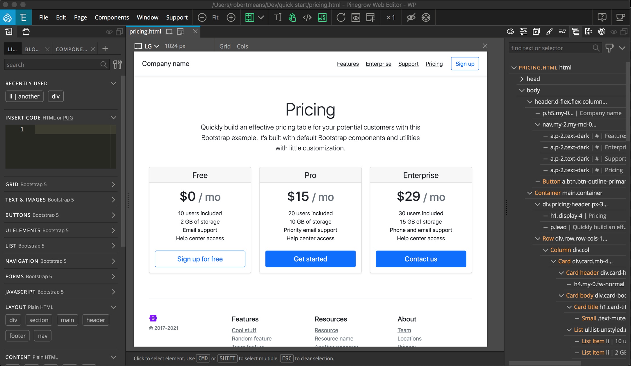
The Pinegrow editor is divided into several functional sections that surround the central Page View. This view emulates what will be shown when you open your HTML document in a browser. This forms the core of designing your web page visually.
The Page View
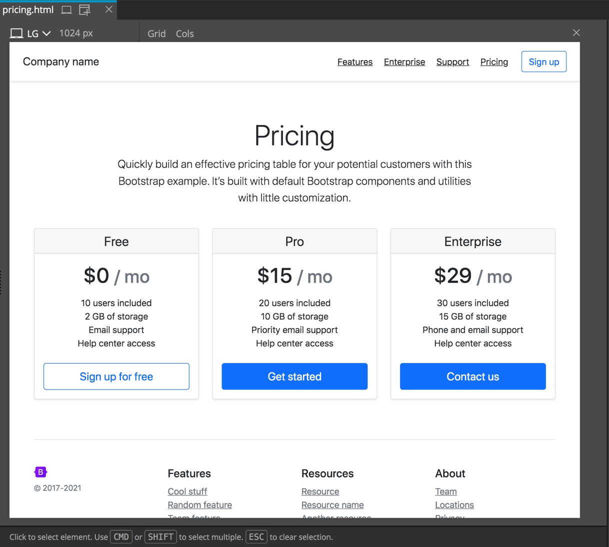
The main panel of Pinegrow in the Page View. This panel displays our code as it will appear in the browser. We can edit any of the on-screen elements. As you move your pointer around the page, editable items will become outlined.
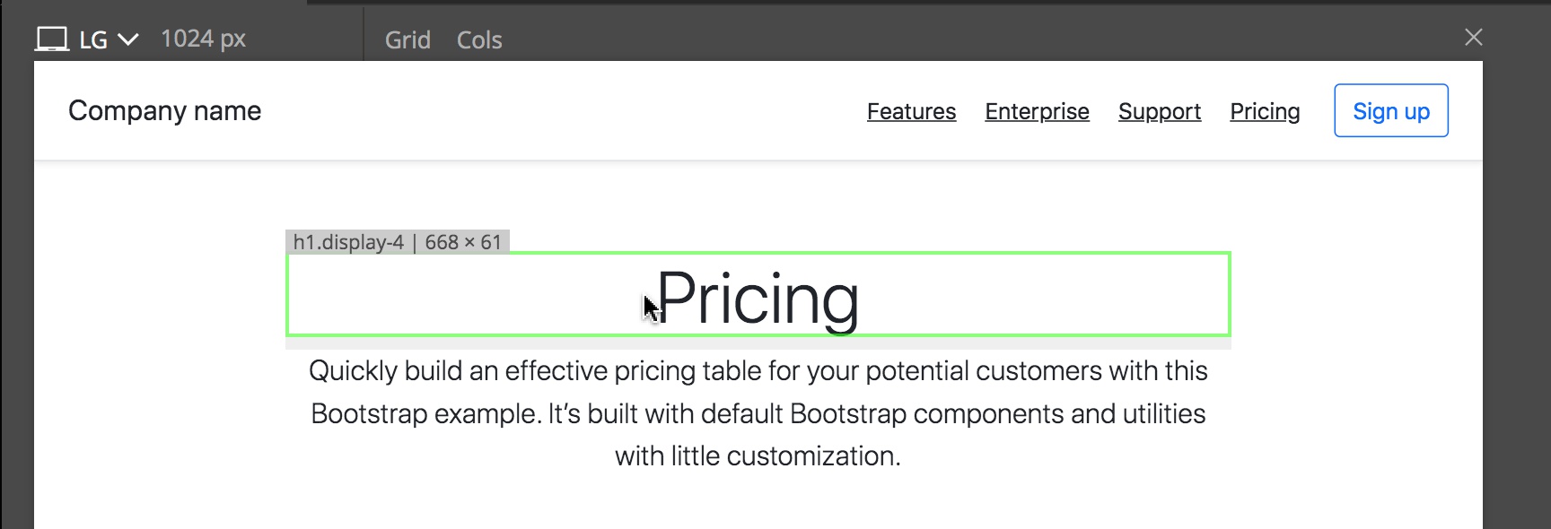
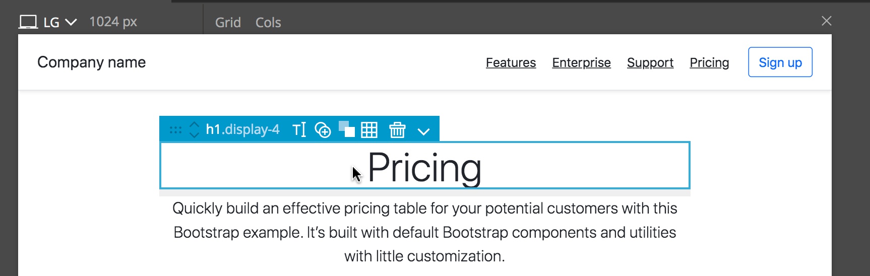
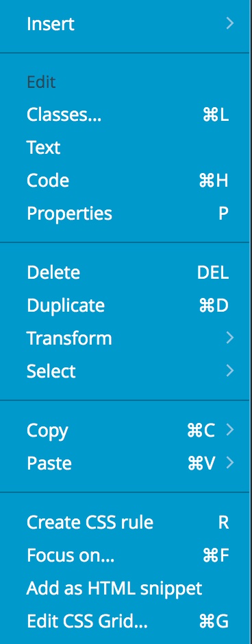
Clicking will select the item and change the color of the outline. This will also bring up a blue menu that lets us access a number of editing controls, like changing the text, or altering the CSS.
The Page view has a number of controls. On the top tab there is the name of the page, such as ‘index.html’, and there can be multiple icons, depending on how many Page Views are open. To open additional views you can click the icon to the right with the plus sign. The “X” closes the file including all open views. The other icons indicate what page views are open and can be clicked to identify where on the screen they are located.
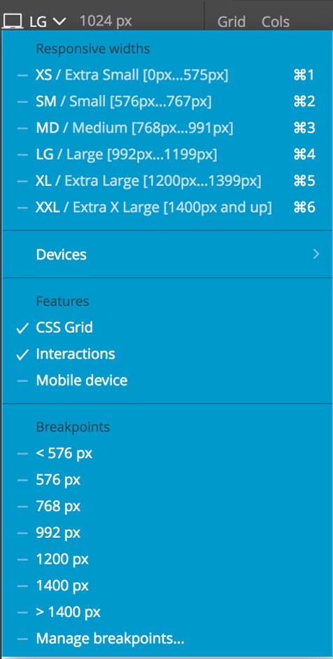
Above each individual Page View there is a dropdown of screen sizes and features for that Page View. You can also set a custom size by either typing in the input to the right of the dropdown or by dragging the right edge of the view to the desired width. Depending on the Framework, there may be additional controls to toggle the display of columns or a grid. Finally, if there is more than one Page view open There will also be a paintbrush displayed on the right side of the view next to the closing “X”. This icon determines what rules will be displayed in the Styles panel when styling for different size pages with media queries.
Note: Pinegrow does not add media queries into your CSS automatically. Selection of a particular sized page only displays what that page will look like in the browser, it does not change any code.
Click on any element on the page to select it. Use CMD and SHIFT keys to select multiple elements. Right click to display the context menu.
The Panels
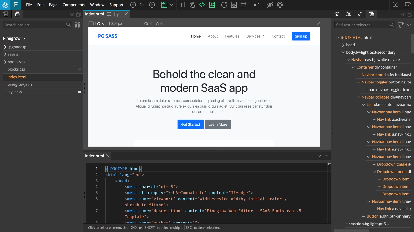
All of the tools in Pinegrow are organized into a number of panels. By default, there are two sections of panels flanking the main Page View. If changes are made in the panel arrangement you can revert to the default from the Window -> Workspace -> default menu item. All of the panels have two icons in their upper right-hand corner. The first is an “eye” icon. This icon will keep the selected panel visible even if the panels are all hidden using the eye icon in the topbar. The second panel allows you to undock the panel from the main App window. This is useful for having several panels of tools on a separate monitor from the Page View. Depending on what extensions you have purchased and what framework you have selected for your project, some additional panels may be present.
The Project panel and Code Editor
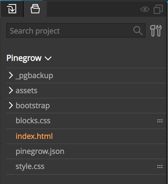
The Project panel, located to the left of the Page View, allows you to see all of the files located in your project. Clicking on an HTML page will open it in the Page View. Clicking on most other files will open them in the code editor located below the Page View. To examine the HTML code that is displayed in the Page View, click on the code icon (</>) located in the topbar above the Page View.
Right click on the project name or file names for more options.
The Design panel
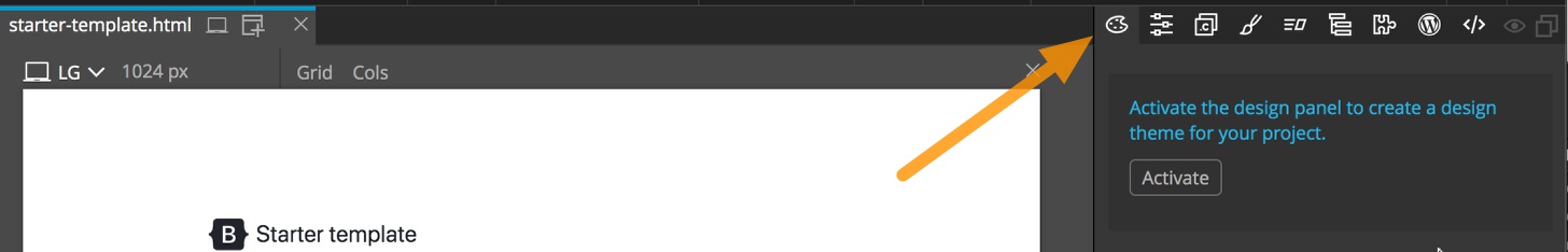
The Design panel is perfect for setting up all of the base styling on a page. For example, setting up the project-wide color palette and fonts. This panel allows you to visually customize the website theme and all the design resources (like custom fonts) will be available in the visual toolset. By default, the Design panel is located to the right of the Page View.
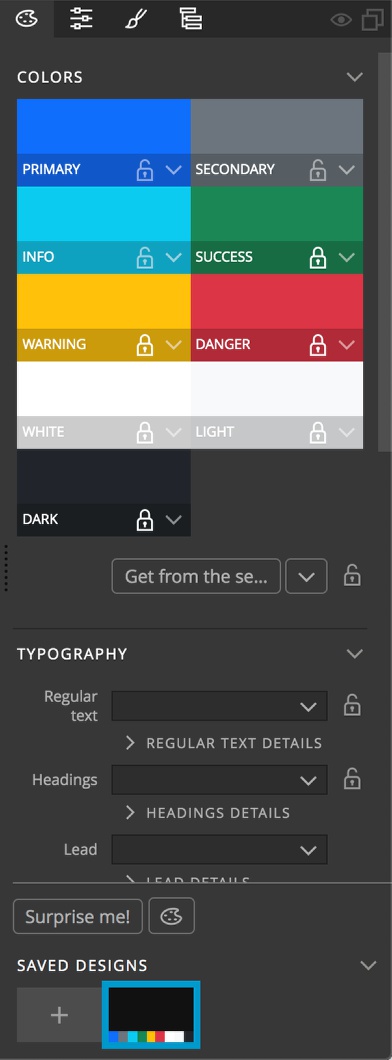
The options appearing in the Design panel differ depending on framework, and you can read about each on our website here for Bootstrap, here for Tailwind CSS and here for plain HITML files (coming soon). This panel allows you to set many global options for your project pages, like colors and fonts. This panel allows you to quickly and easily make design modifications and save multiple designs for your pages so that you can toggle between choices to find what suits you or your client best. For Tailwind CSS projects this also sets up the Just-In-Time processor that dramatically reduces the size of the framework stylesheet by removing unused rules.
The Tree panel
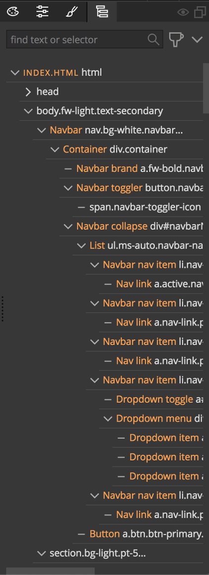
The Tree panel shows the structure of the HTML document being displayed in the Page View. In the default view it is located to the right of the Page View. Each element is given element name and any element classes in white, with an optional display name in orange. It can be used for more precise selection of elements on the page by simply clicking. This will cause the selected element to be highlighted on the Page View. Both the CMD and SHIFT keys can be used for selecting multiple elements within the Tree. Once an element is selected within the Tree a menu will appear to the right side. This allows you to delete, duplicate, and move the element within the tree. You can also use this menu to add a new element with respect to the position of the selected element.
At the top of the panel is a search box to help find elements in the code quickly, as well as a filter next to the search to help find items like inline styles or links. Finally, there is a dropdown menu at the upper-right that switches the Tree between the actual source code of the page versus the displayed DOM that might have dynamic elements injected. This menu also allows you to control the code folding in the Tree.
Right-clicking on an element in the Tree brings up a context menu that allows you to quickly perform a number of additional operations on the element, like shortcuts for adding classes or making new CSS rules.
The Library panel
The Library panel combined with the Page View forms the core of the low-code design interface in Pinegrow. Rather than typing your HTML into a code editor, you drag and drop all of the elements from the library into the Page View or Tree panel.
Note that the elements in the Pinegrow Library Panel are properly formed, but can still be used to construct malformed code for example, adding a
<p></p>inside an<h1></h1>. Some knowledge of the basics of HTML is needed to get the most out of Pinegrow.
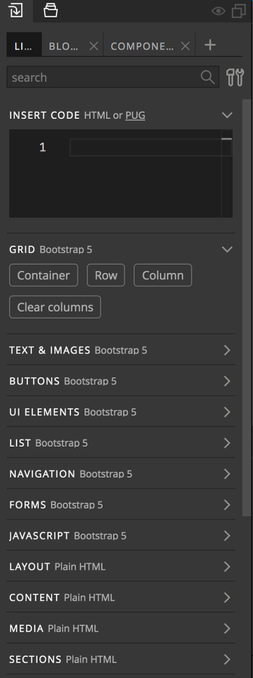
In the default view, the Library panel is located to the left of the Page View. Depending on the type of project it will have one or more tabs. The main tab is the “List” tab. It contains the majority of plain and framework HTML elements organized into usage sections. Each of these items can be dragged to the Page View or Tree panel to build your page. Most are simple elements, but for some frameworks these can be a combination of elements, for example a card is composed of image <img>, title <h4>, content <p>, and link button <a> elements together. At the very top of the list is a search box to allow you to find elements easily. Just below this is the “Insert Code” box. This input takes any valid HTML or JavaScript. You can also elect to add in HTML using either Pug or Emmet, two shortcut languages.
Finally, with some frameworks there will be additional tabs with pre-made content ready to drag to the Page View. This content can be selected by clicking on the appropriate tab and then either scrolling through the elements or selecting from the drop-down menu at the upper left. Any of this content can be dragged to either the Page View or the Tree.
The Styles panel
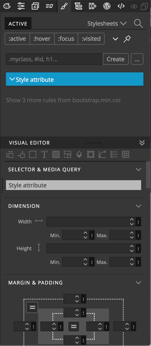
The Styles panel, located to the right of the Page View, is split into two parts. The upper part is used for displaying and interacting with the styling and stylesheets for the project. By default it displays any styling rules that are active for the selected element. This can include both inline styles and styles from any sheets. Through the stylesheet dropdown menu at the upper-right corner of the panel any of the project stylesheets can be opened for editing. Displayed styles can be searched using the search icon next to the dropdown. By default, any styling derived from frameworks, like Bootstrap 5, is hidden. This is because it is generally discouraged to make changes in these sheets as they may be overwritten during update.
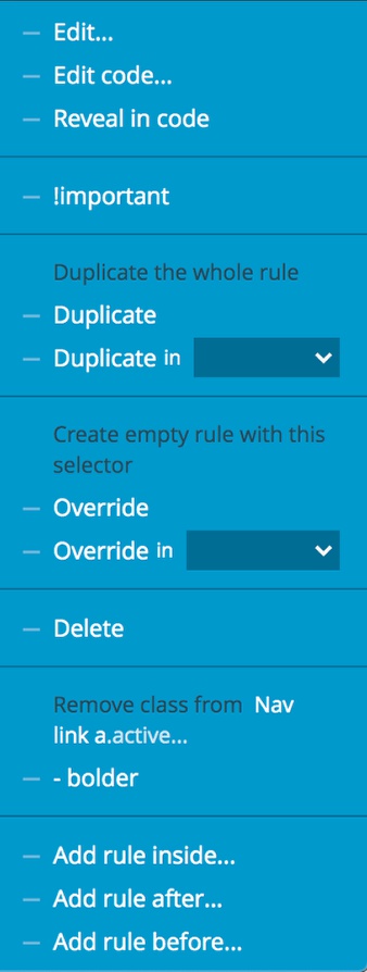
Right-clicking on a stylesheet ruleset, property declaration, or inline style declaration will bring up a context menu. This allows you to perform a variety of functions from identifying where the ruleset is located and making hand coding easier, to adding new rules.
The four buttons at the top of the panel allow the simulation of the named pseudo-class to elements. This can help with styling the hover state on buttons or links.
Note: These buttons do determine the pseudo state affected by the styling changes, they just add the pseudo-class to the selected item so that you can immediately see how your CSS rule impacts the element.
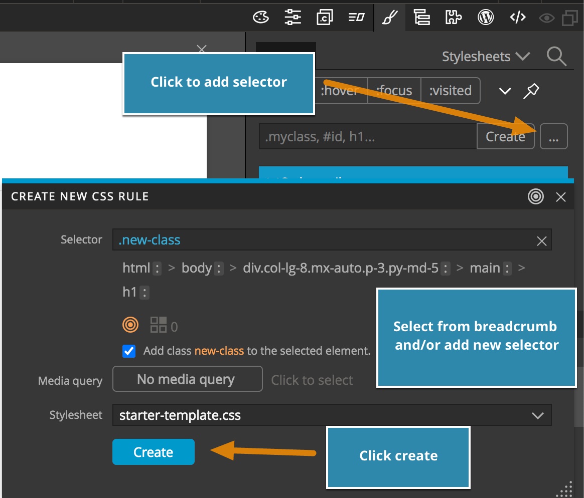
The input box below the button is for creating new CSS rules. Any valid selector can be added to the box. For new class names, Pinegrow will also give the option of adding that class to any selected elements. For more complex selectors, clicking on the ellipsis will bring up all of the element, class names, and ids that could be used within a CSS selector targeting the selected element. You simply need to click on all of the selectors needed – note that the descendent and child selector combinators, as well as most pseudo-classes can be added at the same time. Within this rule creator you can also add media queries and select which stylesheet the rule should be added onto.
The bottom part of the Style panel is the Visual Editor. This section contains controls that allow you to add almost any CSS property. If no rule is selected in the upper half of the Style panel, then the styling declarations will be added inline. You can also select a rule, or add a media query to a rule, from the dropdown in the “Selector and Media query” section. Along the top of the Visual Editor are a number of icons that allow you to jump to different property sections quickly. Hovering over the icon will bring up a tooltip describing the section. The sections in the Visual Editor can be collapsed by clicking on the caret to the right, while holding ALT or OPTION will collapse or open all sections.
Note: You can also edit any CSS or SASS in the built-in Code Editor if you prefer either by opening it using the context menu, or clicking on the file name in the Project folder.
The Properties panel
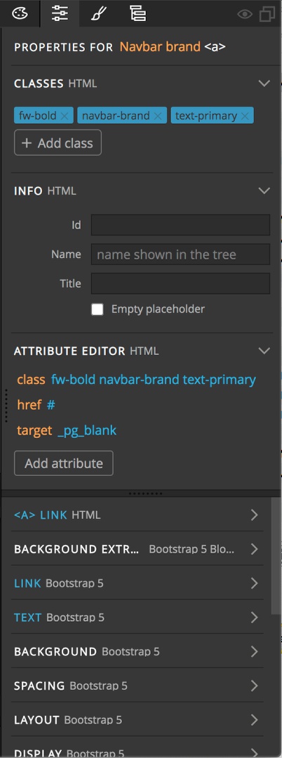
The Properties panel is located to the right of the Page View and is also split into upper and lower parts. The upper part allows you to add classes, ids, and attributes to elements selected in the Tree panel or Page View. You can also give a display name to your element, which will display in orange, so that it can be identified quickly in the Tree panel.
The lower part of the panel contains element-specific controls and all of the framework-specific controls – like the Bootstrap or Tailwind CSS classes. For the lower part, the title of any control sections that contain properties that have been applied to the selected element will be highlighted in blue. In this example, both link and text properties have been added to the selected element.
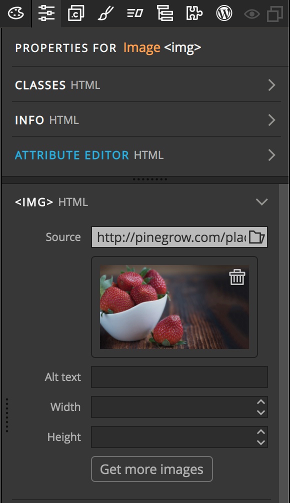
If the selected element is either an img or contains a background image you will be able to set the source of the image from the Properties panel. You can either attach an image from your project folder or from an online source like Unsplash by clicking on the folder icon in the source input box.
Additional panels and controls
The Window menu
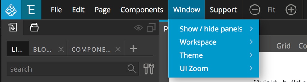
The “Window” menu has a number of options for customizing the Pinegrow working environment. The “Show/hide panels” item allows you to turn off any panels you aren’t actively using in order to free up working space. The “Workspace” item allows you to configure where panels are placed to take best advantage of your monitor set-up, for example multiple monitors. The “Theme” item allows for toggling between ‘dark’ and ‘light’ themes. Finally, the “UI Zoom” option is used to increase or decrease the interface size.
Actions panel
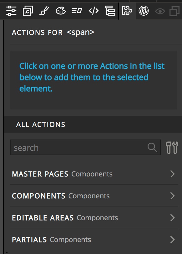
The Actions panel lets you work with master pages and reusable components.
WordPress
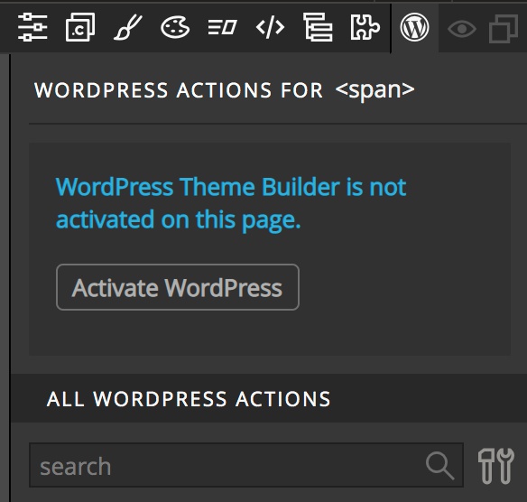
The WordPress panel lets you add define dynamic content and export the project into a production-ready WordPress theme.
Note: This is only available with the WordPress add-on and won’t appear if you haven’t purchased this option.
Interactions
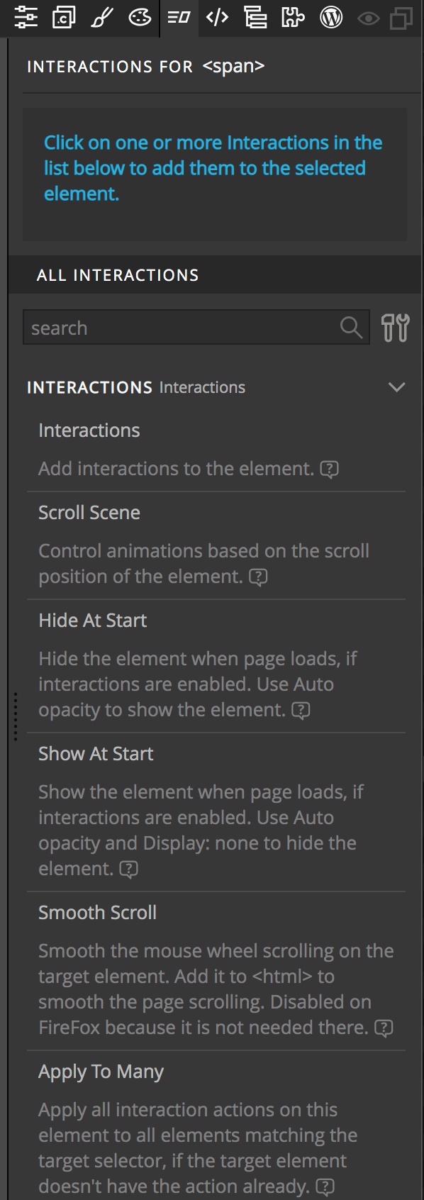
Use the Interactions panel to add GreenSock-powered animations to your project.
Note: This is only available if you have purchased the Interactions add-on – free with either an annual or monthly subscription.
Class Styles
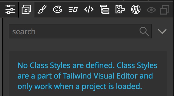
When working with Tailwind CSS projects, use the Class Styles panel to manage reusable styles.
Conclusions
This quick intro has shown the main controls in Pinegrow needed to put together web pages quickly. There are numerous other tools built-in to Pinegrow to help you create your design vision that we haven’t covered here and we encourage you to look through the rest of the online documentation at your convenience.