The Pinegrow Web Editor makes creating nested blocks (blocks within blocks) easy! In this tutorial we will look at how, plus we will look at other customizations you can add to your themes.
In this series of short tutorials we will convert the Pinegrow Bootstrap 5 template “Agency” to a multi-page WordPress theme using Gutenberg blocks and the built-in WordPress theme controls. Let’s get started!
Prefer to read? Scroll past the video.
This tutorial is available in video and textual form. Watch the video, or continue reading. Of course, you can also do both!
Creating nested blocks and class toggles
Before starting this tutorial you should already have set-up our theme as outlined in tutorial 1 and added the top hero block with customization as outlined in tutorial 2.
Update on tutorial 2
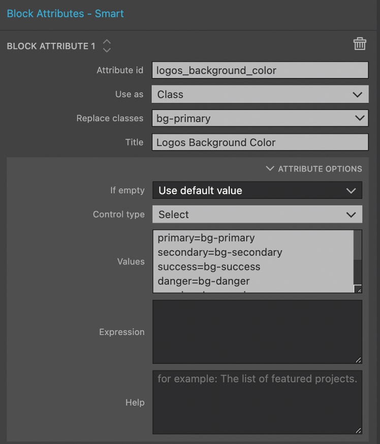
At the end of tutorial 2 we added an input control to change the background color of our block. This control wasn’t that satisfying because it requires our end user to know the various Bootstrap 5 background color classes. A better way to do this is to use the “select” control that allows us to add a list of options in a drop-down menu.
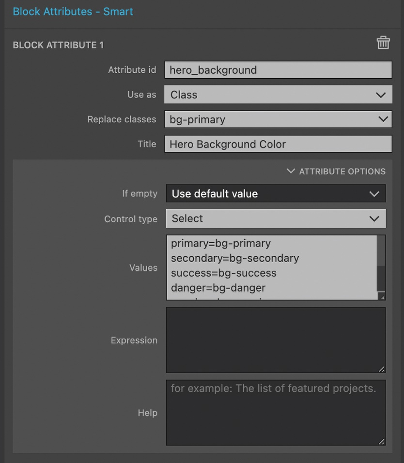
- Within the Block Attributes, open the “Attributes Options” section. This block action should already be set-up for “Use as” Class and “Replace classes” of bg-primary.
- For Control type pick “Select”
- For Values add a list where the user is given a single word (e.g. “primary”) followed by an equals sign and then the class to be added.
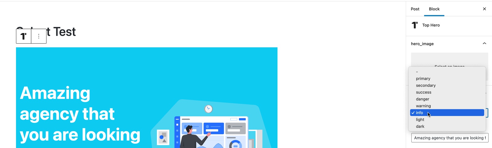
Exporting our theme changes and reloading WordPress reveals our new, more user-friendly control.
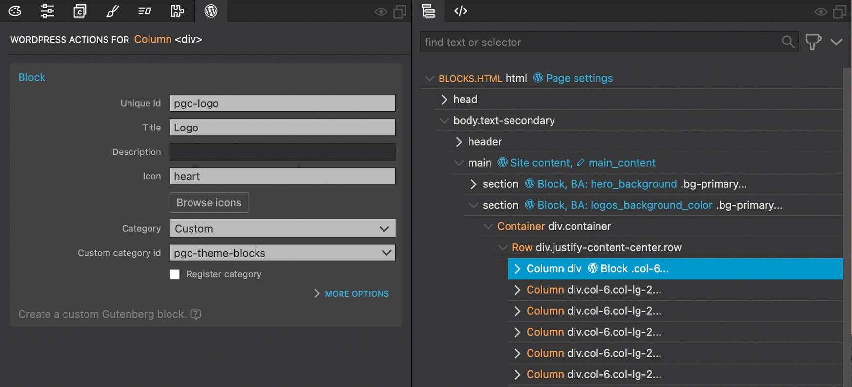
Adding the nested Logos block
The next section of the Agency template is a row of company logos. Each of these logos is an SVG. We want our end user to be able to add or remove logos for the number needed. We also want the user to be able to change the block background color and the color of each logo.
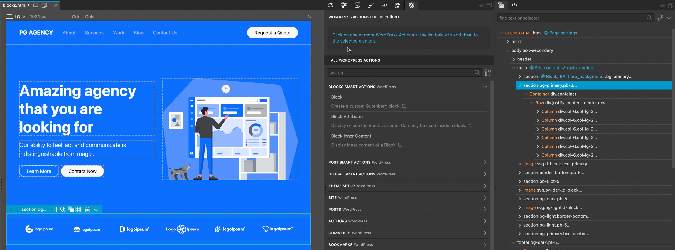
- Select the logos section.
- Add the Block WordPress action.


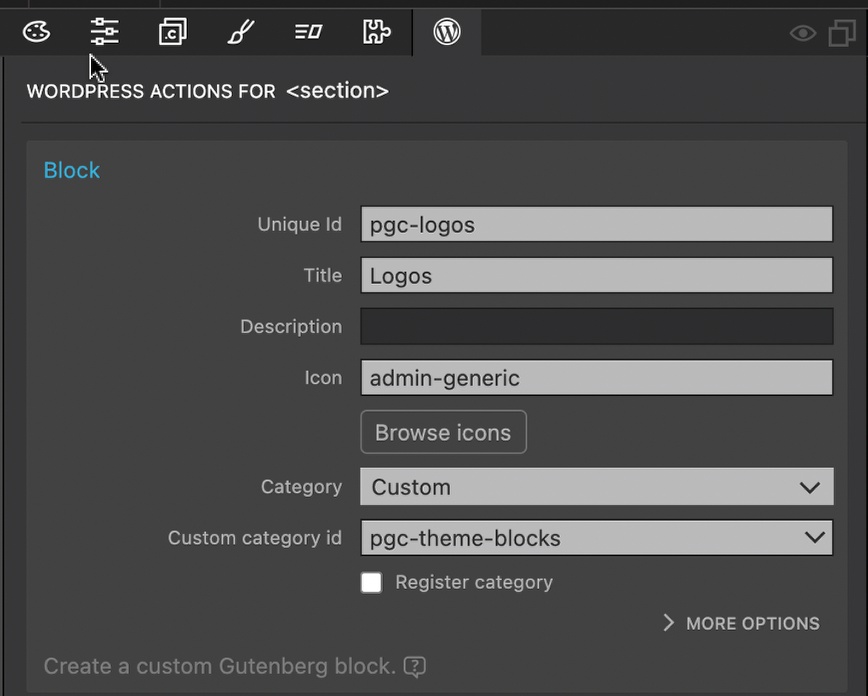
- Add in the unique id, title, and icon. Select the “Custom” category and the already registered Custom category id for our theme.
Exporting our theme and reloading WordPress will allow us to add our new Logos block to the page, but it won’t be editable. We can also see that all six of our SVG logos were exported. This probably isn’t needed.
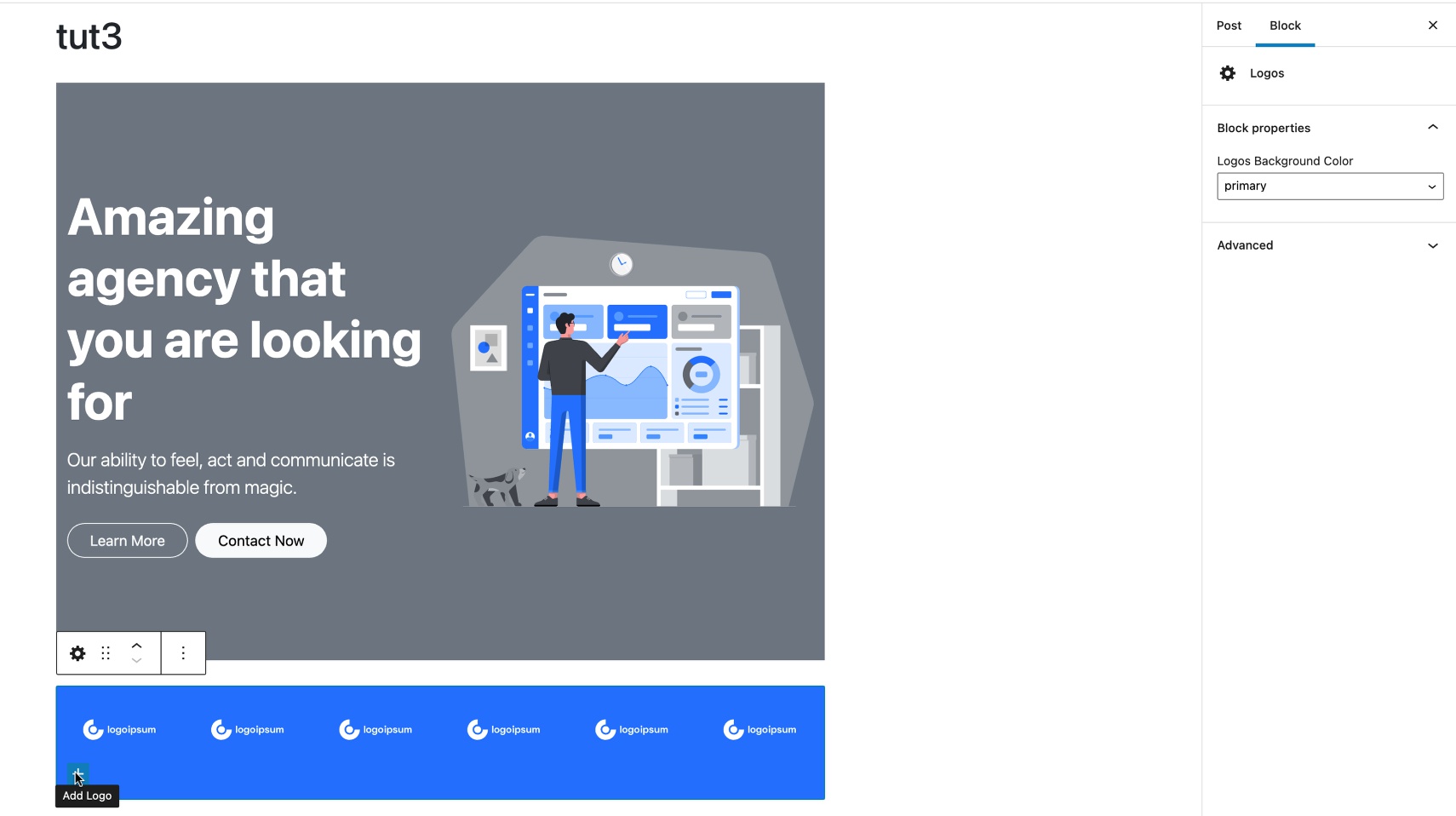
Making the Logos block background editable
Just as with the top hero block, we will make the background to this block editable with a “Select” block attribute control.
- Add a Block Attributes action to the Logos section.
- Add a unique id, select Class for “Use as”, replace the “bg-primary” class, and add a descriptive title.
- Open the “Attribute Optios” section and pick the “Select” Control type.
- Add the list of Bootstrap 5 background color classes.
If we export our theme and reload WordPress we will see the new control available.
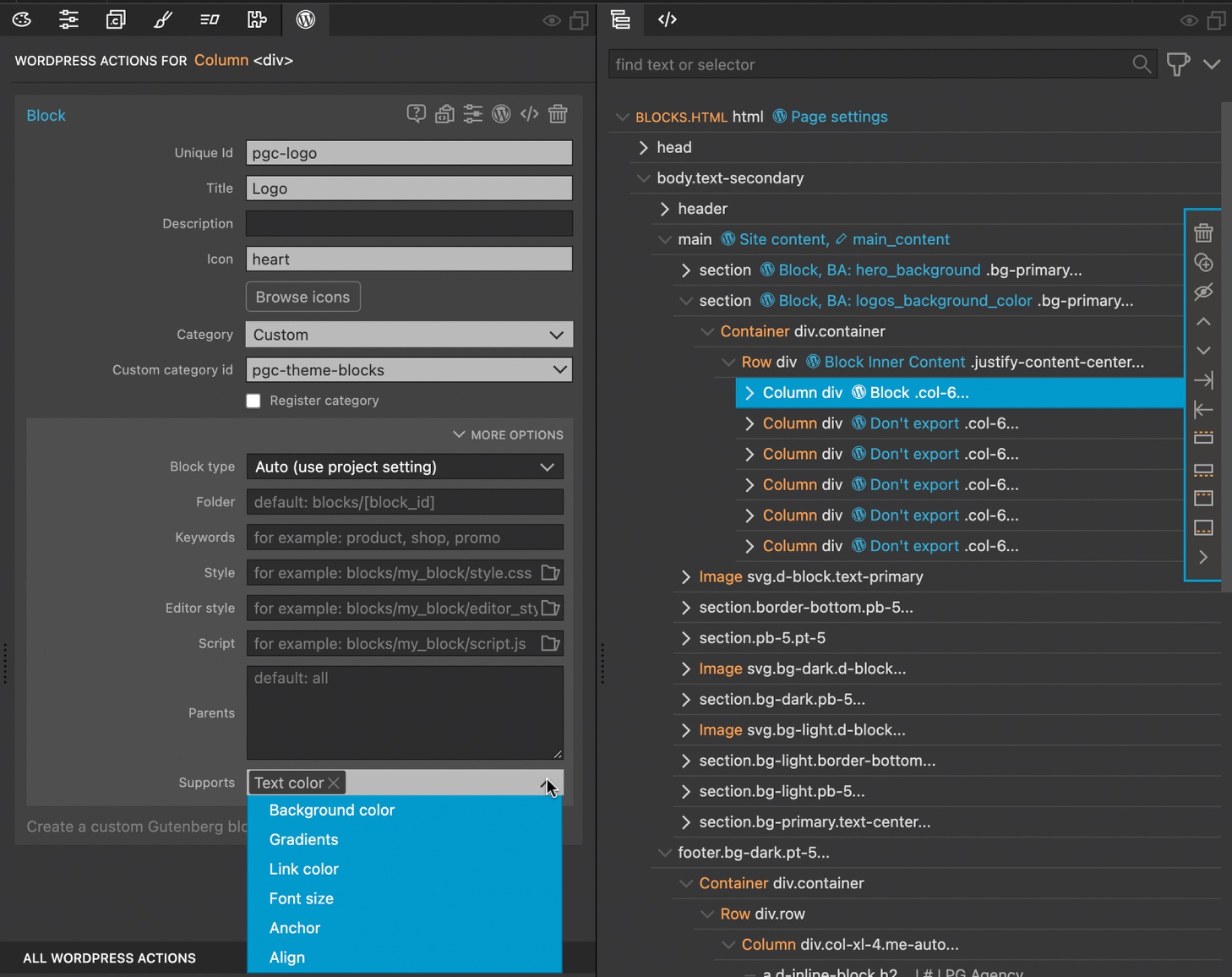
Creating a nested block
Our Logos block contains six individual logos. In order to enable the user to remove or add individual logos, we are going to convert the first logo-containing column to a Logo block and then set our already created Logos block to accept only this block type.
- Select the column containing the first logo and add a Block action.
- Add a unique id, title, and icon. Set the category to our custom theme id.
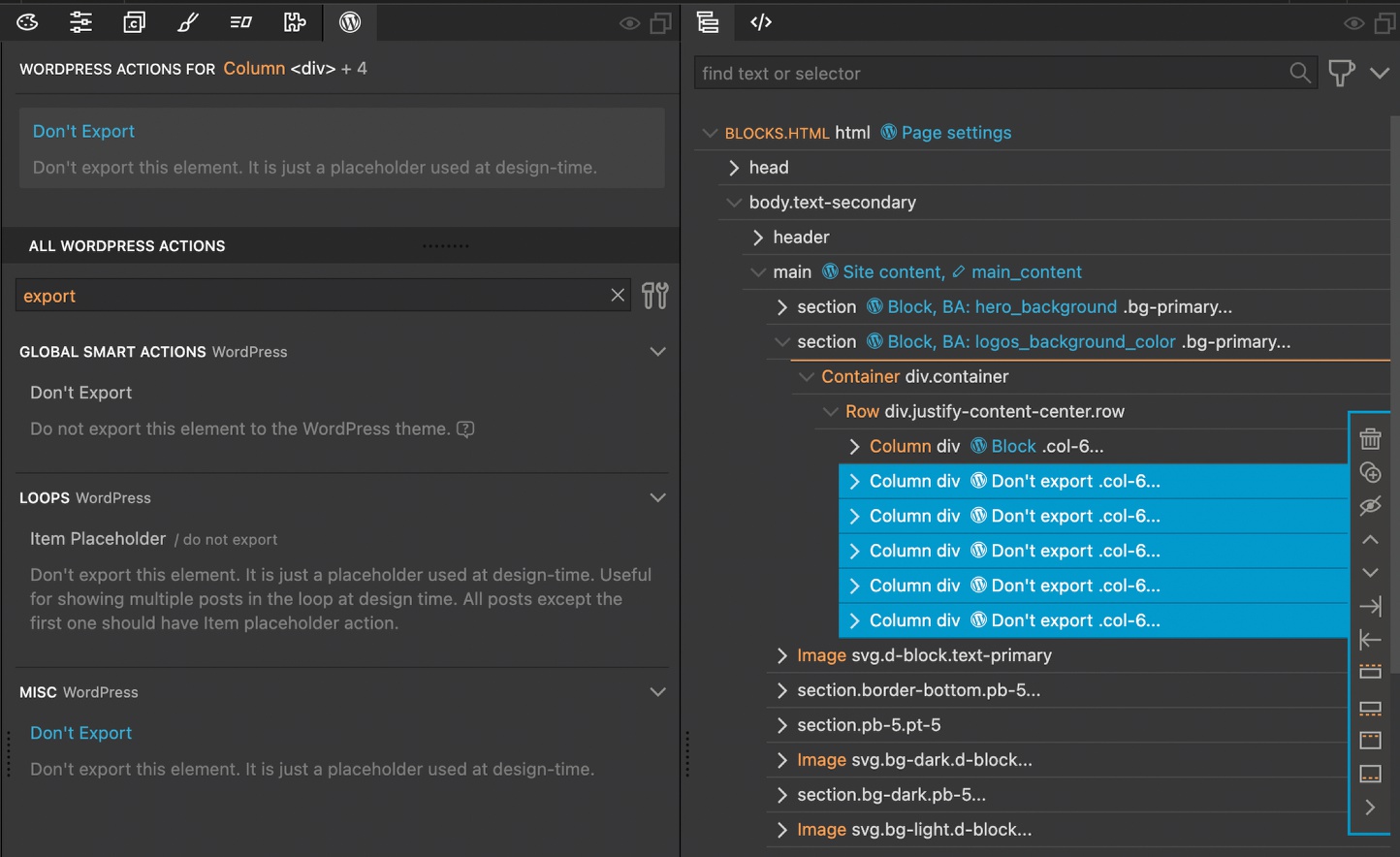
We only need to export our first logo block.
- Select the other five logo columns.
- In the WordPress Actions search, find the “Don’t Export” action.
- Apply it to the five columns.
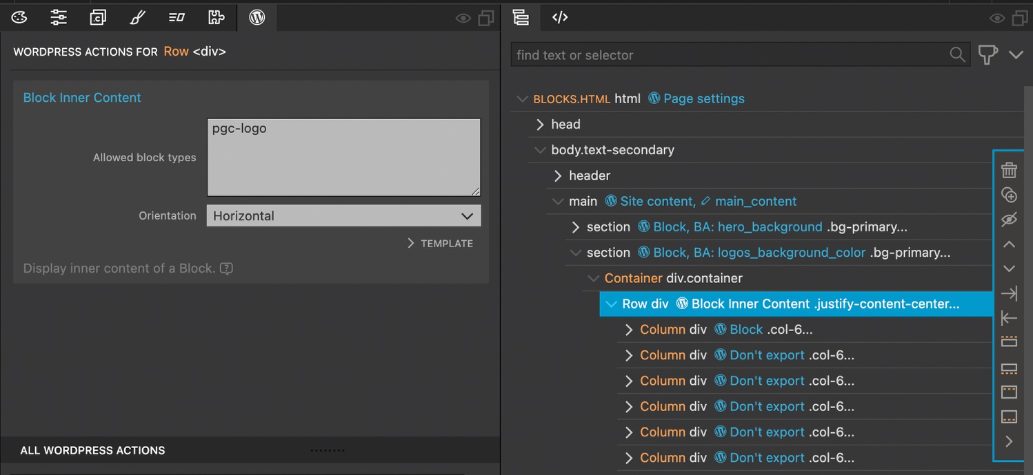
Next we want the user to only be able to add or remove the logos from the block.
- Select the row that contains the logo columns.
- Add the “Block Inner Content” WordPress action. This action is actually being added to the main Logos block.
- For the “Allowed block types” add the unique id used for the individual logo block. Other allowed block types can be added on additional lines.
- Optionally, change the orientation to “Horizontal”.
If we export our theme and reload WordPress we can now add or remove the logos from our block.
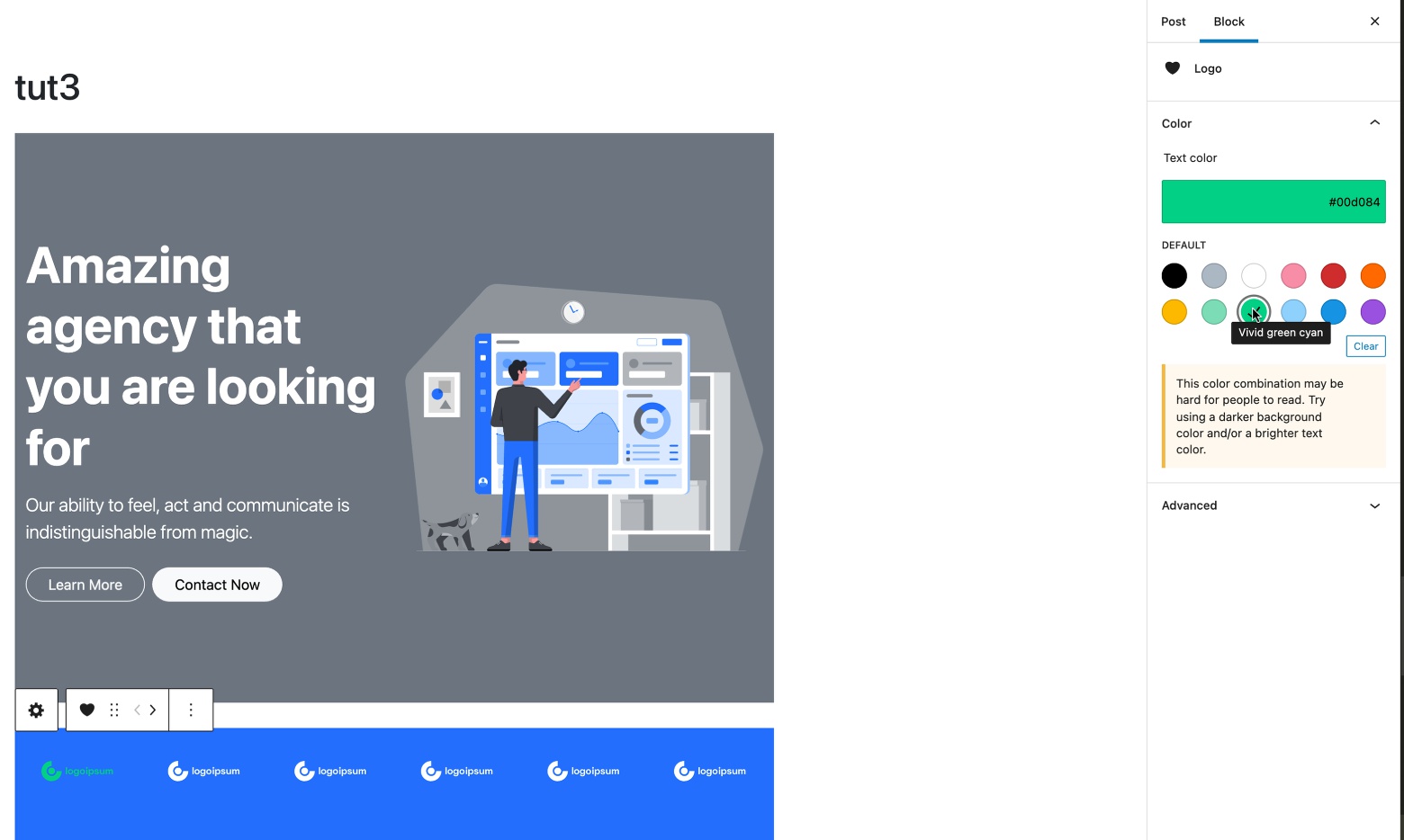
Using the native WordPress controls for logo color
WordPress provides a number of different controls we can add to our blocks. We can take advantage of this to change the color of our SVG logos. If we look at the Bootstrap classes, we can see that the logo color is set using the “text-white” class. So, changing the text color used in the block will change the SVG color.
- Select the Logo block.
- Open the “More Options” section of the Block action.
- For “Supports”, select “Text color”.
Changing the logo image
Note: WordPress doesn’t allow uploading SVG images into the media library by default as it can be a security concern. However, if you choose to trust the theme user you can add this step.
In the second tutorial we enabled the use of inline SVG images through the Pinegrow WordPress Theme Settings menu item. If you want to allow the addition of SVG this needs to be turned on.
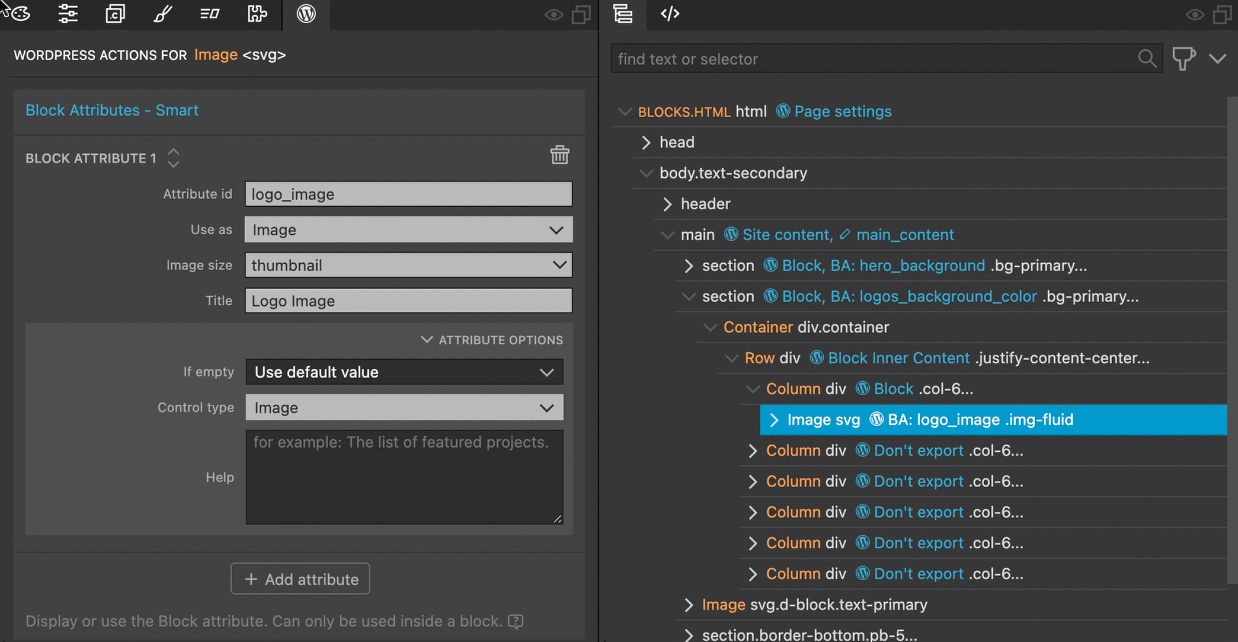
- Select the first logo image.
- Add the “Block Attributes” action.
- Add an id, select “Image” for “Use as”, select an image size, and add a descriptive title.
- Optionally, make sure the “Control type” is “Image” – Pinegrow should add this automatically.
Now our Logos section is completely editable, let’s add another block.
Creating a divider block with class toggle
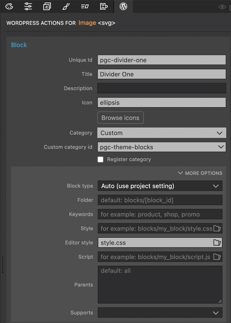
At this point, creating native WordPress blocks should be very straight-forward. Simply select the HTML section and add the Block action.
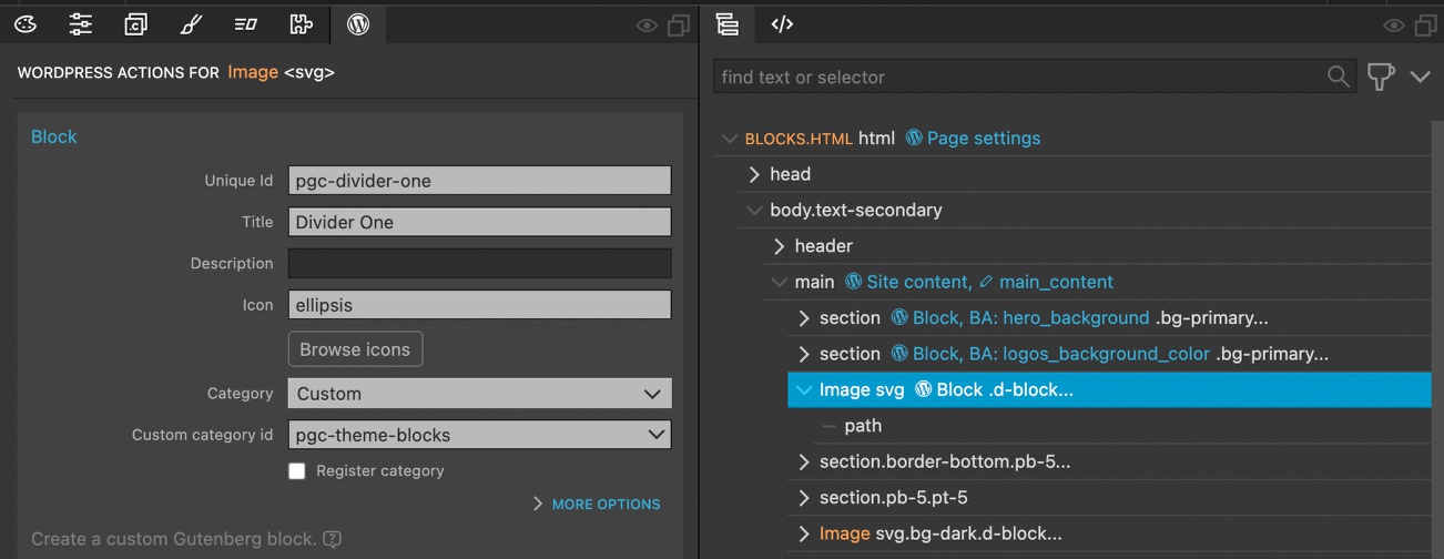
- Select the divider section.
- Add a “Block” action.
- Give the block a unique id, descriptive title, icon, and set the category to our custom theme id.
Changing the background color
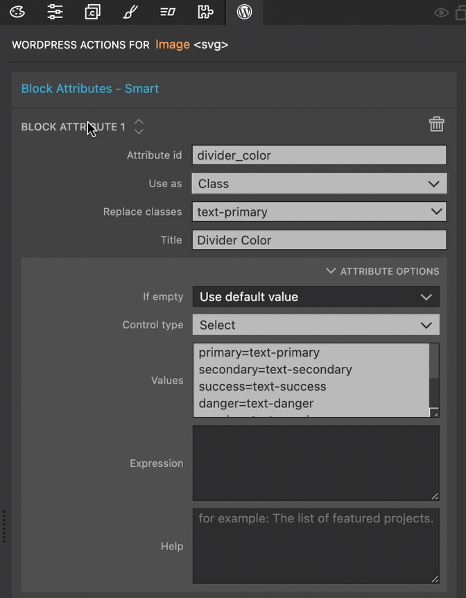
Just like our other blocks, we are going to want to be able to change the background color of the divider.
- Select the divider block.
- Add the “Block Attributes” action.
- Add an id, select “Class” for “Use as”.
- Since the divider is an SVG it gets the color from the text color styling. Select “text-primary” for the “Replace classes”.
- Give a descriptive title.
- Open the “Attribute Options” section.
- Pick “Select” for “Control type.
- Add the list of Bootstrap 5 text classes for the user to select.
Flipping the divider with a class toggle
To add some variety to our theme, it would be nice to be able to flip the divider on the X-axis to be a mirror image. In this case, our end user would be presented a binary choice, which is perfect for a toggle switch control.
Before we add a new block attribute, we will first add custom class styling to our page for the flip.
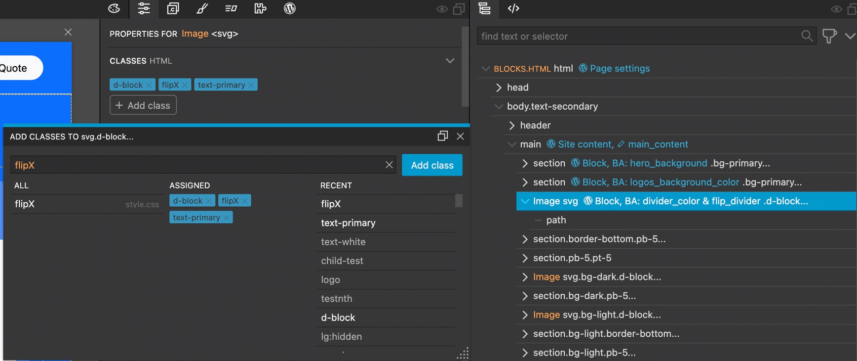
- Select the divider block and then open the Properties panel.
- Click on the “+ Add class” button.
- Add a class of “flipX”.
Next, we have to add a styling rule.
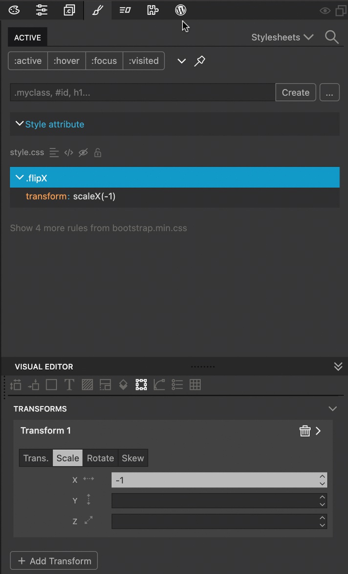
- Open the Styles panel.
- Click on the ellipsis (…) icon and create a new rule by clicking on the
.flipXclass. - With the rule selected scroll to the transforms section of the Visual Editor.
- Click on the “+ Add Transform” button.
- Click on “Scale” and enter “-1” into the “X” input.
Next we add a block attribute to control the addition of the class.
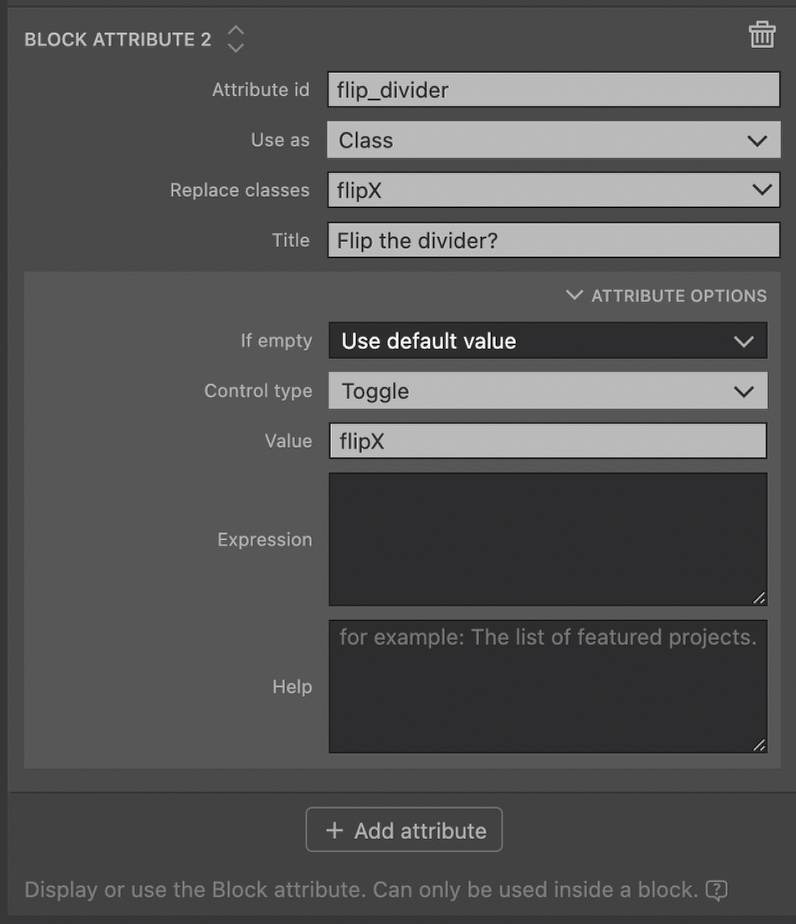
- With the divider block still selected, open the WordPress Actions panel and click on the “+ Add attribute” button at the bottom of “Block Attribute 1”.
- Add an id, select “Class” for “Use as”.
- For “Replace classes” select “flipX”.
- Add a descriptive title.
- In the “Attribute Options” section choose “Toggle” for the “Control type”
- The value input accepts what should be added if the toggle is turned on. Give a value of “flipX”
Right now if we saved and exported our theme it wouldn’t work for two reasons.
First, our divider already has the “flipX” class. This means that switching the toggle will have no impact. For elements that don’t have the “Block” action, we could apply another WordPress action that would strip the class upon export. In this case, however, we need to delete the class manually.
Second, our custom styling rule is being added to the front end, but not the editor. For styling that is only used in one block it is best practice to add it in the “Block” action.
- Select the Divider block.
- Open the “More Options” section.
- In the “Editor style” input click on the folder and navigate to the stylesheet in the Pinegrow project where the custom styling was added. This should already be imported into the front-end, but if not, also add this sheet to the “Style” input.
If we save, export, and reload our WordPress theme our divider should now be available and fully customizable.
Wrap-up
As we have seen in this tutorial, nested blocks are a great way to allow the end user to modify the page, but place restraints on the overall design. The Gutenberg block system has a lot of controls that the Pinegrow Web Editor allows us to easily add. In the next tutorial we will explore dynamic blocks and look at a few more control types.
Until then, have fun designing with Pinegrow!
Discuss this tutorial
Have questions or comments about this tutorial? Let’s talk about it on our forum.
Get in touch
Would you like to see your favorite theme or blocks library featured in the next tutorial? Let us know in the forum or by email!