These Bootstrap 4 element properties can be set for any element on the page.
Responsive vs. non-responsive properties
Responsive properties can be set for a particular display size, while non-responsive properties define the element behavior in general, irrespective of the device size.
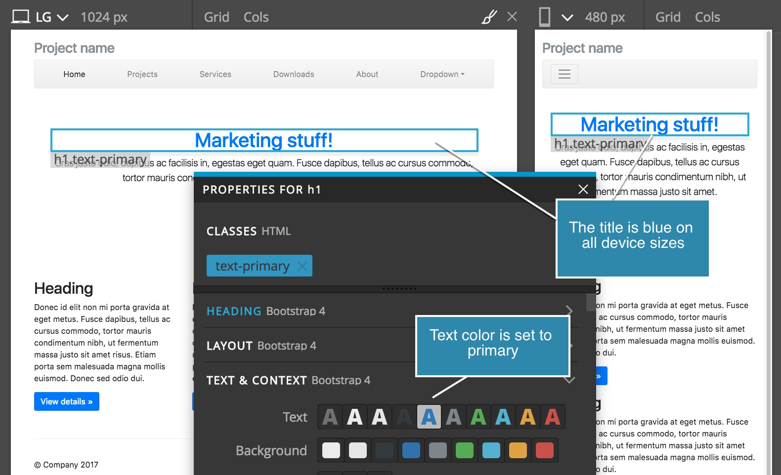
An example of a non-responsive property is the Text Color property. It lets us choose the color of the text, but we can’t make the text red on small screens and blue on others.
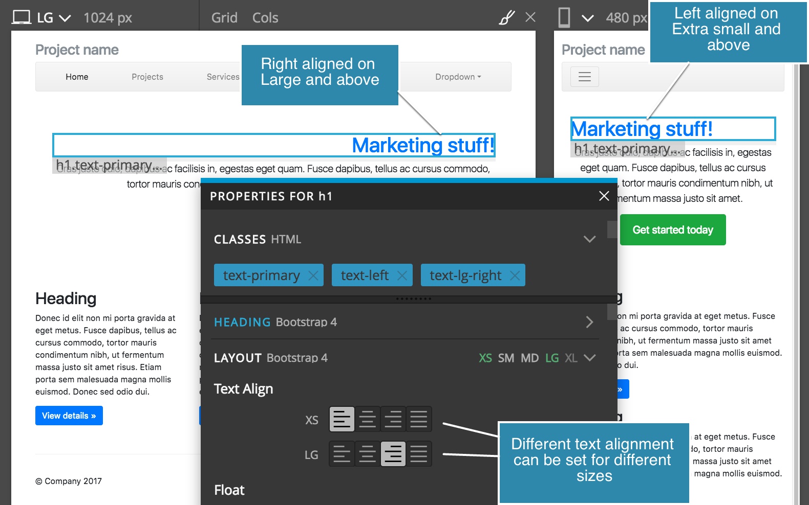
An example of a responsive property is the Text Align property. We can make the text left aligned on mobile devices, centered on tablets and right aligned on larger devices.
Responsive properties have a device size selector displayed at the top of the property section.
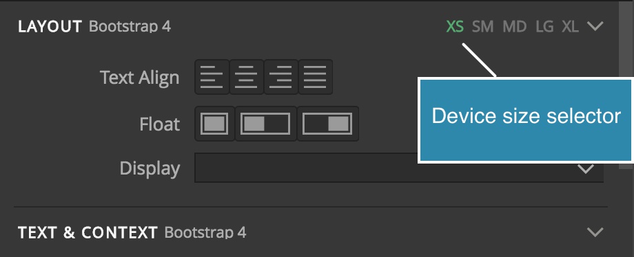
By default, XS (extra small) is selected. In Bootstrap, that means that the property value will affect XS and above, encompassing all screen sizes.
So, if you just leave XS setting, that’s how the element will behave on all screen sizes.
To display settings for another display size, toggle the size in the device size selector:
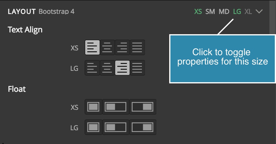
Then, if you then set a different value for that size – for example, LG (large) – that setting will override the default XS value for large sizes and up.
Let’s look at an example:
Here we set the Text Align property for XS to left and to right for LG and above.
On XS, SM and MD sizes the text will be left aligned. On LG and XL, it will be right aligned.
Of course, we don’t have to set the XS value at all. We can make the text left aligned on SM, and right aligned on larger devices. That means that for XS size, the value of Text Align Bootstrap property is not defined. The text on XS will be aligned according to whatever CSS rules affect that element.
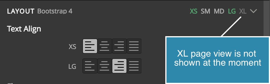
Those sizes that are not visible in the active page view will be shown darker in the Device size selector. For example, XL is dimmed because it is not visible on the currently active page view that has the LG size.
Let’s list all general Bootstrap 4 sections in the Element properties. We won’t go into explaining how Bootstrap works here. We’ll only mention things specific to working with Bootstrap in Pinegrow that are not self-evident.
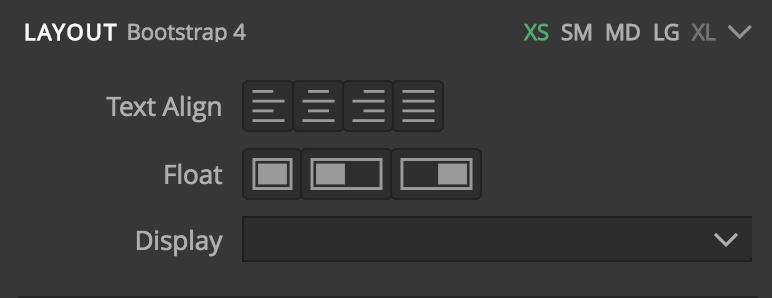
Layout
Responsive
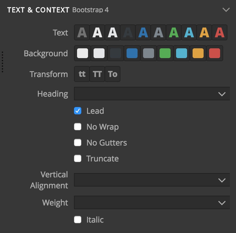
Text & Context
Non-responsive
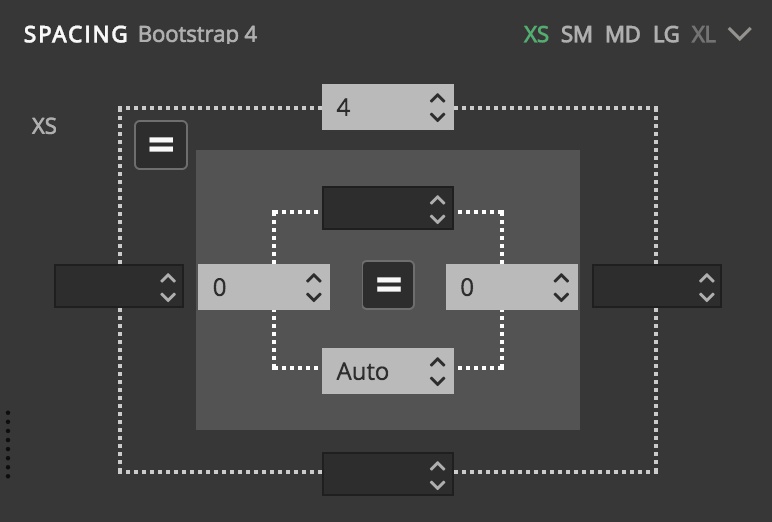
Spacing
Responsive
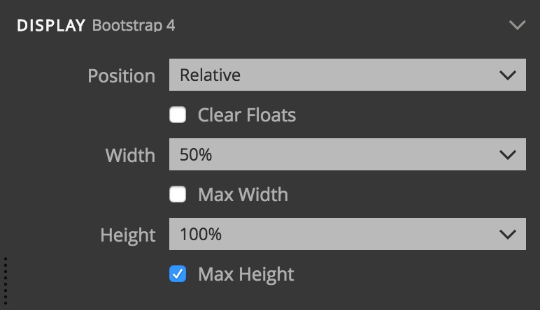
Display
Non-responsive
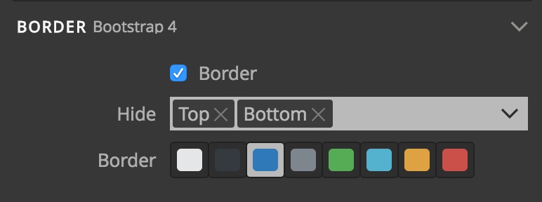
Border
To display borders only on certain sides (for example, top and bottom), select the Border checkbox and then use the Hide multi-select control to select the sides where the border is hidden – in our example, left and right.
Columns
Columns are a responsive control, but here we list the settings for different sizes in a table, instead of using Device size selector.
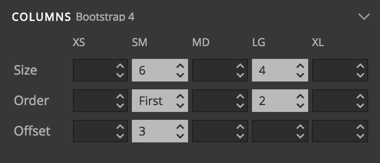
Why is the columns control shown for all elements, not just for divs in rows?
Bootstrap columns are handy for sizing and positioning various elements, not just main column divs.
You could set a column span on a button, for example.
Of course, according to Bootstrap rules, these settings only work properly if the element is positioned inside a row element. That’s why, if you set a column value on an element that is not located in a row, Pinegrow will offer to create a wrapping row element.
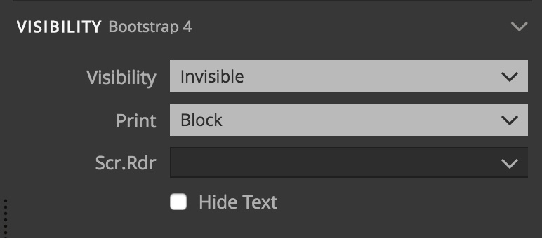
Visibility
Non-responsive
Flex Container and Flex child
Responsive
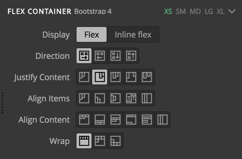
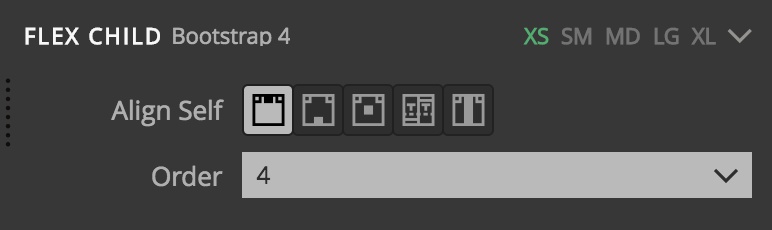
These controls are almost identical to Flex controls in the Style Visual editor. That’s because these Bootstrap helper classes directly correspond to different values of CSS Flex properties.
Flex Container settings apply to containers and Flex child settings to the items in Flex containers.
Tooltip
Check the Tooltip checkbox and set the parameters to display a tooltip on the selected element.
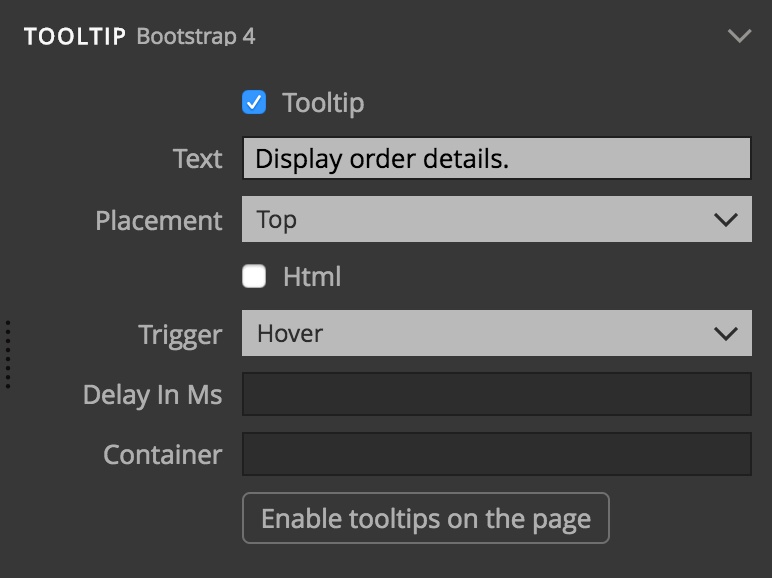
In Bootstrap, tooltips are not enabled by default. You need to activate them by explicitly calling the .tooltip() method. The general code that does that for all tooltips on the page is:
$(‘[data-toggle=”tooltip”]’).tooltip();
Press the “Activate tooltips” button to add this code to the page or copy-paste it to a Javascript file.
Popover
Popovers are very similar to tooltips, described above.
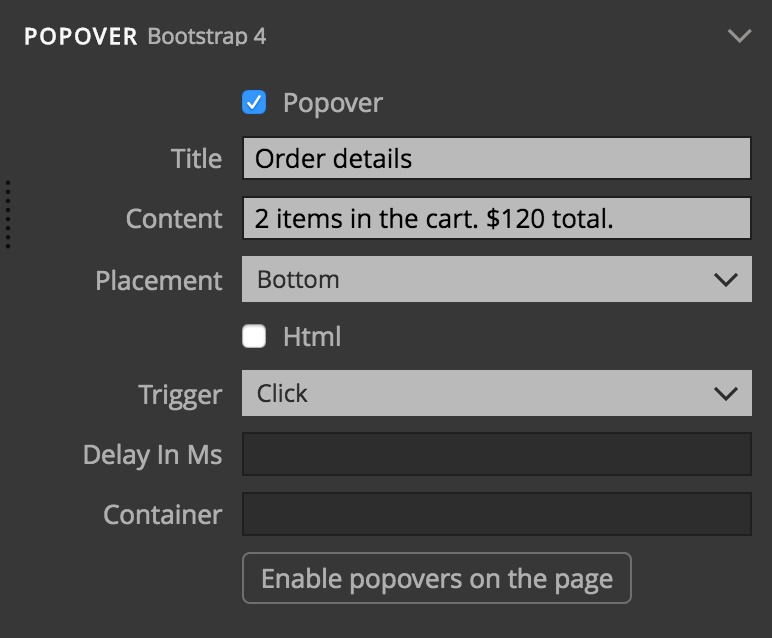
They are also not activated by default. The code to activate all popovers on the page is:
$(‘[data-toggle=”popover”]’).popover();
Press the “Activate popovers” button to add this code to the page or copy-paste it to a Javascript file.
Javascript
The Javascript section contains properties that control some of Bootstrap Javascript features. For many of them, Pinegrow provides a more convenient controls, for example, trigger selector tool for modals. Those controls map values back to these properties.