The Pinegrow Design panel for the Tailwind CSS framework allows you to easily set up a custom theme without editing any config file or setting up a complex compiler. It also allows you to test alternative designs for your whole project quickly and easily.
The Pinegrow design panel provides a central location for you to set a number of base stylings for all the pages in your project. You can customize your Tailwind CSS theme without editing config files, or setting up complicated compilers. This allows you to quickly modify and compare design changes throughout your whole project. For the Tailwind framework these include the available color palettes, fonts, background, and ‘Just-in-Time’ (JIT) compiler options. Let’s take a walk through to see what powers this gives us!
Note: The Design panel is also available for Bootstrap projects. See the documentation here.
Activating the design panel

After opening a Tailwind Block template, plain Tailwind or Tailwind UI page you need to save it as a project before you can start using the Design Panel. Once saved the Design panel will display a button for you to active the panel for the project. This results in the creation of a theme folder named ‘tailwind_theme’. Within this folder there is a file, ‘tailwind.css’ that will contain all of the styling for the project, including changes made from the Design panel. By default, the Tailwind CSS JIT compiler is activated and will only add the rulesets needed for your project to this page.
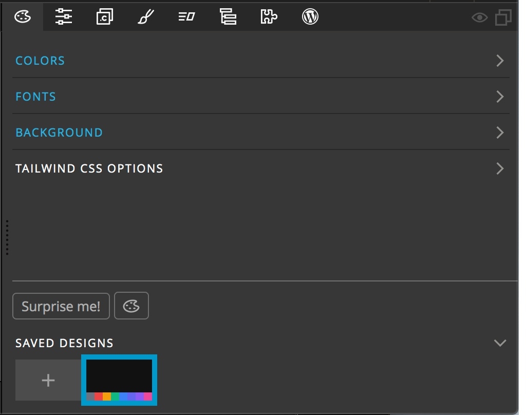
After activation of the Design panel you will see four categories of theme changes that can be made, as well as a section at the very bottom of the panel with a list of saved designs, a tool toggle and the very special “Surprise me!” button. Let’s walk through each.
Colors
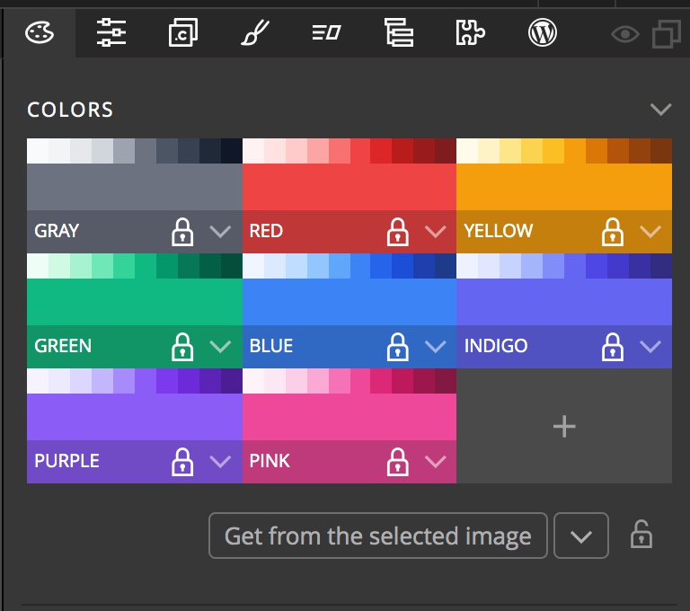
The Tailwind templates come standard with eight different colors, each having 10 shades. Any of these color can be edited by simply clicking on the color and then selecting a new color from the picker or with the input box. Pinegrow will automatically create the 10 shades of the new color. Right-clicking on the color or clicking on the caret at the right will open a context menu with three choices – ‘Edit shades…’, ‘Rename color…’, and ‘Delete color…’.
Note: Making a change to a color name or deleting a color will change the stylesheet, but will NOT make any changes to the HTML in your pages. So, we do not recommend you delete or rename a color when you already have a project underway, as this could leave some elements unstyled.
Edit Shades
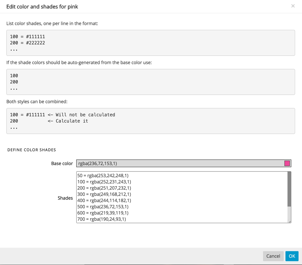
Clicking on the ‘Edit shades…’ item will bring up a modal. At the top of this modal are some instructions for adding in new shades. Each shade is made up of a name and color value. In this example, the shade names are numbers and will generate class names like, .text-pink-300. There are two ways to define shade colors. The first is to enter the exact color as an rgba, rgb, or hex value. The second way is to allow Pinegrow to define the shade by leaving the color value blank. You can also add additional shades to the list as either exact color values or Pinegrow calculated values.
Note: This modal can not be used to change the base color.
Adding a new color
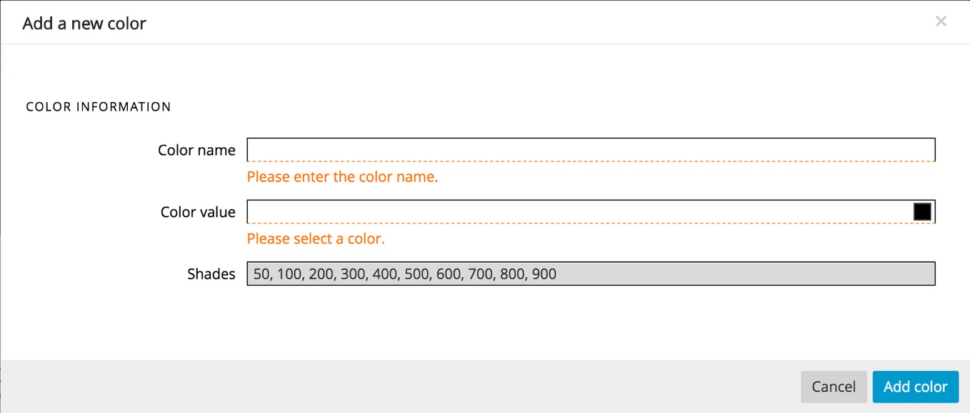
Clicking on the “+” icon will open a new modal. In this modal there are three inputs. The first is for the new name for your color. The name can only contain letters, numbers, or an underscore. The next input is for your base color. You can either enter a value (rgb, rgba, or hex) or use the color picker. Finally, the last input accepts a list of shade names separated by commas. The names can only contain letters and numbers. Pinegrow will automatically assign shades based on the number of different shade names, starting with the lightest shade being assigned to the first name, the darkest to the last name, the base color to the “middle” name, and then assigning the rest of the names colors in between each of these shades. Once assigned, you can go into the shade editor and adjust them if you don’t like the automatically assigned colors.
Assigning colors from an image
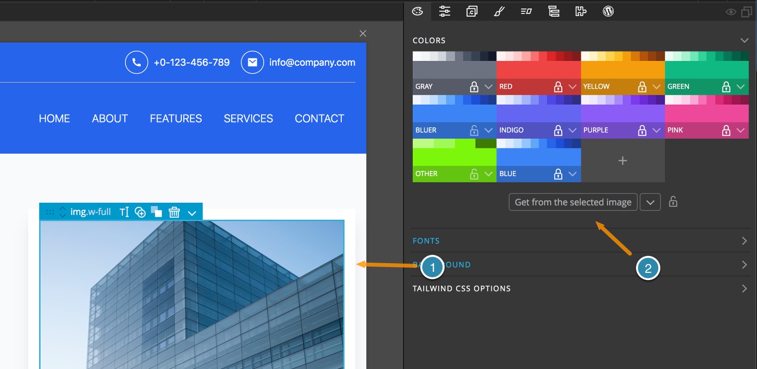
You can also repopulate the colors to fit with an on-page image, such as the main hero image, or any element with a background image. To accomplish this, just select the <img> or element in either the Page View or the Tree and then click the “Get from the selected image” button. If you only want selected colors changed you can toggle the lock icon and it will preserve the existing color. There is another “surprise” use for these locks I will cover later.
Note: By default, all of the existing colors are locked. If you want to change these using colors from an image you will have to unlock them first. But, be aware that is you are starting with a template, this will change all of the colors on the page and your color names will likely no longer make sense. We recommend you only do this when first starting a project.
Any of the colors can be swapped by holding down the alt/option key and dragging one of the colors over the other. For example, if you want to see what your design would look like with two different shades of blue swapped. If you want to keep a color, but with a different class name, just drag the color to whichever slot you choose and it will be copied there – but note, it will overwrite the existing color. Luckily this can be undone if necessary. When using this feature keep in mind that if you use literal names for your colors, you might need to change some things in your HTML for it to make sense.
At any time you can revert any changes made to the original colors by clicking on the caret at the bottom of the section and selecting ‘Restore default colors’. This will not alter any colors that have had their name changed, or new colors that have been added. It will only impact the base Tailwind colors.
Fonts
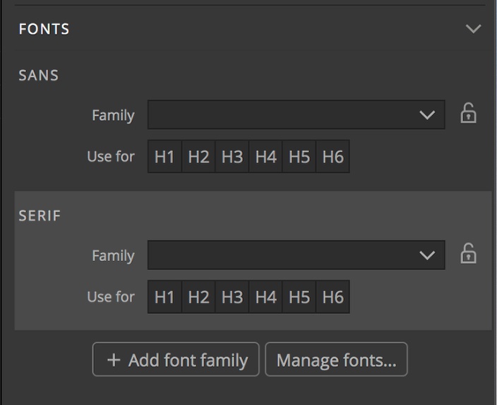
The next section of the Tailwind Design panel allows you to both set the base fonts used throughout your project, but also add additional fonts. Tailwind supports three font types in any base project – ‘Sans’, ‘Serif’, and ‘Mono’. The actual font used for each is dependent on what system fonts are installed. The Design panel allows you to easily assign specific fonts for both the .font-sans and .font-serif classes by clicking on the drop-down input for each and selecting a font from the list.
Notice that each of the ‘Family’ settings has a lock. I’ll save what these are for until the “surprise” at the end.
Additionally, you can click on one or more of the heading tags below the family input to use the font automatically for the specific heading, without having to add the specific class.
Note: You can still add any font to text within your pages through the style panel. For example, if you want some decorative text on one word. Setting the fonts in the Design Panel won’t interfere with this.
Adding additional font choices
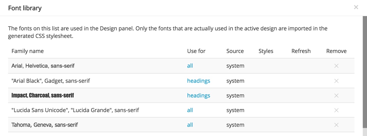
The drop-downs are already populated with a large number of popular fonts. However, if you want to use an unlisted Google font, or a custom font file you can click on the “Manage fonts…’ button or select “Manage fonts” from the bottom of the drop-down list. This will bring up a modal that lists all of the fonts. In addition to adding fonts, this control panel will also allow you to remove fonts from the drop-downs by clicking on the ‘X’ in the ‘Remove’ column. The ‘Use for’ column is not used in the Tailwind Design panel and can be ignored.
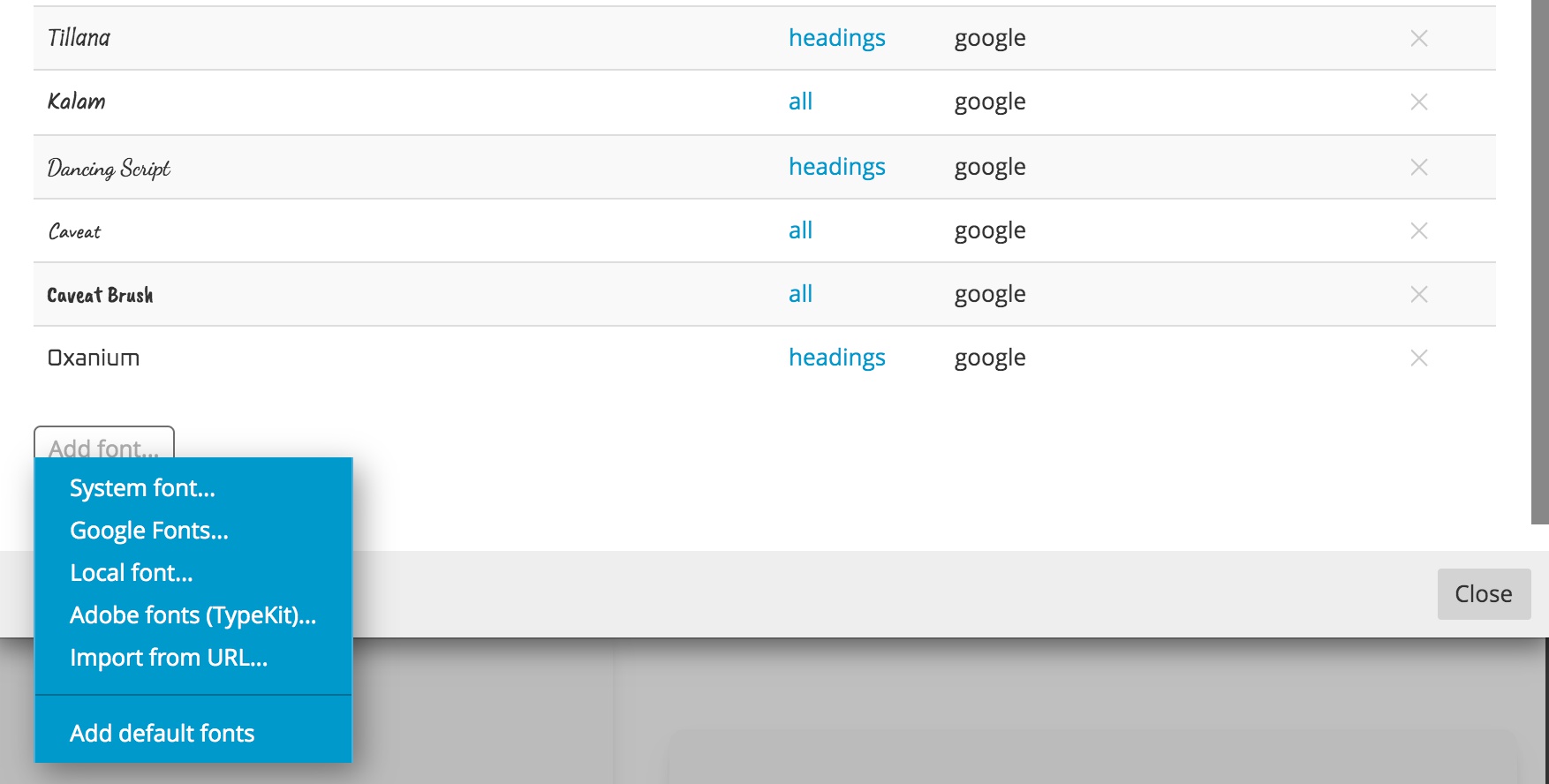
In order to add a new unlisted font, scroll to the very bottom of the Font Library. There you will find a button that when clicked will bring up a context menu. This will allow you to load in fonts from a wide variety of sources, such as Google and Adobe TypeKit. The final selection, “Add default fonts” will add any removed font back to the list.
Note: In order to add local fonts, you will have to create a folder containing your fonts and a stylesheet to import them into your project. The easiest way to accomplish this is by using a site like the Font Squirrel Webfont Generator. Uploading your font file will generate the .woff files and stylesheet. This folder can be copied into your folder and then targeted in the font manager. You may need to change the stylesheet with the correct path once your project is loaded onto your hosting site.
Adding a new font type
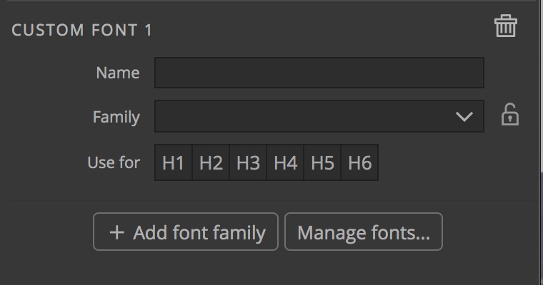
If you want your theme to have additional font choices beside the three basic types, click on the ‘+ Add font family’ button at the bottom of the ‘Fonts’ section. This will add another section with several input boxes. The name input will create a new class, so only use letters, numbers, dashes, or underscores. This new name will show up in the Properties panel font family drop-down. The family and headings selectors work the same as with the other two sections.
Background
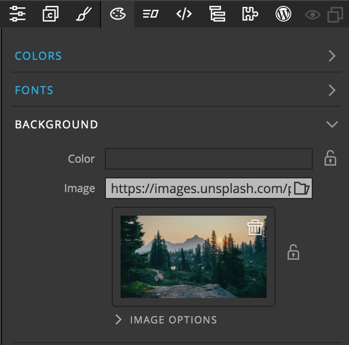
The Background section has a few different uses. Firstly, the color input is populated from the theme colors set in the first section of the Design panel. Selecting a color here will add it as a background color for all of the pages in your project. Secondly, you can do the same thing with an image. Clicking on the folder allows you to select an image file from your project or retrieve a file from Unsplash. However, by default the image isn’t used to set a background, but for the surprise at the end. In the next set of controls we will see how to use this image as background, or to replace any image on the screen.

Opening the “Image Options” reveals an additional set of controls. By default, the top checkbox, “Only use the image for colors” is ticked. The other two controls in this section, “Source” and “Query” will be covered at the end. To use the image as a project wide background simple untick the checkbox.
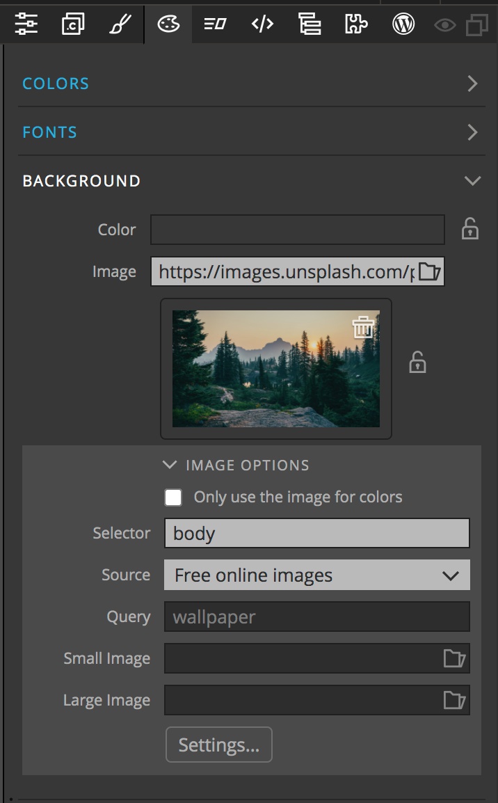
Electing to use the image on the page unlocks some additional features. At the top is the “Selector” input. By default it is set to “body”. This means that the selected image will be added to the body element and act as a background to the page. Instead, you can add a class or id, like #hero-image to have the background image added to a specific element. You also have the option to set a different image for small and large screens through the other two inputs and the settings button.
Images for the large and small screen sizes are added by clicking on the input box folder icon and either selecting a project local file or from Unsplash. Any valid URL will work. You don’t need to add both a small and large image, you can elect to use only one. The image in the main background area will be used for all other sizes. The images will be added to the element targeted by the selector using media queries that can be customized by clicking the “Settings…” button.
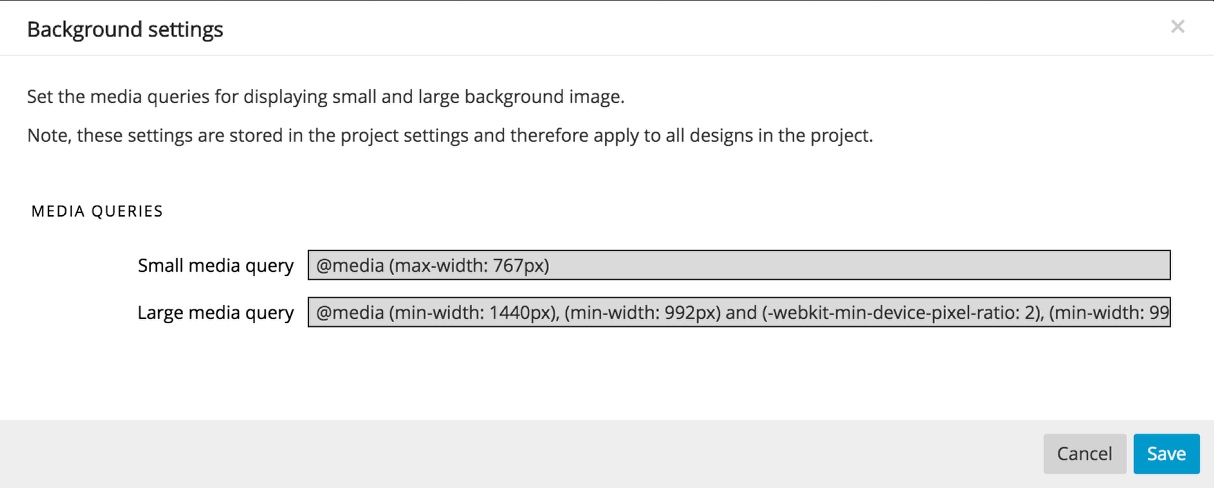
The default media queries target screens less than 768px, and any screen larger than 1440px or retina screens larger than 992px. You don’t need to add both a small and large image, you can elect to use only one. The image in the main background area will be used for all other sizes.
The remainder of the Background controls are for use with the final “surprise” and we will come back to them.
Tailwind CSS Options

This section provides a quick link to the Tailwind JIT compiler options. The compiler is on by default and insures that the resulting stylesheet contains only the rule sets that are needed. Typically there is no need to make changes or add a config file.
UPDATE: The Tailwind Css Options have been updated. There are now options for selecting between multiple built-in JIT compilers. You can also now elect to use an external compiler with plugins. Details are outlined here.
Surprise!
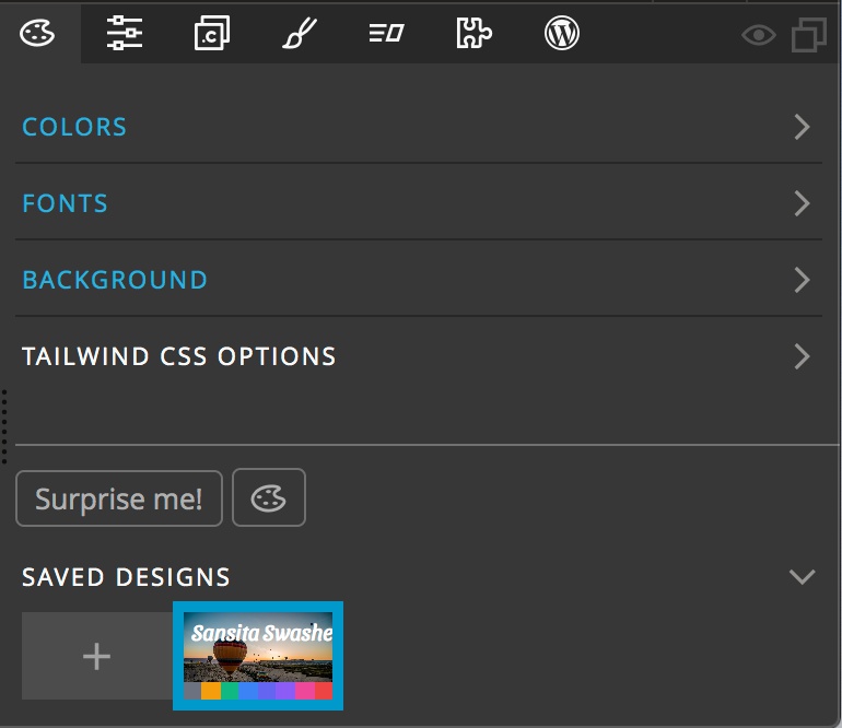
One part of the final section of the Design panel is to help wet your creative juices, a “Surprise me!” button. Clicking on this button loads a random image into the background section and uses this image to set up a new colors.

If you haven’t created any new colors, Pinegrow will prompt you, as well as giving some helpful advice to avoid using specific names like ‘red’ and instead use names like ‘primary’.
Clicking the “Surprise me!” button also creates new font pairings for any fonts added through the Design panel. Remember the locks in the previous sections? When activated, they prevent the “Surprise me!” button from making any changes. Happy with the color pallet, but not the fonts? Just lock what you like and hit the button again. Don’t want your special font substituted – make sure it is locked!
All of the changes that are made in the Page View will also be reflected and automatically update the open browser window if you have the BrowserSync option turned on. The Undo (CMD+Z or CTRL+Z) and Redo (SHIFT+CMD+Z or SHIFT+CTRL+Z) both work to move forward or back through your design changes.

Background

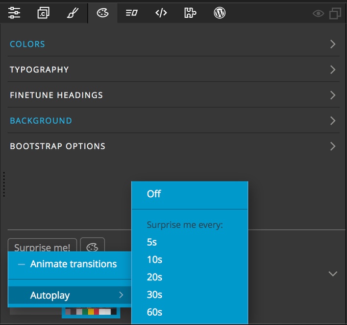
Coming back to the Background section. There are three other controls within the “Image Options”. The first is the checkbox. This allows you to get your theme colors from an image, but not use the image as a background. This is useful for the “Surprise me!” button, as it will change the picture, altering the color pallet, but not change the actual page background. The second input, “Source”, allows you to specify if the surprise images come from a local folder or from Unsplash. The third input, “Query” allows you to narrow the pictures returned by the “Surprise me!” button. Any search term will work, so play around!
Note: If you are using the image loaded into the background to actually display on the page and turn the lock on to keep the “Surprise me!” button from changing it, you will no longer get changes to the color palette. Instead, you will have to select the image on the Page View or Tree, then in the colors section select “Get from the selected image…”.
Saving and reseting your theme

The final section containing our surprise also has two other controls. One is a “Saved Designs” section. This can be used, for example, to store several slightly different design options for a client. Clicking on the “+” icon will add the current design to the saved designs. This can also be used during “autoplay” to capture any design ideas. As you accumulate designs there will be additional thumbnails that you can click to reload them. Right-clicking on the saved designs allows you to delete them or duplicate them to make minor theme changes.
Note: The Background “Selector” input is design specific. For some designs you can elect to change the background for a hero element and for others you can use the image as a background for the whole page, for example.
Finally, the design palette icon next to the “Surprise me!” button opens the floating tools which we will cover in its own section.
Note: You can convert your Design to HTML using Pinegrow, but do you know you can also convert your HTML to a WordPress website/theme? Check our tutorial on how to convert HTML to WordPress.