The Pinegrow Design panel allows you to set project wide styling including color palette and fonts. Plus, the saved design and Surprise me! button allow you to easily explore design alternatives.
The Pinegrow Design panel provides a central location for you to set a number of base stylings for your web project. You can quickly customize your HTML theme without editing config files, or setting up complicated compilers. The panel allows you to quickly modify and compare design changes throughout your whole project. Colors, fonts and background options can all be tweaked in this panel and the customizations will carry through all of the pages in your project. Let’s take a walk through to see what powers this gives us!
Note: The Design panel is also available for both Tailwind CSS and Bootstrap projects.
Prefer to read? Scroll past the video.
This tutorial is available in video and textual form. Watch the video, or continue reading if you prefer to read. Of course, you can also do both!
Activating the design panel
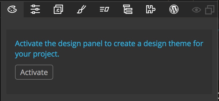
After opening a HTML page you need to save it as a project before you can start using the Design Panel. Once saved the Design panel will display a button for you to active the panel for the project. After activation, it is recommended that you save the open page once again. This results in the creation of a theme stylesheet in the project “css” folder and the addition of this stylesheet to your open page.
The new “theme.css” stylesheet contains a section of minimized CSS that contains some CSS reset code by default. You can read more about it here. Basically, this code ensures that all built-in browser CSS is cleared so that it doesn’t change the display of your HTML. You can remove this code, for instance to add your own reset, by unchecking the box in the Design Options section. The sheet also contains a number of CSS variables (actually called custom properties) and styling rules that can be set using the visual controls in the Design Panel.
By default, the “theme.css” file is loaded before the main “style.css” file. This means that any variables defined in the “theme.css” are available for use in the main stylesheet. Additionally, any rules added to the stylesheet will override the theme rules. This allows for individual styling of selected items on the page if desired.
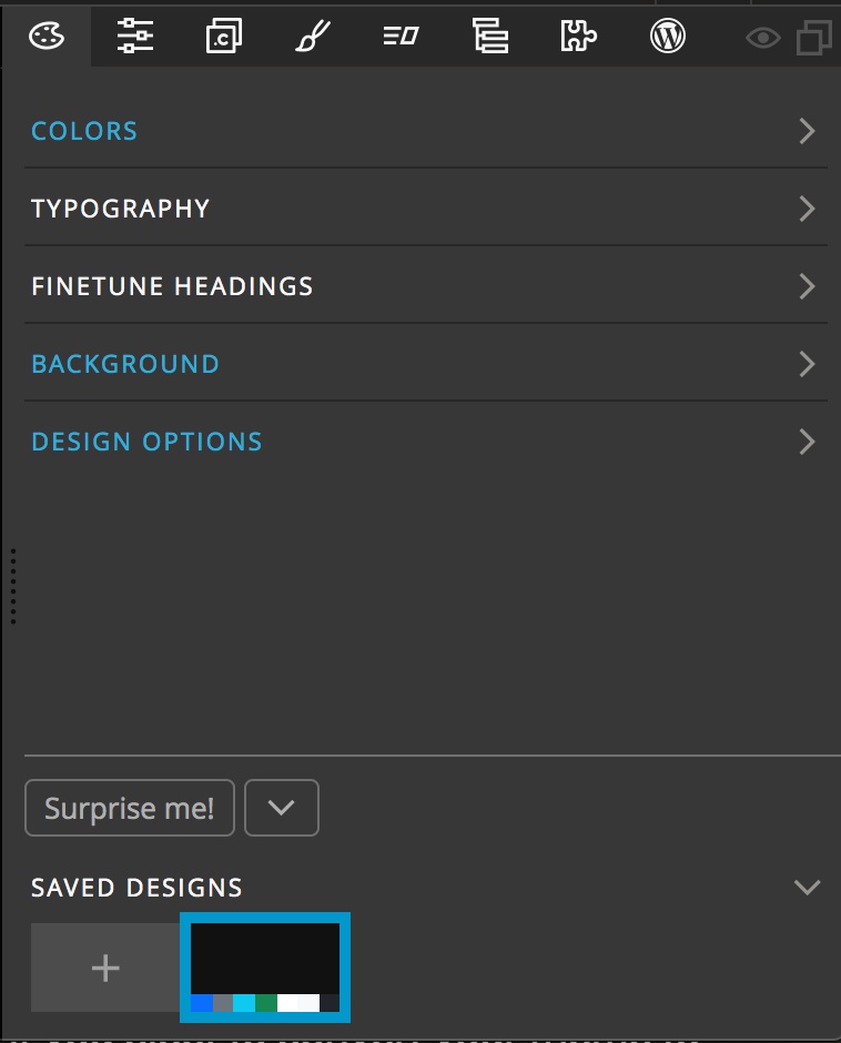
After activation of the Design panel you will see five categories of theme changes that can be made, as well as a section at the very bottom of the panel with a list of saved designs, a tool toggle and the very special “Surprise me!” button. Let’s walk through each.
Colors
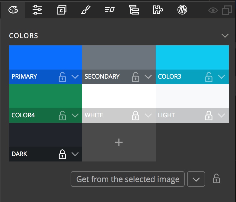
The HTML Design Panel adds seven colors by default. The name displayed below the color is the variable name. Clicking on the name will allow you to change it to any name you wish. Custom properties are case sensitive and can only contain letters, numbers or an underscore. Similarly, clicking on the color itself will allow you to select a new color associated with that variable name. Clicking on “+” at the end of the color list will allow you to add additional colors and assign the color a variable name. Colors can be swapped simply by dragging to another swatch. Colors can instead be copied by holding down the option key when dragging to the new location.
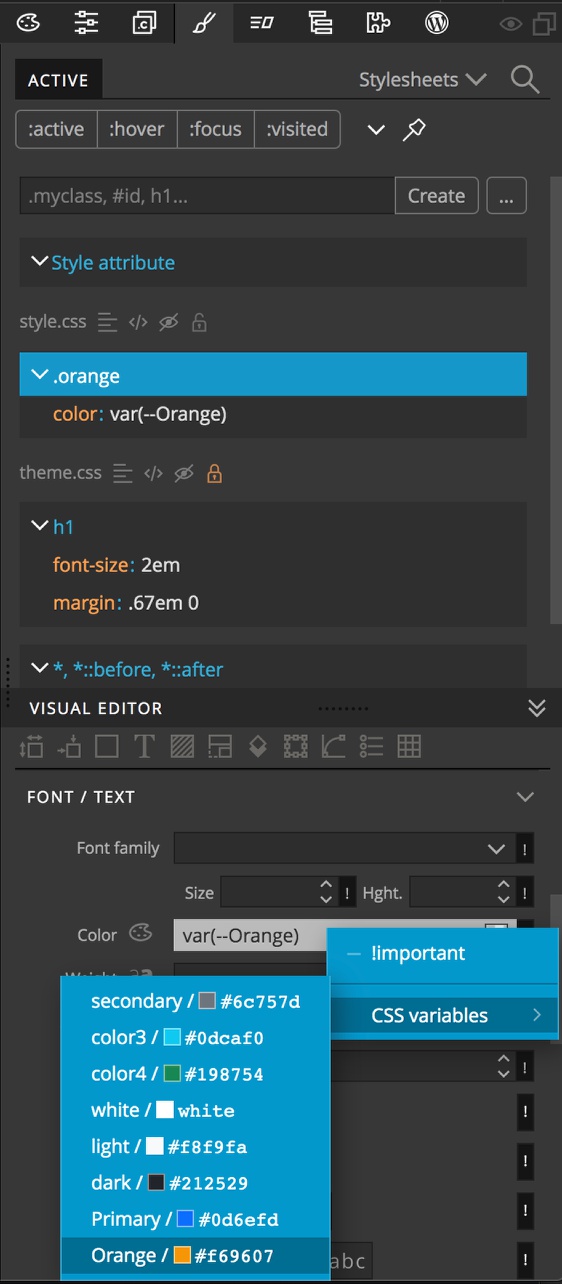
These color variables will show up in the Style panel controls by clicking on the “!” at the end of any control and then selecting the CSS variables drop-down in the resulting context menu.
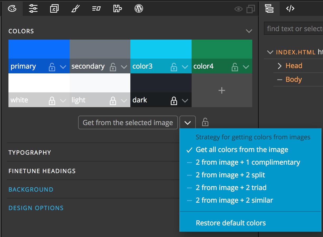
The Pinegrow Design panel allows you to easily set theme colors based on a main image from your page. With the image selected on the page, simply click the “Get from selected image” button below the colors. The locks next to each color name will prevent that color name from baing assigned a new color. By default, white, light, and dark are all locked. The dropdown menu allows you to select the type of palette that will be generated. If you don’t like the colors that Pinegrow generates you can click on the “Restore default colors” option. Finally, the lock at the bottom will lock all of the color, irrespective of each individual lock.
Typography

There are two sections in the Design panel for setting text preferences for your project. The first is the Typography section. There are two dropdown menus in this section. The first, “Regular text” sets the font-family for the body of your document. Basically, this will be the default font that all text on the page will use. The second, “Headings”, will set the font used for the h1 – h6 tags. Underneath the main dropdown menus there are a series of additional settings for each font. From top to bottom, these options let you set the font weight, color, spacing, shadow (Effect) and change the font styling (italics, small caps, or uppercase).
As with the colors, all of these sections have locks to prevent changes. These will be important when we get to the final section.
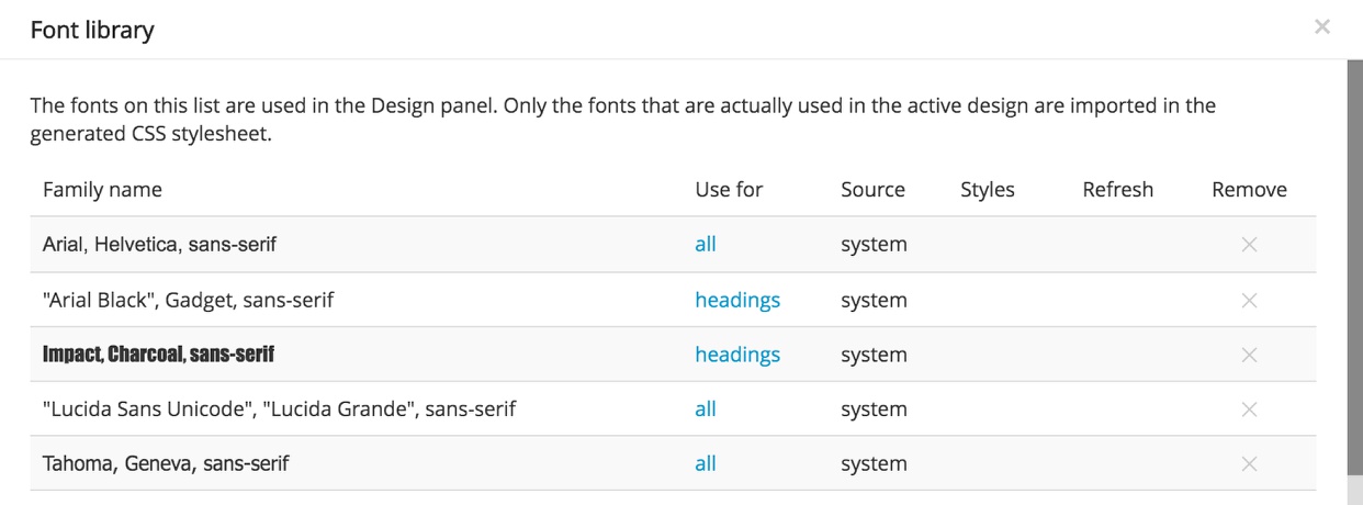
The final control in this section is the “Manage fonts…” button. Clicking on this will bring up a modal containing all of the fonts that can be currently selected by name. In the second column, “Use for”, there will be a listing of either “all”, “headings”, “text”, or “h1, h2”. This regulates which dropdown menus the font will appear. This helps to make the dropdown a little shorter, but has no other impact. You can use this modal to remove font choices if desired.
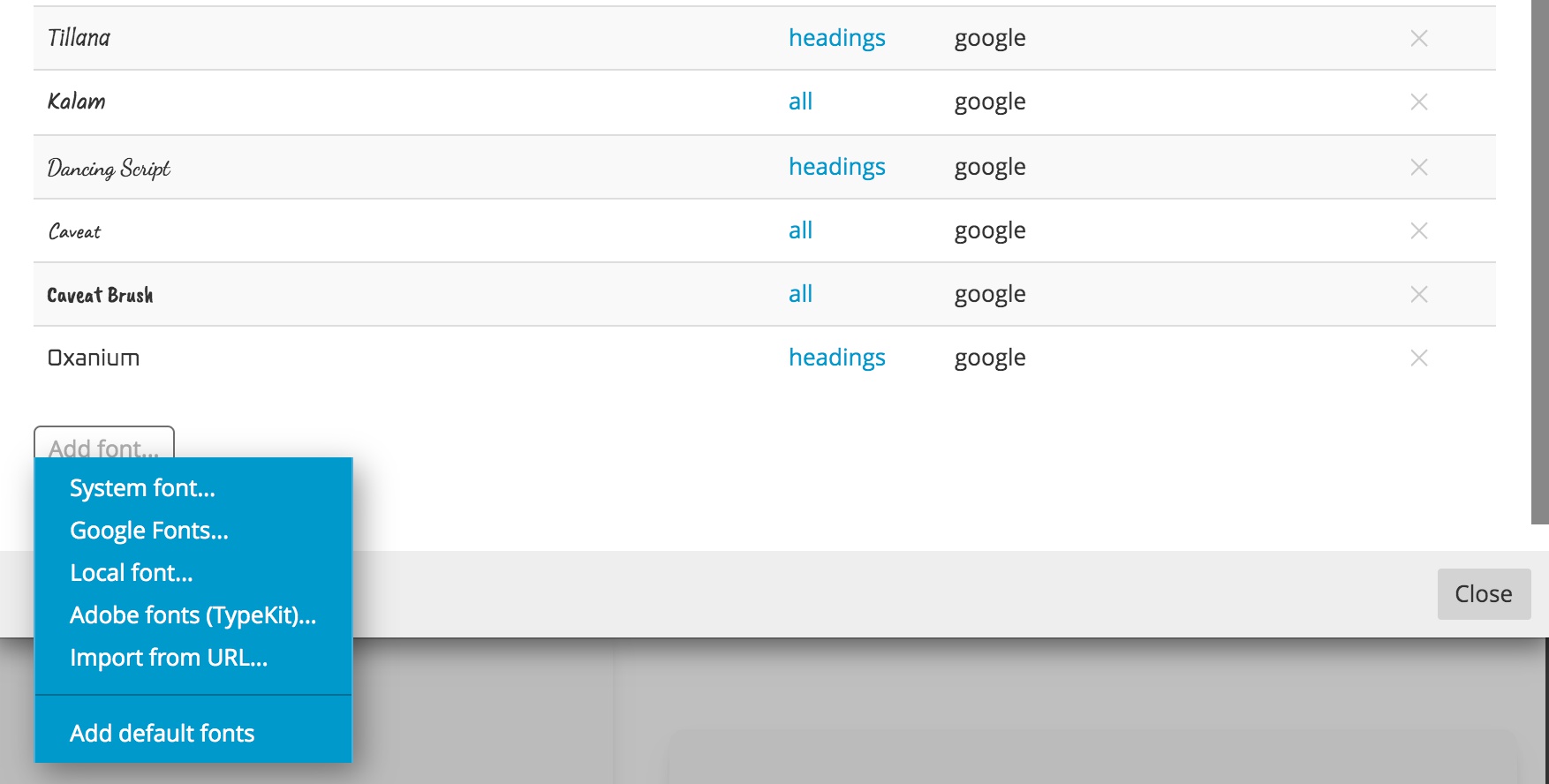
At the bottom of the modal is a button for adding additional fonts from a variety of sources.
Note: Adding fonts here will make them available within the Design panel. If you have already added fonts into your project through another stylesheet they will not be available in the Design panel and adding them here will create a duplicate instance. We recommend deleting them from the other stylesheet and loading them here.
If you have removed any fonts and want to add them back, you can select “Add default fonts” from the menu to restore them.
Finetune Headings
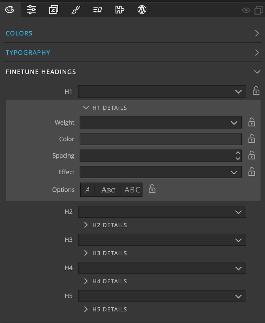
The next section in the Design panel, Finetune Headings, allows you to specify fonts for individual headings tags. Much like with the Typography section, you can also set many styling properties for each of the fonts. Again, there are also locks for each setting that are used in conjunction with the “Surprise me!” button to prevent any changes.
Background
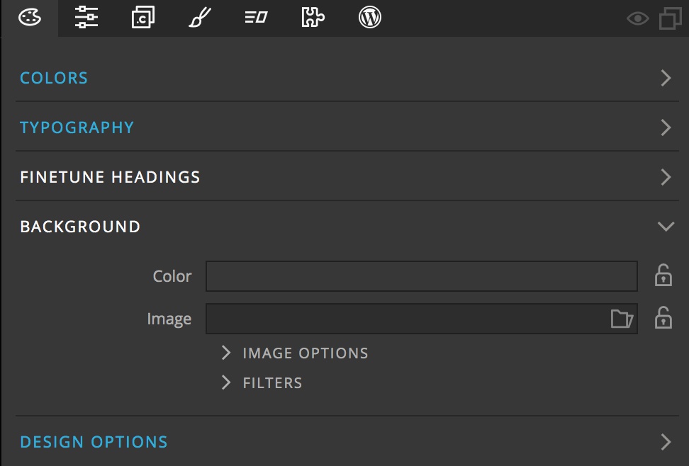
The main area of the Background section has two input boxes. The first “Color” allows you to select from any of the colors in your Design panel palette. This will set the “background-color” property in the “theme.css” file. It can be locked using the icon to the right of the input so that the “Surprise me!” button doesn’t alter it.
The second input box, “Image”, allows for the selection of an image file. This file can either be loaded from the project folder, or from the Unsplash image service. Unlike the Color input, the image will not be used as the background to your document by default. Instead, it will be used for selecting new colors for the palette.
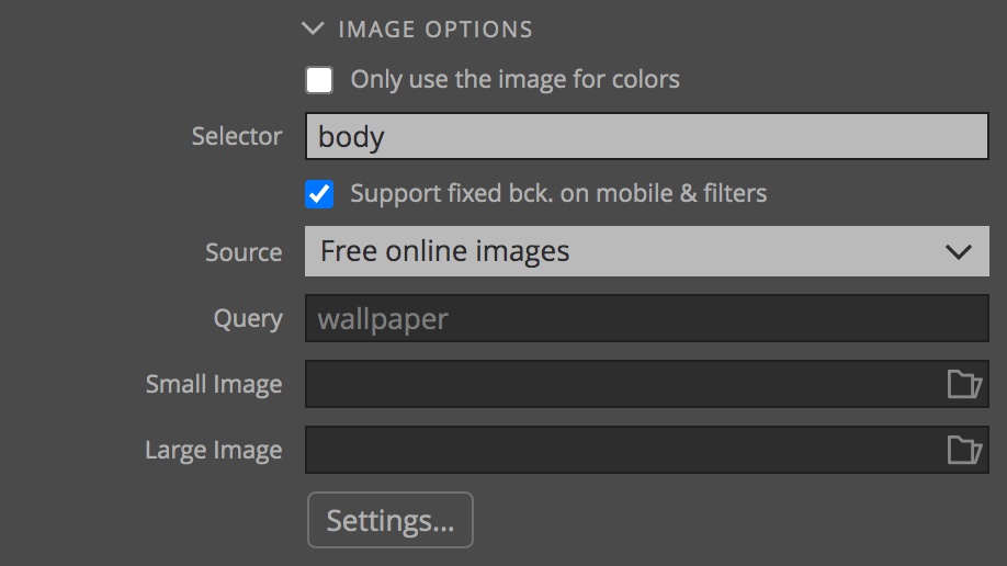
To use the image as background, uncheck the “Only use the image for colors” within the “Image Options” section. This section has several additional input boxes. The “Source” and “Query” inputs are present whether the top input is checked or not. These two are primarily used in conjunction with the “Surprise me!” button. The Source allows you to specify whether new random photos are selected from either a local folder or the Unsplash service. The Query allows you to limit the photos retrieved from Unsplash to certain keywords.
Unchecking the top option exposes a number of additional input boxes. The first is the “Selector” input. This box is set to the body element by default. However you can add in a class (prefix the class name with a “.”) or Id (prefix the Id with a “#”) selector to have the background image replaced in a selected element. For example, you could target the hero image on a page. If the targeted element is an image, the src attribute will be replaced by the path of the new image, otherwise, it will be set as the background of the targeted element.
Note: For a background image the element should have a position of “relative”, “absolute”, or “fixed” if you want to apply filters to the image.
The next selector, allows for the addition of filters, as well as display of the background image on smaller devices.
The final two input boxes allow for finer control of what images are displayed at different screen sizes. The “Small Image” input will allow for selection of an image to display on screens with a max width of 767px, by default. The “Large Image” will change the displayed image on screens that meet a number of criteria for width and resolution, but basically larger than 1440px for most displays. The main image selected will display at any other sizes. So if only a smaller image is selected, than any display size larger than 767px will display the main image.
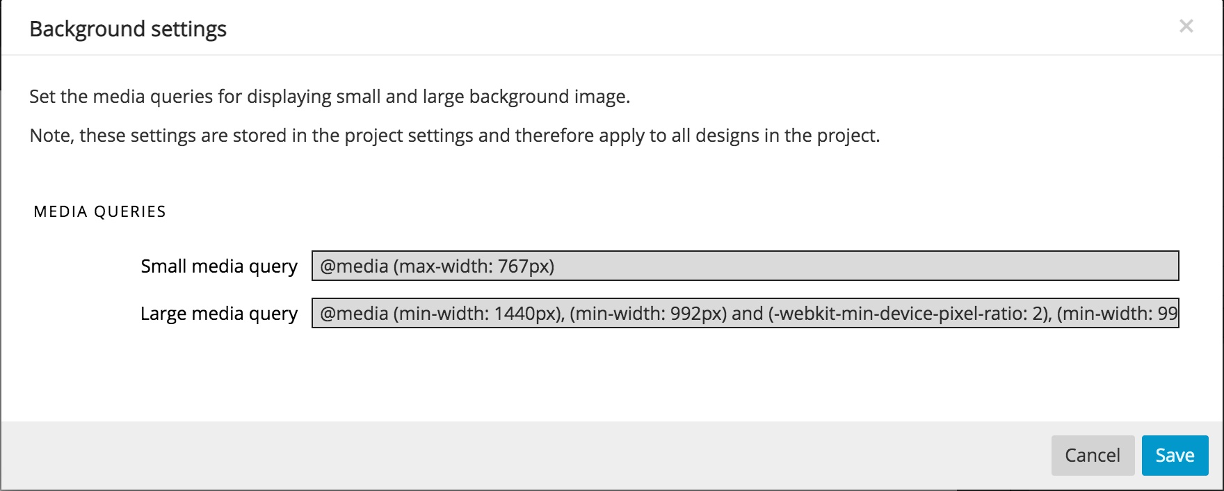
The exact media queries for the small and large images can be set by clicking on the “Settings…” button. These queries can be simple min-width and max-width queries, or more complex queries with all of the logic allowed in media queries.
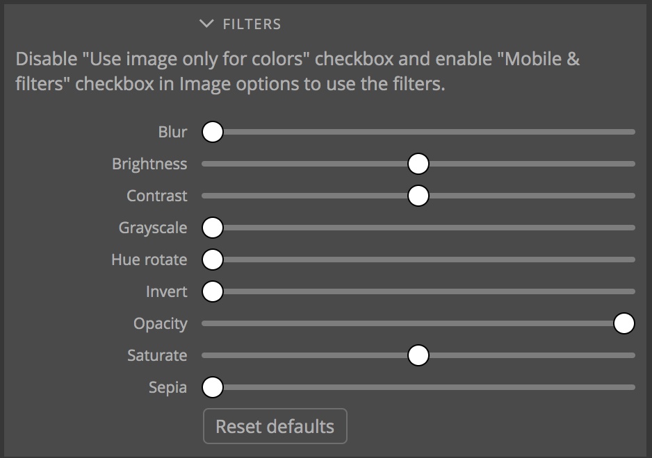
The final inputs in the Background section allow the application of a variety of filters to the main image. By default, the same filters will be applied to each image by adding the CSS properties to the main rule. If different filters for each image are required, the CSS properties have to be added manually to the media query blocks.
Design Options
The next section in the Design panel has a single checkbox selection. This toggles whether or not the CSS reset is added into the theme.css file.
Surprise me! and Saved Designs
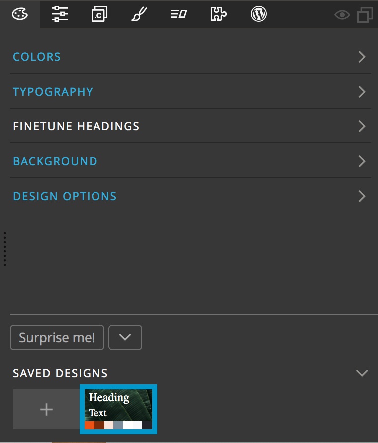
The final section of the Design panel is where inspiration lives! When clicked, the “Surprise me!” button will change any unlocked areas of the Design panel. If the colors and main image are unlocked, a new image will be selected from either the local folder or Unsplash depending on the selected options in the Background section. This will potentially replace the image on the page (depending on selected options) and select a new color palette. Unlocked and selected fonts will also be changed. Any new themes can then be saved by clicking on the “+” icon within the Saved Designs section.
Right-clicking on the surprise me button will bring up a context menu. In this menu you can turn off the animation that occurs when clicking the “Surprise me!” button and turn on auto-clicking of the button. This starts a slideshow of designs. Just click on the plus button to save any you like.
You can easily cycle through saved designs by clicking on the thumbnails to the right of the plus icon. This can be a great feature for simply comparing font pairings, or reviewing design options with clients. Any design can be deleted by right-clicking and selecting delete from the context menu. You can also duplicate the theme from this menu to allow for fine-tuning.
Finally, the dropdown menu next to the “Surprise me!” button allows you deactivate the Design panel for the project. Choose this with caution since it will remove all changes introduced through the panel. You can also use this dropdown to bring up the floating tools. At this time this feature has not been fully developed for plain HTML pages, but will be further implemented in future versions of Pinegrow.
Note: You can convert your Design to HTML using Pinegrow, but do you know you can also convert your HTML to a WordPress website/theme? Check our tutorial on how to convert HTML to WordPress.