CSS Grid has gained much wider support, with virtually all modern browsers supporting it. Page layout is significantly easier than using traditional floats and widths, and best of all, Pinegrow has a variety of visual tools to help out!
In this tutorial I’m going to walk through putting together a simple web page using CSS Grid using the visual tools of the Pinegrow Web Editor. Along the way we will also look at some tricks and tips for using CSS Grid, as well as looking at the drawbacks.
Let’s face it, putting together web page layouts can be quite painful and is one major reason people turn to frameworks. Frameworks like Bootstrap, typically have a grid system to help size and place items on the page. Depending on the framework, this can be set-up behind the scenes using widths and margin, or more recently using flexbox. This allows the web designer to easily place html elements onto the page, but it does require the use of HTML markup that conforms to the framework developer’s CSS. Enter the “new” kid on the block, CSS Grid.
Let’s get started!
What you’ll need
- A copy of Pinegrow, a trial version will do.
- Download the tutorial project. It contains two pages, start.html with just the content and finished.html with the finished project. Open the content.txt if you follow along with the tutorial and need the textual content.
Prefer to read? Scroll past the videos.
This tutorial is available in video and textual form. Watch the three videos, or continue reading if you prefer to read. Of course, you can also do both!
Video 1 – Setting up the project
Video 2 – Creating the page
Video 3 – Making it responsive
Introduction to CSS Grid
The idea of CSS grid has been around in various forms since the late ’90s, but wasn’t as refined as the spec we have today. Interestingly, the browser most people love to hate, Internet Explorer, was the first browser to ship with something close to what we can enjoy today back in 2012. So, what is it?
Basically, CSS grid lets you split the screen into rectangular segments into which HTML elements can easily be placed. Unlike tables or column systems, you can easily overlap HTML elements without breaking the page flow using absolute positioning.
You apply the grid layout to a parent wrapper. Each of the children within that wrapper are then placed on the grid either by specifying track numbers or specific area names.
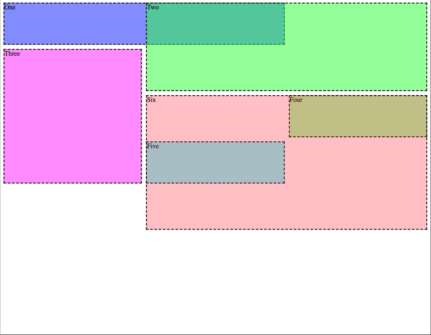
Edge, Chrome (under experimental settings), and Firefox all have CSS Grid line inspectors. Examining the example shown above with this featured turned on reveals what the grid looks like with respect to track numbers and the size of each rectangle.
In this case, the parent wrapper is the full-width of the screen and split into three equal sized columns using the property: value, grid-template-columns: repeat(3, 1fr). This can be seen from left-to-right along the top of the screen. So what does the value after the property mean? The repeat() can take a number of arguments, but here it takes two. The first is the number of columns that we want – ‘3’ and the second is the size – ‘1fr’. The ‘1fr’ means 1 fraction of the area. In this case we are saying we want 3 columns each with 1 fraction of the space, or ~33% of the width. The great part here is that the browser does that calculation for us!
The second property:value, grid-template-rows: repeat(5,100px) creates five, 100px high rows that are labelled top-to-bottom along the left side of the screen.
Finally, there is a space between each of the rectangles on the screen created by the property:value, grid-gap: 10px.
One important concept that sometimes trips up Grid beginners is the numbering system. The numbers aren’t added to the rectangles, they are added to the tracks. So the positive numbers start at either the very left or the very top of the wrapper and are increased to the right for columns and down for rows. So, in the example, the area labelled ‘one’ starts at column 1 and goes horizontally to column 3. For height, it stretches from row 1 to row 2. In addition to positive numbers the Grid tracks are also given negative numbers. These numbers start with -1 at the last column and row, in this case the lower-right corner of the screen, and then decrease as you go up the rows, or to the left in the columns. As I will show, this can be useful for positioning elements. As I will show, to make layout easier you can name segments, as well as the tracks that separate them.
At the most basic, a grid is made up of four CSS properties:
grid-column-start
grid-column-end
grid-row-start
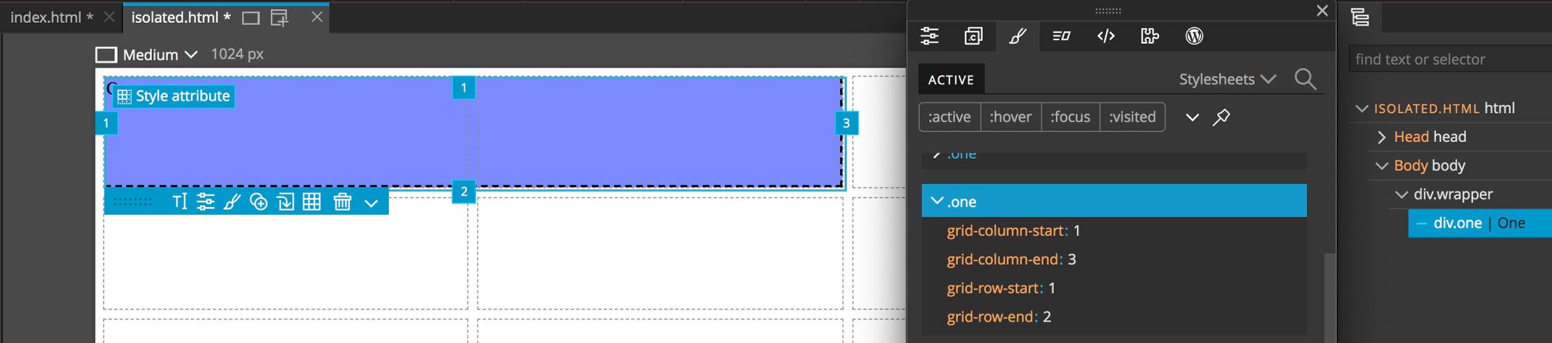
grid-row-endIf we look at just the first positioned div in the example using Pinegrow we can see this. There are also a number of shorthand ways to write this. So,
grid-column: 1 / 3
grid-row: 1
would work, as would just:
grid-column: 1 / span 2Setting up CSS grid in Pinegrow
Okay, let’s move on from the theoretical to actually building something in Pinegrow. Remember, CSS grid is just a set of properties, so we can use it in a plain HTML page, or in conjunction with a framework like Bootstrap if we want to use additional components. I’m going to start with a minimal project that I’ve already created containing some assets and a blank Bootstrap page. You can download it from here to follow along.
If you are using the starting template after downloading and un-zipping the project, open the “SummerNights” folder as a project by starting Pinegrow, clicking on the “Open Project” shortcut, and then selecting the newly created folder.
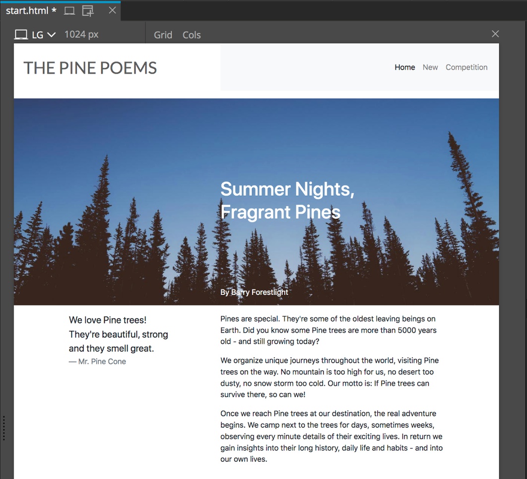
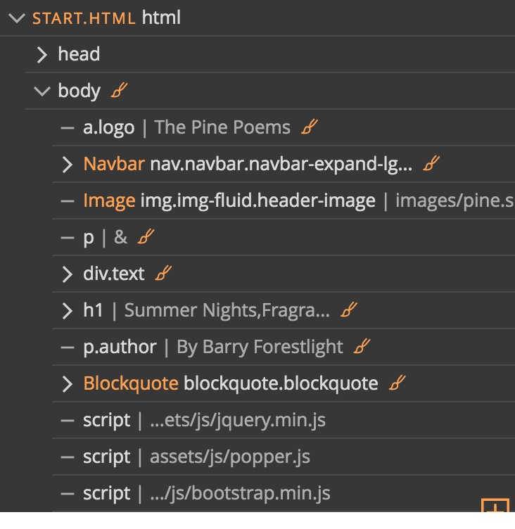
Next, open the “start.html” file by clicking. A very basic page will appear with an image, a title, and some text.
First, we will set up our grid for displaying the page contents. There are a number of ways that we could do this. For example, if we planned on a complex page with a number of different grids, we could wrap the existing content in a div element. Since we are setting up a simple page, we will add our grid to the page “body” element.
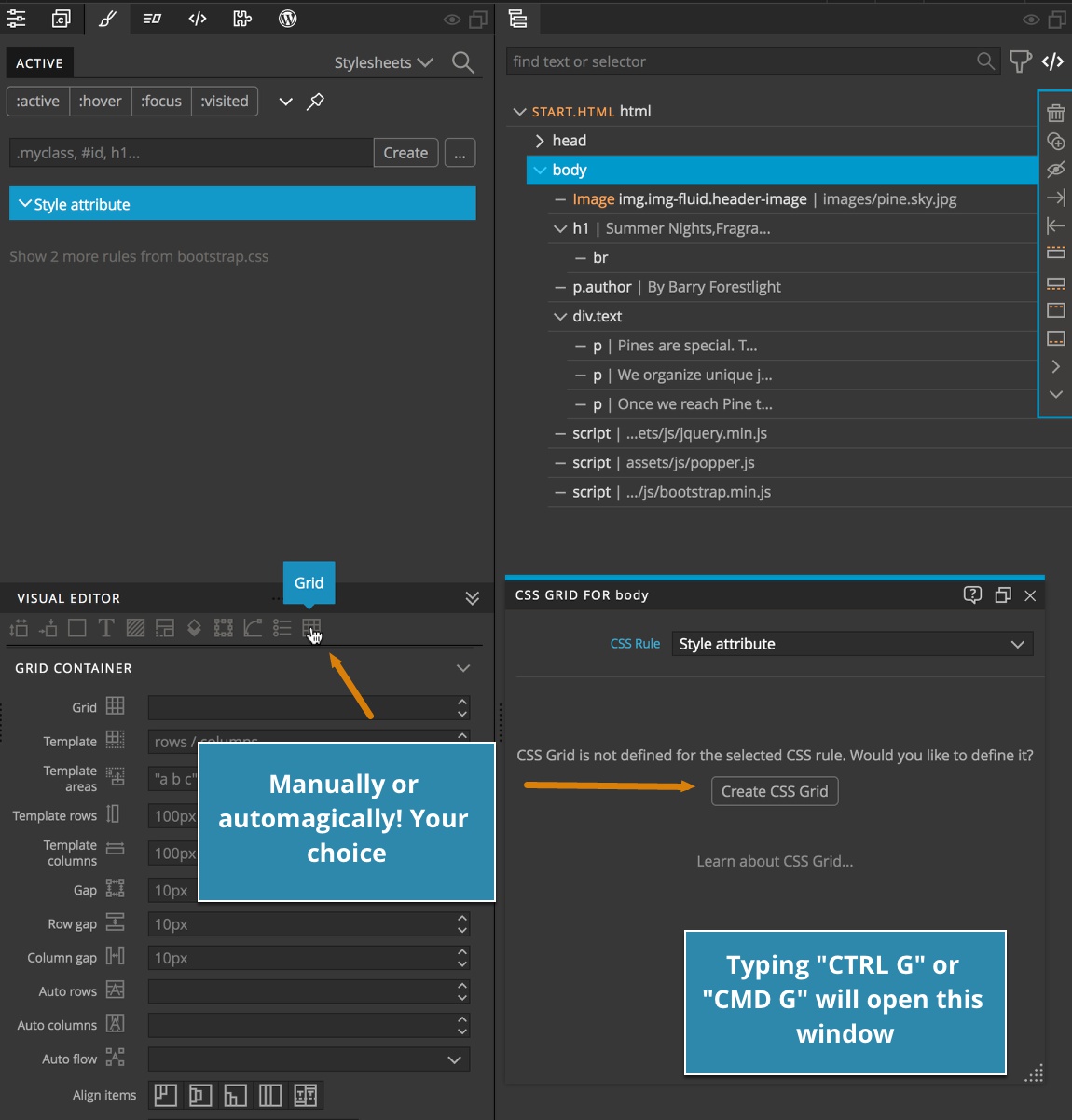
- Select the body element from either the Tree panel or the Page View.
- Type CTRL G or CMD G depending on your operating system to bring up the Pinegrow Grid Editor. Note: we could also use the Pinegrow Visual Editor by opening the Styles Panel and then scrolling to the Grid Container properties bu clicking on the grid icon.
- Click the “Create CSS Grid” button. This will add our new grid as an inline style, as well as adding the
display: gridrule to the body.
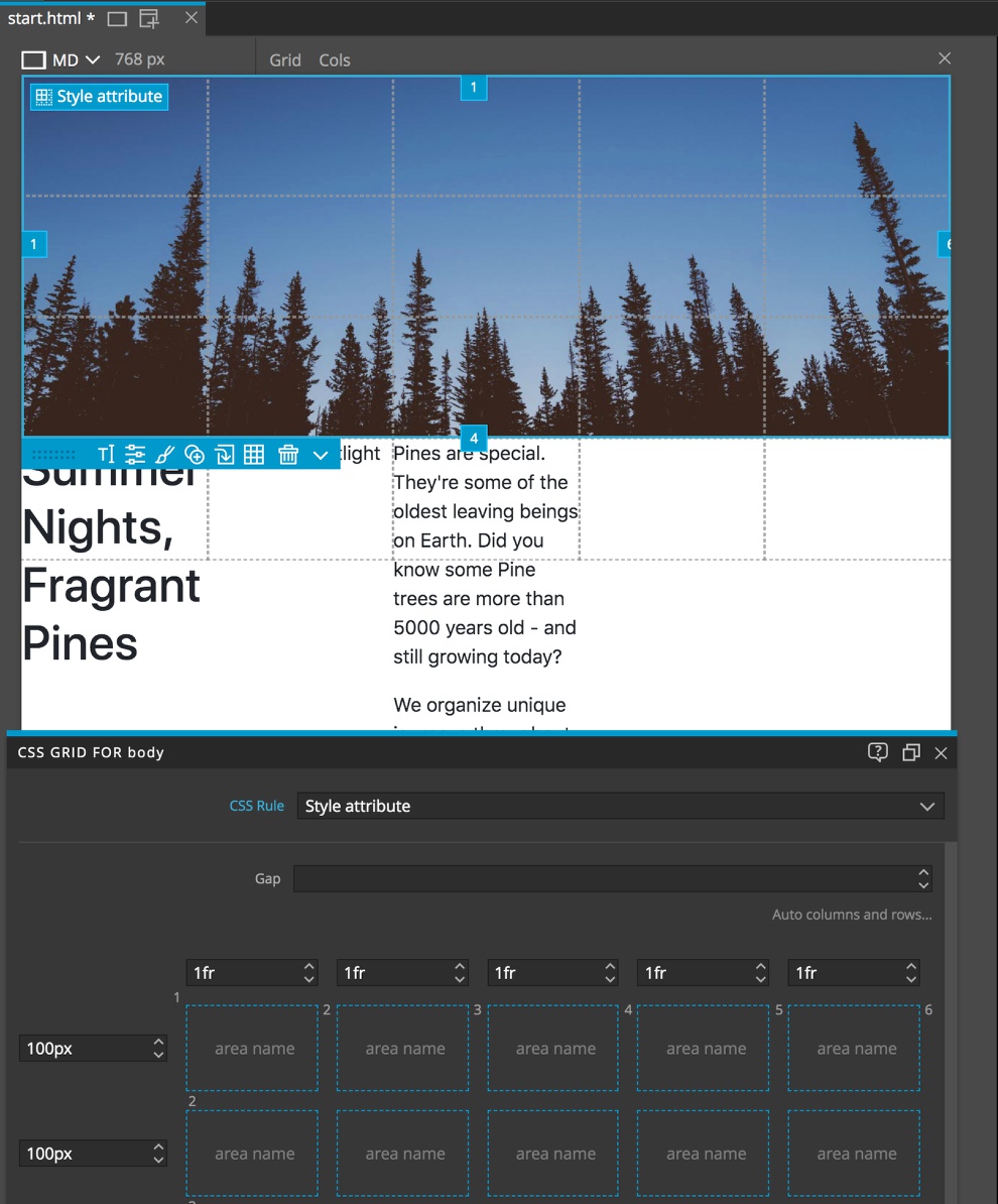
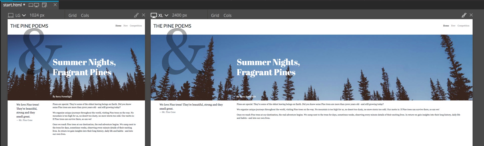
If we have display helpers turned on, we can now see the Page View is divided into a series of rectangles – three across and two down. Our image is in the first rectangle, the title in the second, the author in the third, and since we only have defined three columns, the div with our p elements wraps to a new automatically created row. The top row is 100px as defined by the CSS. The second row, housing the text, expanded in height to contain all of the content.
Placing content in the grid
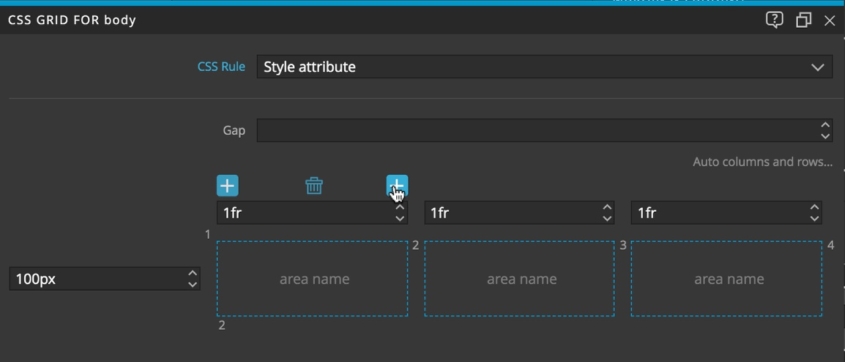
At this point we can use the Pinegrow Grid editor to add columns and rows. I’ll add two more columns and three rows by clicking on the plus icons that appear when you hover above the row or column sizing.
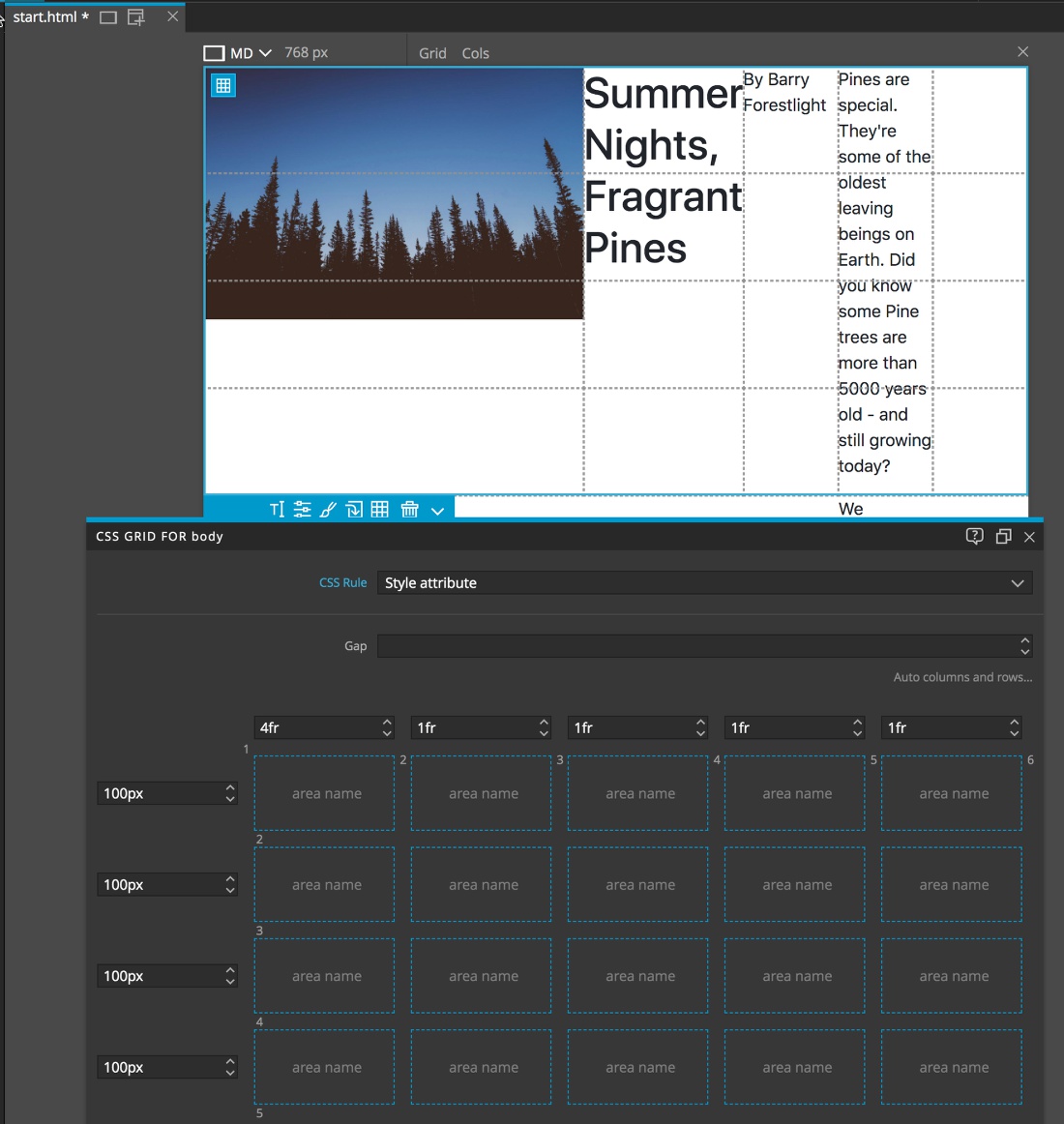
If we want, we can start playing around with sizing. If we want to stick with fractions for our columns we can either use the slider or up-and-down arrows. For example, we can increase the size of the first column containing our image to ‘4fr’. This will both increase the width of the image container, but also shrink the rest. The browser now calculates that there should be a total of 8fr across the whole screen width and makes the image container 4fr or 50% wide.
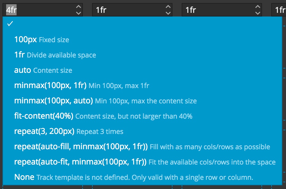
If we double-click on the size input we will get a context menu containing the most common sizes, along with descriptions. In addition to px for fixed sizes we can also use rem or em units. As you can see, there is also a selection for repeat as we saw in the example, as well as, a very handy property, ‘minmax’. This property allows us to to make sure that a particular area never gets bigger or smaller than the two sizes we define.
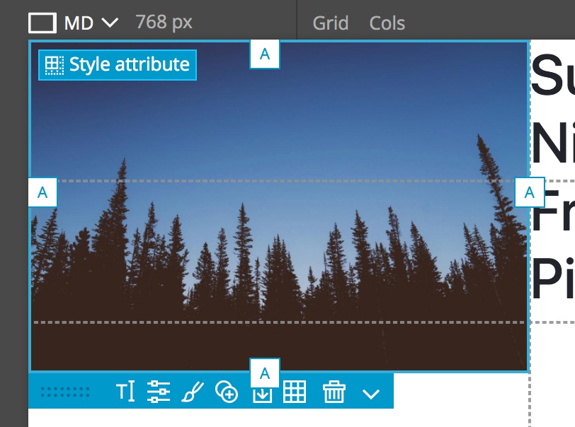
Let’s start by placing the image. If you select the image in either the Tree panel or the Page View you can see that the edges now have tabs with the letter “A”, standing for automatic. This is because we haven’t added any CSS properties to define where it should be placed in the grid. We can also notice that the bottom of the image if floating between two areas. That is because the image is being constrained by the width of the column and then maintaining expanding to the full height of the image. Let’s change this so that we get more precise placement.
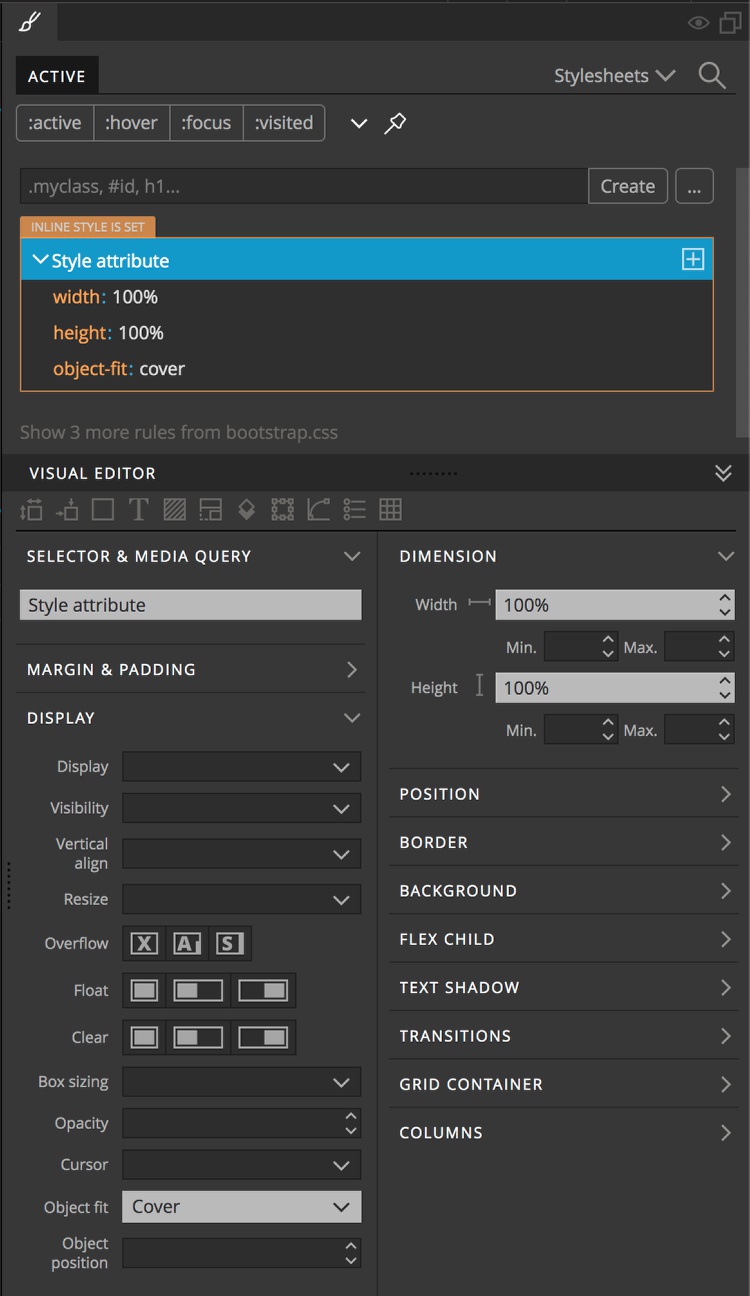
We will start by constraining the height and width to 100% of the grid area. The problem is that now our image doesn’t maintain the correct aspect ratio making it look squished. To overcome this we will use “object-fit” and give it a value of “cover”.
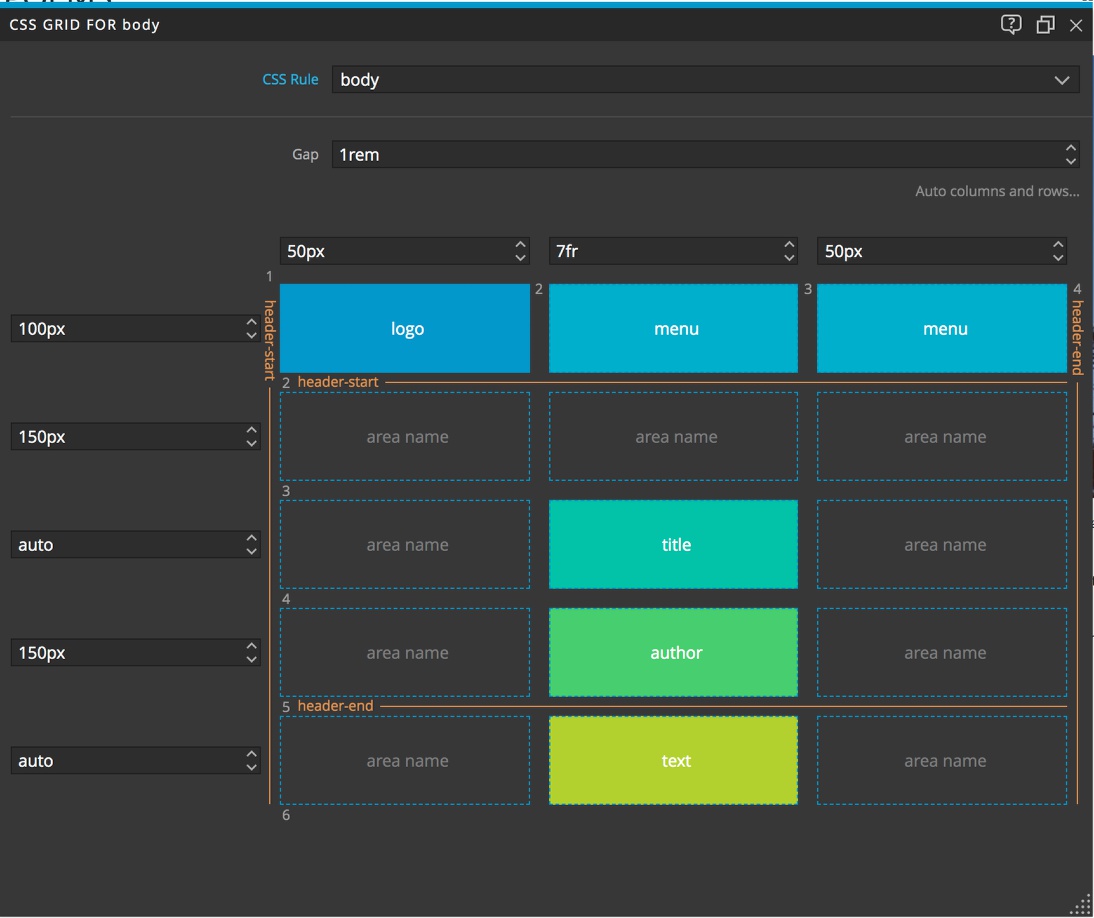
Next, we will resize it to the whole width of the grid and the first three rows by simply dragging the tabs on the right and bottom of the image. You can see each of the tabs now display a number. If we look at our CSS, the image now has a new property:value, grid-area: 1 / 1 / 4 / 6. This is short-hand for the row-start/column-start/row-end/column-end.
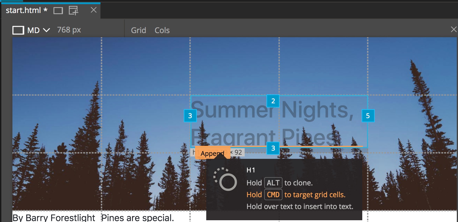
Next, let’s place the title. We can do this two different ways. We can drag the handles like we did for the image, or we can select the title element and then drag it where we want it while holding down either the CMD or CTRL keys. Once we have it in the correct position we can use the grid tabs to expand the size so that it is taking up an area 2 rectangles wide by one high.
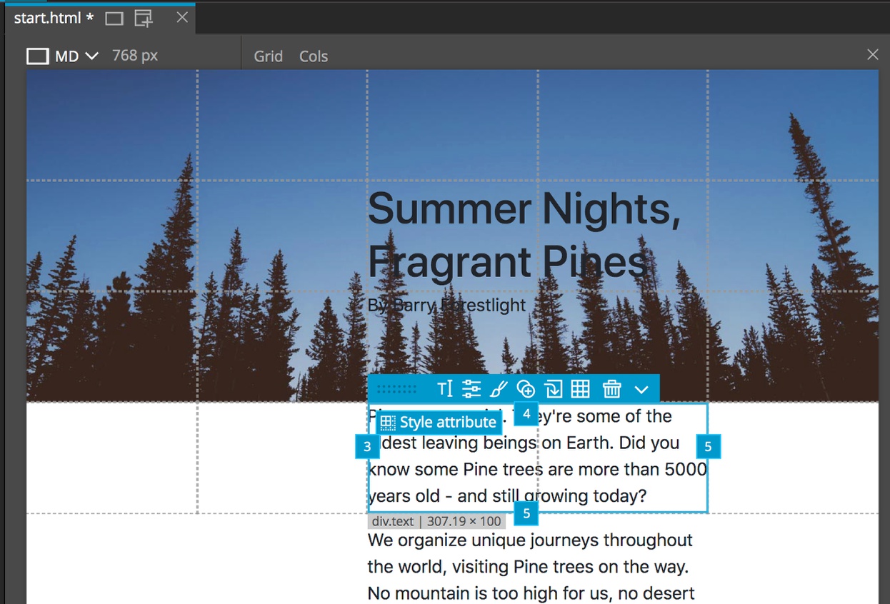
Similarly, we can place the author and the text. For the author we can place it in the area directly below the title in the third row and the third column. For the text, make sure that the div containing each p element is selected, not the individual p elements, and move it to the third column, fourth row and then stretch it to the fifth track.
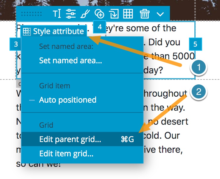
With that completed we can no begin resizing our grid to better fit how we want our content laid out. First, we can see that the text is bigger than the final row. To accommodate the content we will re-open our grid editor if you closed it. To do this we can either type our short-cut keys CMD-G or CTRL-G, or we can click on the “Style Attribute” button that is at the upper-left corner of the selected element. This will bring up a context menu and then we can select “Edit parent grid…”
To fit all of our content in, we will change the sizing on the last row to “auto”. This will cause the row to expand or contract in size based on the content contained within. Again, to change the size we will double-click the input bow to bring up the context menu and then select auto.
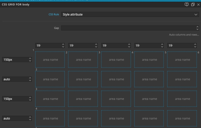
We will also do this for the title row, plus make the rows above and below the title a little large (150px) and equal in size. When making larger changes in sizes, rather than clicking on the input box and then having to repeatedly click the up or down arrow, we can instead hold the shift key while pushing the arrow. This will make the value jump by 10px each time instead of 1px.
Using flexbox in grid
Things are starting to shape up, and best of all, we haven’t had to deal with floats or relative positioning! Before proceeding with more grid goodness, let’s do just a little bit of styling.
First, lets give both the title and author a different color so that we can see them. We can style them like we normally would. Select them either in the Tree panel, or in the Page view, switch to the Styles panel, and scroll down to the “Font/Text” section by clicking on the “T” icon at the top of the Visual Editor. For color either type #ffffff or select white from the color picker.
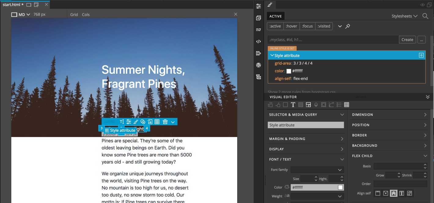
Next, let’s place the author down closer to the edge of the image. One way we can do this is to take advantage of the fact that we can use CSS flexbox inside of grid. With the author selected, scroll down to the “Flex Child” section and from “Align Items” pick the third icon over to align to the end.
Dropping elements in the grid
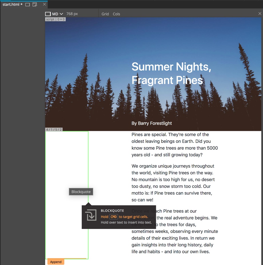
Now we want to add another element to the page – a quote. In this case, Bootstrap has a nice component we can use. To insert it we can click on the + key to open an element insertion modal. From that we can do a search for a “blockquote” and then drag it to the page. In this case, rather than electing to prepend or append it to the pageview, we will hold down either the CMD or CTRL key to be able to select a specific grid location. We will place it in the lower-left corner of the grid.
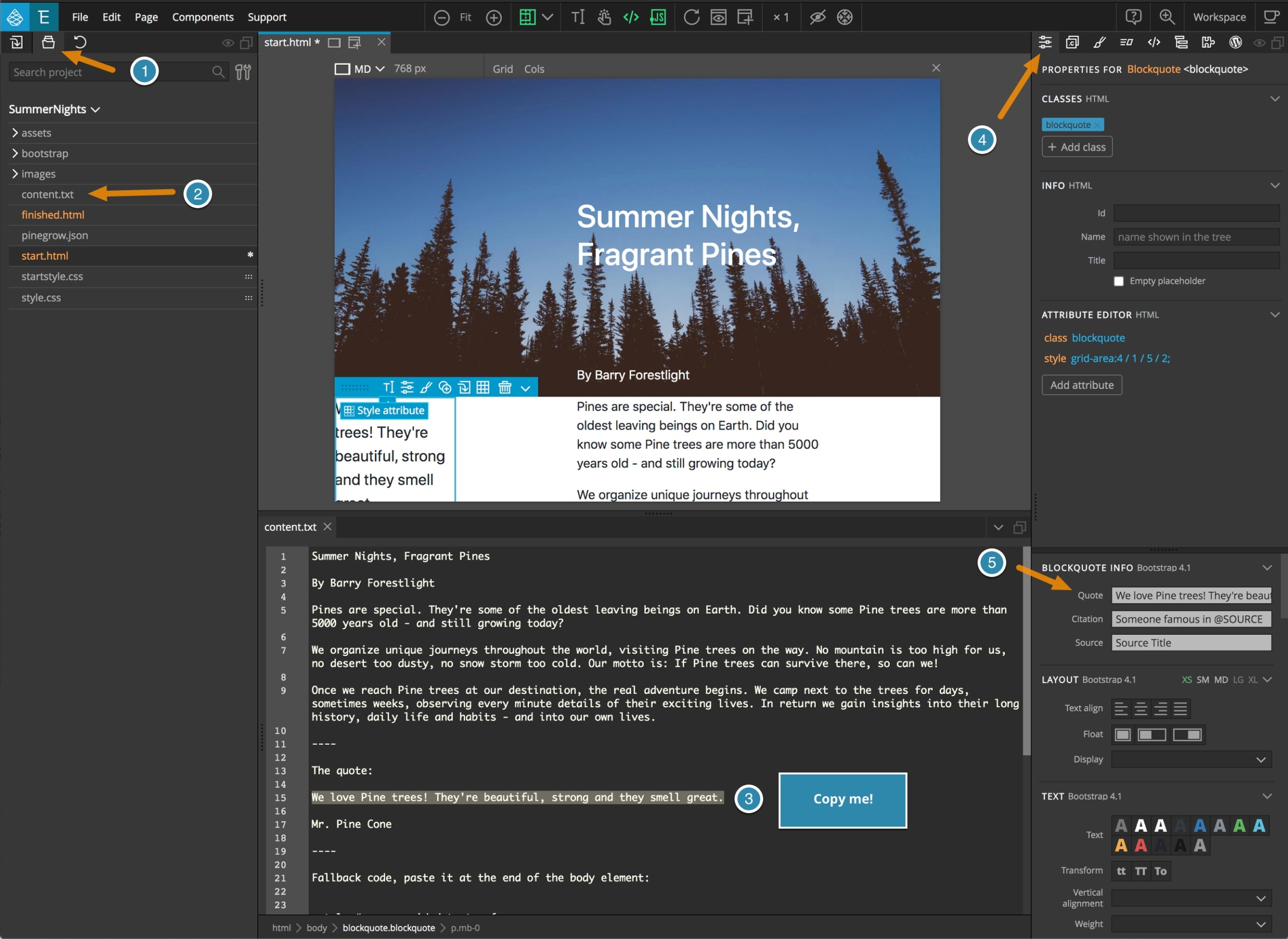
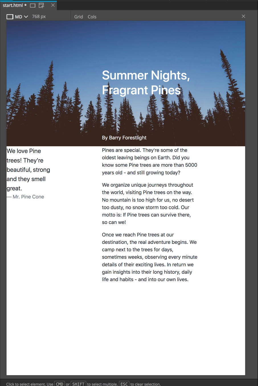
Next, I’ll open the Project panel and select the “content.txt” file. This will open it in our code editor so that we can select the quote and the quote author. After copying the quote there are a number of ways we can put it onto the page. We can of course select all of the text on the Page View and paste the quote. However, if we open the Properties panel we can also paste the quote into the “Blockquote Info” section. We can do the same for the citation, the famous author Mr. Pine Cone!
So our quote is in place, but it is placed right up against the side of the page. In the past we might do something like add some margin to the left side of the quote. However, if we then put more content below we might have a bit of hassle making everything line up. Instead, with CSS Grid, we can just add another column to the left.
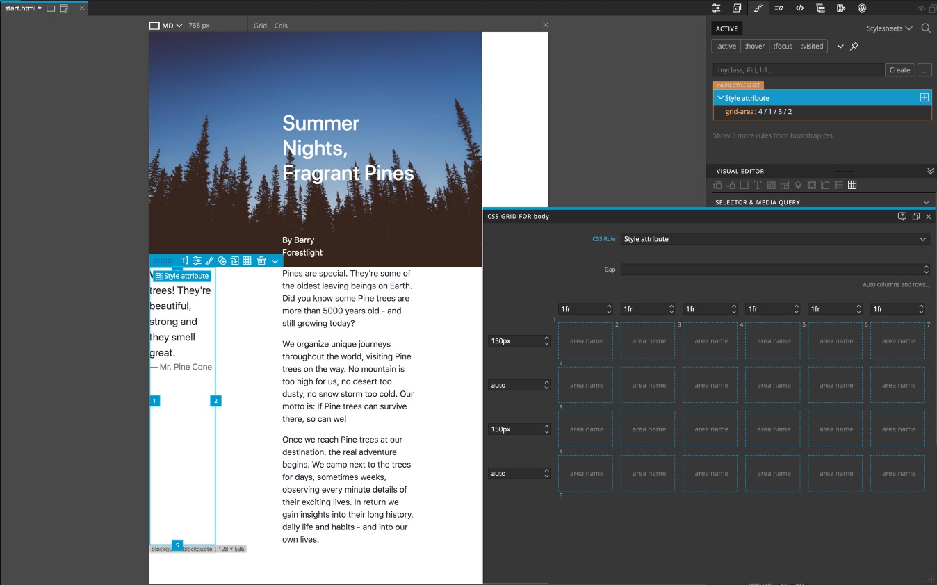
To do this, open up the Pinegrow Grid Editor again with either the short-cut key or by clicking on the “Style Attribute” button and selecting to edit the parent grid. To add a column before the blockquote click on the left-hand plus sign that appears when you hover above the first column. We can see that this causes quite a problem for our layout. Because we placed our items using track numbers everything shifted one to the left, leaving a blank column on the right.
To fix this we can simply drag the tabs of each element to reposition them where we want. Going forward, I’ll show you how to use named areas and tracks, plus a little trick to prevent this from happening. First, let’s do a little resizing of the grid.
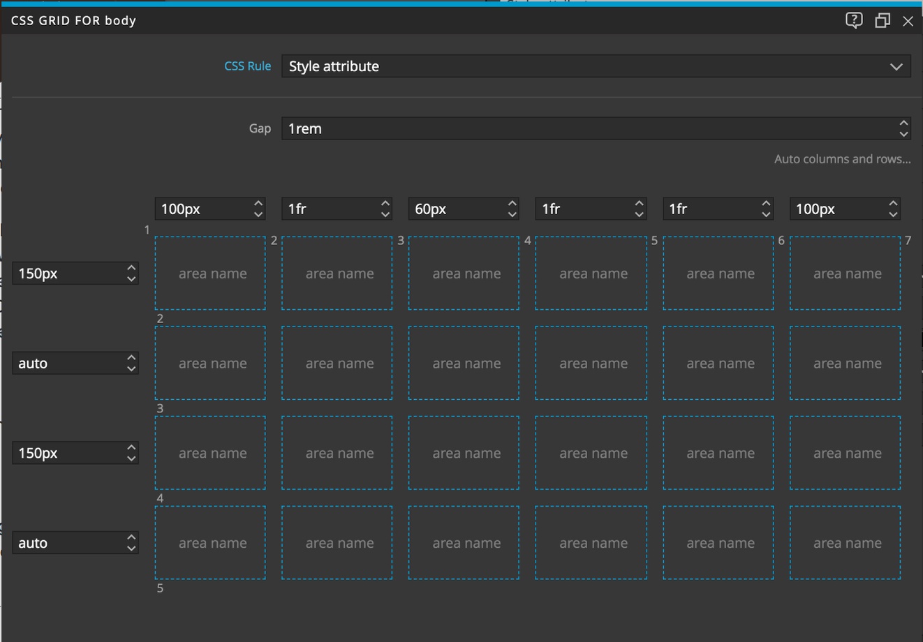
For the first column, we will give it a fixed size of 100px by double clicking the size and selecting it from the list. We will do the same with the last column. The space between the quote and the text is also a little large. We’ll give this a fixed size that looks good – maybe 60px. We’ll also add a gap of 10px from the selector above the grid. The gap can also be sized in “em” or “rem” units.
Hopefully, you can appreciate how easy it is to get just the layout that you want with a very minimal amount of CSS. Right now we have only 10 lines of CSS to define our entire layout!
Named areas and tracks
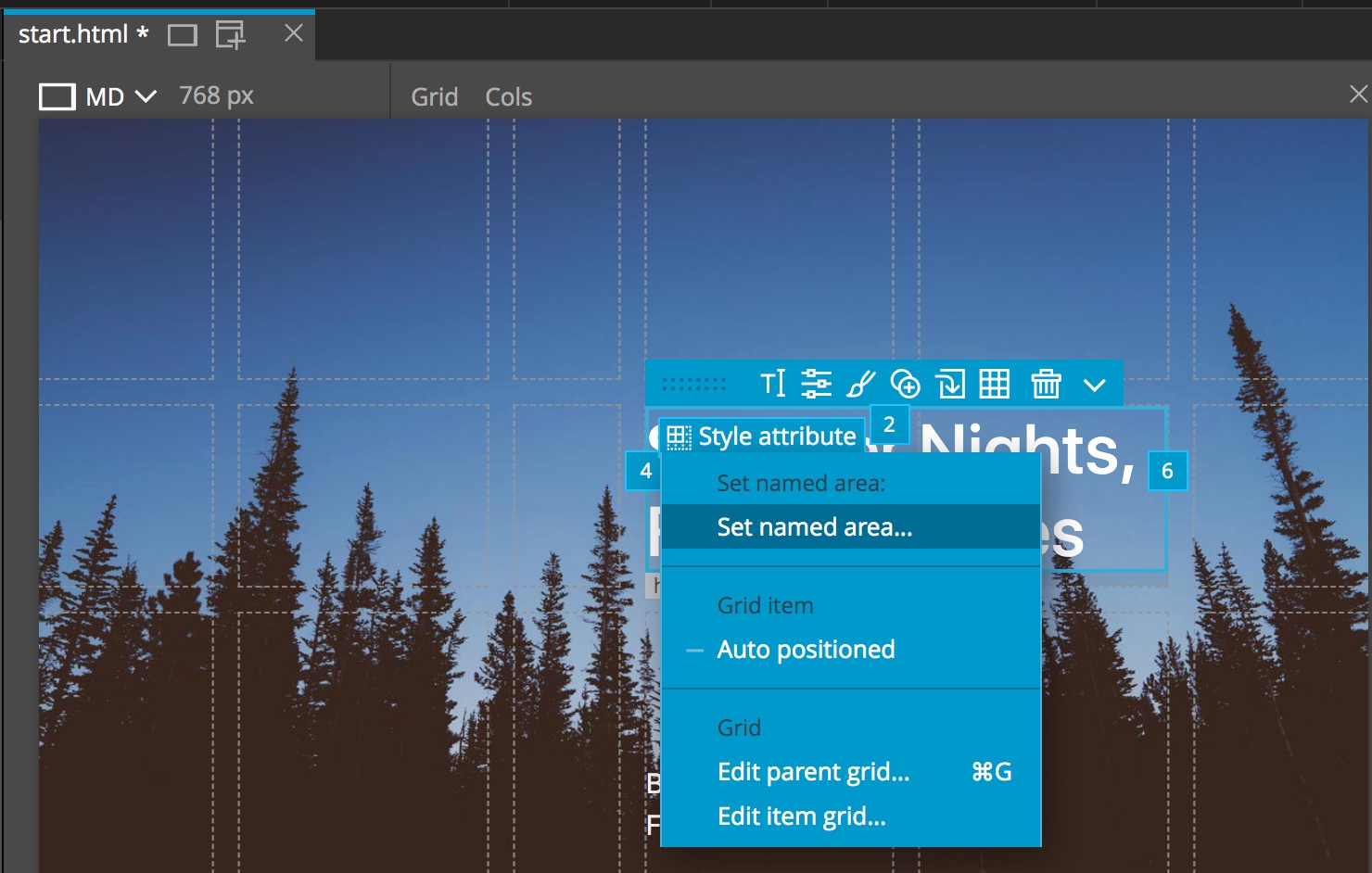
Assigning elements to named areas, rather than grid coordinates can make placing them on the page a little easier when doing updates to the grid structure. Adding area names is quick and easy with Pinegrow. To place the title all we have to do is select it in the Tree panel or the Page View, click on the “Style Attribute” button, and then select “Set named area…”.
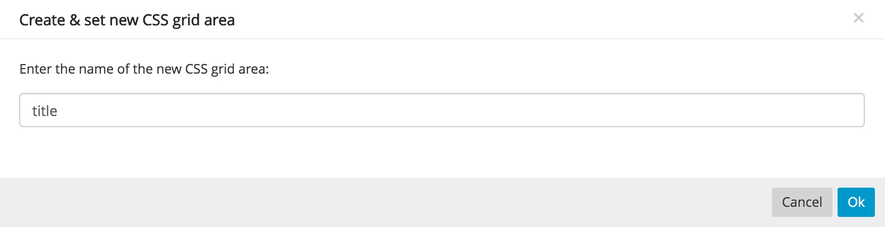
This will cause a modal to appear for the name you want to give the area – like “title”.
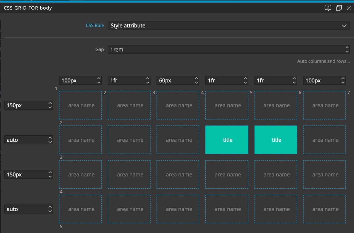
Now if we look at the Pinegrow Grid Editor we can see that the areas where the title is located are labelled. If you look at the CSS, you will see that the title now has a property:value of grid-area: title.
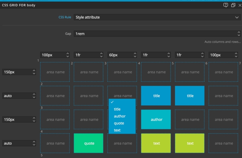
We can do the same with the rest of the page elements. Now if we want our title to span three areas instead of two, we can simply double-click in the are and select the name we desire. If we add a column or row, we just have to move the area names to the correct new spot.The only limitation to this method is that named areas cannot overlap.
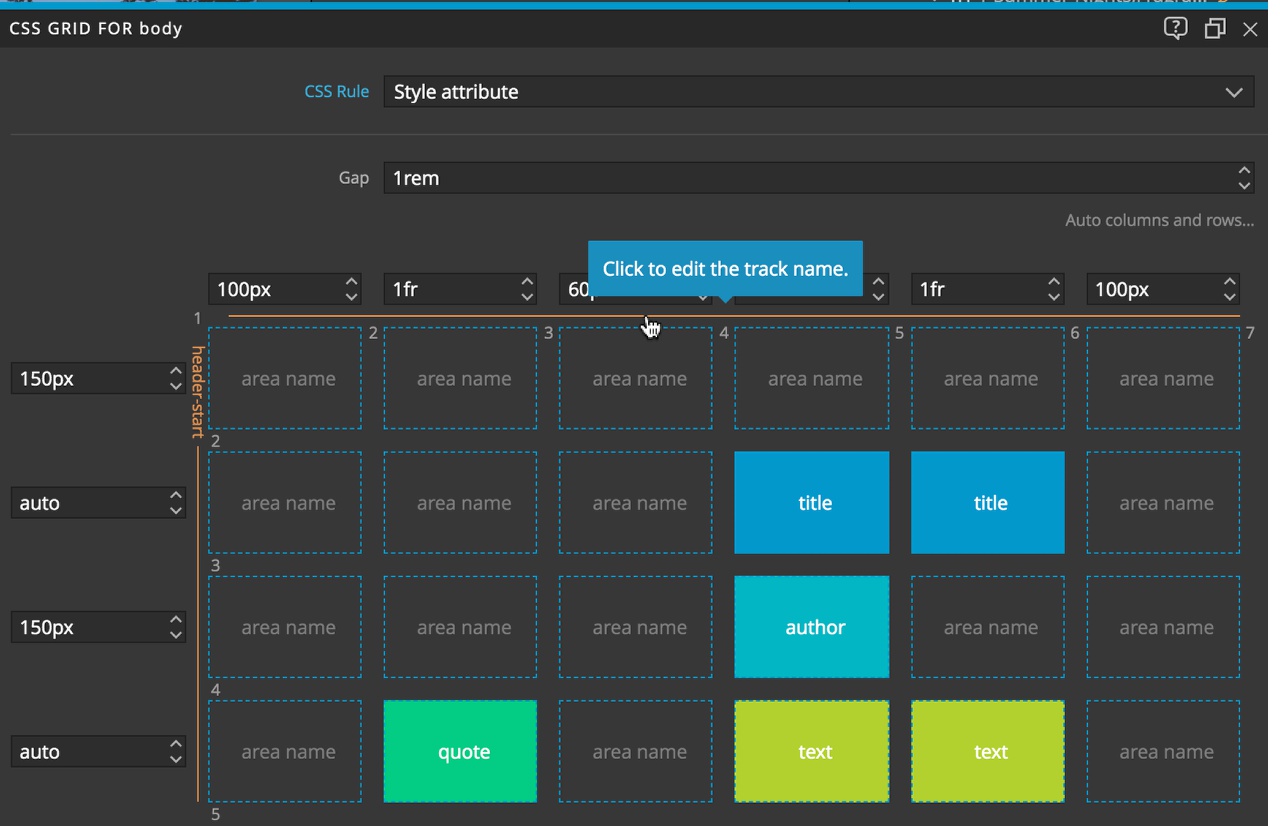
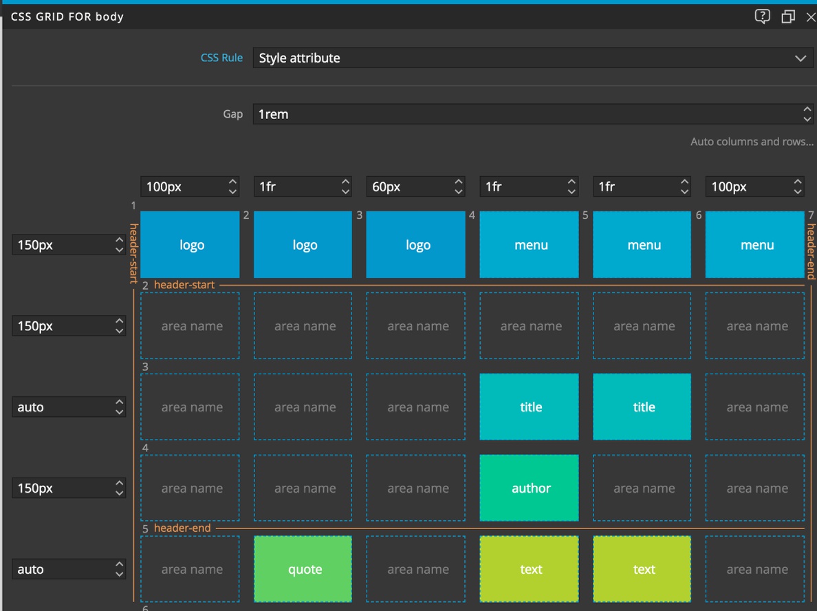
To more easily place overlapping elements we can name tracks instead. Let’s see how this works with the image at the top of the page. If we hover over any track we will get an orange line. Clicking that line will cause a modal to appear. In that modal we can enter whatever name we desire. The only limitation is that if we want Pinegrow to automatically add them to the Page View tabs we be to add a suffix or either ‘-start’ or ‘-end’. This isn’t needed normally in CSS grid and will be removed from the resulting CSS.
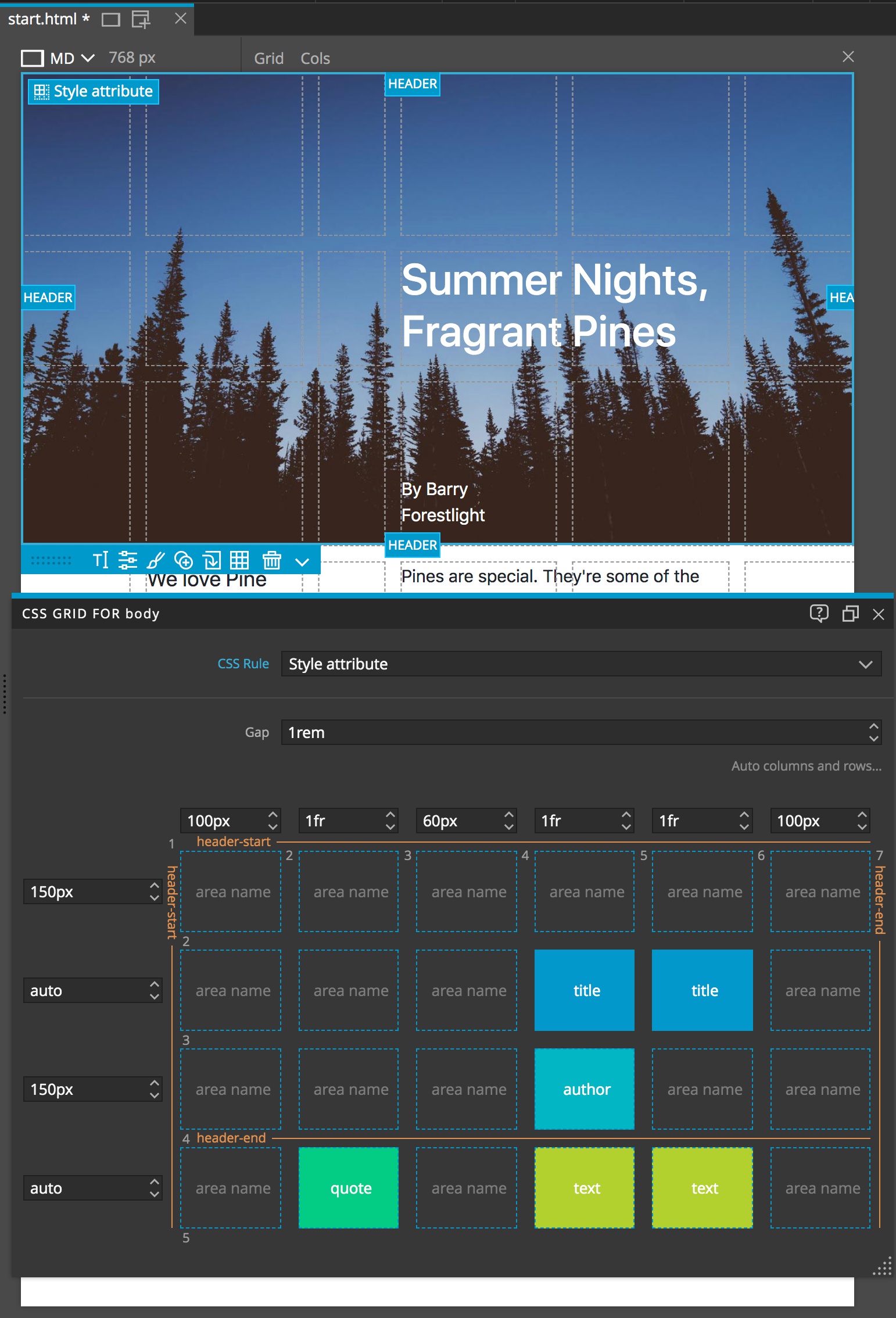
To place the header we will give the top-most and left-most tracks a name of “header-start” and the fourth row track and the final column track names of “header-end”. We could also choose to give each a unique name if we choose. To get the new names added to the handles on the image we just need to have the image selected and move one of the handles slightly. If you need to change which track is labelled, simply click on the mis-labelled track and delete the name.
Okay, now we’ve seen multiple ways to designate where are elements should be positioned: coordinates, named areas, and named tracks. They all have pluses and minuses. Another trick I like to use that isn’t quite as automatic in Pinegrow is to use coordinates with negative numbers. Let’s take the header as an example. We can add a property:value rule:
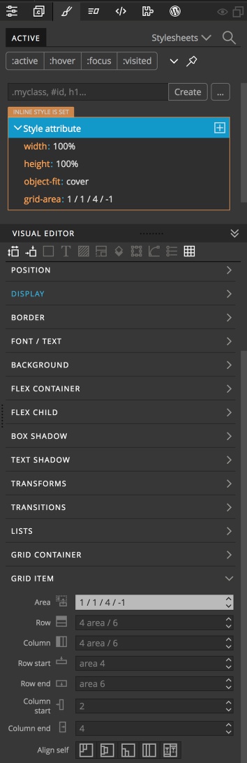
grid-area: 1 / 1 / 4 / -1
This will designate the start to be in the upper-left corner, the bottom to be at the fourth track, and the right side to be the full width of the grid, no matter how many columns, because the left-most track is always -1. However, Pinegrow doesn’t support this with just drag-and-drop, you will have to add it either by typing in the rule-set or in the Visual Editor.
Adding a logo and navigation
Let’s put together the rest of our page by adding our site logo and some navigation. First, open up the Pinegrow Grid Editor with the short-cut key. Then click on the plus sign that appears above the first row size input when you hover. This is the row where our new elements will be placed.
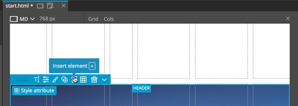
Next, either click on the insert element icon of the element menu, or press the + on your keyboard to open the insert element pop-up.
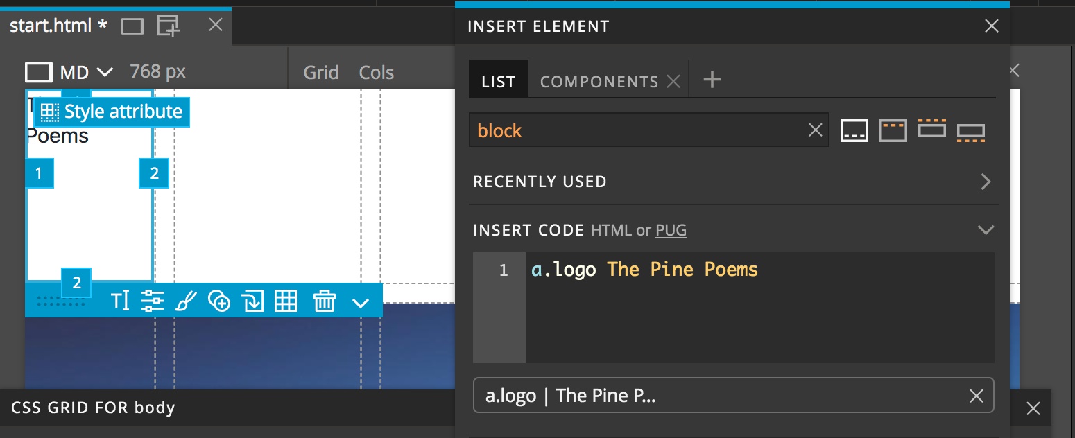
Then we will use a little pug to insert a link with a class of logo by typing a.logo The Pine Poems into the “Insert Code” box. Then drag the box below the code box to the page with either CTRL or CMD pressed and drop it in the upper-left grid area.
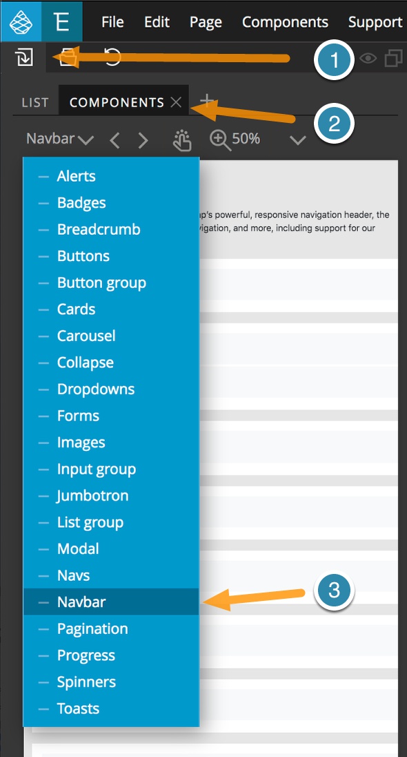
For the navigation we will drag-and-drop a Bootstrap navbar to the page, placing it in the right-most top grid area. Click on the “Components” tab of the Library panel and then from the navigation dropdown select “Navbar”. Pick the navbar you like and drag it to the Page View with the CMD or CTRL key held down to place it in the grid.
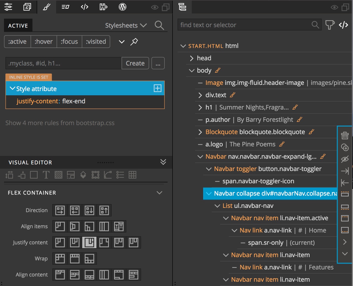
I’m going to use the handles to stretch the logo to take up the first three columns and the navigation the last three. Using the Visual Editor, with the Navbar collapse selected I’m going to open the Styles panel and utilize flex once again to position the menu at the right side of the area. Scrolling down to the “Flex Container” section I’ll select the third “Justify Content” icon to place the content at the end.
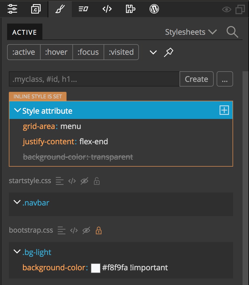
Now I’ll just neaten up the navigation links by deleting the disabled on, and renaming the other three. This isn’t really neccessary for the lesson, just makes it look a little more custom. The other thing that I’ve noticed is that the navbar has a slight background color. We will give it a background color of ‘transparent’. If we open the Style panel and scroll down to the “Background” section and type ‘transparent’ in the input box we will see that the rule is crossed out. Opening the Bootstrap rules we can see that there is already a rule specifying this background with an ‘!important’ flag. We can either add an ‘!important’ flag to our styling, or we can remove the ‘.bg-light’ class from the navbar.
With that completed we can set the names for the logo and navigation areas. With the logo selected in either the Tree panel or on the Page View, click the “Style Attribute” button and then select “Set named area…”. From the dialog give it a name of “logo”. Using similiar steps, name the navigation area “menu”. Opening the Pinegrow Grid Editor we can see our new page structure. Right now the top row seems a little wide, let’s make it a little smaller – maybe 100px. Click the size input and then hold shift and click the down arrow five times.
The navigation is already centered vertically in the area by flexbox styling in Bootstrap. Let’s do the same with the logo. Because the log isn’t within a container, we can’t use the same ‘justify-content’ property we used previously. Instead we have to use ‘align-self’ which is located both in the “Flex Child” section and the “Grid Item” section. For either, select the second icon to align the content in the center.
Embellishing the style
While the page doesn’t look too bad, let’s give it a little TLC. For the logo, we’ll change the font to ‘Lato’, increase the font size to ‘2.2em’, transform to all capitals, change the color to ‘#5b5b5b’, then add margin-left of 20px. I’ll trust you can use the Pinegrow Visual editor to make these changes. Your rule-list in the styles panel should look like this:
grid-area: logo
font-family: 'Lato', sans-serif
font-size: 2.2em
text-transform: uppercase
color: #5b5b5b
margin-left: 20px
For styling the navigation we will create a CSS rule targeting the navigation links. Select one of the links, open the Styles panel and click on the ellipses button. From the selector breadcrumbs pick the ‘.navbar-nav’ class and either the ‘a’ element, or the ‘.nav-link’ class. Change the CSS in the Visual Editor to a font of ‘Lato’ and a color of ‘#a5a5a5’.
Next we need to style the hover state. Click on the ellipsis button and choose the same selectors as before, but also click on the colon at the end of the list and select “:hover”. Change the color to ‘#474747’ to make the hovered link a little darker.
Finally, style the active state. Again make a rule with the same selectors, but make sure to also select or add the ‘.active’ class at the end of the list. Change the color to ‘#1e1e1e’.
Looking pretty good! Maybe we can change the overall page font. Select the body element and then from the Visual Editor change the font to ‘Georgia’.
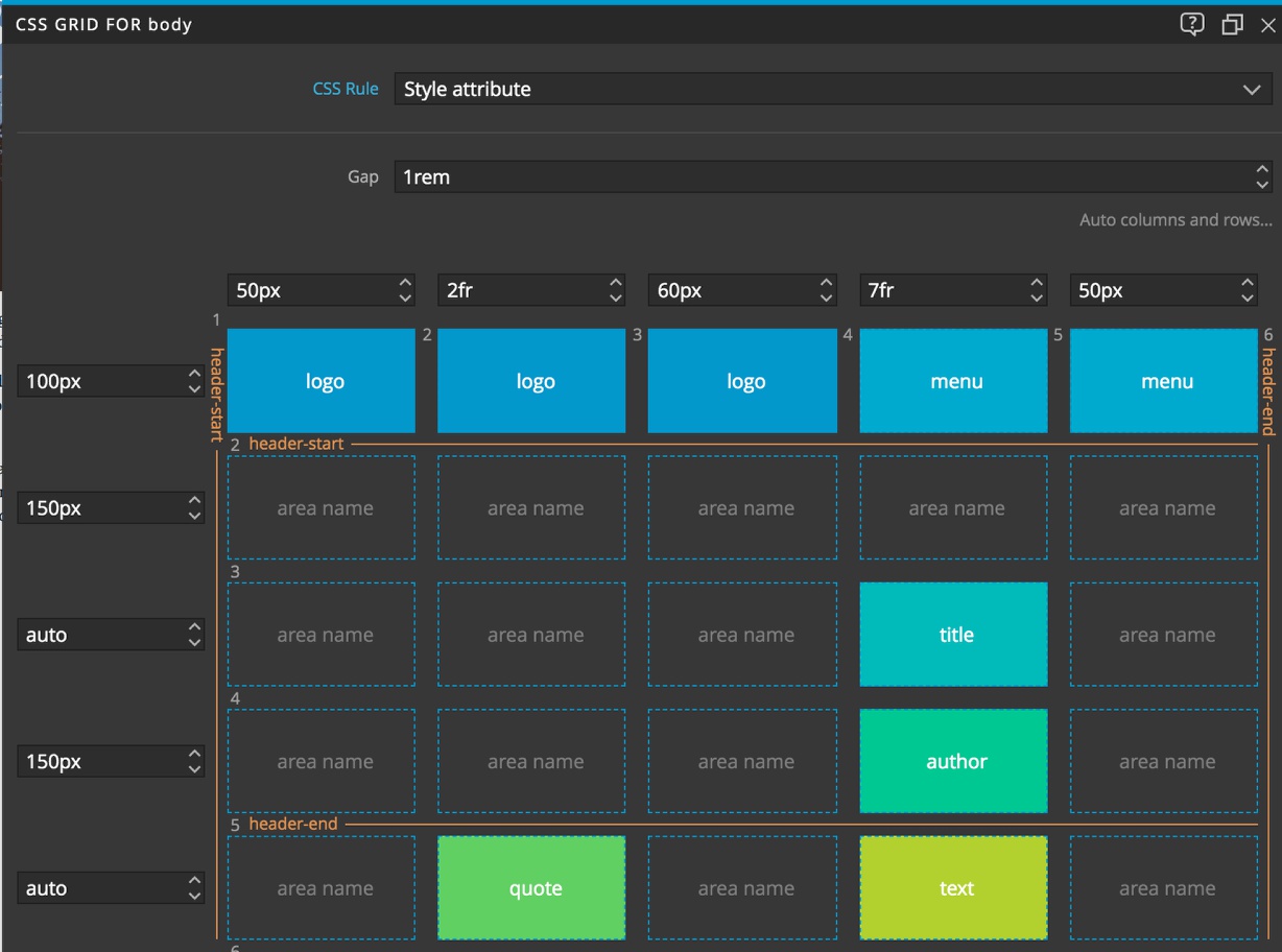
We want to make sure the title breaks correctly, so let’s put a break after the comma by eliminating the space and holding shift and typing enter to place a break. Change the font to ‘Abril Fatface’ from Google and increase the font-size to 4em. This seems a bit narrow, so open the Pinegrow Grid Editor and change the column sizes until the layout is pleasing. Overall, I changed the spacing on the end to 50px, put the quote in a 2fr column, and the majority of the content in a 7fr column with a 60px spacer between.
This is the magic of both CSS Grid and the visual editing of Pinegrow. You can fool around with spacing so easily to get just the right look!
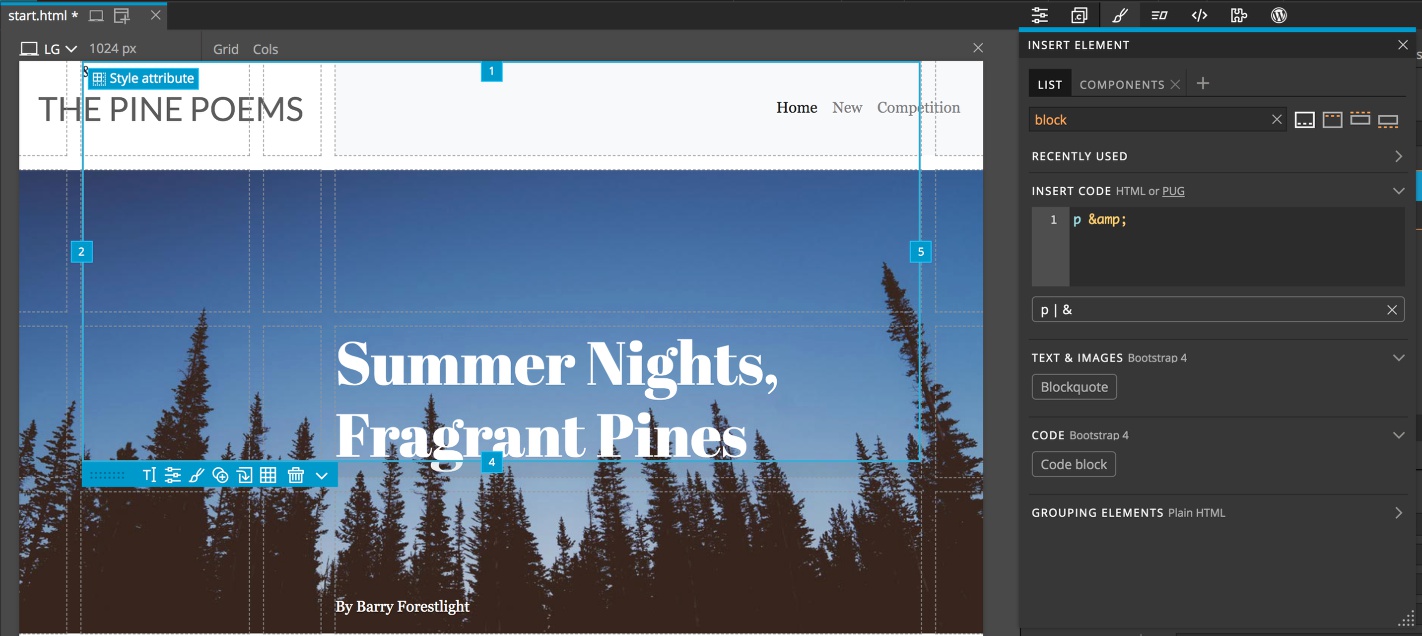
One last thing for styling, let’s add some decoration to the page. Press the plus sign on the keyboard to insert an element and then in the code box type p &. Drag the box below the code insert to the page with either CMD or CTRL held down to place it in the second grid column, on top of the logo. Got to the Visual Editor. Stretch the tabs over to the fifth column and down to the fourth row so that none of our existing content is disturbed.
Next, in the Visual Editor increase the font-size to ’30em’, the line-height to ‘1’, and the color to ‘rgba(0,0,0,0.33)’. So right now we are getting a little overlap with our title. We could change that by altering the z-index, but this is also an opportunity to learn something about grid.
If we look at the Tree panel, we can see that the order of the DOM elements in no way resembles our page. The logo and navbar are after all the rest of the content, yet they appear first on the page. When you order items by CSS grid, where they appear on the page doesn’t have to correspond to where they are in the tree. However, because the decoration is after the title, the browser will paint it on top of the title. To prevent this, rather than change the z-index we can just move it higher in the tree – after the image, but before the title. Let’s also move the logo and navigation up to the top of the tree so that it matches the page layout. This can be important for accessibility.
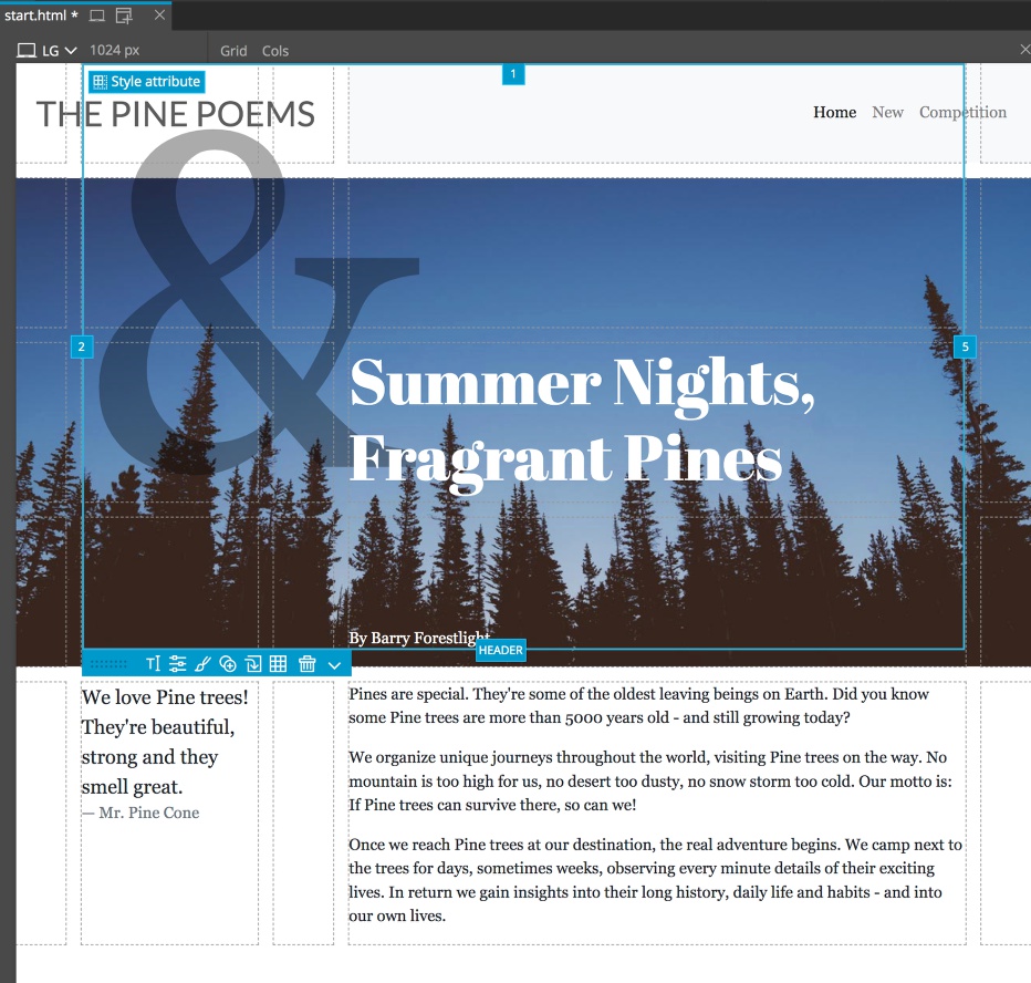
One small problem. The decoration has made the spacing below the title a bit to large since this row is set to auto. We will drag the tab of the decoration to include one more row to eliminate this problem. This can happen if you have a lot of rows set to auto. Content can unexpectedly change you sizing, but luckily in Pinegrow we can see this happen and adjust accordingly.
Responsiveness with CSS Grid
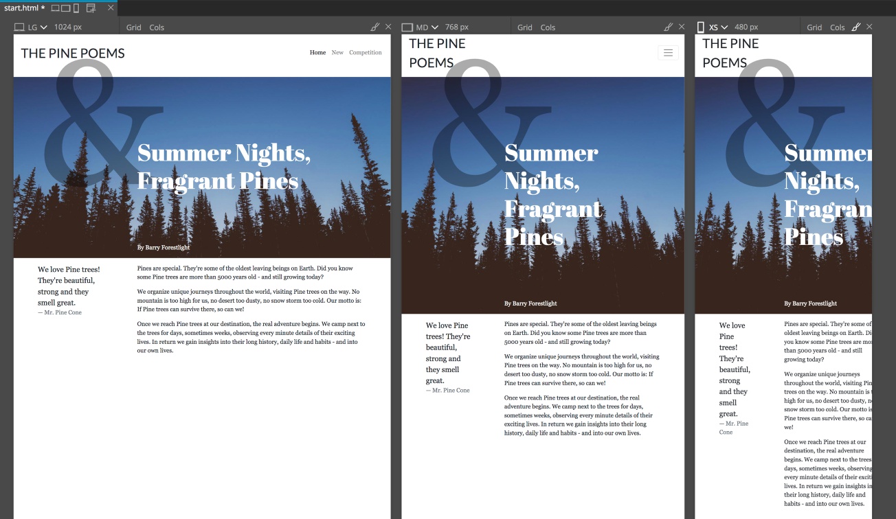
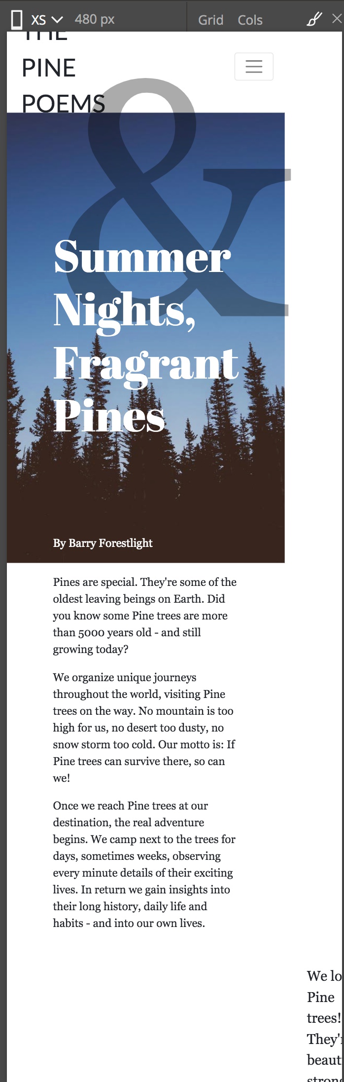
Our page good on the large screen where we put it together, but how does it look on smaller screens? On a medium screen the layout isn’t too bad but starts to begin looking a little squished. On the small screen it looks horrible and is cut-off on the right side. Based on this, we will create a new layout that will handle sizes smaller than large. Since Bootstrap has a built-in breakpoint at 992px we will use that.
How about large screens? Well if our visitor is on a desktop with a high resolution monitor, the page looks really stretched. So we will create another breakpoint that changes the layout at larger page sizes. Bootstrap has a breakpoint at 1200px, but this may be a little small for our purposes. Never fear, adding breakpoints in Pinegrow is easy and we will create a new rule to target screens 1600px and up.
I can hear some of you out there saying, “Why didn’t you design mobile-first?!?”. One real strength of CSS grid is being able to easily divide up large areas of the screen. You could argue that it isn’t particularly good for smaller screens where we typically want a single column. So, when styling with CSS grid it is often best to design for a medium-size screen and then degrade down for smaller screens.
Moving inline styles to our stylesheet
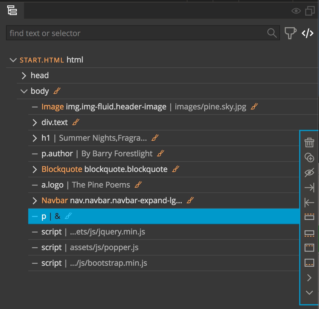
To begin making this page responsive, we first have to move all of the inline styling over to rules because media queries don’t work with inline styling. Luckily, as I pointed out, we didn’t need a lot of CSS to get this page layout and converting inline styles to rules is easy in Pinegrow. Opening the Tree panel you can see that there are 7 inline rules as designated by the orange paintbrushes to the right of the DOM element.
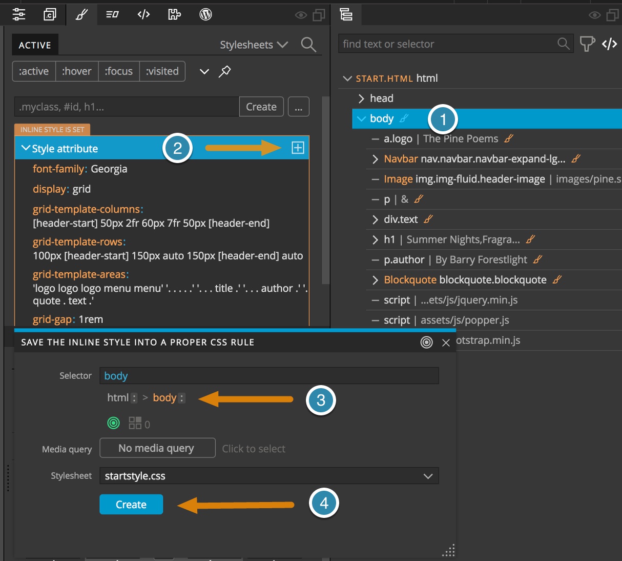
Start by selecting the top-most body element. Then open the Styles panel and click on the plus sign to the right of the inline style. This will bring up a dialog box with selector breadcrumb. Pick the body selector and click “Create”. Let’s proceed with the rest of the elements.
The next element in the tree is the logo. It already has a class of ‘.logo’, so let’s use that in our selector. With the logo selected in the tree, open the style panel, click on the plus sign next to the inline style, select the logo class from the breadcrumbs and click create.
The next down in the Bootstrap Navbar. Since it already has a class of ‘.navbar’ we can use that to apply our styling.
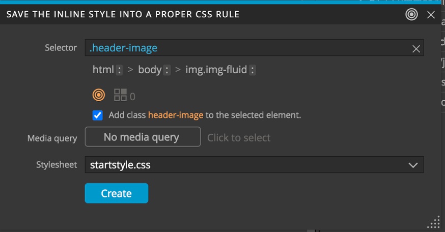
For the image, let’s add a class of ‘.header-image’. Make sure that you include the period before the class name to indicate in the CSS rules that it is a class. You can see that a checkbox appears offering to add this class to the element. Just a reminder, the orange target indicates that right now this rule won’t match the object. If it was green, the rule would match the selected object, and a number to the right would indicate how many other elements will be matched. We can see it is zero, so we don’t have to worry.
You should have the idea now. Finish up by creating a rule set for the paragraph with our decoration, giving it a class of ‘.decoration’. Use the existing ‘.text’ class for our text block. You can either just use the ‘h1’ element as selector, or add a class of ‘.title’, while the author can use a class of ‘.author’. Finally, the blockquote can receive a class of ‘.blockquote’.
Just as a final thing before adding media queries, the title and the author can be moved up in the Tree panel above our main text element to have the content match the layout.
Adding media queries
Now, let’s add some queries!
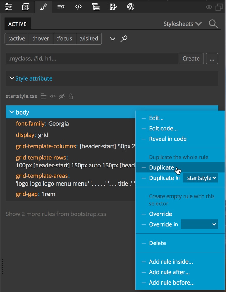
The majority of our CSS changes will be to the grid layout that is applied to the body element. So let’s start by selecting the body in the Tree panel and then opening the Styles panel. We will duplicate the rule set that applies to the body element. Since we are going to add a total of three layouts, depending on size, we will make two additional copies of the body ruleset by right-clicking on the rule-set and then selecting duplicate. Repeat that action to create a third copy. We can now see three copies of the ruleset with two crossed out. This is because the rule set on the top was created last and if rules have the same specificity, the browser will apply the one that loads in last. Keep this in mind!
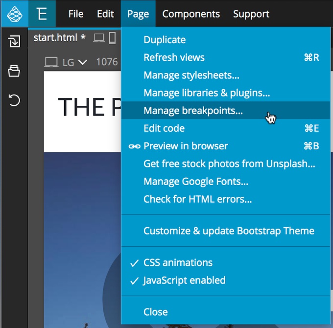
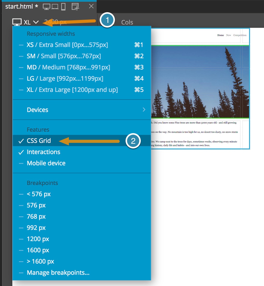
Okay, so each of those rule sets are for a different size. We will designate the last duplicate that we made, the one at the top of the list for large page sizes. First, we need to add a new breakpoint. To do this, Go to the page menu and select “Manage breakpoints…”. This will open a dialog and you can click “Add breakpoint”, type ‘1600px’ and click “Add”.
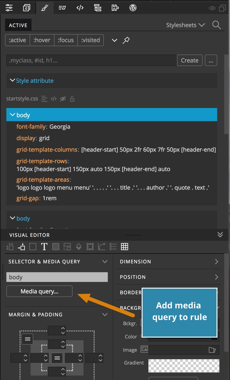
Close the dialog and then highlight the first body rule – this is the one that was created last and appears after the other two body rules. In the Visual editor click on the “Media query…” button that is in the “Selector & Media Query” section.
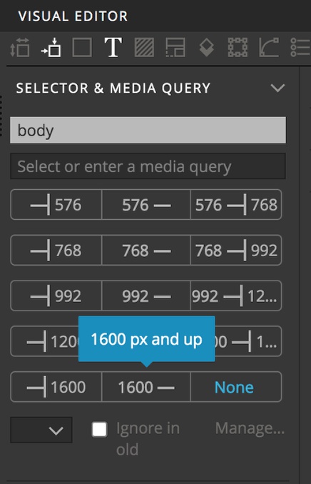
Next, click the bottom-center button. This will add a media query for screens 1600p and up. We can see that one of the body rule sets disappears because we don’t have a screen active that the rules apply.
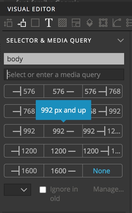
Repeat this addition of media query of the newly activated rule set at the top. In this case, we want the rules to apply to screens larger than 992px. Click on the “Media query…” button in the Visual Editor and click on the center button labelled with “992 -“.
First, we want to change the page for smaller devices. We will open two pages in the Page View, one at a large size and on at an extra-small size. This way, as we change the mobile styling we can see if we accidentally impact the large screen size. Make sure the paintbrush in the upper-right corner of our small screen is highlighted so that Pinegrow presents the active rules.
We will now open the Pinegrow Grid Editor by using the shortcut key. Typically on mobile we only want a single column of content, so we are going to leave the two outer-most columns that we are using to provide a little white space at the edge of the page, as well as the large main column containing the title, author, and text ares. We will delete the other two columns, leaving us with three columns.
The first thing we will notice is that the mobile view looks odd. This is because we eliminated the quote named area. The browser is compensating by adding an additional column for the content. We can fix this by adding a new column with auto sizing below the existing and adding the name back double-clicking on the area below the “text” area and typing “quote”. We also have a little space on the right edge due to our gap. We can get rid of this by removing any gap value.
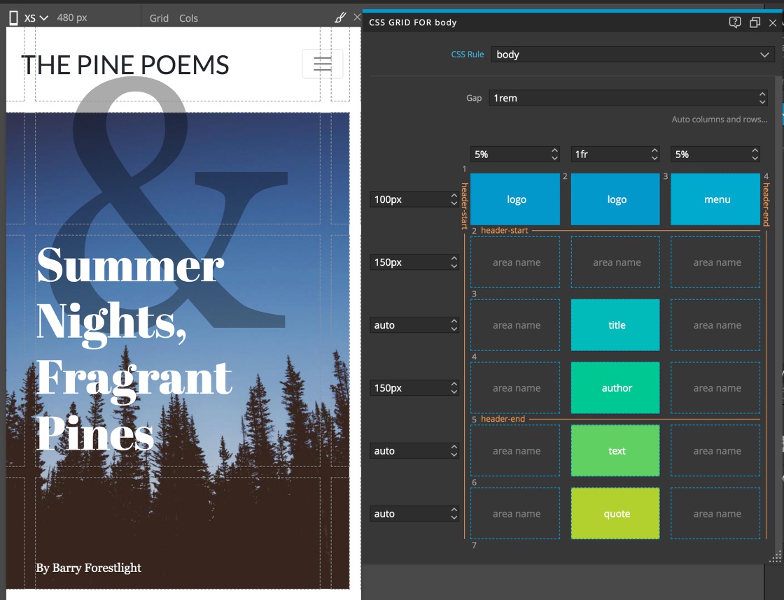
Not bad, but maybe we don’t need as much space to the left and right. Let’s reduce the size to ‘5%’. Better except that the logo is a bit crunched and we’ve allocated too much space for the menu. We can right click on the top-center area and change the name to “logo” To give our logo some room.
One thing you can notice is that we have some white space on the right side of the page. If we click through our element with the Grid helpers turned on, we can see that the decoration has a grid area of 1 / 2 / header / 5. Since we don’t have a track 5 anymore, this is causing the browser to create a new column. To eliminate this we just have to select the decoration and move the right-hand tab in slightly to snap it to the “header-end” track. Again, we could also change the last track number to ‘-1’. If the decoration becomes a pain, we can hide it on small sizes with Bootstrap.
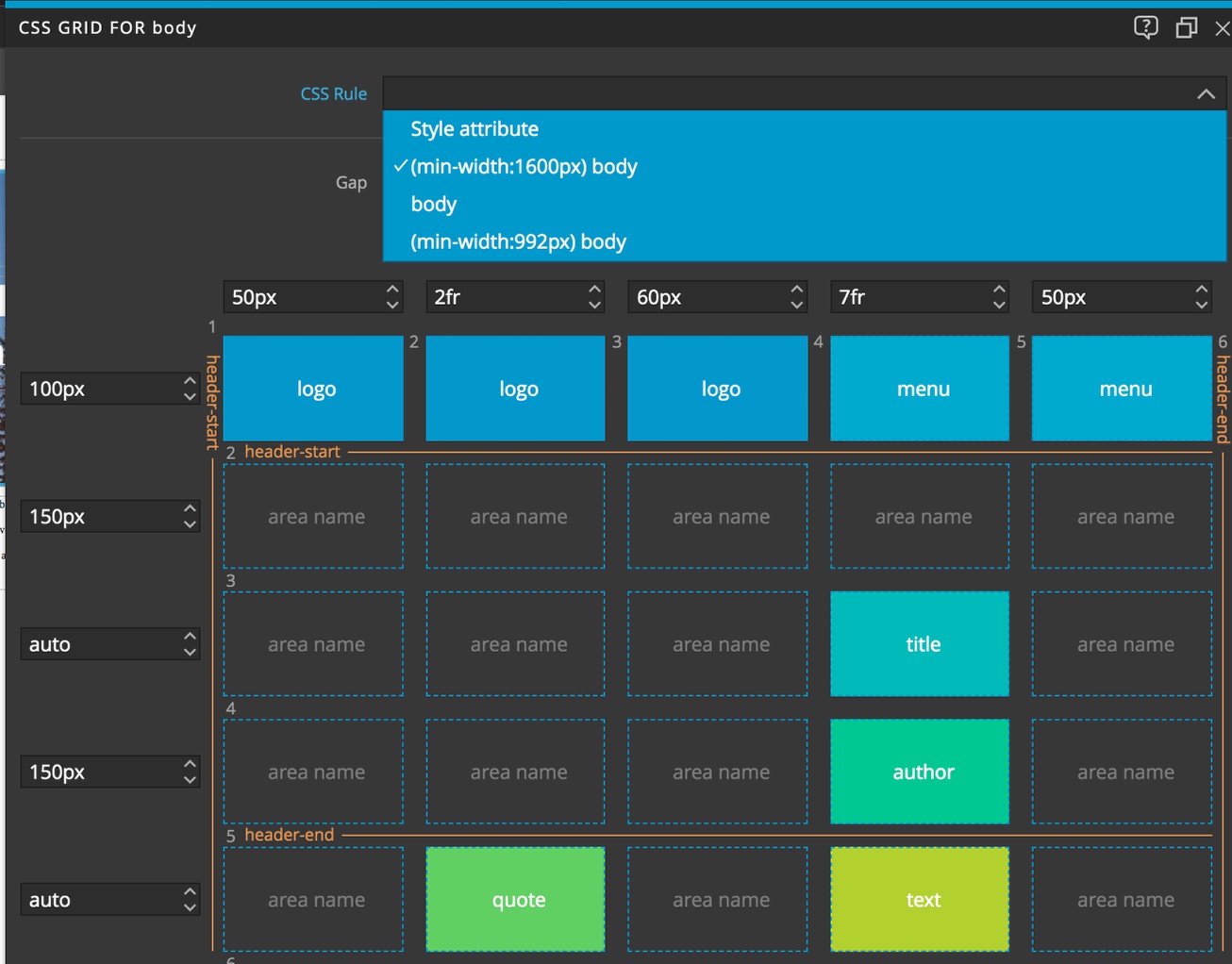
Let’s move to the media query for the larger screen sizes. If look at the top of the Pinegrow Grid Editor there is a dropdown. This allows us, when we have media queries for example, to select the grid we want to edit. So, from that dropdown we can select our large “(min-width:1600px) body” rule set.
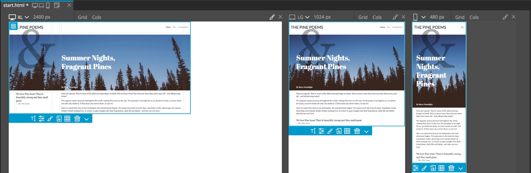
Overall, the layout is just too stretched at really large screen sizes. Based on the content there isn’t a real reason to have it full-screen, so one solution is to simple limit the max screen size with CSS and not change the grid at all. First, open a Page View that is 1600px or larger. Then with the paintbrush on this view highlighted, select the body element and then the body rule with the large media query. Next, in the visual editor enter a max screen width of 1600px. I think that is it!
Conclusions and fallbacks
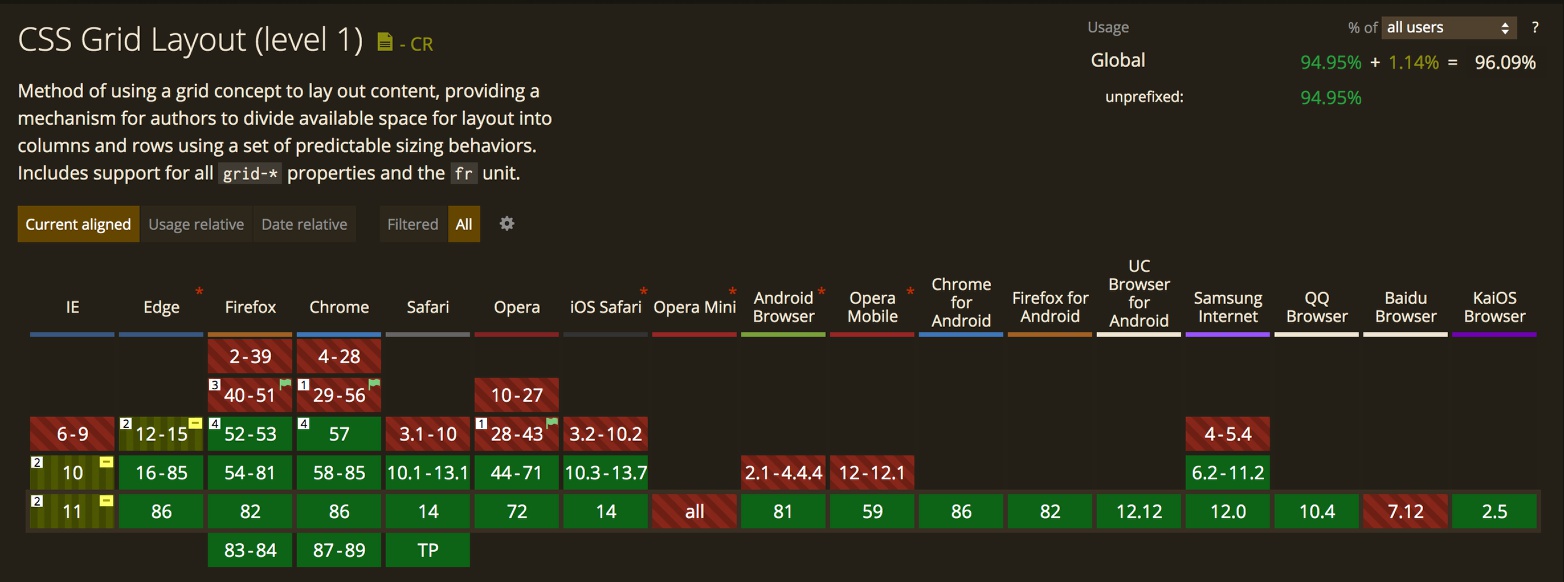
CSS Grid is fairly well supported in more than 96% of modern desktop and mobile browsers. Internet Explorer which gave birth to one of the original grid prototypes still needs prefixing with -ms- in IE10 and IE11. We can also write CSS rules that will only be added in browsers without grid support called @supports rules. These are much like media queries and surround rule sets that change if CSS grid is not supported, like so:
@supports not (display: grid) {
    body {
        //new property:values to be applied
    }
}
Pinegrow helps us write these rules by being able to turn CSS Grid support off from the Page View screen size dropdown. If you click on the caret next to the screen size you can uncheck CSS Grid to turn it off for that display. You can determine if your end users will be needing this support. In the case of this page, you would likely need to write one @supports not block directly in your stylesheet that eliminates the decoration and changes the title and author color to black. That is about it. Non-grid rules to limit page width will remain in place.
Well, that is it for this tutorial. Hopefully this has been informative and fun! Putting pages together with grid is enjoyable and almost addictive with the visual tools that Pinegrow provides.
Discuss this tutorial
Have questions or comments about this tutorial? Let’s talk about it on our forum.
Get in touch
Would you like to see your favorite theme or blocks library featured in the next tutorial? Let us know in the forum or by email!