In this quick CSS Grid tutorial we’ll use multiple track names to create a responsive CSS Grid layout.
As the starting point, we’ll take the layout example from “Breaking out with CSS Grid explained” by Rachel Andrew. It’s recommended that you read this article first, especially if you’re not yet familiar with named tracks in CSS Grid.
The featured example is a static layout suited for larger devices. On smaller screens it would make more sense to have a simple full width layout.
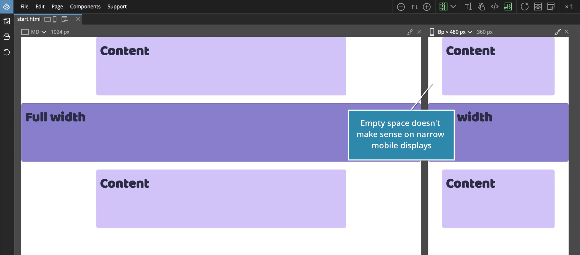
We’ll do that here.
You can download the project files with both initial fixed layout and completed responsive one. You’ll also need Pinegrow Web Editor, a free trial version will do.
Here’s a short video if you prefer to watch the action, otherwise just keep reading to see all the steps explained.
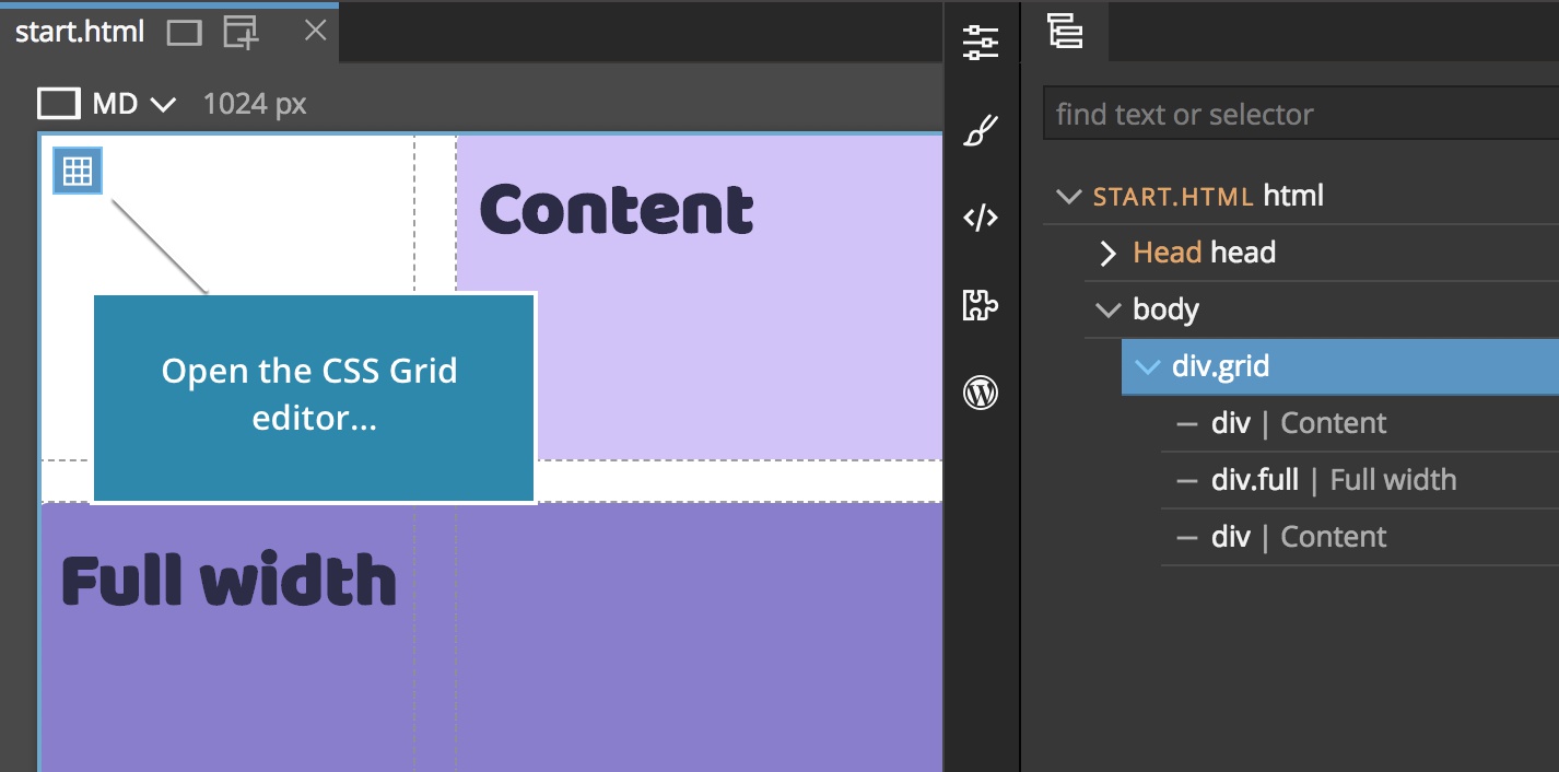
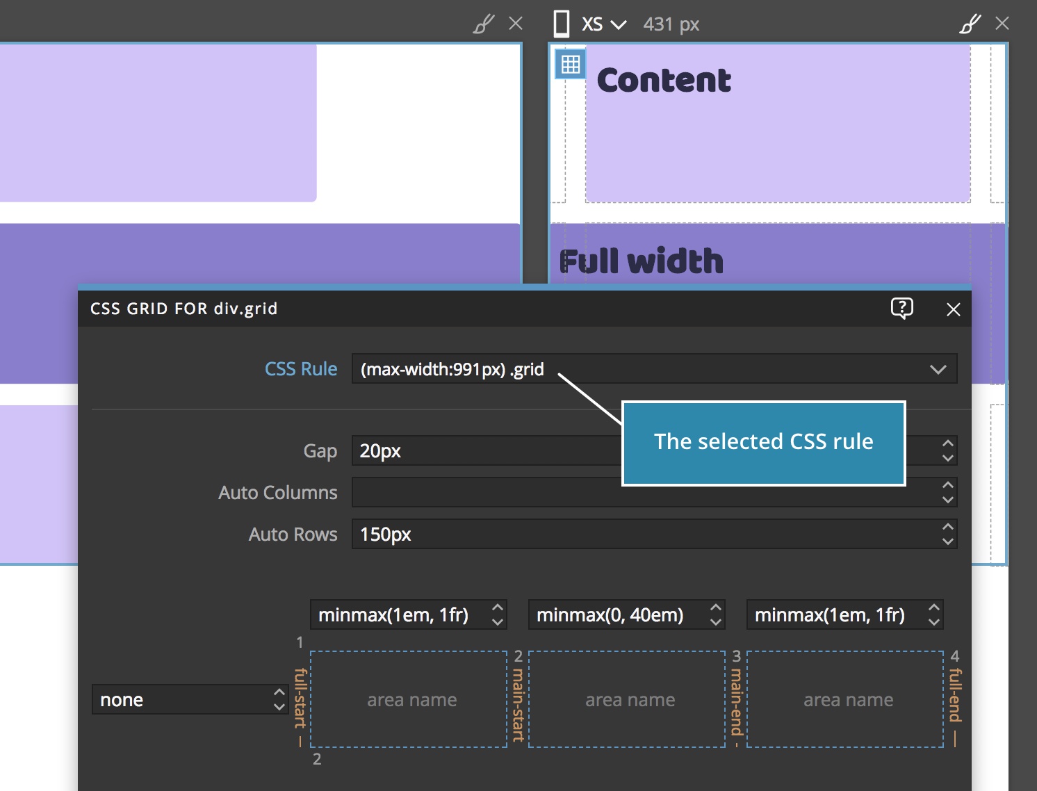
In Pinegrow open the start.html and select the div.grid element.
Click on the Edit grid icon or press CMD+G (CTRL+G on Windows and Linux) to open the CSS Grid editor:
Here we can see that the only the grid columns are defined (rows are set to none).
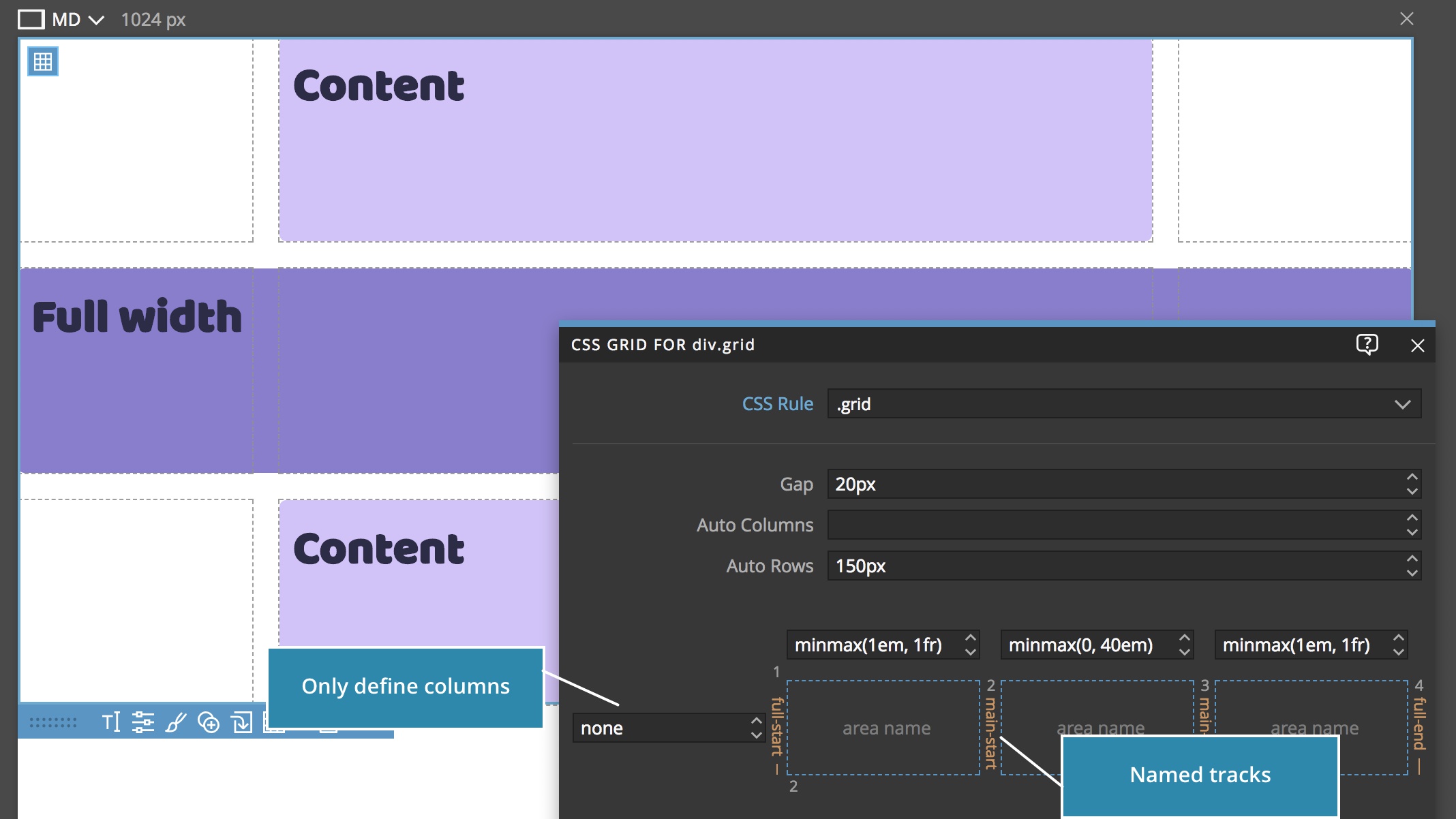
The grid rows are auto-generated by the browser using the Auto rows property.
Note, in a real world scenario, the Auto rows would most likely be set to auto so that the rows are sized according to the size of their content.
The layout uses named tracks to define full and main content areas using the -start and -end name prefixes.
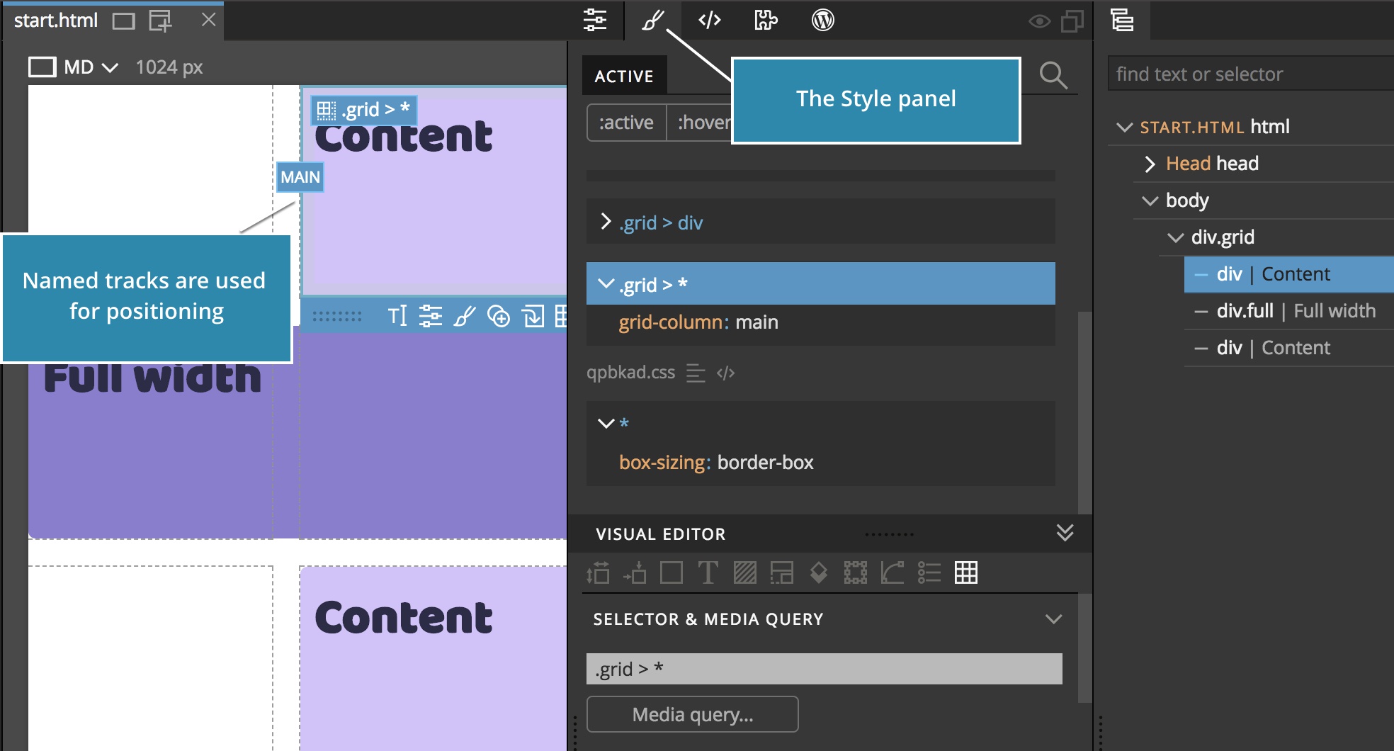
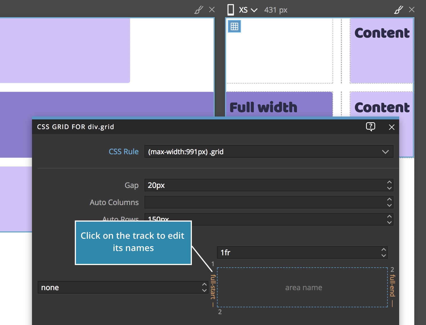
Switch to the Style panel and click on “Content” and “Full width” grid items and explore how they are positioned using the full and main track names:
One of unique features of Pinegrow is that we can edit multiple page views at the same time. So, let’s open a second page view showing the mobile device size:
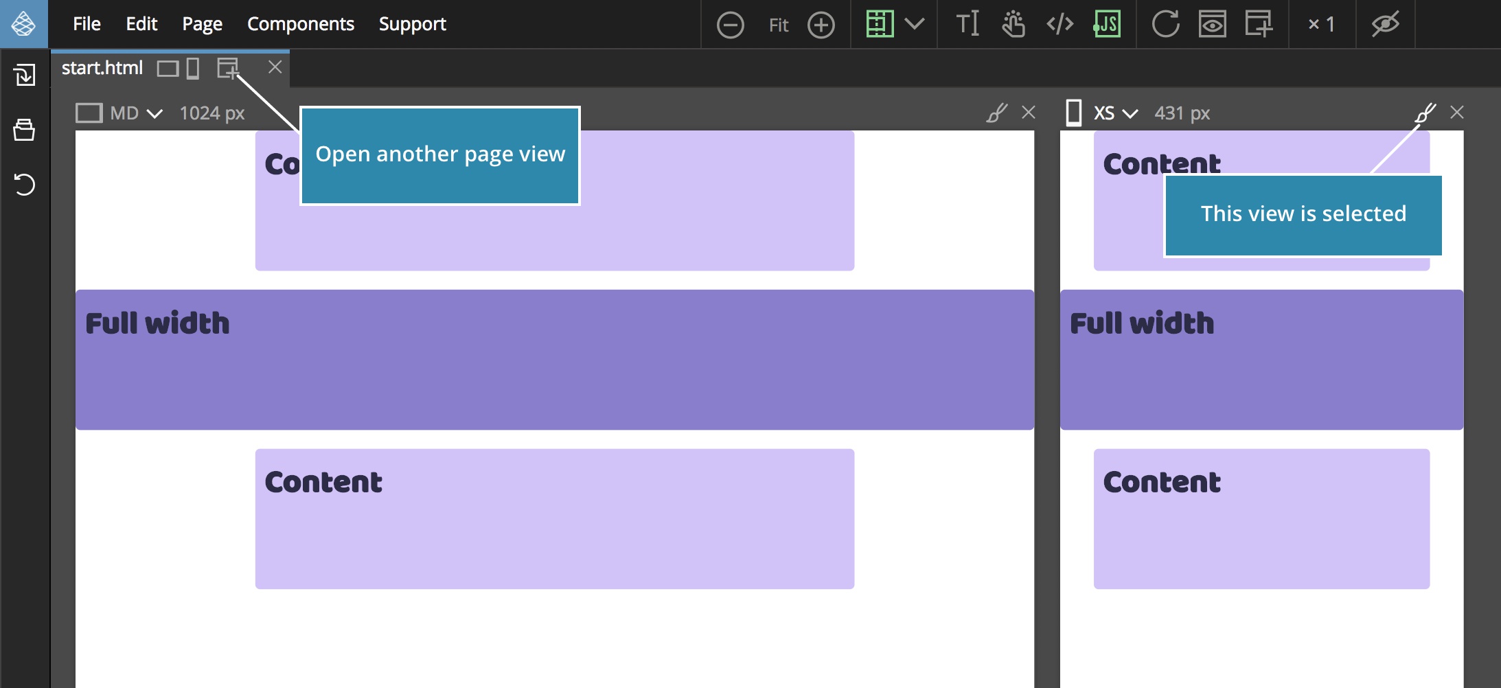
Make sure that the mobile page view is selected.
The best practice for making layouts responsive is to pick the most simple way – that’s usually the approach that requires the least additional CSS rules.
In our case, we’ll just override the grid definition and leave the CSS rules that position the grid items between named tracks as they are.
First, let’s duplicate the .grid CSS rule:
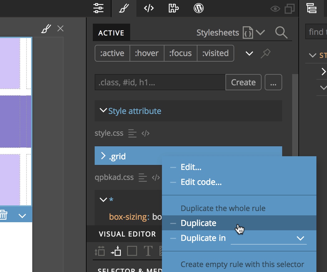
The new, duplicated, CSS rule is selected by default.
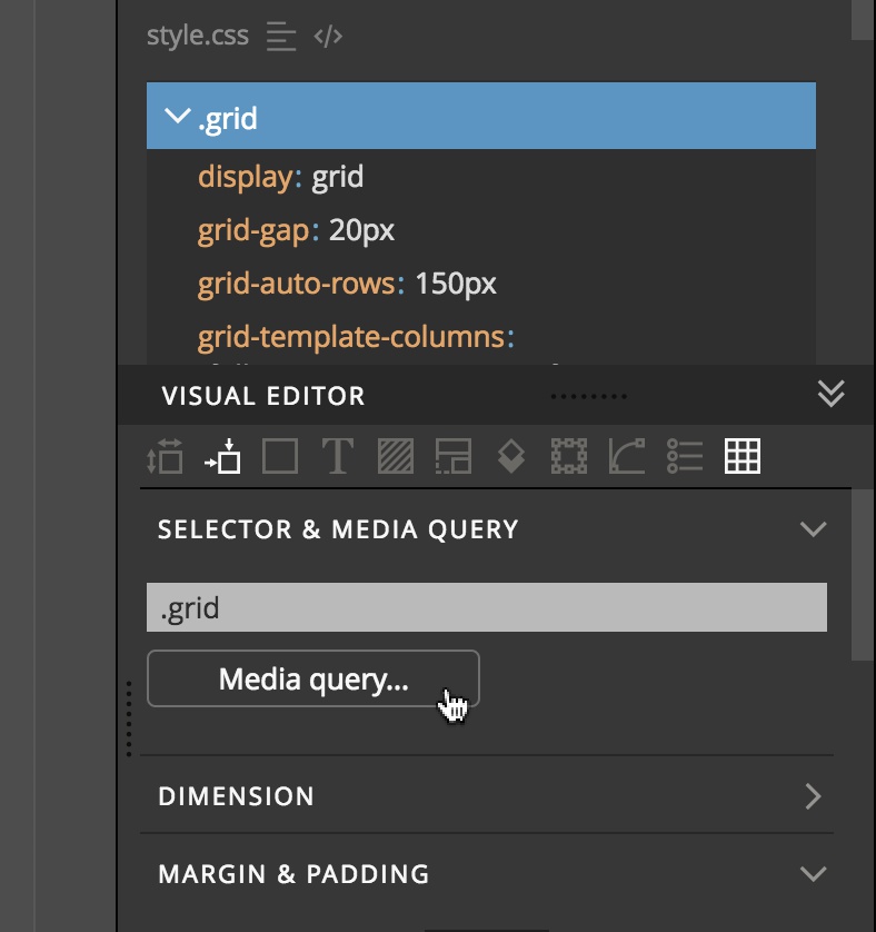
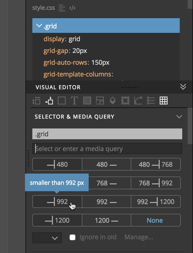
We’ll select a media query to target only devices smaller than 992px.
Let’s open the CSS Grid editor by selecting either the div.grid element or any of its children and press CMD+G (CTRL+G on Windows and Linux).
The .grid CSS rule with the media query should be selected in the CSS Grid editor.
There, we remove the first and last column to create a simple one column layout. The size of the single column should be 1fr, meaning all available size.
And now we’ll do the magic:
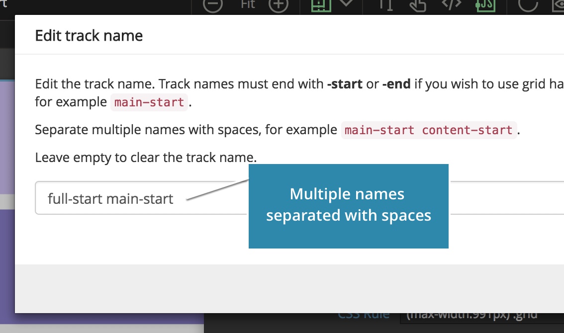
CSS Grid lets us give multiple names to a single track.
To achieve a single column layout for all of our grid items we name the first track full-start and main-start and the last track full-end and main-end.
Click on the track to edit its name.
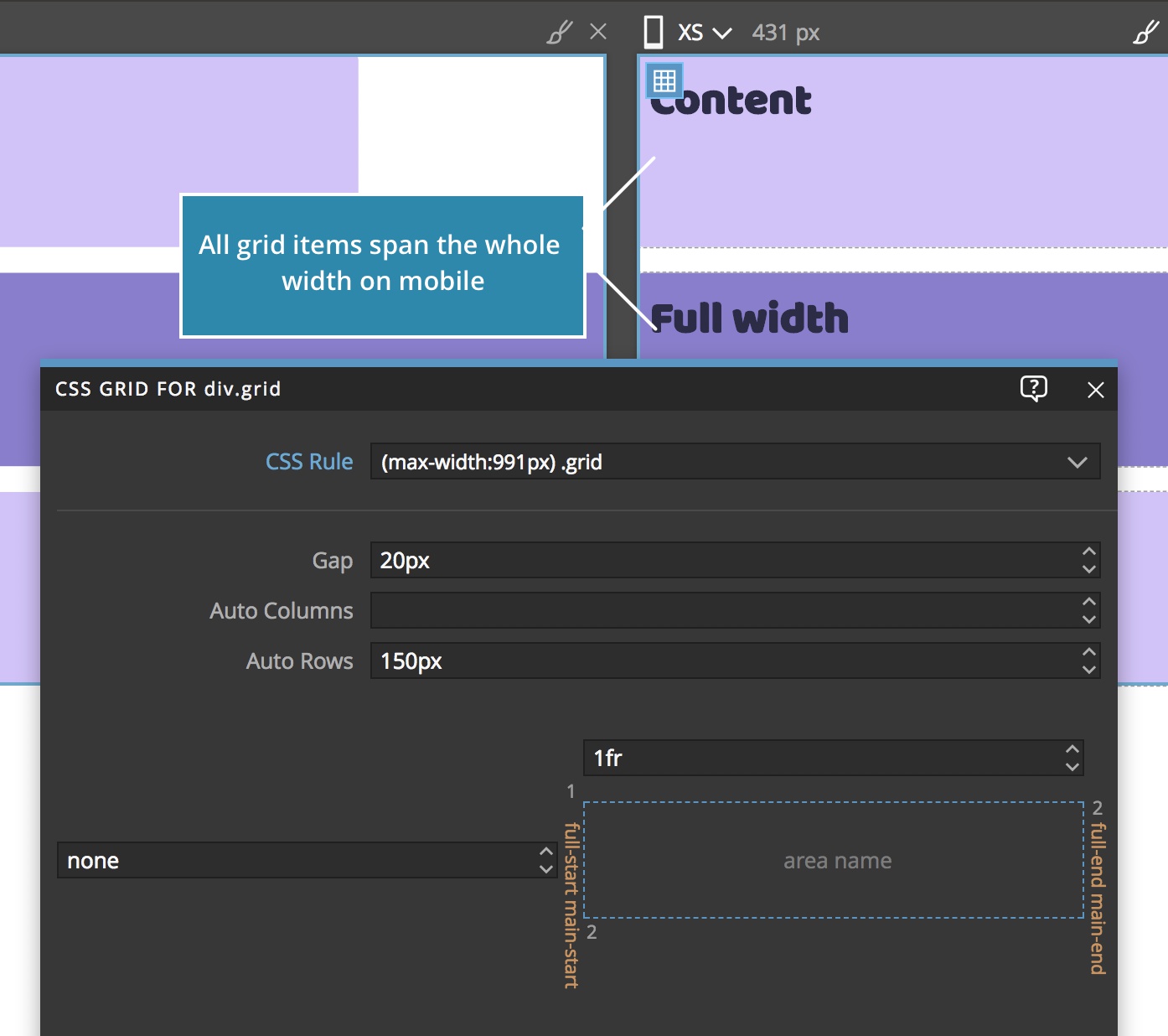
That will cause both .full items and normal content items to span the whole available width on mobile devices.
Conclusion
We achieved our goal by adding a single CSS rule that redefines the grid layout on smaller devices while leaving the rules that position the individual grid items intact.