Pinegrow features a library of Bootstrap 4 blocks to make assembling a page quick and easy. These blocks are non-opinionated and easily altered to give your pages a custom look.
Not sure about what are Bootstrap Blocks? Read the introduction first.
Adding Bootstrap Blocks
Note: While the title to this video indicates that it is for the Bootstrap 4 blocks, the process is the same for Bootstrap 5 blocks.
Pinegrow Blocks are now a built-in part of the Pinegrow Bootstrap frameworks. They allow you to very quickly put together great looking pages.
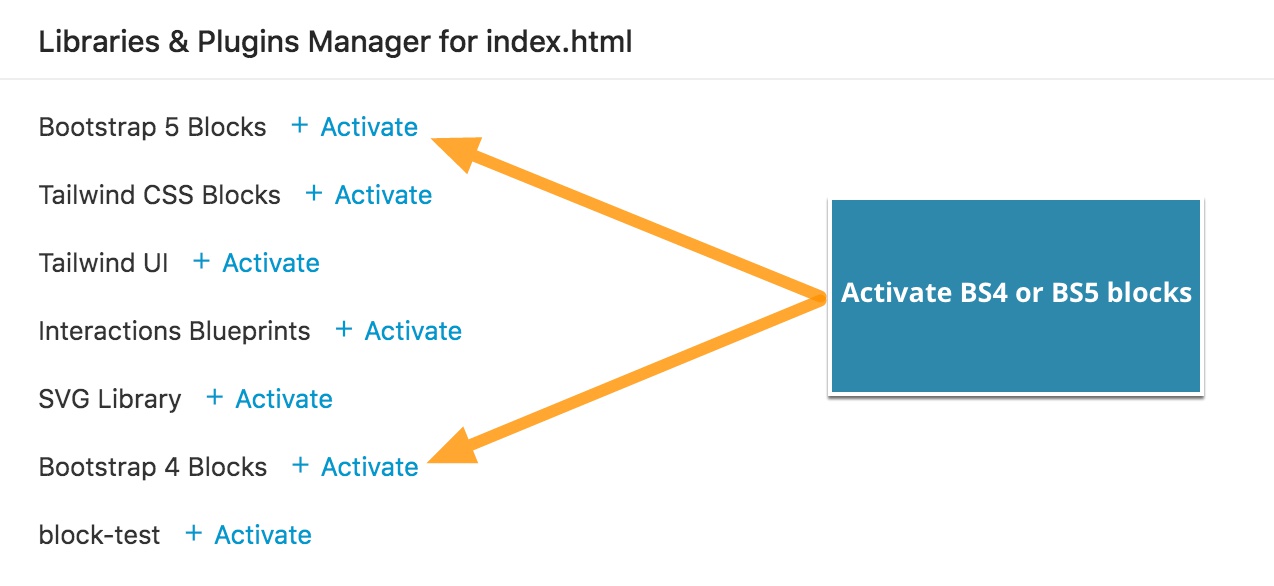
The Blocks are automatically added to all Bootstrap 4 and 5 projects. In situations where Bootstrap is not automatically detected, they can also be added to existing projects by opening the file menu and selecting “Manage libraries & plugins…”.
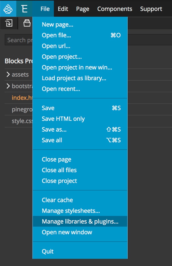
Next, from the pop-up window activate the “Bootstrap 4 Blocks”, no other steps required!
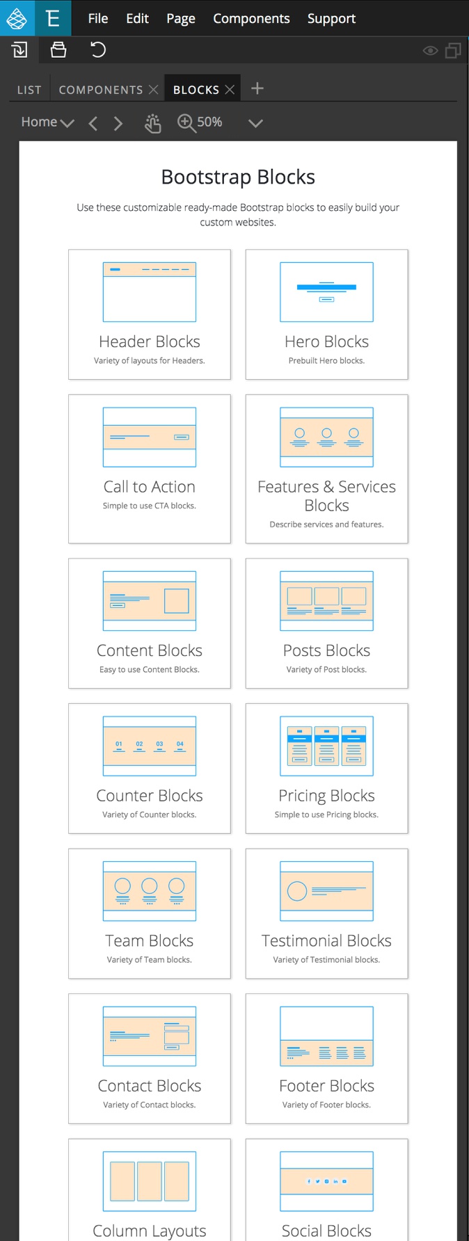
Navigating the Blocks Library
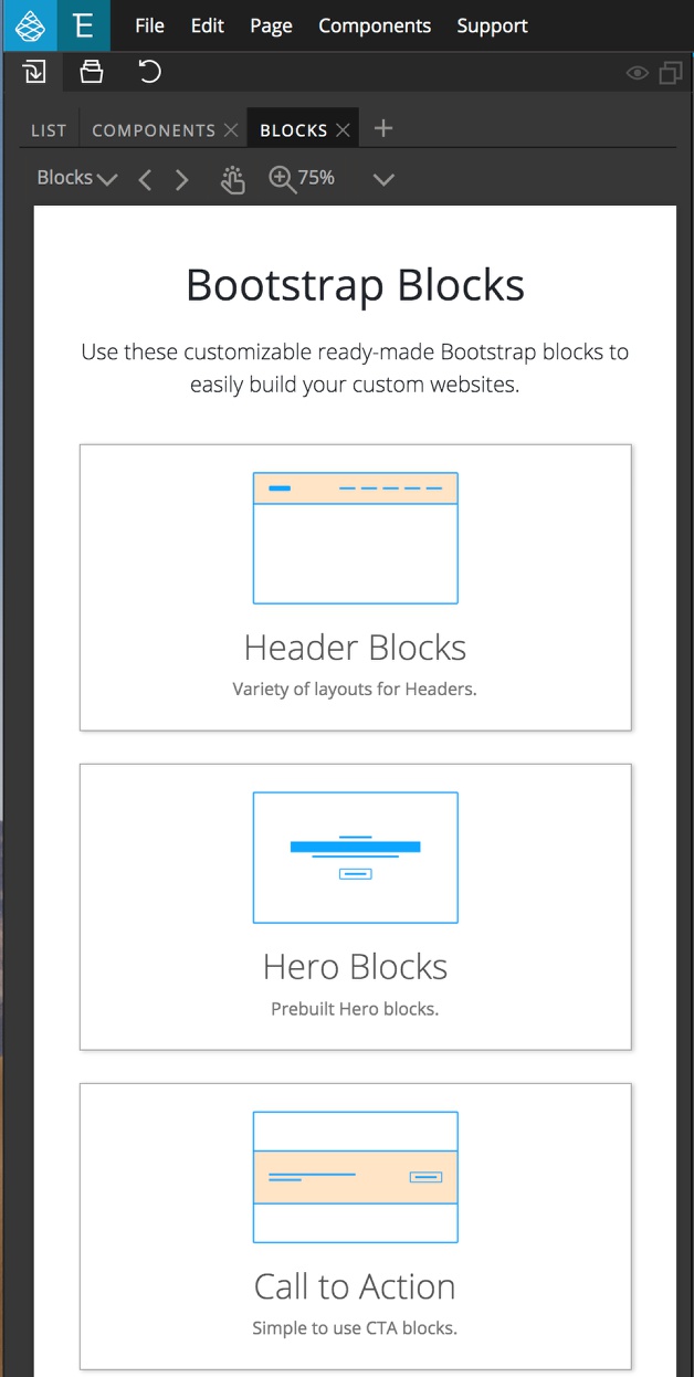
Once activated, the Blocks will show up in the Library Panel.
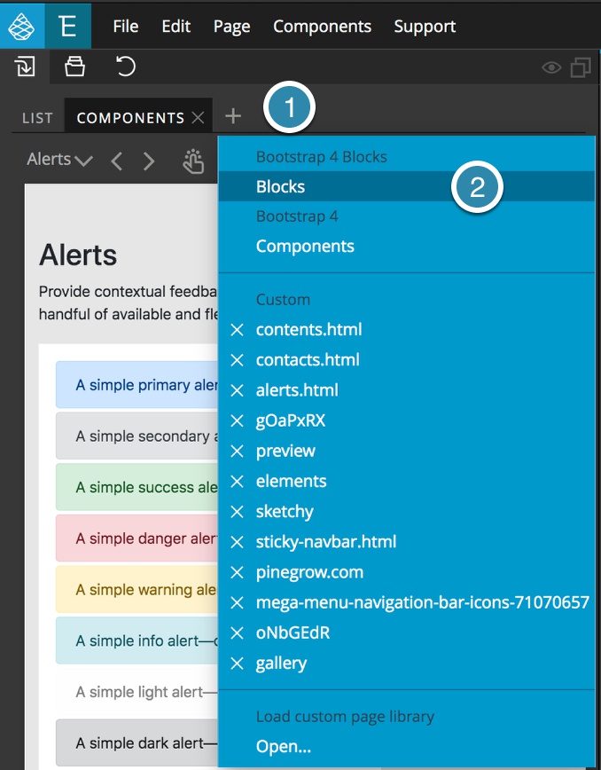
If the Blocks tab isn’t visible, or is closed it can be reopened by clicking on the plus sign to the right of the tabs in the Library and then selecting the “Blocks” tab.
Blocks can be selected in several ways. When the Blocks tab is first selected it will appear as an index of all the different block types. You can scroll down this list until the correct type of block appears. Clicking on any of the block types will open a graphical list of all the blocks of that type.
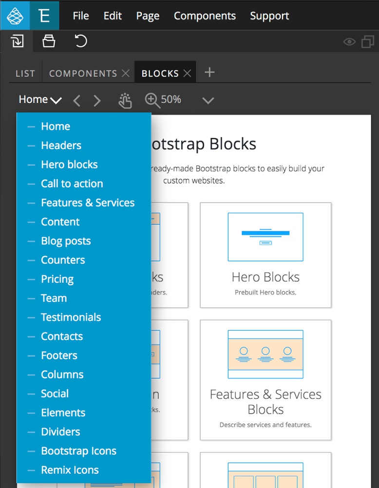
As an alternative to scrolling through the index there is a dropdown menu at the upper right corner that allows for the selection of any of the block types. Selection of “Home” from the top of the menu will bring the tab view back to the index.
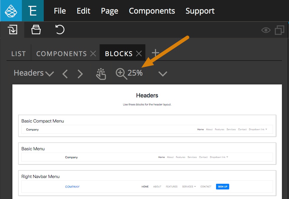
Within the individual component types the magnifying glass can be used to look at how each block will look on different size screens without having to expand and collapse the width of the Library panel.
Adding Blocks to a Page
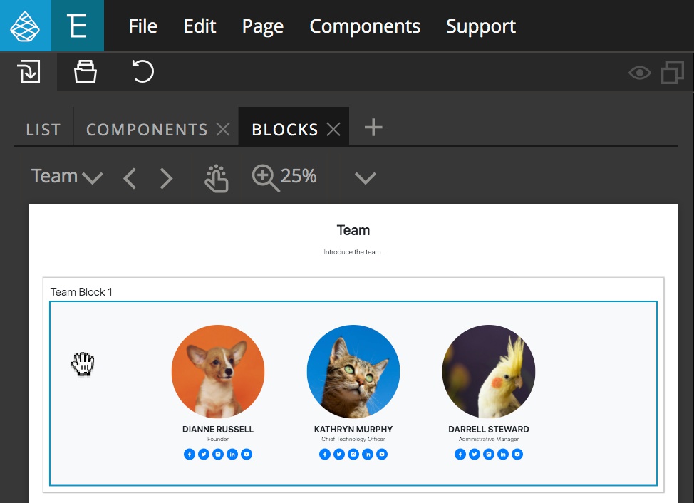
In order to add a new Block to a page, all you have to do is drag-and-drop to either the Page View or the Tree panel. Hovering over the Block will add a blue outline to show what will be added to the page.
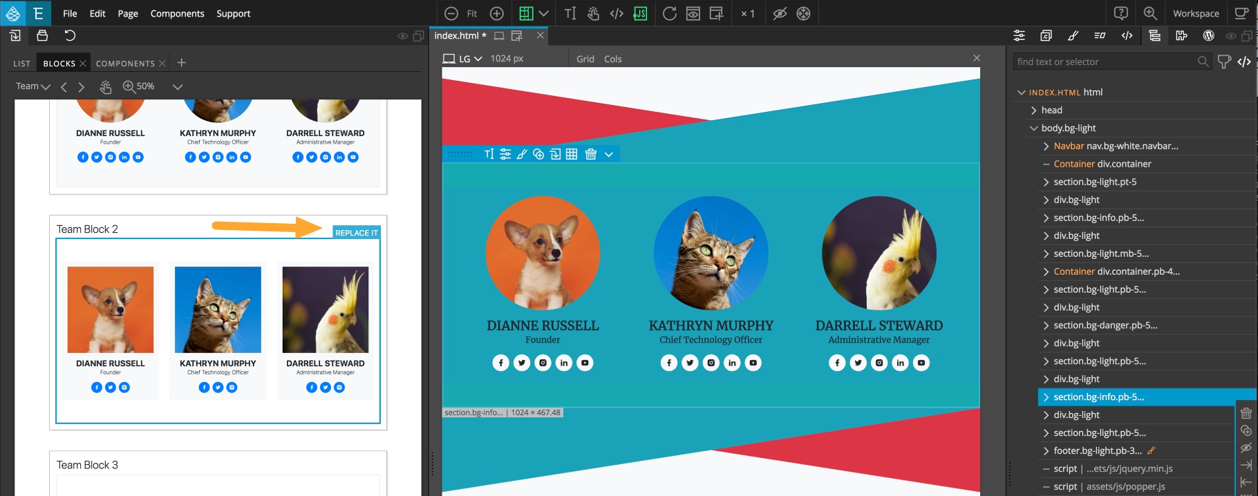
Pinegrow also gives the option to swap existing content out with a Block selected from the Library. Simply select the content to be replaced in either the Page View or the Tree panel. Now when you hover over a block you will get an additional “REPLACE IT” tag at the upper-right. Clicking on this will change out the element for the new one.
Note: you can swap between different blocks of the same type, different types, or even replace non-Block content.
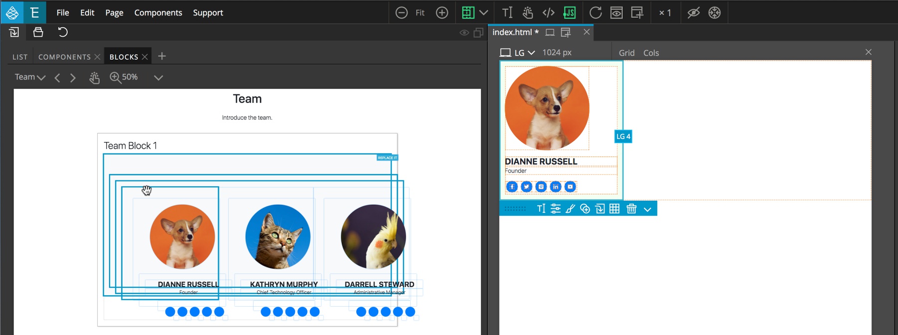
For some complex Blocks, you can elect to only add part of the Block to the page. There are two ways to accomplish this. Double-clicking on the Block will split it apart into components. Hovering over the split components will again cause a blue border to appear, identifying what parts of the component will be added to the page. Note that the parental nodes of the selected item will also be highlighted with blue to aid selection.
The other option is to add the entire component to the page and then delete any undesired parts of the Block.
Editing Blocks
Blocks are fully editable using the Properties and Styles panels. All of the Bootstrap framework options can be added through the Properties panel. For example, changing the background and text colors.
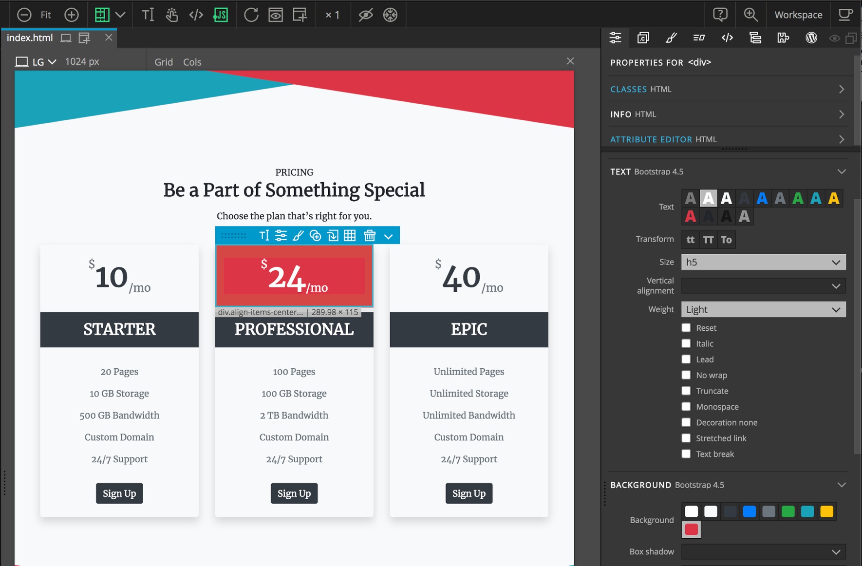
Text within the block can be edited by either double-clicking or by selecting the text edit icon from the helper menu. Like other Bootstrap elements, column widths and responsiveness can be adjusted through the Properties panel.
Adding Background Images
The Blocks add an additional section to the Properties panel. This section allows you to add background images to Block elements or content added manually. This section also allows you to set the background image position and toggle the cover property.
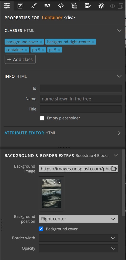
Finally, this section also has controls not normally found in Bootstrap 4 for controlling the width of borders and for setting the opacity of items, like overlay text.
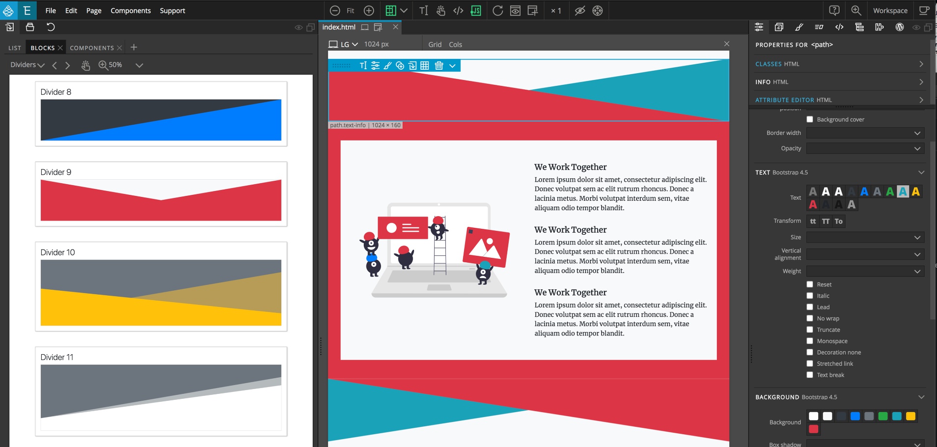
Dividers
In addition to Blocks containing content, there are also a number of dividers to select from in the Library. They can be placed directly on the page to span the entire width, or within containers to only span a portion of the page. The symbols within the dividers can be edited for size, or replaced with icons, or SVG images.
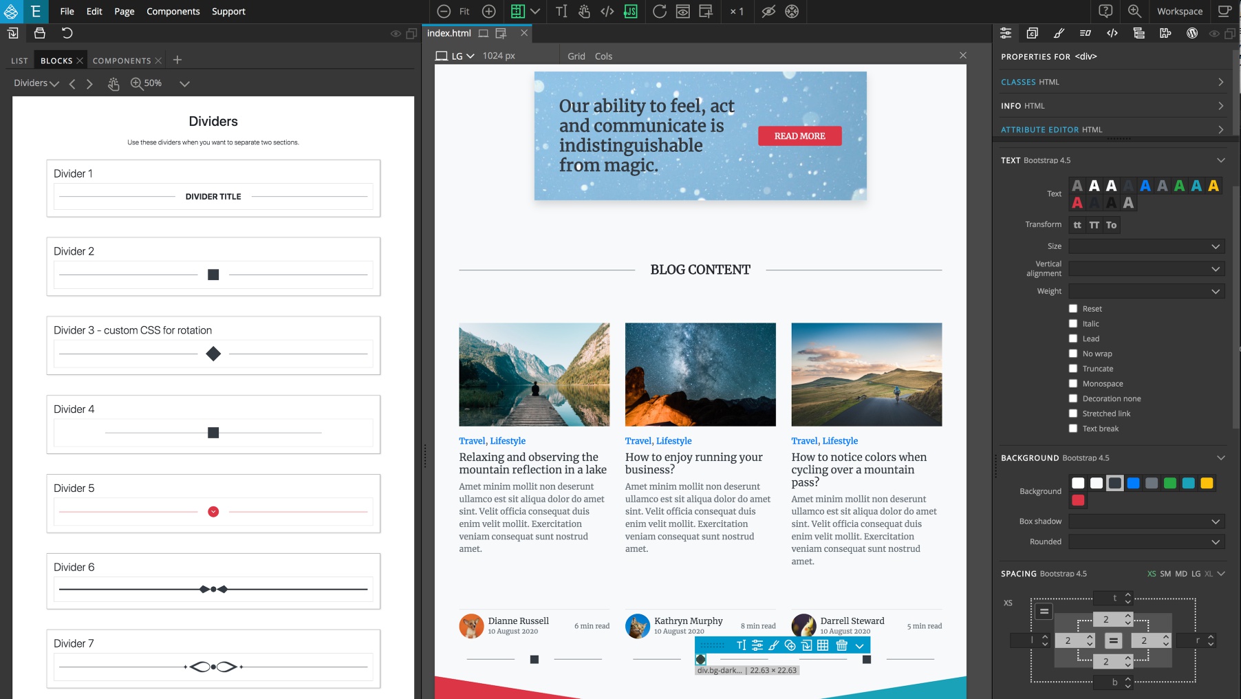
There are also several dividers composed of SVG shapes. These dividers can be easily re-colored and transformed, for example rotated, to give a variety of different looks.
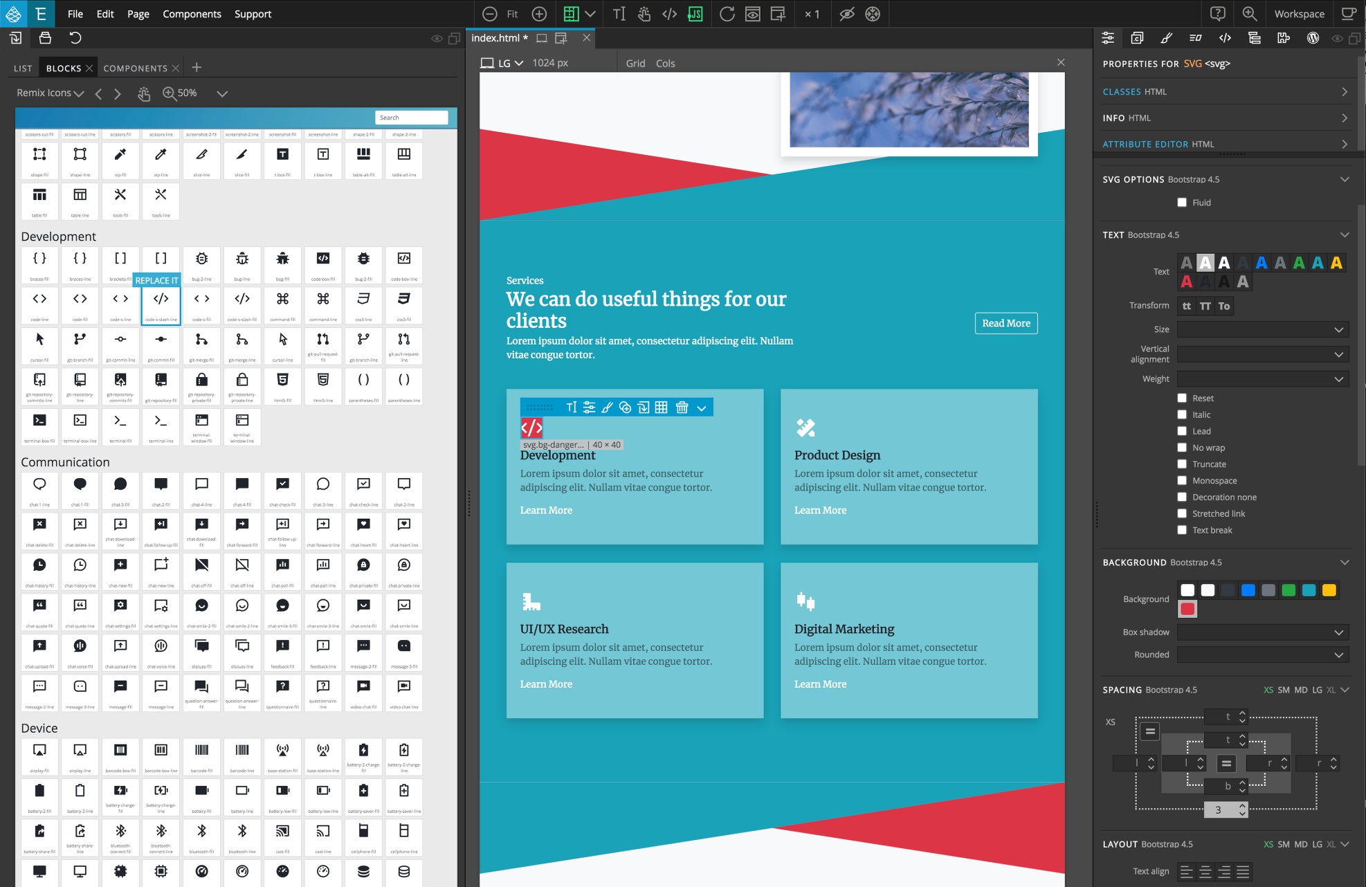
SVG Icons
The Blocks library also contains two sets of SVG icons. One set is the official Bootstrap icon set. The other is the Remix icon set. Icons from both set can be added to the page simply by dragging them to either the Tree panel or the Page View. They can be styled using the Properties panel Text and Background controls, as well as the normal SVG controls.
Customizing the Bootstrap Theme
Note: As of Pinegrow 6 you can also use the Design Panel to set a number of properties. See the documentation here.
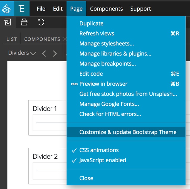
As with other aspects of the Bootstrap framework, changing the theme colors of the Blocks is simple with Pinegrow. From the page menu select “Customize & update Bootstrap Theme” to convert your project to use the SASS version of Bootstrap.
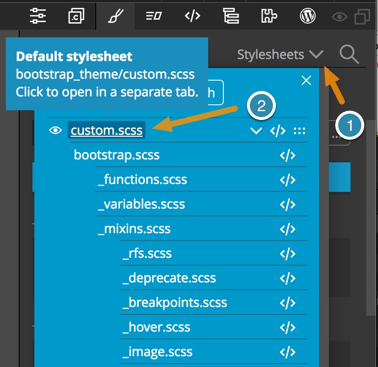
Several modals will appear asking for confirmation of the conversion. Once completed, your page(s) will now have a “custom.scss” stylesheet. You can open this within the Styles panel by clicking on the stylesheets dropdown menu at the upper-right of the panel and then clicking on the stylesheet name.
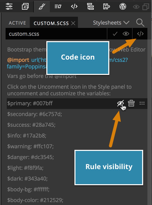
The custom stylesheet already has a number of common variables for colors and fonts. To use these variables or fonts they first need to be made active by hovering next to them and clicking on the eye icon.
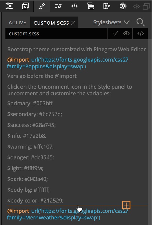
New variables or @import statements can be added in the Styles panel by hovering at the location that you want the new rule inserted and clicking on the orange plus sign that appears.
You can also edit the stylesheet using the Pinegrow built-in code editor. If the stylesheet is already opened in the Styles panel, clicking on the code icon in the upper-right will open it in the Editor.
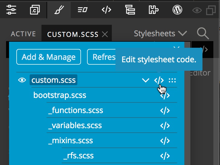
It can also be opened from the stylesheets dropdown by hovering next to the stylesheet name and clicking the code icon. Finally, it can be opened if the file is selected in the Project panel.
In the code editor, any of the variables can be made active by removing the preceding // or /*.
Note: Importing new fonts, either through the Styles panel or in the code editor, typically requires a page refresh. This can be accomplished by either clicking on the refresh top bar icon or typing the hot key (either CMD+R or CTRL+R).