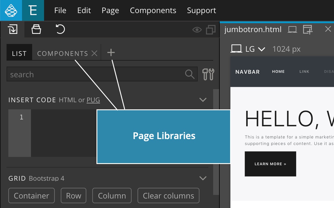
Load any website into the Library panel and use it as a component library from where you can drag elements to your page.
Do you have a web page with a collection of reusable elements and components? Or, did you find such a library online?
Wouldn’t it be great to simply add this page to the Library panel and then drag the components from there to your page?
That’s exactly what Page Libraries can do.
Note, Page Libraries work with HTML code of components. When you drag an element to your page only the HTML code will be added. You have to add any required CSS and Javascript resources manually.
To open a Page Library click on its tab or on the in the Library panel tab bar.
The two types of Page Libraries
There are two kinds of Page Libraries:
Page Libraries that are defined by plugins
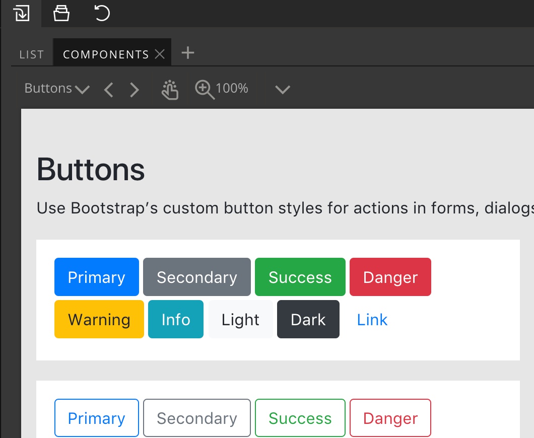
For example, Bootstrap plugin registers a page library “Components” that includes a collection of various Bootstrap example components.
When registering page libraries, plugins usually define which elements are draggable, which elements represent navigation and they might also add custom logic for getting the HTML code of the selected element, in order to make using the page library as simple as possible.
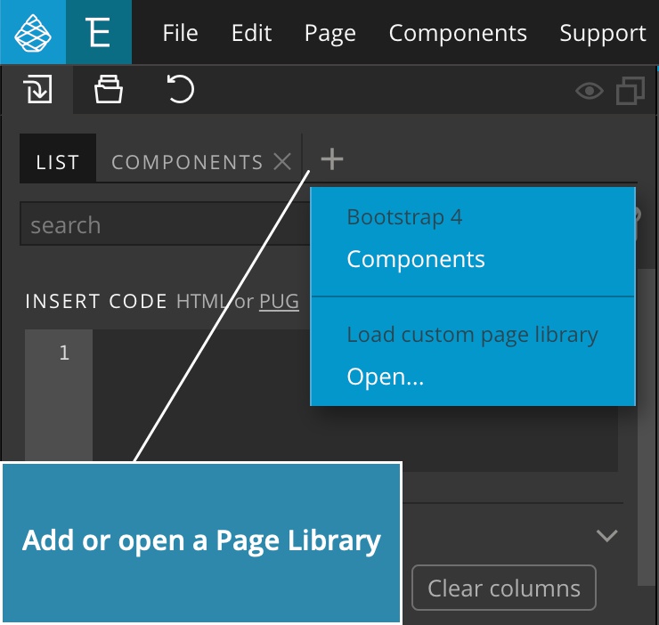
Plugin Page libraries are listed at the top of the “Add Page Library” menu and are open as tabs in the Library panel by default :
Custom Page Libraries
These are local or remote web pages that you load as Page Libraries.
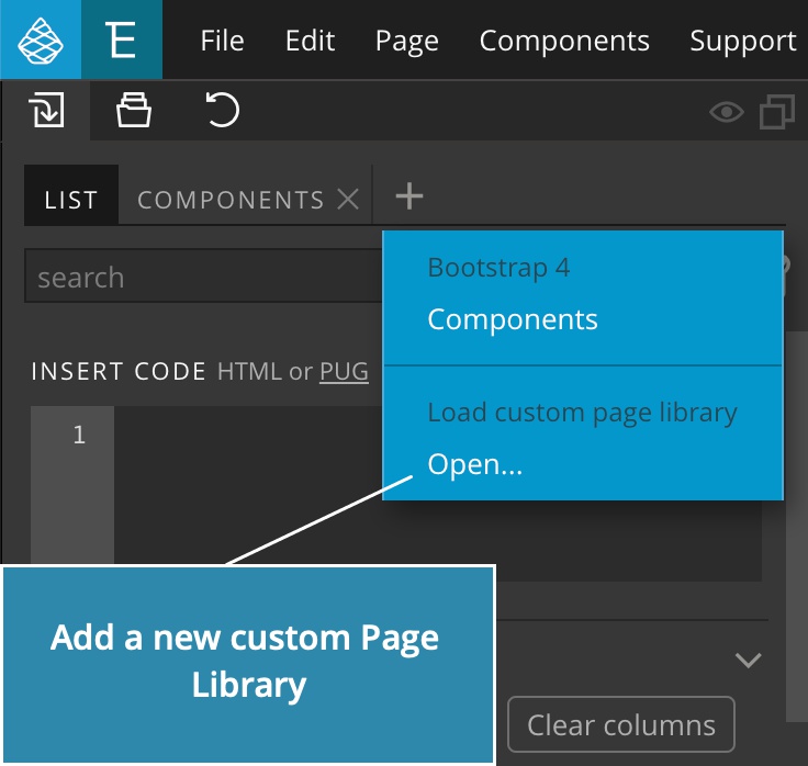
Adding a custom Page Library
To load a new Page Library click on “Open”:
This brings up the Page Library settings dialog:
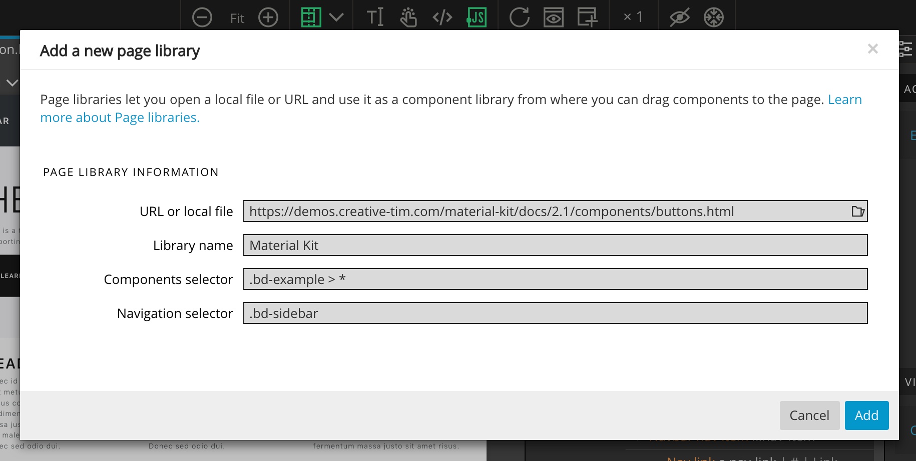
The settings are:
URL or local file
Enter the URL of the remote website or click on the file picker icon to select a HTML file on your computer.
There is a slight difference in how local files and remote URLs are loaded:
Local HTML files are loaded through Pinegrow’s internal web server. Why? That lets Pinegrow connect browser DOM elements to their representation in the source code. That means that when we drag an element to the page we get the source code of the element without any dynamic changes that might have happened after the page was loaded the browser.
Remote URLs are loaded directly from the remote website, bypassing the internal web server. This ensures that the page navigation and any login methods work correctly. That means that you’ll work with HTML code as it is in the browser, potentially altered by the Javascript code. In most cases that’s not a problem.
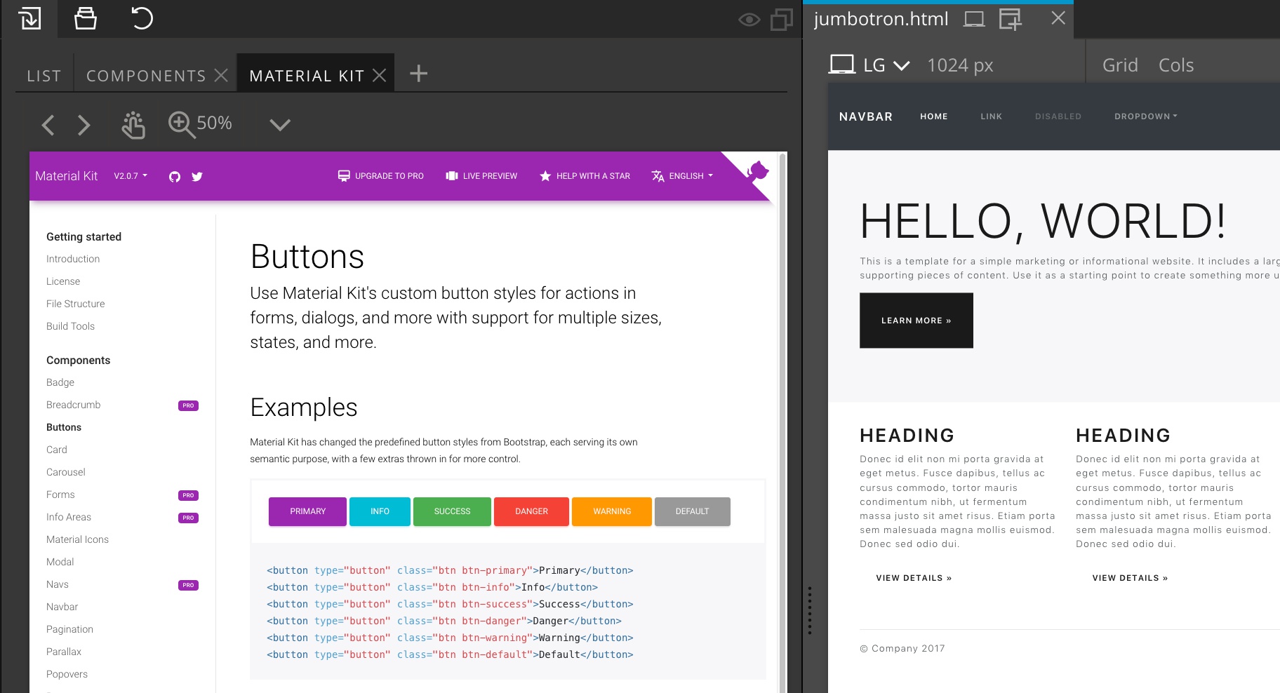
The selected file or URL will be loaded into the Library panel:
The file or URL is the only required setting, all other are optional.
Library name
Give a library an easily identifiable name that will be shown in the tab title and in the menu. By default, the name of the HTML file is used.
Components selector
By default, all elements on the page can be selected and dragged to your project. Although this is ok in most cases, we can make working with the page library more efficient by telling Pinegrow what elements on the page are actual components that can be dragged on the page.
We do that by specifying a CSS selector for such elements. To discover the selector we have to investigate the structure of the page with browser developer tools or similar.
For example, we discover that all components are wrapped around the div with the class bd-example and so we enter the selector .bd-example > *. Or, if components consist of <section>, <header> and <footer> elements, we enter the selector section, header, footer.
Clicking outside of such components will interact with the page directly, for example, it will navigate to a selected sub page.
Navigation selector
In some cases we might want to keep all elements on the page draggable and only exclude certain elements, for example those that are used for the navigation.
Or, the Components selector might not be specific enough and also includes the navigation area.
In such situations we can explicitly tell Pinegrow what page elements to leave alone.
For example, imagine we have a bunch of <section> elements on the page. The navigation menu is also wrapped in <section> and has the id “navigation”.
In this case we set Components selector to section and Navigation selector to #navigation.
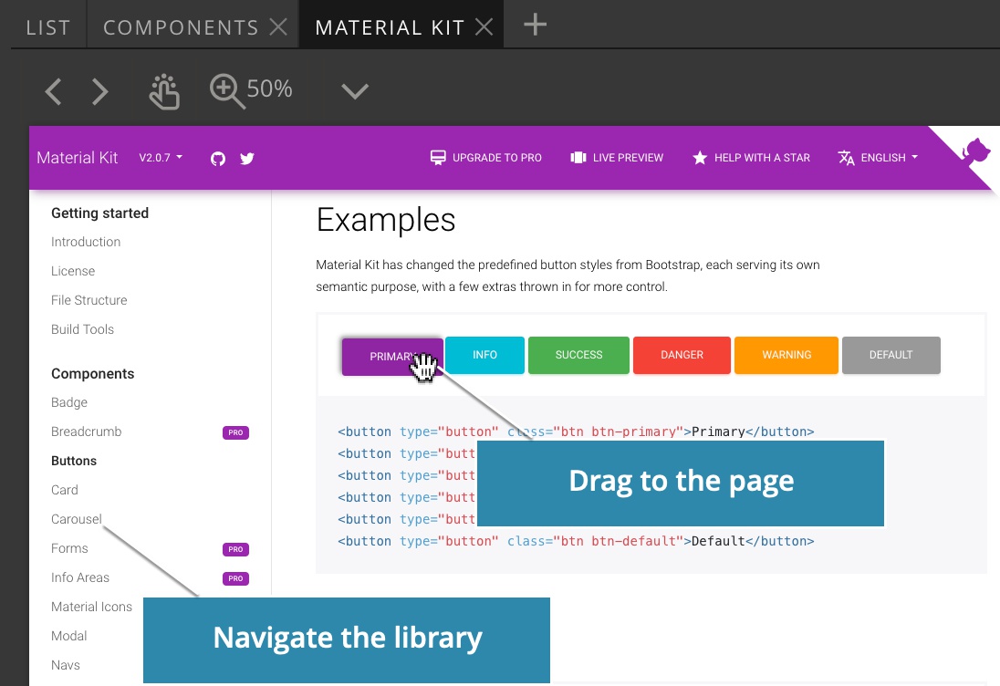
Add the elements from the page library to the page
Now the Page Library is loaded and we can start using it.
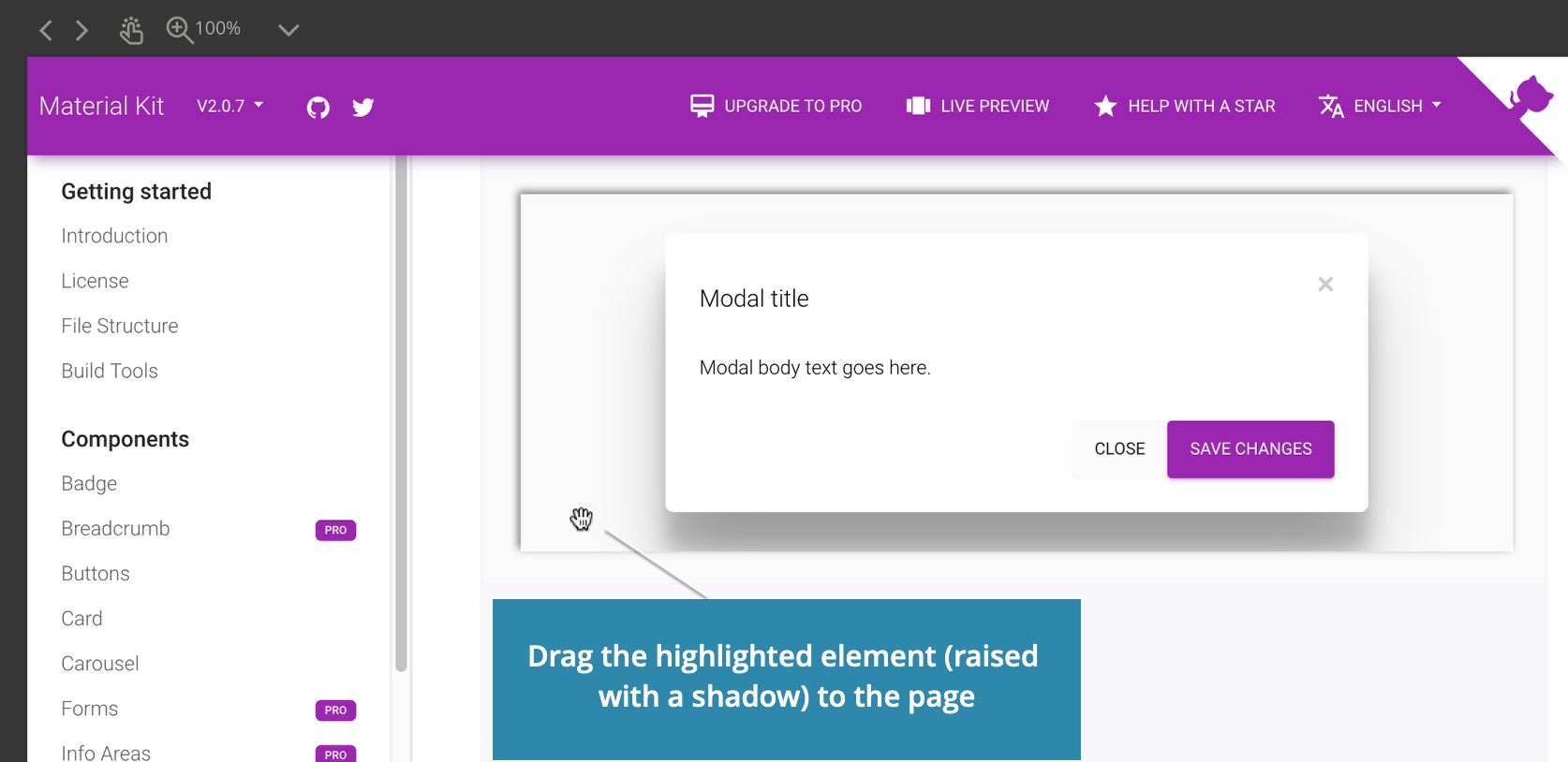
Move the pointer over the library page and drag highlighted element to the page view or to the Tree panel.
Page library behaves slightly different when all elements are draggable, as opposed to when components are defined with the Components selector.
Case A – Components are defined
In case components are defined with the Components selector setting you can only drag those elements that match this selector.
Clicking on such component will break it apart, so that you can drag any of its subelement to the page.
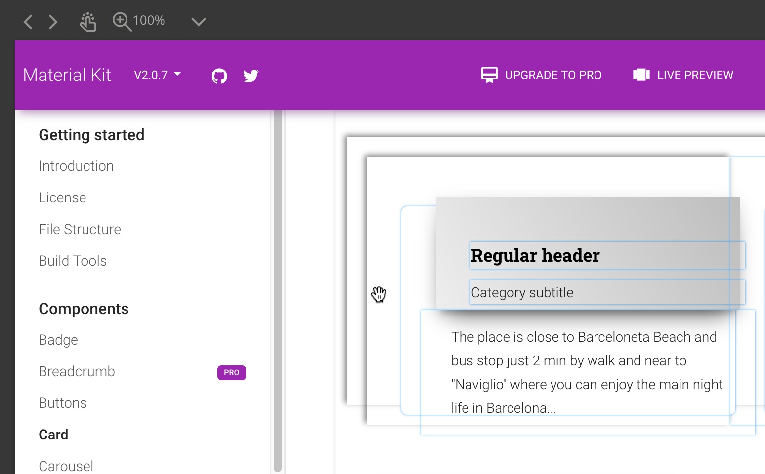
Click again to restore the component back to its original state.
Case B – Components are not defined and all elements are draggable
You can drag all elements to the page.
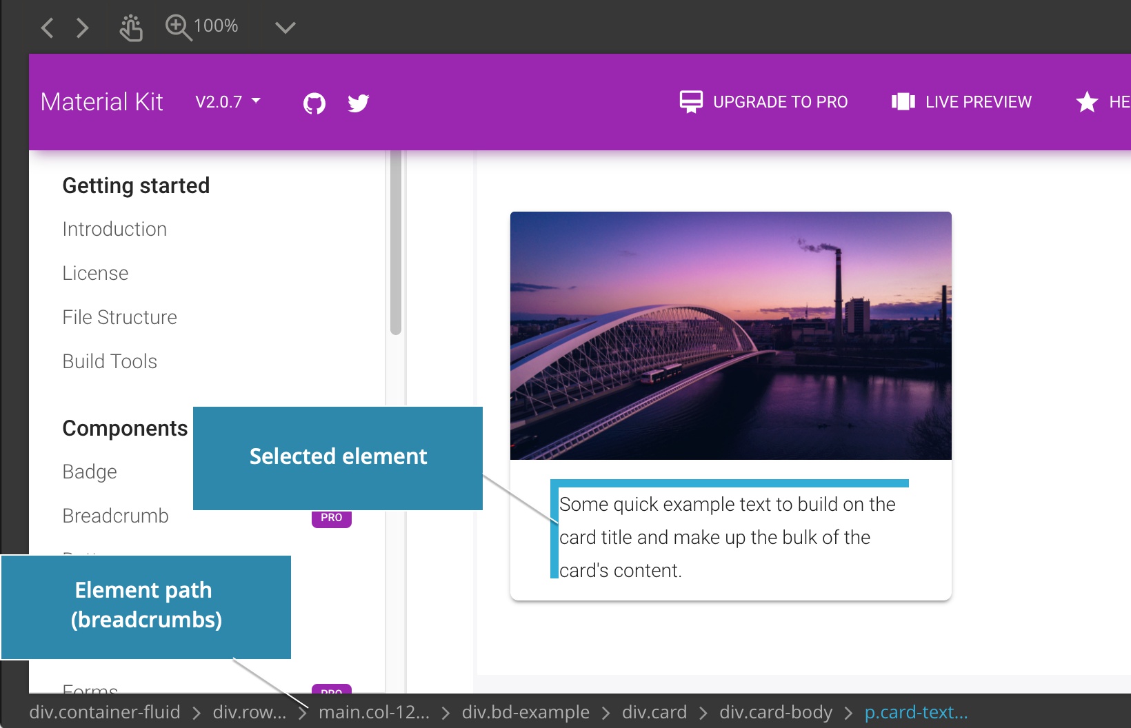
Click on any element on the page to select it and to show its HTML path.
When an element is selected only that element is draggable.
Click on another element to select it or use the HTML path to select any of its parents.
This feature lets you precisely select the element that you want to drag to the page.
Click on the selected element again to unselect it.
Double-click on the element to break it apart. Double-click again to restore it to the original form.
Navigating the page
Each page library doesn’t represent only a single page. Rather, any loaded local file or URL is a full website. You can use its navigation features to move around its sections and sub-pages.
The toolbar
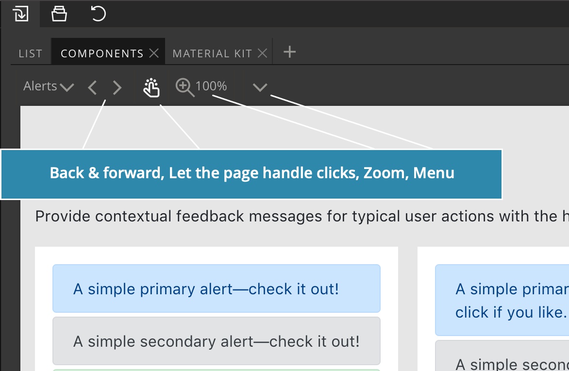
Each Page Library has a toolbar at the top:
Navigation history
Use the Back and Forward buttons to move around the navigation history.
Page click mode
If all elements on the page are draggable but you need to click on a link or use any interactive feature of the page, activate the “Page click” button in the toolbar:
When the Page click is active Pinegrow will let the page handle all clicks.
Click on the icon again to deactivate the Page click mode.
Zoom
Zoom lets you decrease the scale of the page library view so that you can see the whole page at desktop size without having to enlarge the Library panel.
Menu
Options menu lets you edit the settings of the page library and reload the current page.
Note that settings are only available for custom page libraries, not for page libraries that are registered by plugins.
Tutorials and examples
Froala Design Blocks – A step by step tutorial on using Froala Design Blocks for Bootstrap 4. Please note that the tutorial shows an older version of Pinegrow Web Editor.